
Create Your First Fully Cross-Platform Mobile App With Compose Multiplatform 4/4 — UI Layer And Navigation
Build a cross-platform iOS and Android app using the Jetpack Compose API with a single codebase

In this article series, we build a fully cross-platform mobile app with Kotlin Multiplatform (KMP) in combination with Compose Multiplatform for iOS.
In the previous parts, we built the data and domain layer and prepared our view models and some helper functionalities to use some platform capabilities.
In this final article for this series, we will build up our base and finally implement our UI using Compose Multiplatform.
We start by implementing a rudimentary navigation system and will go forward to create the UI of our two screens.
Below, you can find the table of contents for this article series.
- Introduction
- Dependency Injection and Database
- Use Cases and view models
- Navigation system and Compose Multiplatform UI code (you are here)
1 Implementing a navigation system
For this article series, we build a simple navigation system that suits our simple two-screen app. Hopefully, there will be a port for the Jetpack Compose navigation library in the future.
Navigator
We can navigate within our system by accessing the Navigator class, which you can see below.
class Navigator {

    enum class Routes {
        OVERVIEW_NOTES,
        CREATE_NOTES
    }

    private val _backStack = MutableStateFlow(listOf(Routes.OVERVIEW_NOTES))
    val backStack: StateFlow<List<Routes>> = _backStack.asStateFlow()

    fun navigateTo(route: Routes) {
        if (_backStack.value.last() == route) return

        _backStack.update { currentState ->
            currentState + route
        }
    }

    fun navigateBack() {
        if (_backStack.value.size > 1) {
            _backStack.update { currentState ->
                currentState.dropLast(1)
            }
        }
    }
}
We define a Routes enum, which represents the composables we want to navigate to. The Navigator holds a MutableStateFlow representing the back stack and exposing it as immutable StateFlow to interested parties.
We can call navigateTo(..) with the respective route to push the route onto our back stack and, on the other hand, use navigateBack() to drop the last item we added onto our list as long as there is at least one Route available. Of course, if you want to have this behavior, you could also allow the back stack to be empty and close the app in that case.
Additionally, don’t forget to add the Navigator to your Koin module so it can be injected appropriately:
val mainModule = module {
    ..
    singleOf(::Navigator)
}
Navigation host
Next, we need a container that reacts to state changes of that back stack, and that shows the correct Composable to the user accordingly.
The code below shows the NavigationHost composable which will be responsible for this job. Created in our shared/commonMain folder path, it wraps our two destinations OverviewScreen and CreateNoteScreen.
@Composable
fun NavigationHost(
    navigator: Navigator = koinInject()
) {
    val backStack: List<Navigator.Routes> by navigator.backStack.collectAsState()
    val previousBackStackSize: Int by remember { mutableStateOf(backStack.size) }
    val isForwardNavigation: Boolean by derivedStateOf { backStack.size > previousBackStackSize }

    AnimatedContent(
        targetState = backStack.lastOrNull(),
        modifier = Modifier.fillMaxSize(),
        transitionSpec = {
            if (isForwardNavigation) {
                slideInHorizontally(initialOffsetX = { width -> width }) togetherWith
                        slideOutHorizontally(targetOffsetX = { width -> -width })
            } else {
                slideInHorizontally(initialOffsetX = { width -> -width }) togetherWith
                        slideOutHorizontally(targetOffsetX = { width -> width })
            }
        }
    ) { route: Navigator.Routes? ->
        when (route) {
            Navigator.Routes.OVERVIEW_NOTES -> NavigationDestination { OverviewScreen(navigator) }
            Navigator.Routes.CREATE_NOTES -> NavigationDestination { CreateNoteScreen(navigator) }
            null -> Unit
        }
    }
}
Additionally, we use the NavigationDestination composable, we created it in the previous article. That way, the view model created inside those destinations will be removed as soon as the composable gets removed.
Also, we added some logic to distinguish if we navigate to a new destination or our back stack got popped. Respectively we use a horizontal slide animation.
2 Design System
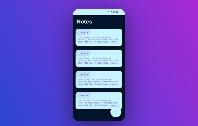
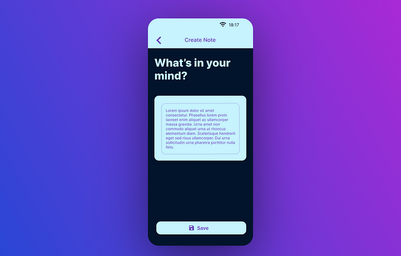
As a recall, we wanted to implement screens looking similar to those two screenshots from Figma below:
Notes overview screen:
Create notes screen:
As we know it from Android’s Jetpack Compose API, we can use the material design system and its color scheme. Check out the AppTheme composable below, which represents a color system equal to the one you saw above in the Figma screenshots.
private val colorPrimary = Color(0xFF6C42BD)
private val colorBackground = Color(0xFF02142B)
private val colorSecondary = Color(0xFFC6F3FE)

private val colorsLight = Colors(
    primary = colorPrimary,
    primaryVariant = colorPrimary,
    secondary = colorSecondary,
    secondaryVariant = colorSecondary,
    background = colorBackground,
    surface = colorSecondary,
    error = Color(0xFFB00020),
    onPrimary = colorSecondary,
    onSecondary = colorBackground,
    onBackground = colorSecondary,
    onSurface = colorBackground,
    onError = Color(0xFFFF4545),
    isLight = true
)

private val shapes = Shapes(
    small = RoundedCornerShape(16.dp),
    medium = RoundedCornerShape(8.dp),
    large = RoundedCornerShape(0.dp),
)

@Composable
fun AppTheme(
    content: @Composable () -> Unit
) {

    StatusBarColor(
        color = colorsLight.secondary,
        lightStatusBar = true
    )

    MaterialTheme(
        colors = colorsLight,
        shapes = shapes,
        content = content
    )
}
3 Creating our screens
Now that we have everything prepared and in place, let’s proceed to connect the dots by creating our actual screens.
Notes Overview
The first screen we will implement is our start screen, which shows an overview of all our created notes.
@Composable
fun OverviewScreen(
    navigator: Navigator,
    viewModel: NotesOverviewViewModel = koinViewModel()
) {

    val notes: ImmutableList<Note> by viewModel.notes.collectAsState()

    OverviewContent(
        notes = notes,
        onNavToCreateNote = { navigator.navigateTo(Navigator.Routes.CREATE_NOTES) }
    )
}

@Composable
private fun OverviewContent(
    notes: ImmutableList<Note>,
    onNavToCreateNote: () -> Unit
) {

    Scaffold(
        floatingActionButton = {
            FloatingActionButton(onClick = onNavToCreateNote) {
                Icon(Icons.Default.Add, contentDescription = "Create Note")
            }
        }
    ) { innerPadding: PaddingValues ->

        LazyColumn(
            modifier = Modifier.fillMaxSize().padding(innerPadding)
        ) {
            item(key = "header") {
                Row(
                    modifier = Modifier.fillMaxWidth().padding(16.dp),
                    verticalAlignment = Alignment.CenterVertically
                ) {
                    Text(
                        text = "Notes",
                        style = MaterialTheme.typography.h3,
                        fontWeight = FontWeight.Bold,
                    )
                }
            }
            if (notes.isNotEmpty()) {
                items(notes) { note ->
                    NoteItem(
                        modifier = Modifier.fillMaxWidth().padding(16.dp),
                        note = note
                    )
                }
            } else {
                item {
                    Box(
                        modifier = Modifier.fillMaxSize(), contentAlignment = Alignment.Center
                    ) {
                        Text("No notes yet")
                    }
                }
            }
        }
    }
}
The NoteItem composable looks like the following:
@Composable
private fun NoteItem(
    modifier: Modifier,
    note: Note
) {

    val timeStamp: String by remember(note.date_created) {
        val timestampDate: LocalDate = note.date_created.toLocalDateTime(TimeZone.currentSystemDefault()).date
        mutableStateOf(timestampDate.toString())
    }

    Card(
        modifier = modifier
    ) {
        Column(
            modifier = Modifier.fillMaxWidth()
        ) {
            Box(
                modifier = Modifier
                    .height(IntrinsicSize.Min)
                    .width(IntrinsicSize.Min),
                contentAlignment = Alignment.TopStart,
            ) {
                Box(
                    Modifier
                        .fillMaxSize()
                        .clip(RoundedCornerShape(bottomEnd = 16.dp))
                        .background(MaterialTheme.colors.primary.copy(alpha = 0.25f))
                )

                Column {
                    Text(
                        modifier = Modifier
                            .fillMaxWidth()
                            .padding(start = 16.dp, top = 16.dp, end = 16.dp),
                        text = timeStamp,
                        style = MaterialTheme.typography.body1.copy(color = MaterialTheme.colors.primary),
                    )
                    Spacer(modifier = Modifier.height(16.dp))
                }
            }

            Text(
                modifier = Modifier.padding(8.dp),
                text = note.content,
                style = MaterialTheme.typography.body1.copy(color = MaterialTheme.colors.primary),
            )
        }
    }
}
Notes Creation
The screen for the creation of our notes then looks like the following:
@Composable
fun CreateNoteScreen(
    navigator: Navigator,
    viewModel: CreateNoteViewModel = koinViewModel()
) {

    val state: CreateNoteState by viewModel.state.collectAsState()

    BackHandler {
        navigator.navigateBack()
    }

    LaunchedEffect(state.onNoteCreated) {
        if (state.onNoteCreated) {
            viewModel.onNoteCreatedConsumed()
            navigator.navigateBack()
        }
    }

    CreateNoteContent(
        noteText = state.noteText,
        onNoteTextUpdated = viewModel::onNoteTextUpdated,
        onCreateNote = { viewModel.createNote() },
        onNavBack = { navigator.navigateBack() }
    )
}
We make use of state hosting by collecting the CreateNoteState from our CreateNoteViewModel and pass it down to the CreateNoteContent.
Additionally, we added a BackHandler which you also know from Android Jetpack Compose.
However, currently, there is no official handler available. It only applies on the Android side, where a back button is available. You can implement this composable using the expected actual pattern in the following way:
commonMain
@Composable
expect fun BackHandler(onBackPressed: () -> Unit)
iOSMain
@Composable
actual fun BackHandler(onBackPressed: () -> Unit) {
    // Nothing to do here, iOS has no back button to handle
}
androidMain
import androidx.activity.compose.BackHandler

@Composable
actual fun BackHandler(onBackPressed: () -> Unit) {
    BackHandler(
        enabled = true,
        onBack = onBackPressed
    )
}
As you can see, we use this BackHandler as a facade to invoke the real BackHandler on the native Android side.
The next part is the CreateNoteContent which looks like the following:
@Composable
private fun CreateNoteContent(
    noteText: String,
    onNoteTextUpdated: (String) -> Unit,
    onCreateNote: () -> Unit,
    onNavBack: () -> Unit
) {
    Scaffold(
        topBar = {
            TopAppBar(
                contentColor = MaterialTheme.colors.primary,
                backgroundColor = MaterialTheme.colors.secondary,
                title = { Text("Create Note") },
                navigationIcon = {
                    IconButton(
                        onClick = onNavBack
                    ) {
                        Icon(Icons.Default.ArrowBack, contentDescription = "Back")
                    }
                },
            )
        },
    ) { innerPadding: PaddingValues ->

        Column(
            modifier = Modifier.fillMaxSize().padding(innerPadding).padding(16.dp),
            verticalArrangement = Arrangement.SpaceBetween,
        ) {

            Text(
                modifier = Modifier.fillMaxWidth(),
                text = "What's in your mind?",
                style = MaterialTheme.typography.h3.copy(fontWeight = FontWeight.Bold),
            )

            Card(
                modifier = Modifier.fillMaxWidth()
            ) {
                Box(modifier = Modifier.padding(16.dp)) {
                    OutlinedTextField(
                        modifier = Modifier
                            .fillMaxWidth()
                            .height(200.dp),
                        value = noteText,
                        onValueChange = onNoteTextUpdated,
                        label = { Text("Start typing..") }
                    )
                }
            }

            Button(
                modifier = Modifier.fillMaxWidth(),
                onClick = onCreateNote,
                enabled = noteText.isNotBlank()
            ) {
                Icon(Icons.Default.Create, contentDescription = "Save")
                Text("Save")
            }
        }
    }
}
Here we have a simple Scaffold that wraps the content of our screen, which consists of a title, the input field in the form of a OutlinedTextField as well as a button to save the note.
4 Compose Multiplatform Entry Point
The entry point for our Compose Multiplatform UI lies in shared/commonMain/App.kt. Here, we have already set up the KoinApplication composable in part two of this article series.
Android and iOS calls use this composable in their shared code part to invoke our written Compose Multiplatform code. Also, this pattern allows us not to host the whole application in Compose Multiplatform but extract only some parts as Compose Multiplatform Composable while leaving the rest of the application in their native UI version.
Coming back to the App.kt file in the commonMain, for the content parameter of the KoinApplication, we now first add our AppTheme and wrap our NavigationHost composable inside.
@Composable
fun App() {
    KoinApplication(application = {
        modules(mainModule)
    }) {
        AppTheme {
            NavigationHost()
        }
    }
}
From now on, the application is in place, and we can start the application on Android and iOS.
5 Testing
Before we come to the final result, let’s quickly take a look at how we can test the shared Kotlin Multiplatform code in the example of the Navigator we implemented for our navigation system.
For testing our shared code, we can use the Kotlin.test API. To do so, for the last time, we need to go back to our build.gradle.kts file in the shared module.
Here, we add a new section commonTest with the following dependencies:
val commonTest by getting {
    dependencies {
        implementation(kotlin("test"))
        implementation("org.jetbrains.kotlinx:kotlinx-coroutines-test:1.7.3")
        implementation("io.mockk:mockk-common:1.12.5")
    }
}
Because we need to run the tests on one of our systems, we will use the Android platform as an example. Therefore, we also need to add the following section with the mentioned dependencies:
val androidUnitTest by getting {
    dependencies {
        implementation(kotlin("test-junit"))
        implementation("io.mockk:mockk:1.13.7")
    }
}
Now, we can create a new module in shared/src called commonTest. Here, we can create a new class NavigatorTest.
Now, we can make use of all the introduced dependencies and test the logic of the navigator. Please take a look at the following or check out the GitHub repository for this project to get some inspiration on how to write tests for testing the view state of the view models we created, for example.
class NavigatorTest {

    private lateinit var navigator: Navigator

    @BeforeTest
    fun setUp() {
        Dispatchers.setMain(Dispatchers.Unconfined)
        navigator = Navigator()
    }

    @AfterTest
    fun tearDown() {
        Dispatchers.resetMain()
    }

    @Test
    fun `Route gets pushed on backstack on navigation`() = runTest {

        val testRoute: Navigator.Routes = Navigator.Routes.CREATE_NOTES

        navigator.navigateTo(testRoute)

        assertEquals(testRoute, navigator.backStack.first().last())
    }

    @Test
    fun `Route gets popped from backstack on back navigation`() = runTest {

        val testRoute: Navigator.Routes = Navigator.Routes.CREATE_NOTES

        navigator.navigateTo(testRoute)
        navigator.navigateBack()

        assertEquals(Navigator.Routes.OVERVIEW_NOTES, navigator.backStack.first().last())
    }

    @Test
    fun `Route does not get popped from backstack on back navigation if only one route is on the stack`() = runTest {

        navigator.navigateBack()

        assertEquals(Navigator.Routes.OVERVIEW_NOTES, navigator.backStack.first().last())
    }

    @Test
    fun `Route does not get pushed on backstack on navigation if route is already on the stack`() = runTest {

        val testRoute: Navigator.Routes = Navigator.Routes.CREATE_NOTES

        navigator.navigateTo(testRoute)
        navigator.navigateTo(testRoute)

        assertEquals(2, navigator.backStack.first().size)
    }
}
Let’s quickly get an overview of the most important parts:
private lateinit var navigator: Navigator

@BeforeTest
fun setUp() {
    Dispatchers.setMain(Dispatchers.Unconfined)
    navigator = Navigator()
}

@AfterTest
fun tearDown() {
    Dispatchers.resetMain()
}navigator: An instance of theNavigatorclass that we want to testsetUp(): This method runs before each test. It sets the dispatcher toDispatchers.Unconfined, which ensures that all coroutines inside our tests run in a predictable manner. It also initializes thenavigatorwith a fresh instance.tearDown(): This method runs after each test, resetting the central dispatcher to its default state.
As you can see, this is equal to the regular test setup of a regular Android app.
6 Result
In the screenshot below, you can see the final result.
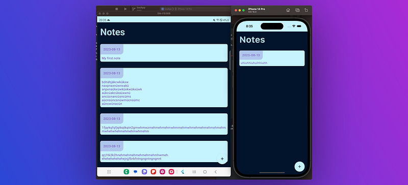
On the left, you can see our notes app running on a Samsung Galaxy Fold 4. On the right, you see the same app on an iPhone 14 Pro emulator 🎉
7 Conclusion
In this last article, we build the UI for our complete cross-platform Kotlin Multiplatform project. We built upon all the building blocks we created over the last articles of this series. We saw how we could implement a rudimentary navigation system, set up an app theme, and how we can implement the screens themselves.
This article series was my most ambitious project on Medium and took me a long time to write, as well as several iterations with all the cross-references and so on. Thank you very much if you followed along all the parts or even just skimmed through the articles.
You can check out the complete project via the following GitHub link.
I hope you had some takeaways. Clap if you liked my article, subscribe to get notified via e-mail, and follow for more!


