
Create a Bar Chart Race Animation App Using Streamlit and Raceplotly
Learn How to Use Streamlit to Build an App that Generates Bar Chart Race Animations within Seconds and No Coding

Introduction
Bar Chart Race is an interesting data visualization that displays data changing over time with the evolution of a bar chart. It is widely and effectively used as a visualization type to show and evaluate rankings among a group of entities over a defined time frame.
Creating a bar chart race in Python (e.g., Plotly), in the past, hasn’t been an easy thing to do and requires a decent amount of coding. Fortunately, I found this package called raceplotly, which was specifically written for creating such a graph with just a few lines of simple python code. It for sure saved a lot of my time and headache when I needed to create a bar chart race animation.
Then I took one step further and was thinking: how about we create an app that lets users quickly and easily create bar chart race animations without even writing a single line of code or knowing python? That could be a cool hands-on project to level up my Streamlit skills! Are you interested?
So, without further delay, let’s start building this app. The app we are going to create looks like this (2-minute YouTube Video Demo):
Pre-requisite
Install Streamlit:
You can refer to the following article and follow the instructions to install Streamlit and learn the basics.
Install the Following Packages:
pip install raceplotlypip install streamlit-aggridpip install streamlit-option-menuImport Libraries
Overview of the App Design
Let’s first briefly talk about the overall layout and design of the app. In my previous article, we talked about how we can use streamlit-option-menu to create a beautiful and professionally-looking navigation menu.
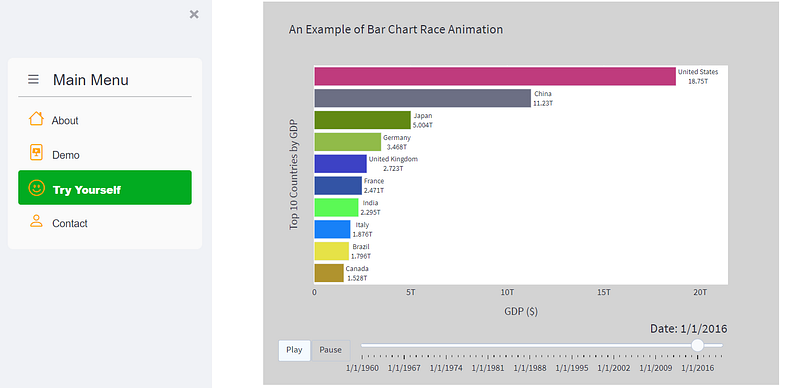
We can do the same thing for this app. We’ll create a multi-page app that includes:
- ‘About’ page: gives an introduction of the app or the app creator
- ‘Demo’ page: shows a brief video demo of the app
- ‘App’ page: allows users to upload a csv file and generate a bar chart race animation instantly
- ‘Contact’ page: shows a contact form for users to fill out
In this post, we will be mainly focused on the ‘App’ page as we have already discussed how to create a multi-page app using streamlit-option-menu in the aforementioned article. For the ‘App’ page, I will explain the code in detail whereas for the other pages the code is pretty straightforward to understand.
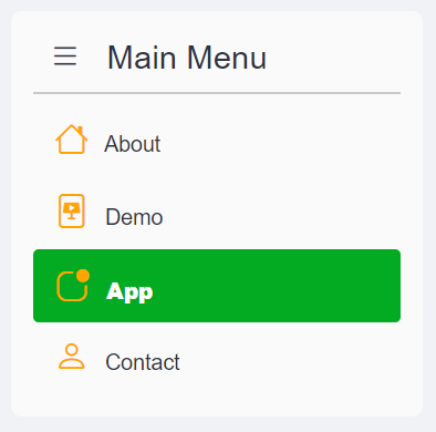
Create a Menu in the Sidebar
First, let’s create a menu using streamlit-option-menu and add it to the sidebar using the code below.
Create the ‘About’ Page
Next, let’s create the ‘About’ page using the code below:
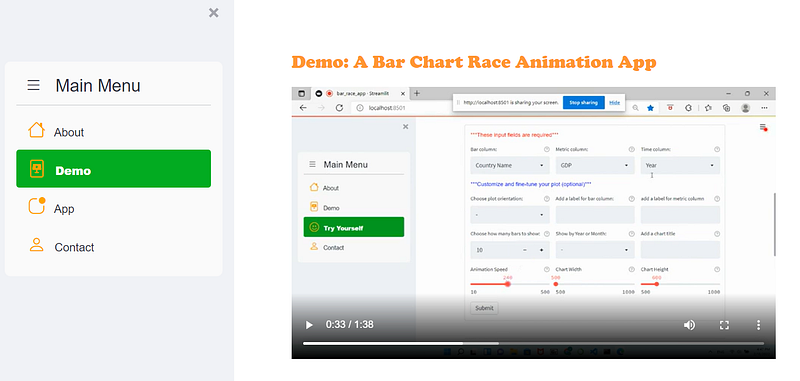
Create the ‘Demo’ Page
We can create a demo page that shows a short video clip to demo the app. To do that, you can record a short video about the app and save it as a .mp4 media file in the same path as your python file.
In the code below, lines 6–7 reads the video file into Streamlit and line 8 uses st.video() to display the video player. From Streamlit’s documentation, it looks like you can also display YouTube videos with st.video() widget by directly pointing to YouTube URLs which is very nice!
Create the ‘App’ Page:
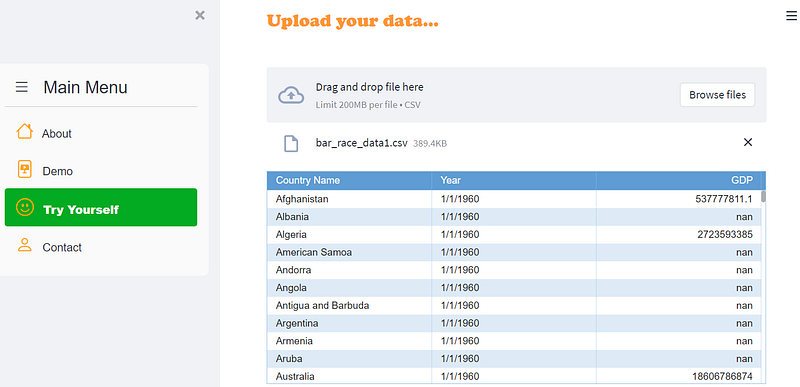
Step1: Add a file uploader
This is the app page for the bar race generator and is the most important page in the app. We’ll spend a great deal of time here explaining how this page is created.
We start by creating a file uploader to allow users to upload a csv file and then display the data using st.aggrid() as a nicely-formatted table. One important thing you need to remember is that after we create a file uploader (line 8) using st.file_uploader(), we need to put the rest of the code (line 10–21) within the if uploaded_file is not None: statement. Using this statement ensures that when a csv file hasn’t been uploaded, the app doesn’t throw any error message for not finding any files to import and display.
Step 2: Create Bar Chart Race Animation Using Raceplotly
After the user uploads the data, we want to pass that data to a dataframe behind the scene and use raceplotly to generate the bar race plot. If you don’t have raceplotly, you can install it by running the following command line:
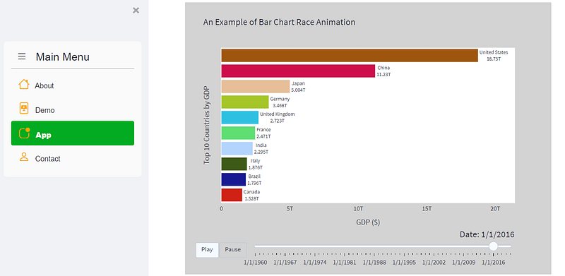
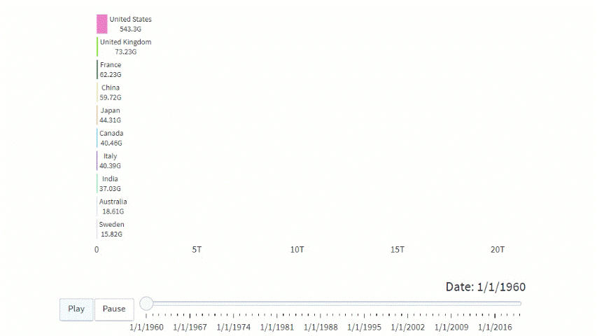
pip install raceplotlyTo create a bar race plot using raceplotly, you only need two lines of code with a few arguments. Below is an example of using the sample data we uploaded earlier to create a bar chart race animation.
raceplot = barplot(df,  item_column='Country Name', value_column='GDP', time_column='Year')

raceplot.plot(item_label = 'Top 10 Countries', value_label = 'GDP ($)', frame_duration = 800)
The most important and required arguments here are:
item_column: name of the column representing the items/bars to be ranked (e.g. countries, teams, companies, etc.)value_column: name of the column representing the value/metric to be used for ranking (e.g. GDP, population, scores, etc.)time_column: name of the column representing the time variable (e.g., years, months, etc.).
The rest of the arguments (e.g., item_label, value_label, etc.) are just ways to customize and fine-tune the plot. You can read the official raceplotly documentation here if you want to learn more about those parameters.
Step 3: Create Input Widgets to Take User Inputs
The problem with the two lines of code above is that when users upload their own data, the data will most likely have different column names than the example shown above. Therefore we wouldn’t know which column name should be used for item_column, value_column, or time_column unless the user explicitly tells us.
Therefore, we need to create some user input widgets in the app to take users’ input on those parameters. We can also add a few more widgets that allow users to do a variety of customizations to the plot to enhance the app’s user experience.
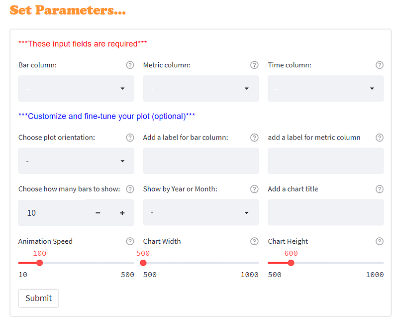
As shown in the image above, we will create 12 input parameters, arranged in 4 rows and 3 columns. The first three parameters are required fields, whereas the rest are optional. Let’s see how to do this using the code below. Make sure you insert the code within the if uploaded_file is not None: statement with correct indention.
Let’s look at the code above in greater detail:
Line 3–5: Create a list that includes all the column names from the user’s uploaded data. I also appended a ‘-’ to the beginning of the list. This is a trick I used to allow default selection to be ‘-’ in the widget so that it’s more explicit to users that they must choose something from the list.
Line 7–15: Create the first 3 parameters and display them side-by-side using st.columns(). Notice that we can also display a little help icon on the widget by including help= in the st.selectbox() widget.
Line 17–50: Create the rest of the parameters. These parameters are optional and allow users to customize or fine-tune the plot, such as changing the orientation of the bars, adjusting the animation speed, changing the size of the plot, etc.
Line 6 and 52: We use st.form() and st.form_submit_button() to batch input all the widgets so that users can interact with the widgets as much as they want without triggering a re-run of the app every time they change something in a widget.
Step 4: Generate the bar chart race animation
After users submit their input widget selections, we will pass their input to raceplotly and generate the bar chart race animation. But before we do that, we need to first take care of two important things:
- We want to make sure that users provide input to the first three parameters as those are the required fields to generate the plot. We can display a warning message if the user doesn’t complete the required fields.
- The
value_columnneeds to be numeric and thetime_columnneeds to be a date type. The data uploaded by users may not always comply therefore we need to make sure that these two columns are converted to the correct data types before passing the dataframe toraceplotly.
In the code below, lines 3–8 takes care of these two points. Line 10–19 takes the user input and passes the parameters to the barplot() function, generates an animated bar chart race plot, and displays it in the app. Please make sure that you insert this code block within the if uploaded_file is not None: statement with correct indention.
You can also add more features to this app, such as enabling users to export the bar chart race animation to HTML and share it with others. I’ve already covered this technique in another article on how to create an ‘Export’ button in Streamlit that allows users to export plotly charts to HTML. If you are interested you can read the article here.
Create the ‘Contact’ Page
Lastly, let’s create a contact page using the code below:
Hooray! We have created a quick-and-easy bar chart race generator using Streamlit and raceplotly! I always enjoy hands-on projects as those are the most effective ways, for me personally, to learn something new and brush up on my coding skills.
Thanks for reading. I hope you enjoyed this article and are ready to apply what you have learned to your next new exciting project!
Data Source:
The dataset used in demoing the app is an open dataset (no license required) downloaded from The World Bank’s website: https://data.worldbank.org/indicator/NY.GDP.MKTP.CD?name_desc=true
You can unlock full access to my writing and the rest of Medium by signing up for Medium membership ($5 per month) through this referral link. By signing up through this link, I will receive a portion of your membership fee at no additional cost to you. Thank you!


