
Crafting an Interactive YTD Sales KPI in Power BI
Creating a Year-to-Date (YTD) Sales KPI in Power BI can significantly enhance your data analysis and reporting capabilities. This guide will take you through the steps to design a dynamic, user-friendly dashboard that offers actionable insights into your sales performance.
Here’s what you’ll explore:
Introduction to YTD Sales KPI:
Understanding the importance and purpose of YTD sales KPIs.
- Setting Up Your Data: Preparing and importing sales data into Power BI.
Creating the KPI:
- Data Modeling: Structuring your data for accurate calculations.
- Using DAX Functions: Applying DAX formulas to calculate YTD sales.
Designing the Dashboard:
- Visual Customization: Enhancing your KPI visuals for better clarity and impact.
- Interactivity: Adding filters and slicers to make your dashboard interactive.
Best Practices:
Tips for maintaining and updating your KPI dashboard.
This step-by-step approach will empower you to build an engaging and informative YTD Sales KPI in Power BI, helping you make informed business decisions based on real-time data.
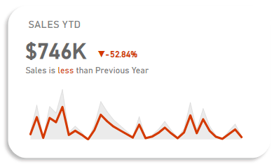
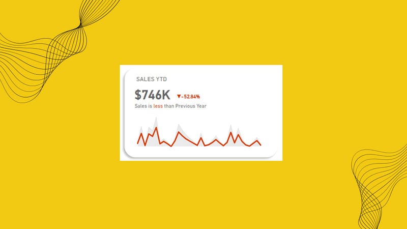
This is how our end result is going to look like:
Building the KPI
We will go through these steps:
- Creating the DAX Functions
- Creating the Background for the KPI
- Creating the Sales YTD Text Box
- Creating the YTD Sales KPI card
- Creating the YoY Sales Percentage change section
- Creating the inference Text Box
- Creating the Area Chart
- Creating the Line chart
Happy learning!

Creating the DAX Functions:
YTD Sales KPI = TOTALYTD(SUM(Table1[Sales]), Table1[Order Date])
The DAX formula calculates the Year-to-Date (YTD) profit for the Table1 dataset. It calculates the cumulative profit from the beginning of the year to the current date based on the Table1[Order Date] column.
PYTD Sales KPI = CALCULATE(SUM(Table1[Sales]), SAMEPERIODLASTYEAR(Table1[Order Date]))
CALCULATE
The CALCULATE function evaluates an expression in a modified filter context. Essentially, it allows you to change the context in which data is evaluated.
Syntax:
CALCULATE(<expression>, <filter1>, <filter2>, ...)SAMEPERIODLASTYEAR
The SAMEPERIODLASTYEAR function is a time intelligence function that returns a table with the same period in the previous year. It’s useful for year-over-year comparisons.
Syntax:
SAMEPERIODLASTYEAR(<dates>)YoY Sales KPI = ([YTD Sales KPI] — [PYTD Sales KPI])/[PYTD Sales KPI]

Sales Colour KPI = IF([YoY Sales KPI]>0,”Green”,”Red”)

It assigns Sales Colour KPI Green or Red depending on the value of YoY Sales KPI greater or less than zero respectively.
Sales Indicator PP KPI = var positive_icon = “▲”
var negative_icon = “▼”
var result = IF([YoY Sales KPI]>0, positive_icon, negative_icon)
return result
This DAX formula creates a KPI indicator based on the Year-over-Year (YoY) Sales KPI value:
Variables:
positive_icon= "▲"negative_icon= "▼"
Logic:
- If
[YoY Sales KPI]> 0, usepositive_icon. - Otherwise, use
negative_icon.
Return:
- The appropriate icon (▲ or ▼) based on the sales KPI.
All these are basic DAX functions which is always good to know, refer the below article to understand them, it’s under 3 min read.
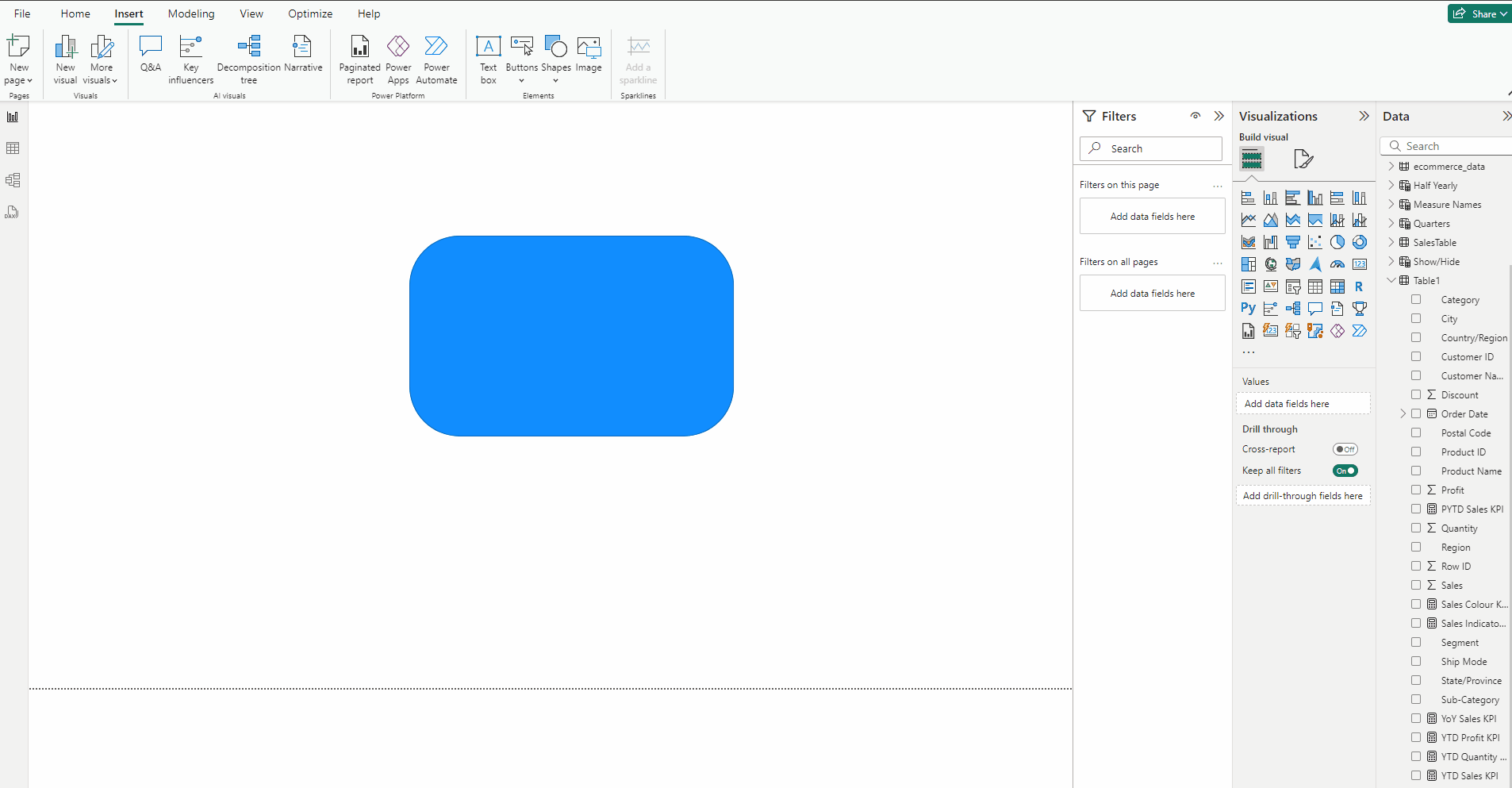
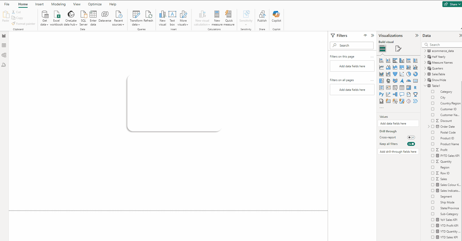
Creating the Background for the KPI:
- Go to the Insert tab and select Rounded Rectangle from Shapes.
- In the Format visual → General →Properties set Height to 246 and Width to 398.
- Expand Shape and use 10% in Rounded Corners.
- Expand Style turn off Border, for Color use White.
- Turn on Shadow, for Color use Black, set Position to Bottom left.
Creating the Sales YTD Text Box:
- In the Insert tab select Text box.
- Type SALES YTD.
- Set Font to DIN and size 12 and Font color to #808080.
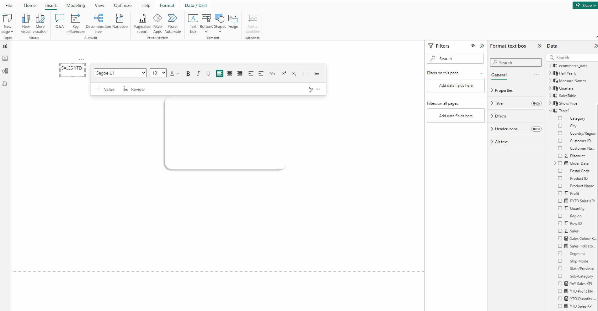
- Select the Text box.
- In the Format visual → General →Effects turn off Background.
- Place it on the top the Background created in Step 1.
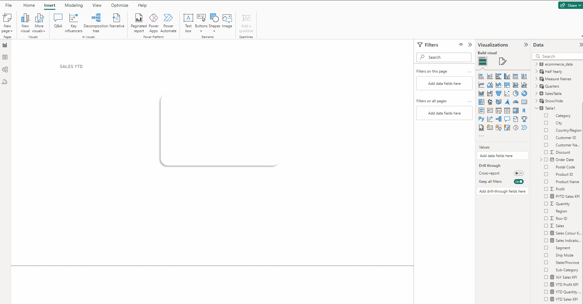
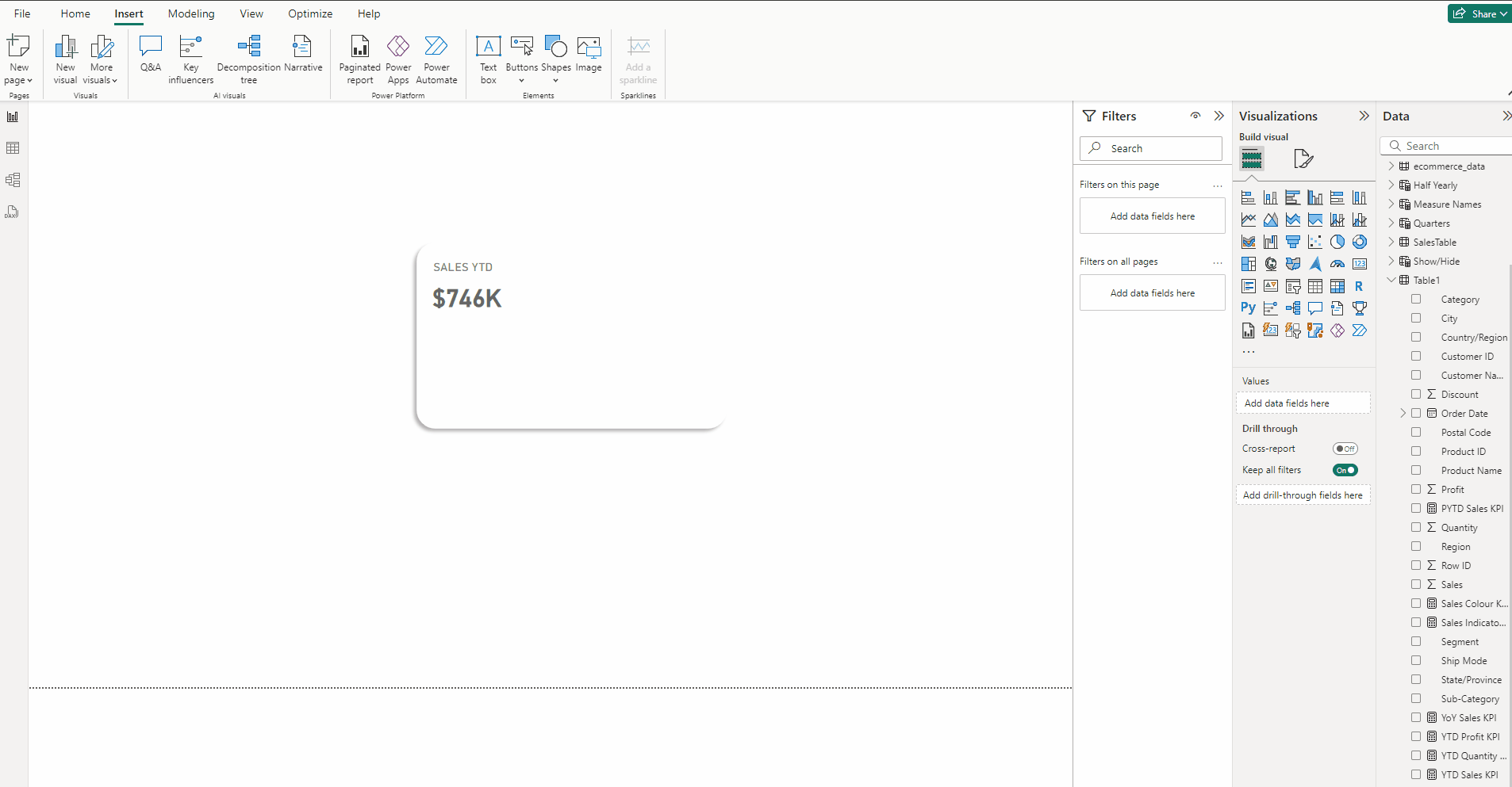
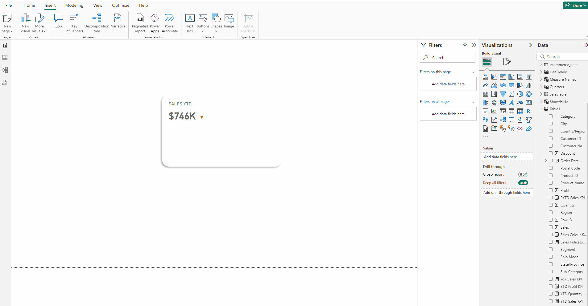
Creating the YTD Sales KPI card:
- Add a Card visual and put YTD Sales KPI to it.
- Turn off Category label.
- In Format visual → Callout value set size to 25 and Bold the font.
- Set Font to DIN and for Color use #666666.
- In the Format visual → General →Effects turn off Background.

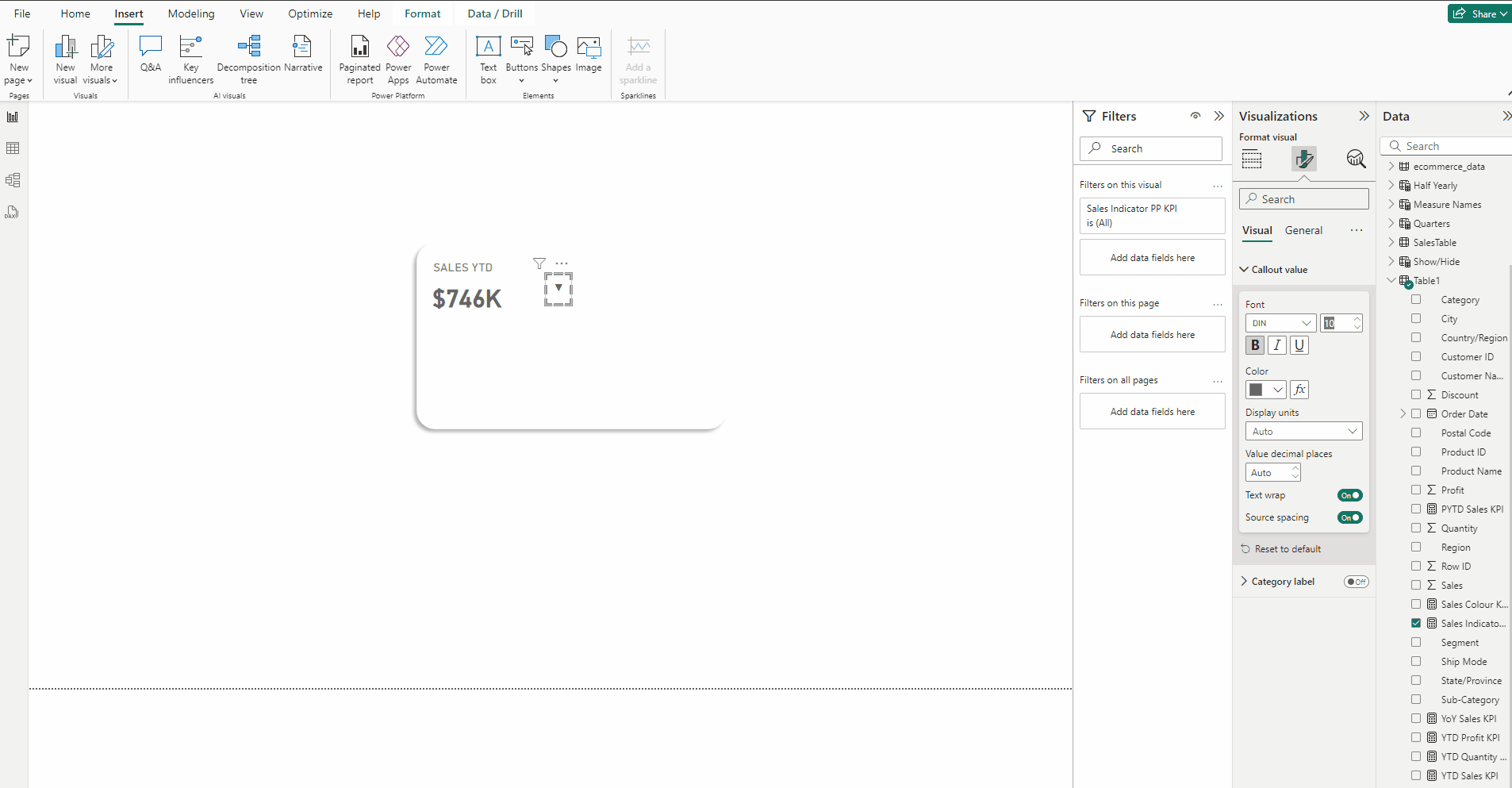
Creating the YoY Sales Percentage change section:
- Copy the YTD Sales KPI card.
- Put Sales Indicator PP KPI in it.
- In Format visual → Callout value set size to 10.
- In Format visual → Callout values in the Color section press fx.
- Keep Format Style → Rules and in field select Sales Colour KPI.
- Type Green select #00E463 for color and for Red select #D43900, press OK.
- Copy the Sales Indicator PP KPI card.
- Put YoY Sales KPI in it.
- Place it next to the sales indicator.
Creating the inference Text Box:
- Copy the SALES YTD text box
- Type “Sales is less than Previous year” and set size to 10.
- For word “less” use color #D43900.

Creating the Area Chart:
- Add an Area chart and put Sum of Sales in Y-axis and Order Date in X-axis.
- Select Order Date from the visual X-axis drop down.

- Expand X-axis and turn off Values and Title, similarly expand Y-axis and turn off Values and Title.
- In the Format visual → General turn off Title and in Effects turn off Background.
- In Filters pane in Filter type select Relative Date and for Show items when the value to is in the last.
- Select years type 1, Click on Apply filter.
- This is done to filter the chart for last years’ data.
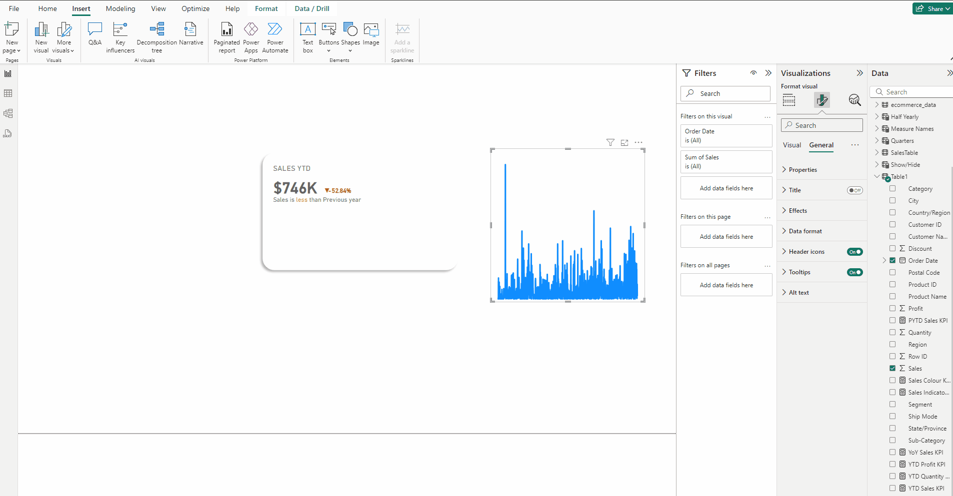
- In Format visual →Visual →Lines set Width to 0.5 px.
- In Format visual →Visual →Lines →Color use this #CCCCCC.
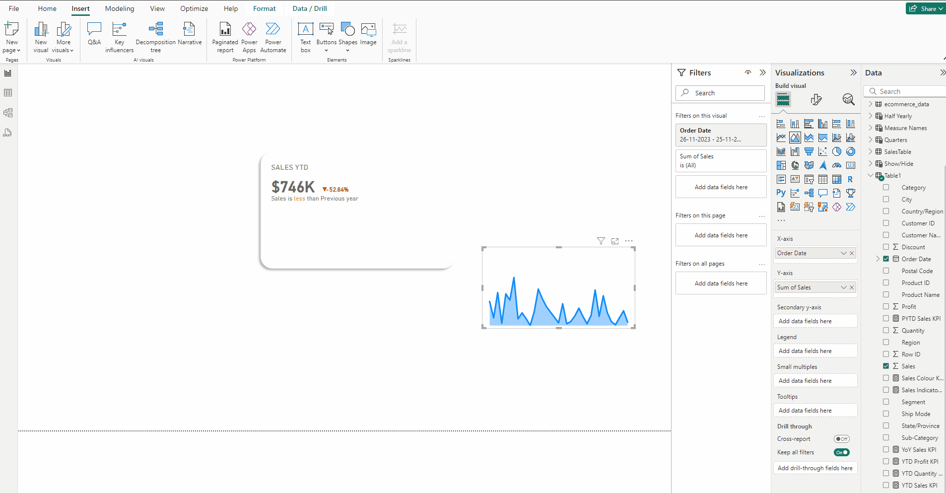
Creating the Line chart:
- Copy the Area chart in the previous step.
- In Format visual →Visual turn off Shade area.
- In Format visual →Visual →Lines set Width to 3 px.
- In Format visual →Visual →Lines →Color use this #E66C37.
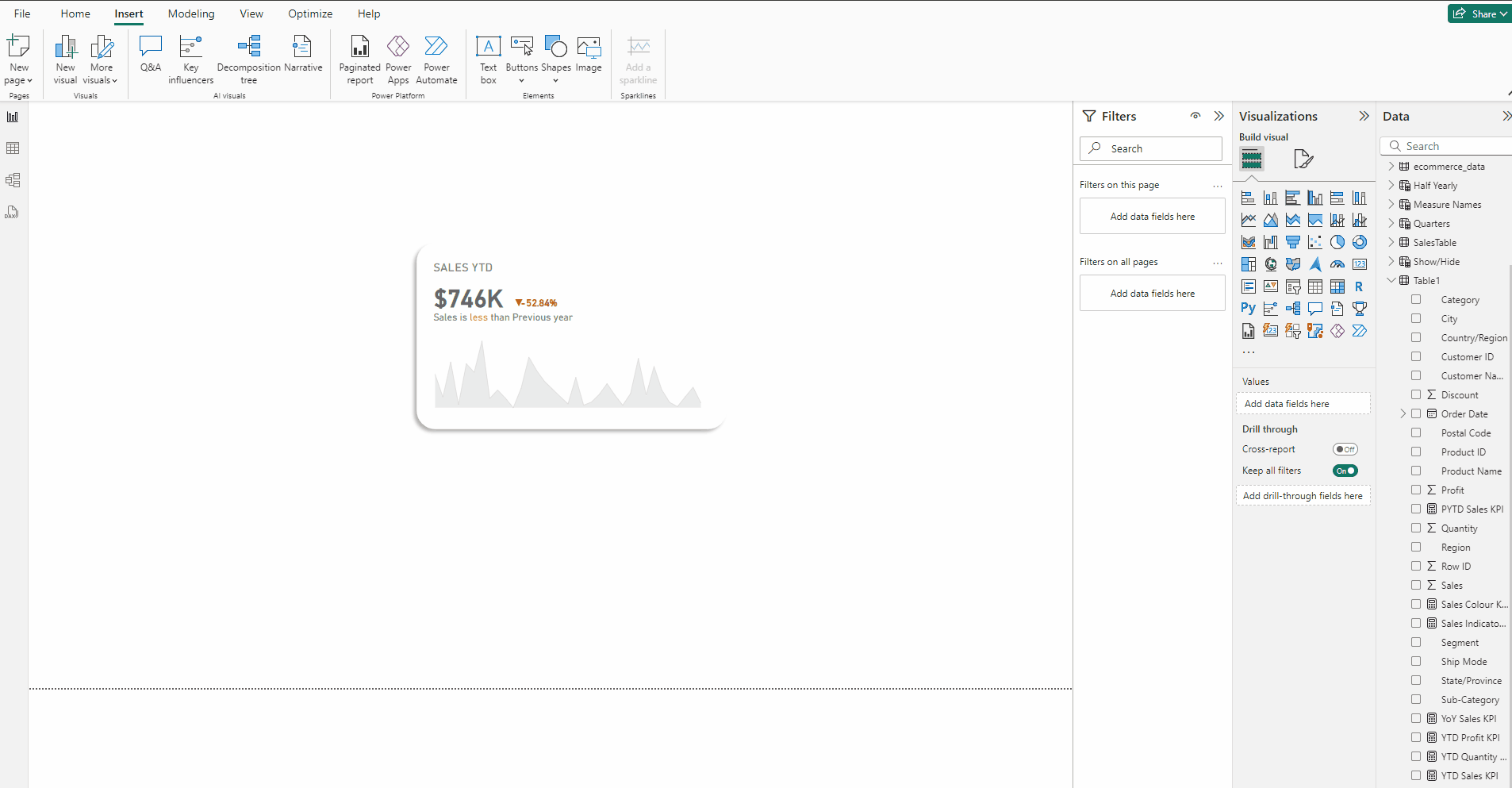
Finally we have our KPI.
Download the data for the KPI from this link.
Download the PBIX file from this link.
Thank you for your attention!
Follow me or subscribe to get all my Power BI articles!
Don’t forget to subscribe to
👉 Power BI Publication
👉 Power BI Newsletter
and join our Power BI community:


