
Crafting an easy dashboard style KPI in Power BI
Creating effective Key Performance Indicator (KPI) dashboards in Power BI can transform your data analysis and reporting capabilities. Whether you are a seasoned data analyst or a novice, this guide will walk you through the essentials of designing a user-friendly, visually appealing dashboard. Here’s what you’ll learn:
- Basics of Power BI: A brief overview of Power BI and its dashboard functionalities.
- KPI Selection: How to choose the right KPIs that align with your business goals.
- Data Preparation: Steps to prepare and import your data into Power BI.
- Dashboard Design: Tips and tricks for designing an intuitive and interactive dashboard.
- Customization: Techniques for customizing visuals to enhance clarity and impact.
Let’s dive into each of these aspects to help you create a KPI dashboard that not only looks good but also provides actionable insights.
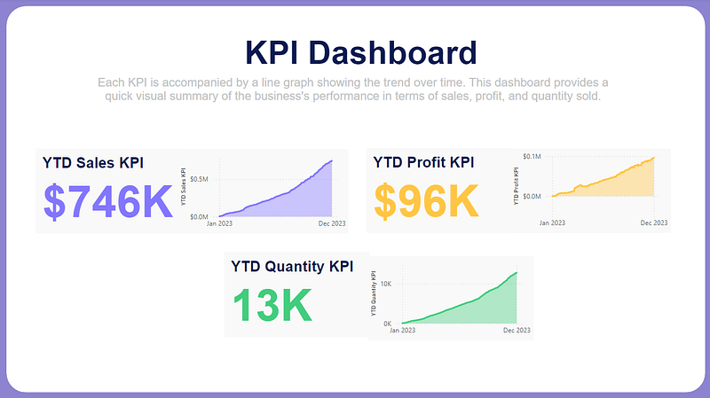
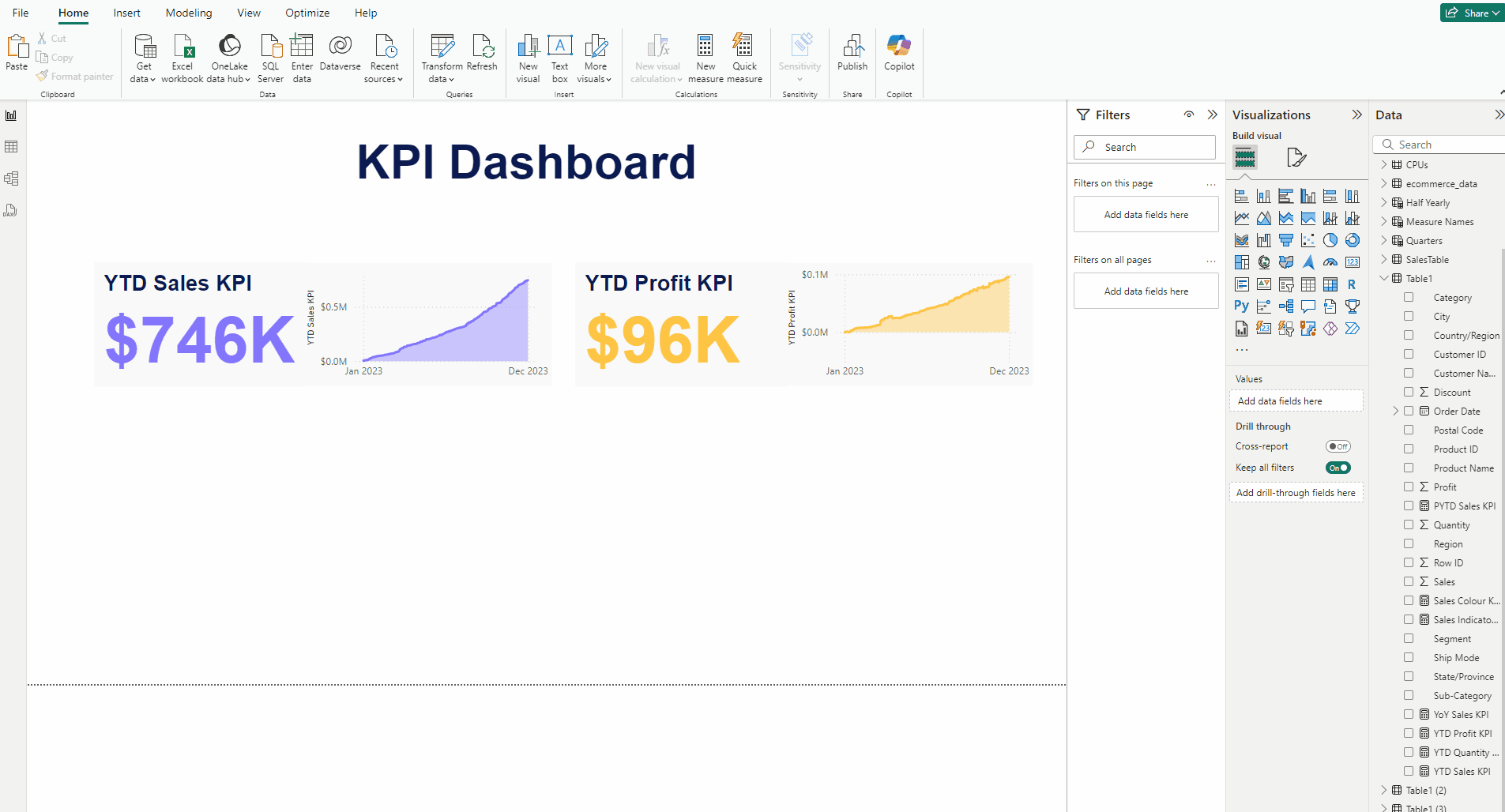
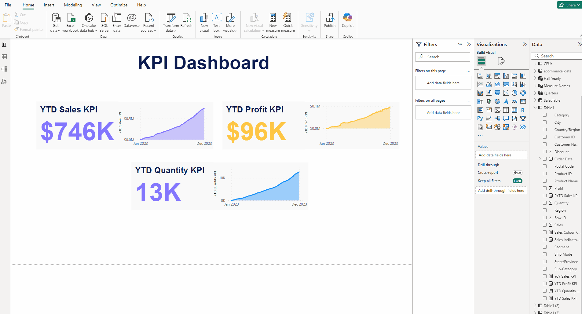
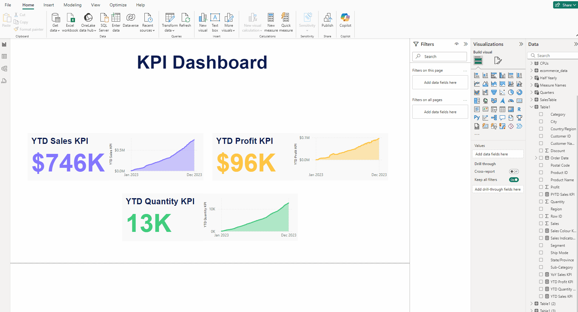
We are aiming to create this KPI Dashboard:
Building the KPI
We will go through these steps:
- Creating the DAX Functions
- Creating the heading Text box
- Creating the YTD Sales KPI
- Adding the area chart for YTD Sales KPI
- Creating the YTD Profit KPI
- Creating the YTD Quantity KPI
- Adding the inference Text box
- Finishing the KPI
Happy learning!

Creating the DAX Functions:
YTD Sales KPI = TOTALYTD(SUM(Table1[Sales]), Table1[Order Date])
The DAX formula calculates the Year-to-Date (YTD) profit for the Table1 dataset. It calculates the cumulative profit from the beginning of the year to the current date based on the Table1[Order Date] column.

Similar to sales we will calculate the YTD Profit and YTD Quantity DAX functions.
YTD Profit KPI = TOTALYTD(SUM(Table1[Profit]), Table1[Order Date])

YTD Quantity KPI = TOTALYTD(SUM(Table1[Quantity]), Table1[Order Date])

All these are basic DAX functions which is always good to know, refer the below article to understand them, it’s under 3 min read.
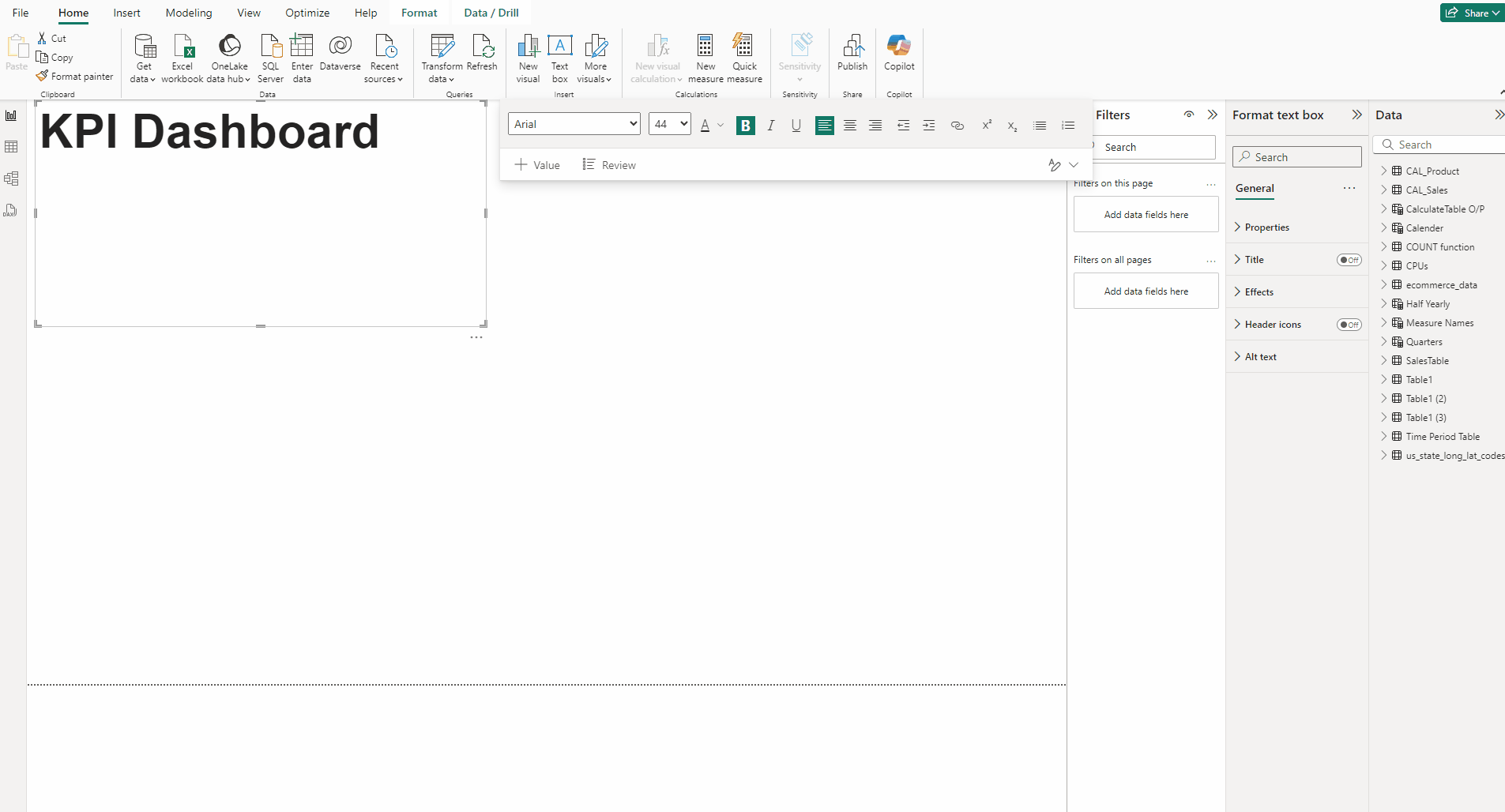
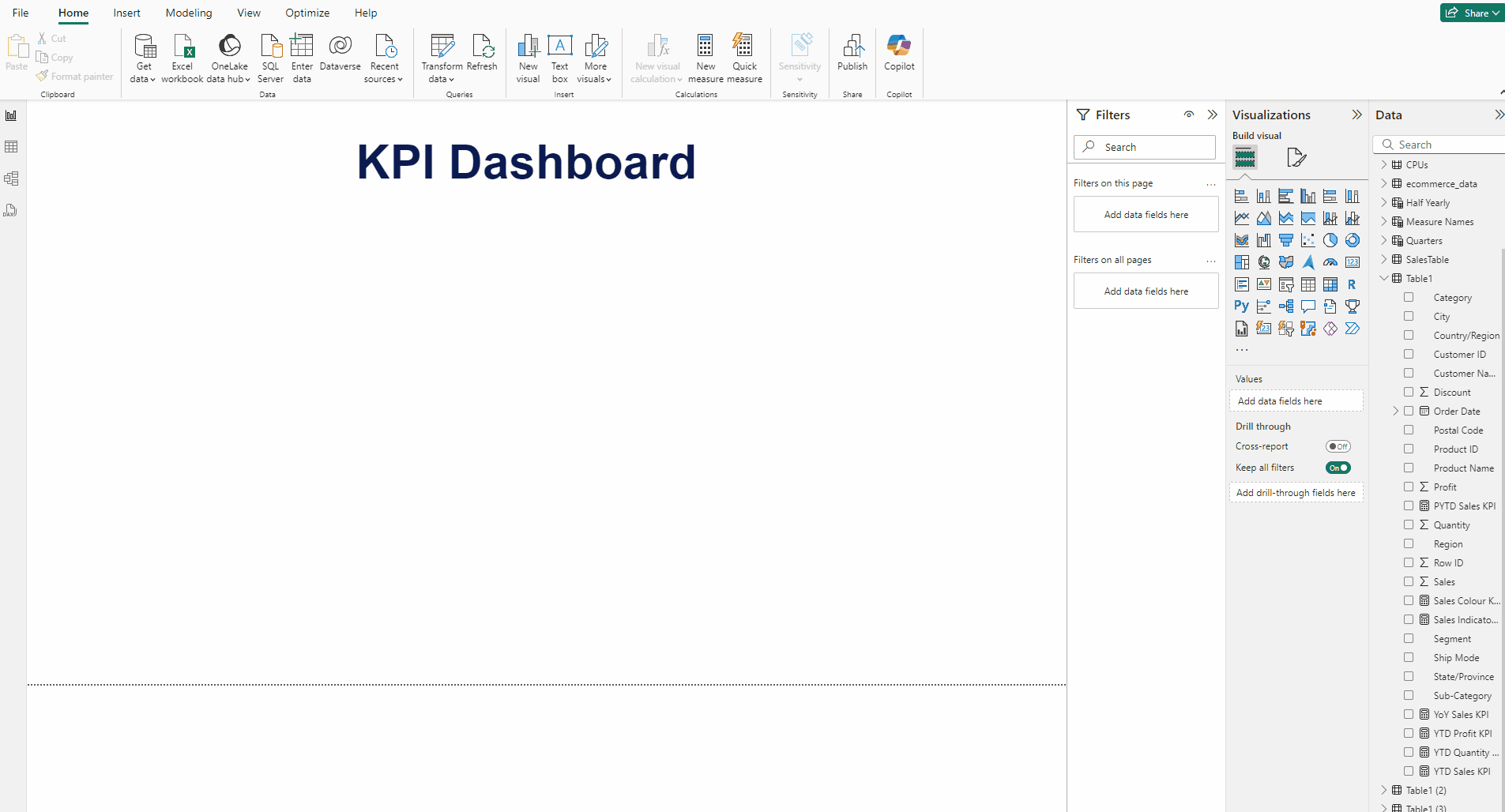
Creating the heading Text box:
- In the Insert tab and select Text box.
- Type KPI Dashboard set Font to Arial, size 44 and Bold the font.
- For Font color use #0B1B51.
- Place it at the center of the canvas.
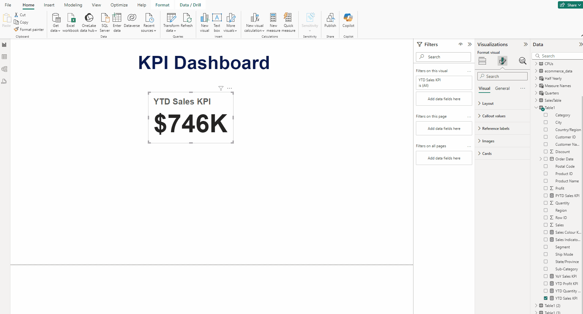
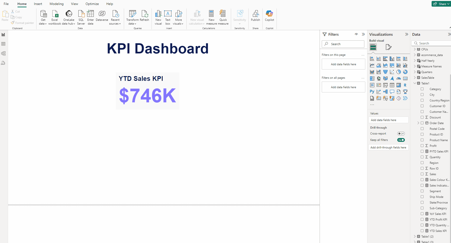
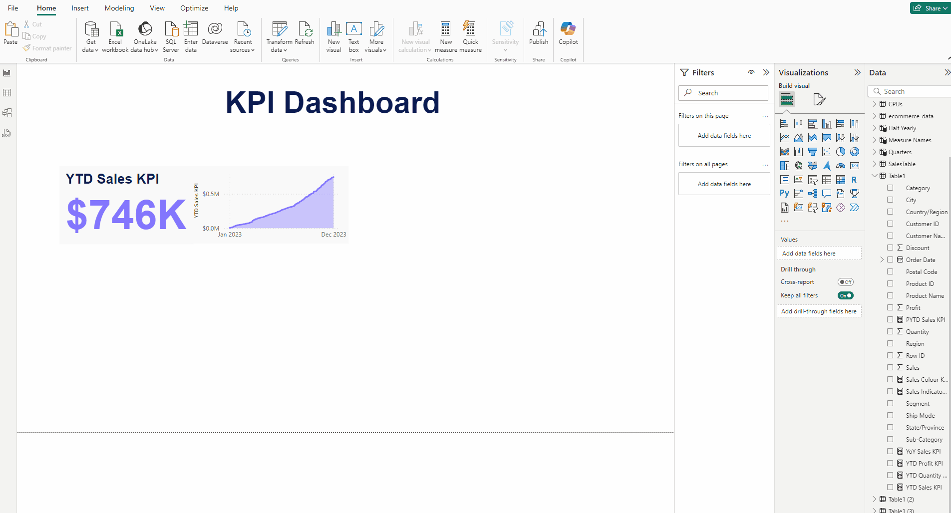
Creating the YTD Sales KPI:
- Add a Card(new) visual and put Sales to it.
- In the Format visual → General →Properties set Height to 163 and Width to 271.
- In Format visual → Callout value →Values set size to 60.
- Set Font to Arial and Bold the font.
- In Label again for font use Arial and Bold it, for size use 20.
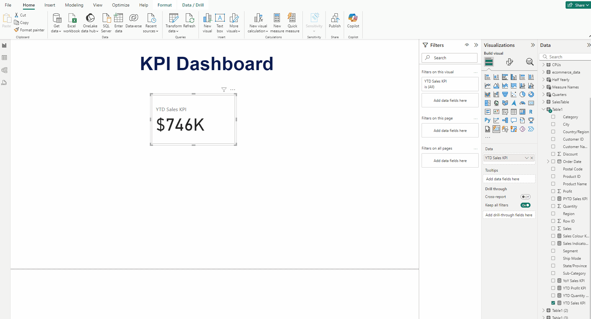
- In Format visual → Callout value →Values set use color #8376FE.
- For Labels use this color #0B1B51.
- In Cards →Background and for Color use #F9F9F9.
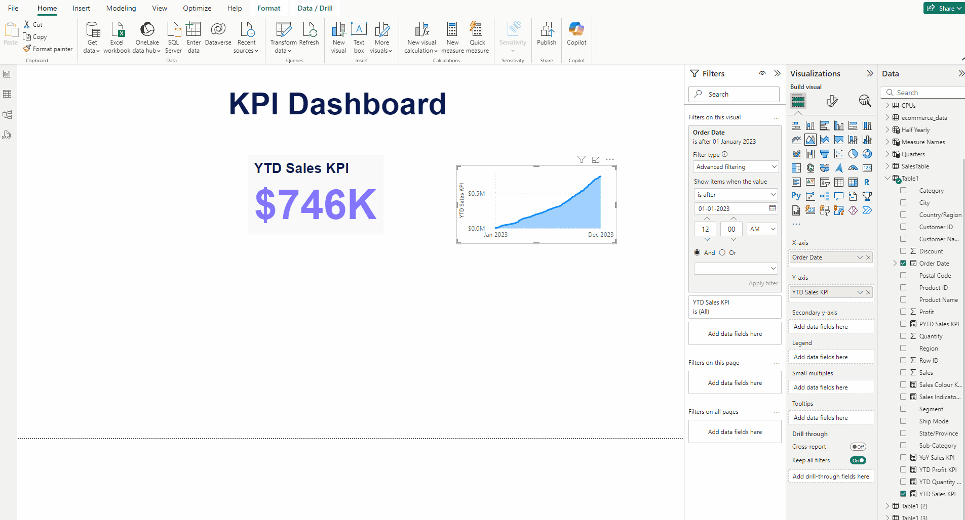
Adding the area chart for YTD Sales KPI:
- Add an Area chart and put YTD Sales KPI measure in Y-axis and Order Date in X-axis.
- In Filters pane in Filter type select Advanced filtering and for Show items when the value to is after.
- Then set the Date to 1 January 2023.
- Click on Apply filter.
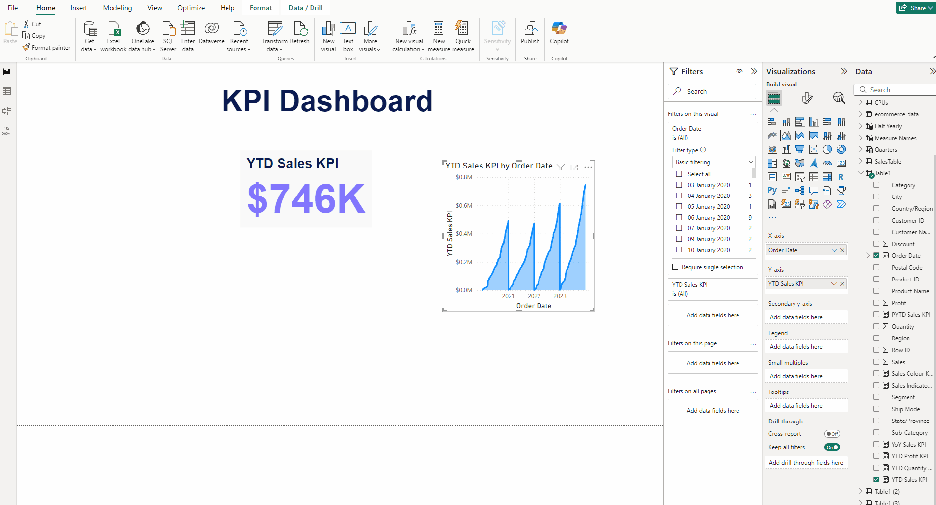
- Expand X-axis and turn off Title.
- In Format visual → General turn off Title, in Properties set Height to 151 and Width to 307.
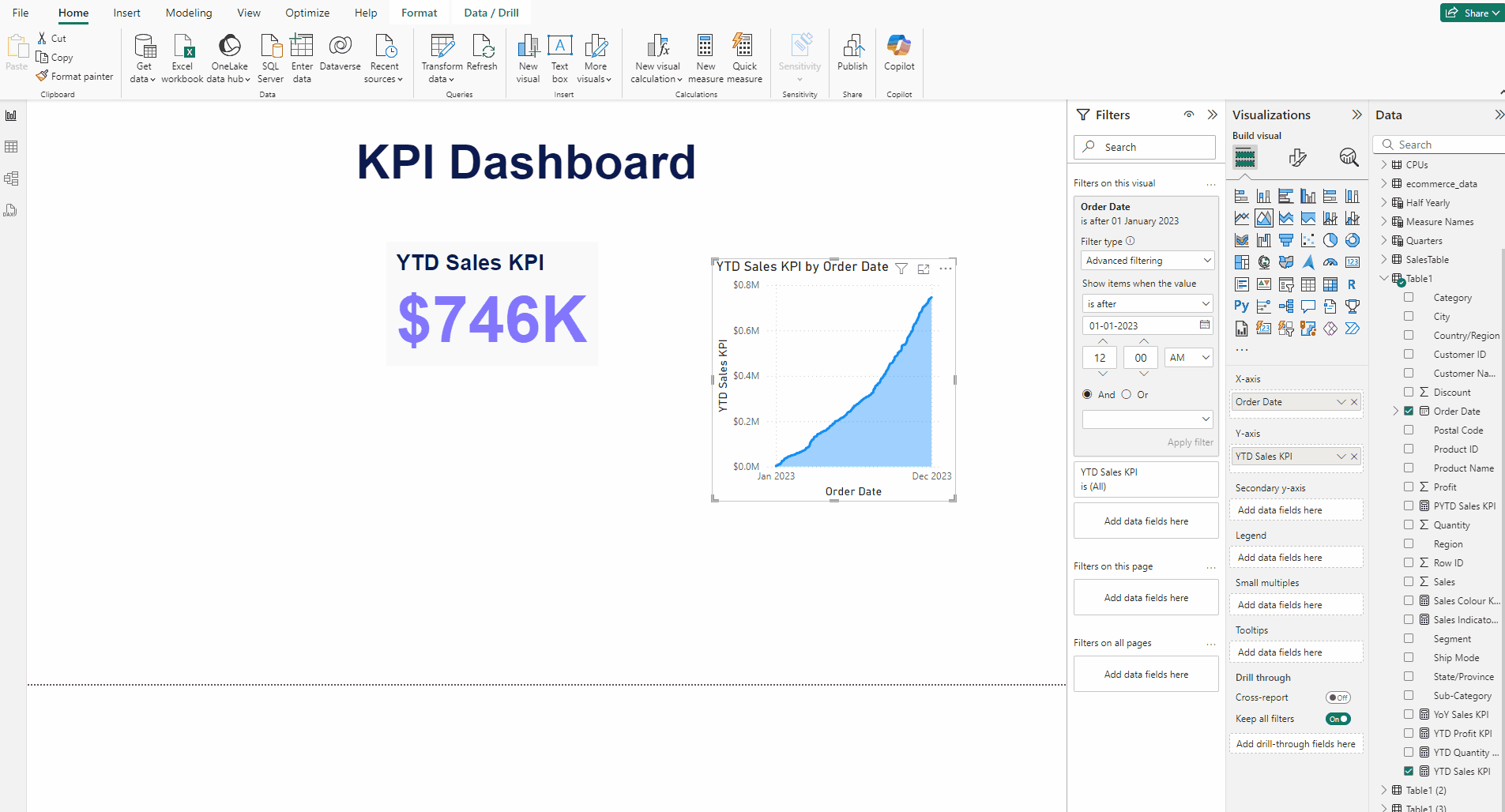
- In Format visual →Visual →Lines →Color use this #8376FE.
- In Format visual → General → Effects for Background Color use #F9F9F9.
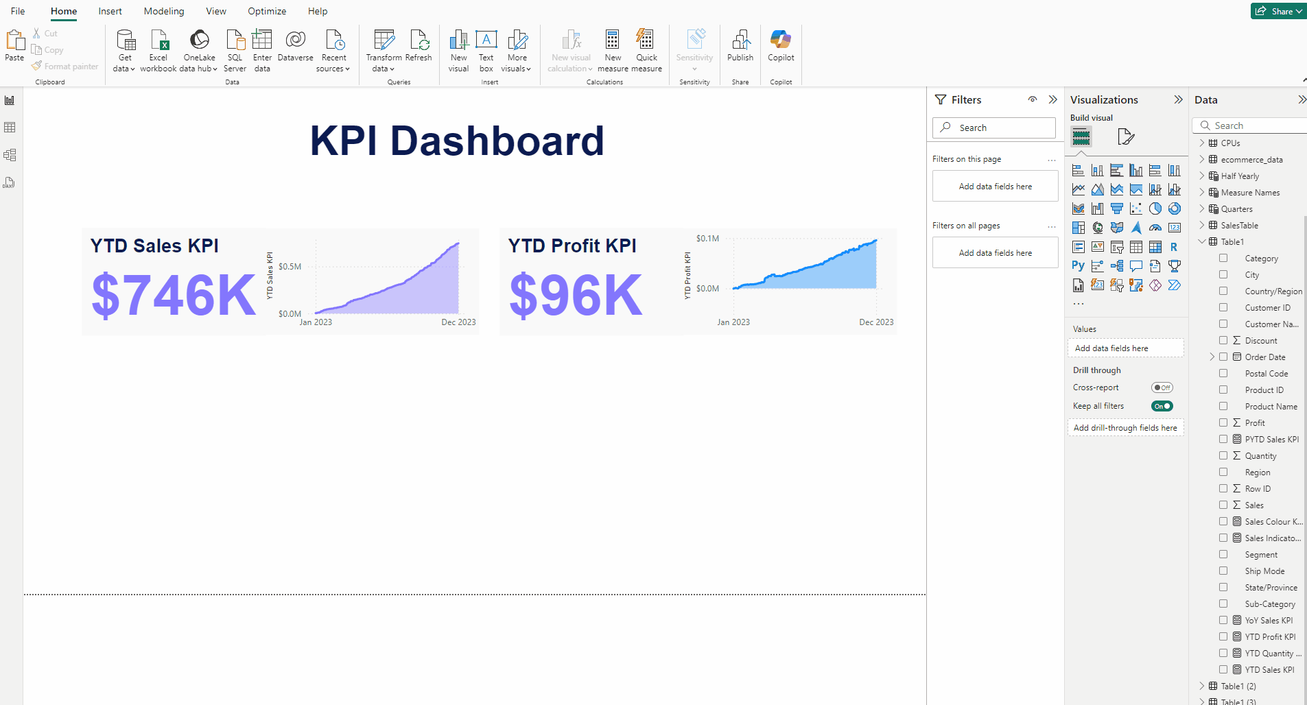
Creating the YTD Profit KPI:
- Copy the YTD Sales KPI then Paste it at the side to it.
- Put the YTD Profit KPI measure to both the Card(new) visual and the Area chart of the copy.
- For the Card(new) visual, in Format visual → Callout value →Values set use color #FFC644.
- For the Area chart, in Format visual →Visual →Lines →Color use this #FFC644.
Creating the YTD Quantity KPI:
- Again Copy the YTD Sales KPI then Paste it at the bottom of the both KPIs.
- Put the YTD Quantity KPI measure to both the Card(new) visual and the Area chart of the copy.
- For the Card(new) visual, in Format visual → Callout value →Values set use color #41CD7D.
- For the Area chart, in Format visual →Visual →Lines →Color use this #41CD7D.
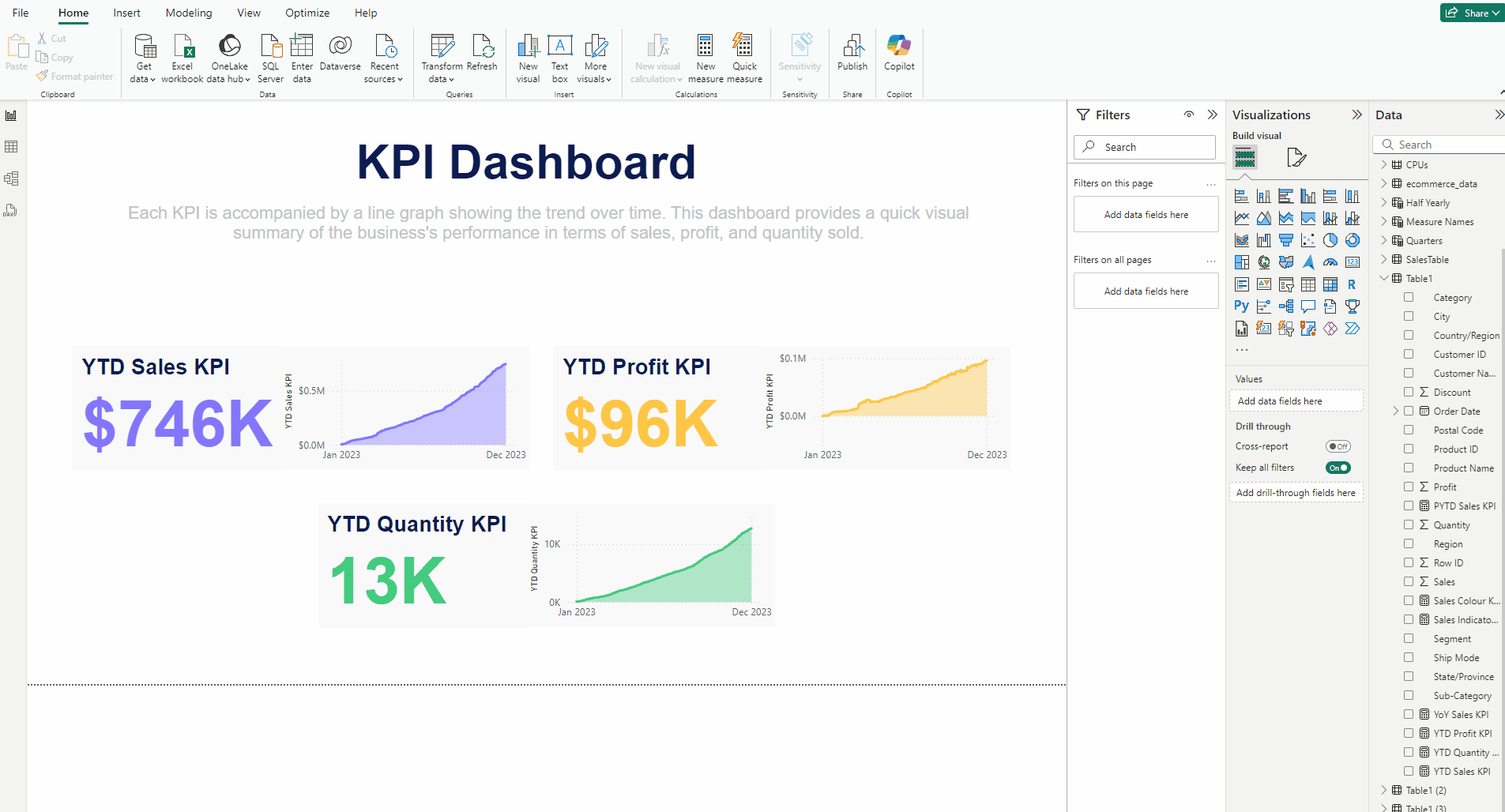
Adding the inference Text box:
- In the Insert tab add a Text box.
- Type: Each KPI is accompanied by a line graph showing the trend over time. This dashboard provides a quick visual summary of the business’s performance in terms of sales, profit, and quantity sold.
- Set Font to Arial and size 16 and color to #C1C3C4.
- Use Center Alignment.
Finishing the KPI:
- Go to the Insert tab and select Rounded Rectangle from Shapes.
- Select everything from the canvas except the rectangle, Cut and Paste them.
- Expand the rectangle over the canvas.
- In Shape set Rounded Corners to 5% and in Style set Color to white.
- Also turn off the Border.
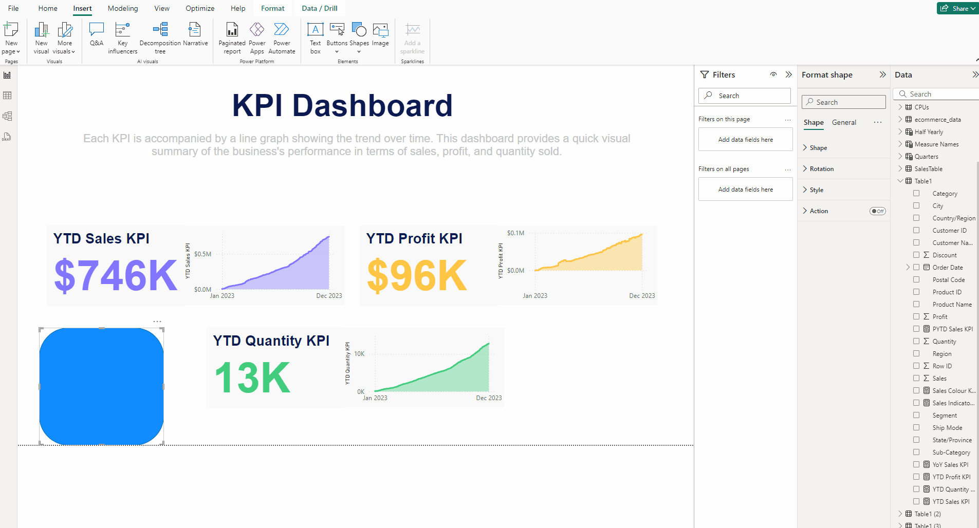
- Deselect everything.
- In Format page head to Format your report page.
- Expand Canvas background, in Color use #8C84D0 and set Transparency to 0%.
Finally we have completed our KPI Dashboard.
Download the data for the KPI from this link.
Download the PBIX file for the KPI from this link.
Thank you for your attention!
Follow me or subscribe to get all my Power BI articles!
Don’t forget to subscribe to
👉 Power BI Publication
👉 Power BI Newsletter
and join our Power BI community:


