
HOW TO PAINT IN WATERCOLOUR
‘Communing with the Moon’
Wet-on-wet painting
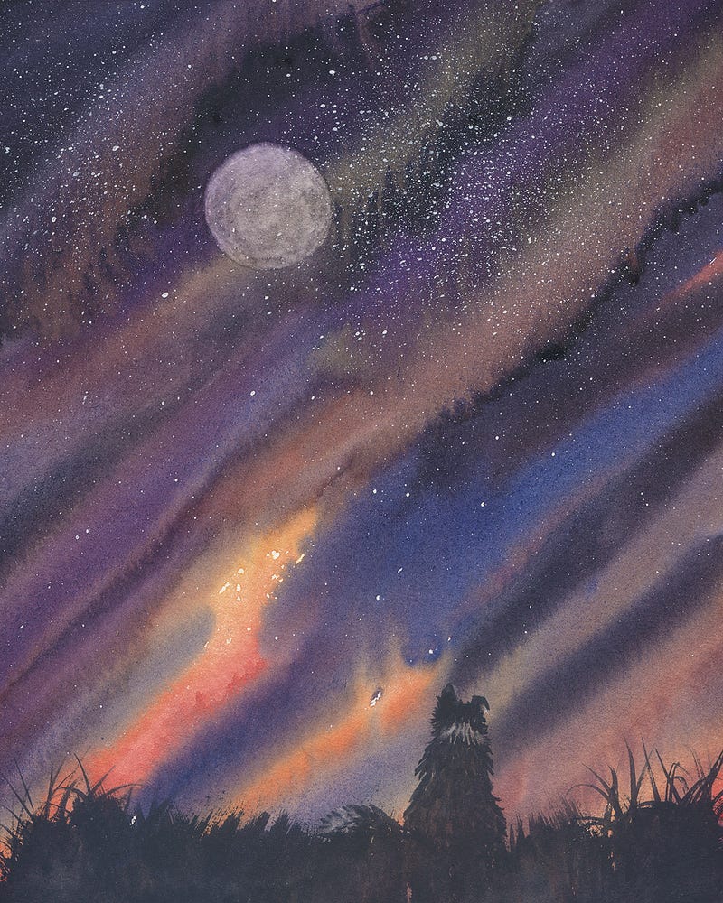
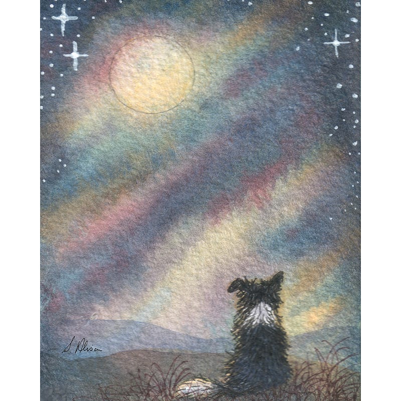
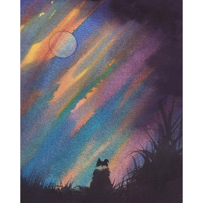
Here are ‘Communing with the Moon’ paintings I prepared earlier to give you an idea of where this session is going. The one on the right is the one I painted for this session.
I always aim to end up with pictures that are 8x10 inches in size — I have found they are the most economic size to mount and frame. So any paper bigger than this is what I use. It needs to be bigger so there is overlap to go under the mount.
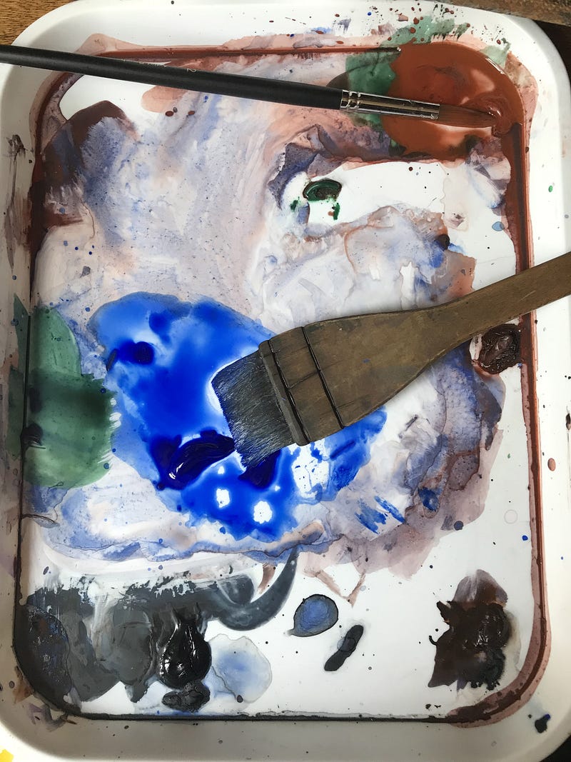
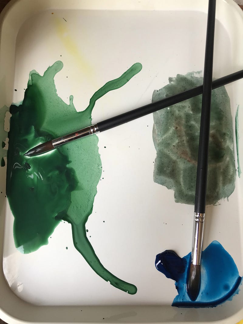
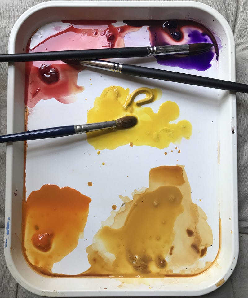
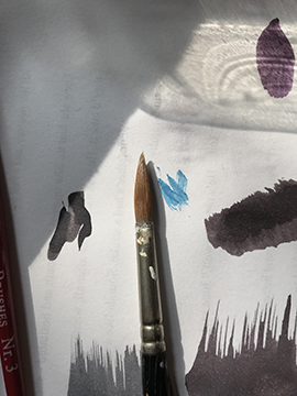
Use whatever colours you have to hand. I already had some of these colours — above — on my palette from the previous session — blue, light red, hooker’s green, turquoise, and raw sienna. To these I’ve added blobs of alizarin crimson, yellow, purple, and orange.
With a clean, wet brush I gently swept over the ‘old’ paint to ‘enliven’ it again where it had dried out.
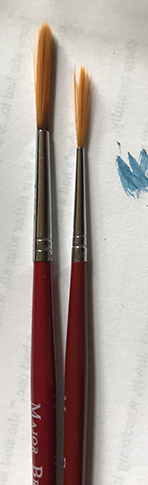
I’m using quite a few big brushes because it saves time. I have a lot of them because I got several prior to the last time I taught painting to make sure everyone had a big brush, so they’d have no excuse for fiddling with a little brush. Otherwise I would have used one or two brushes, cleaning them between different colours.
I make sure to have pools of all the colours ready-mixed.
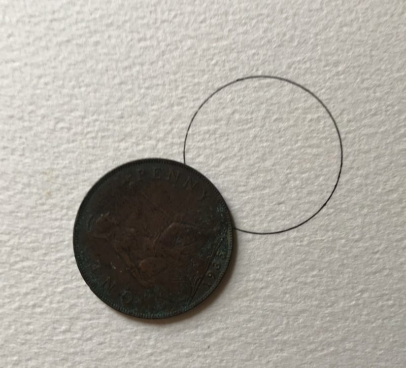
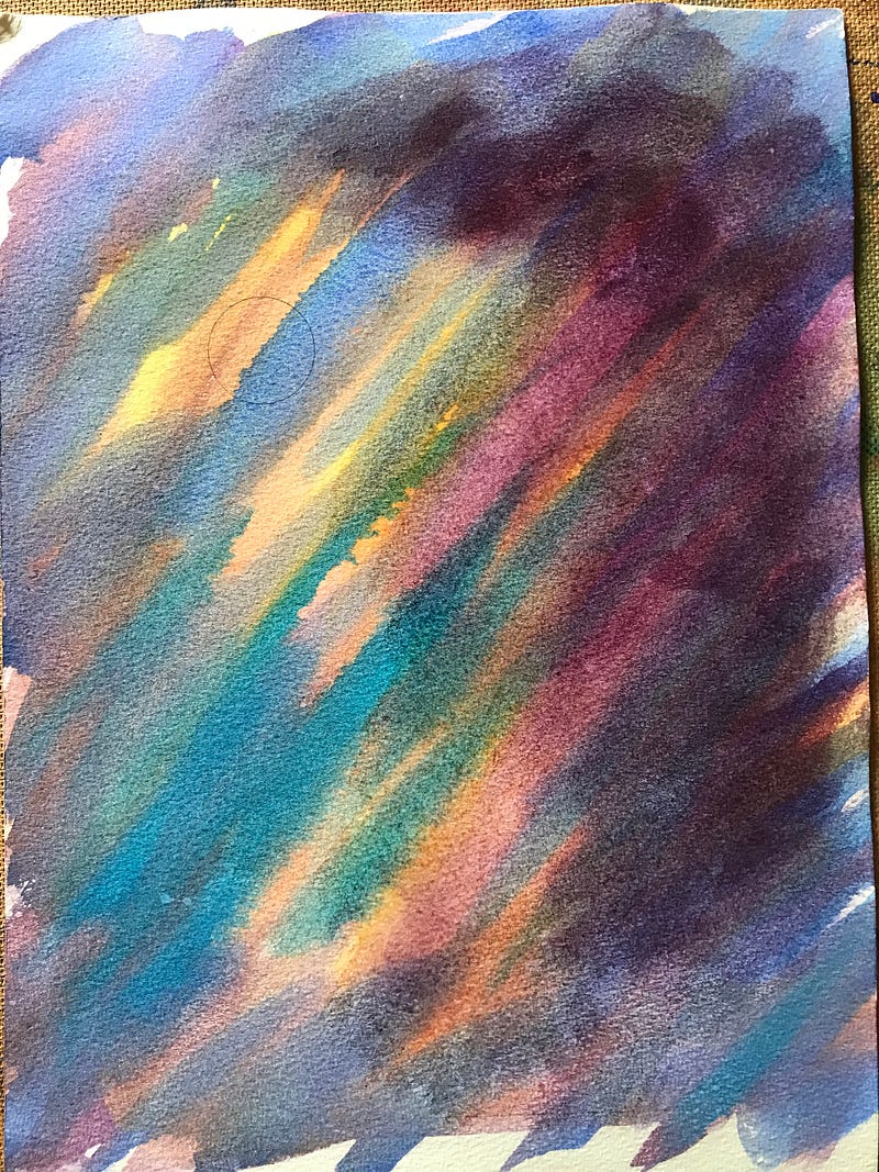
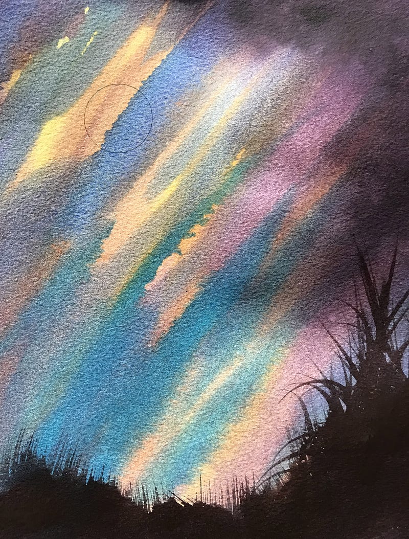
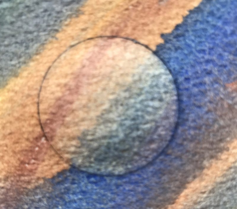
Having settled on the watercolour paper, or painting pad, that I will be using, I then wanted a moon, and I wanted it to be round, rather than sort-of-round.
To get something round I draw around something round, either with pencil or with pen. I used pen.
In this case, I used a very old penny because I couldn’t find any cash, not having used any over the last couple of pandemic years.
Then I put a wash of clean water over the paper — the picture above right shows the wash half done. I collect up the excess water with the brush on the next swipe, just the same as I would with a wash of paint.
I’m putting on a water layer in order to keep the paint I put on top wetter for longer.
I want the paint to stay wet so that the colours merge in together.
I have the paper on a board at an angle so that the paint tends to run down.
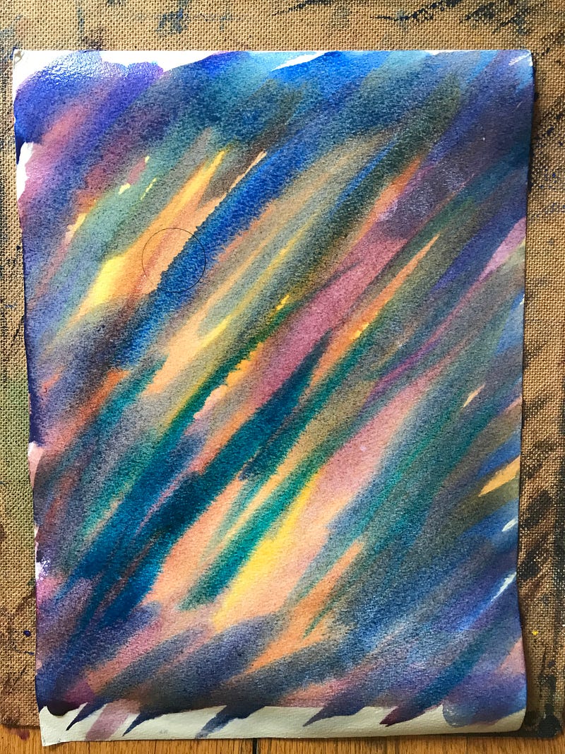
It’s usually the case that it’s best to start a watercolour painting with the lightest colours and work up to the darkest.
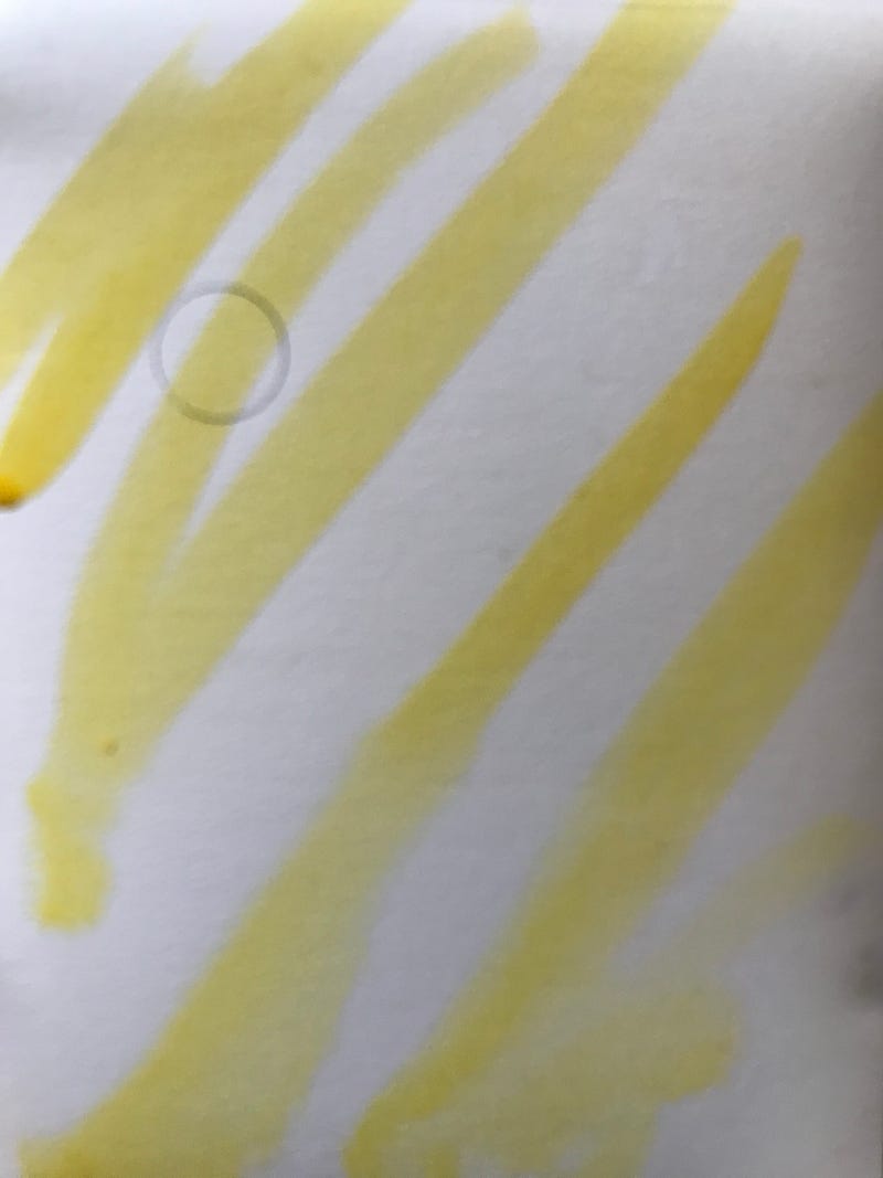
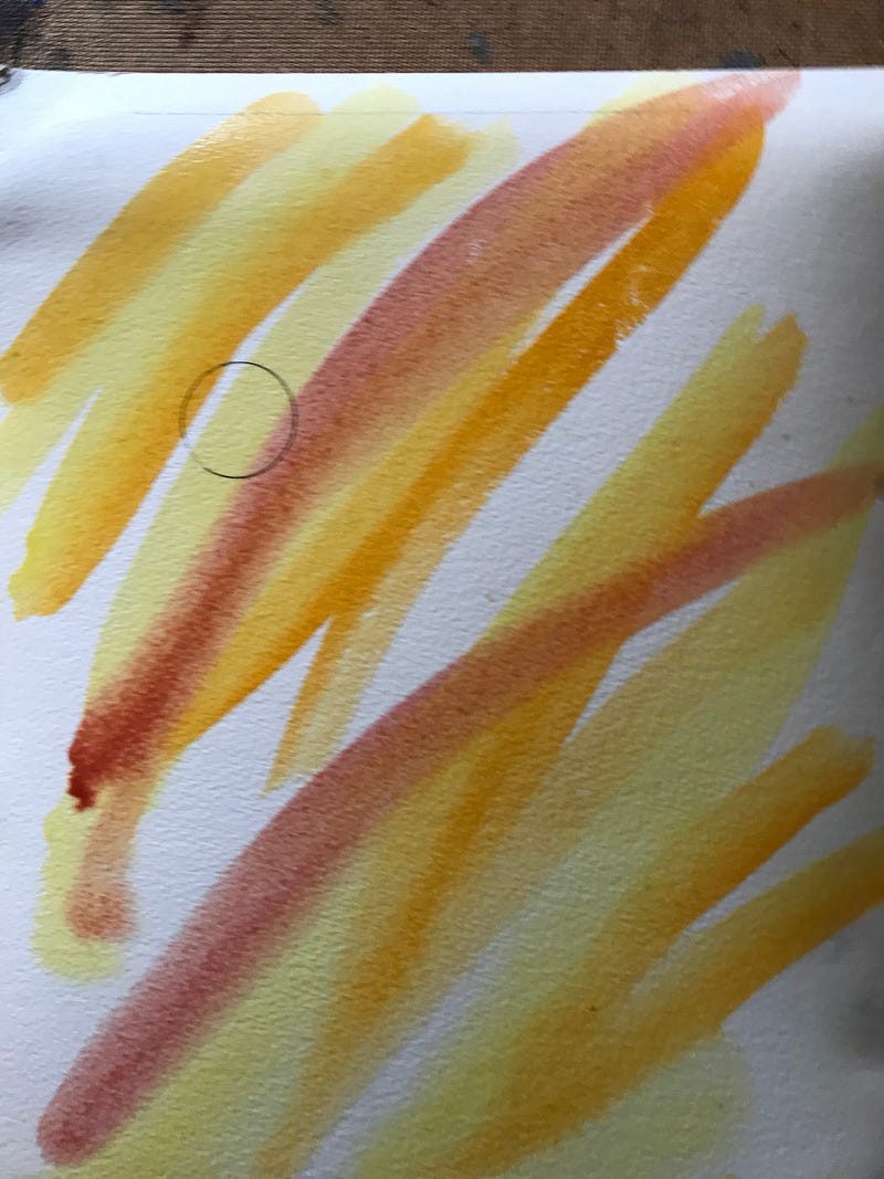
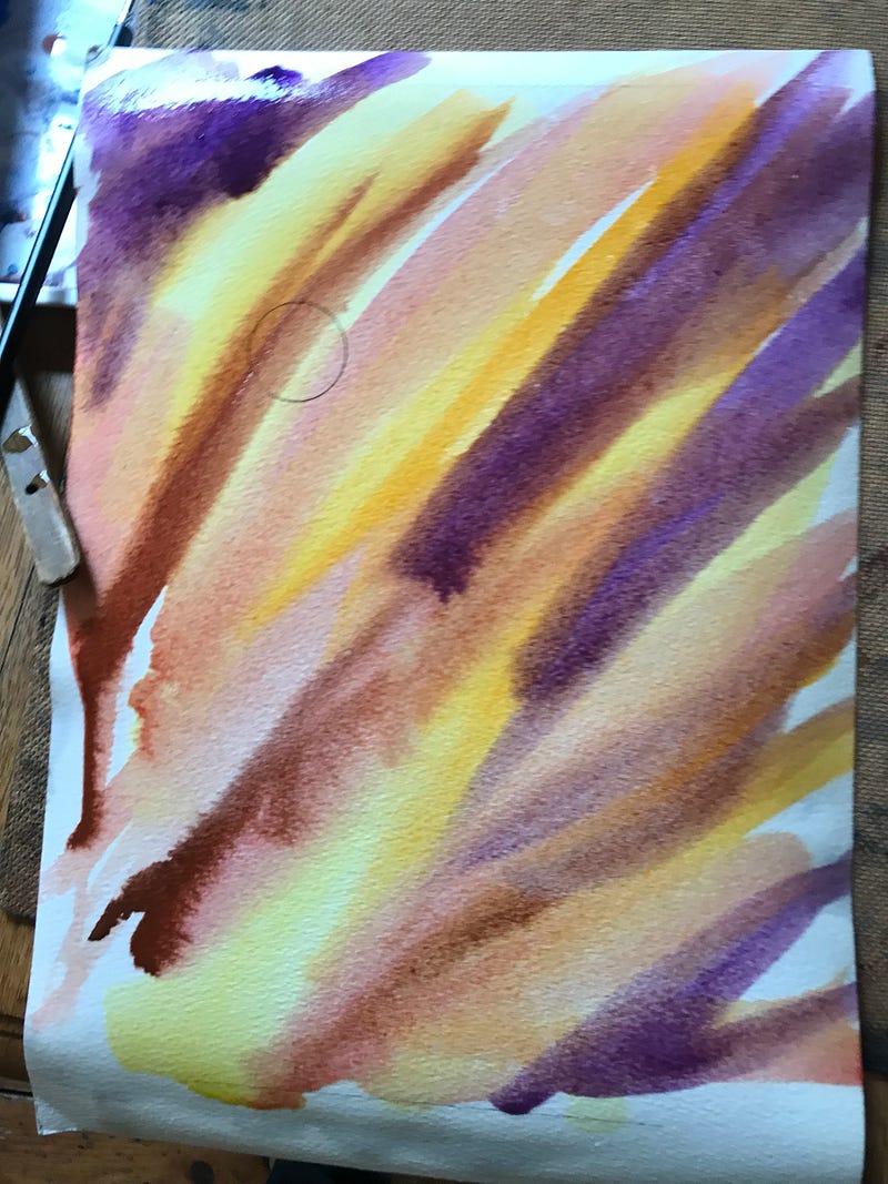
I start with yellow as above left, and keep the brush strokes diagonal across the paper. Then I add in darker colours. The only idea I have in mind is that the darkest colours will end up more around the outside of the picture, and that some of the lightest colour will end up coming down to where the land will be, so that the creature painted in at the end will show up against a lighter colour rather than fighting to show up against a darker colour.
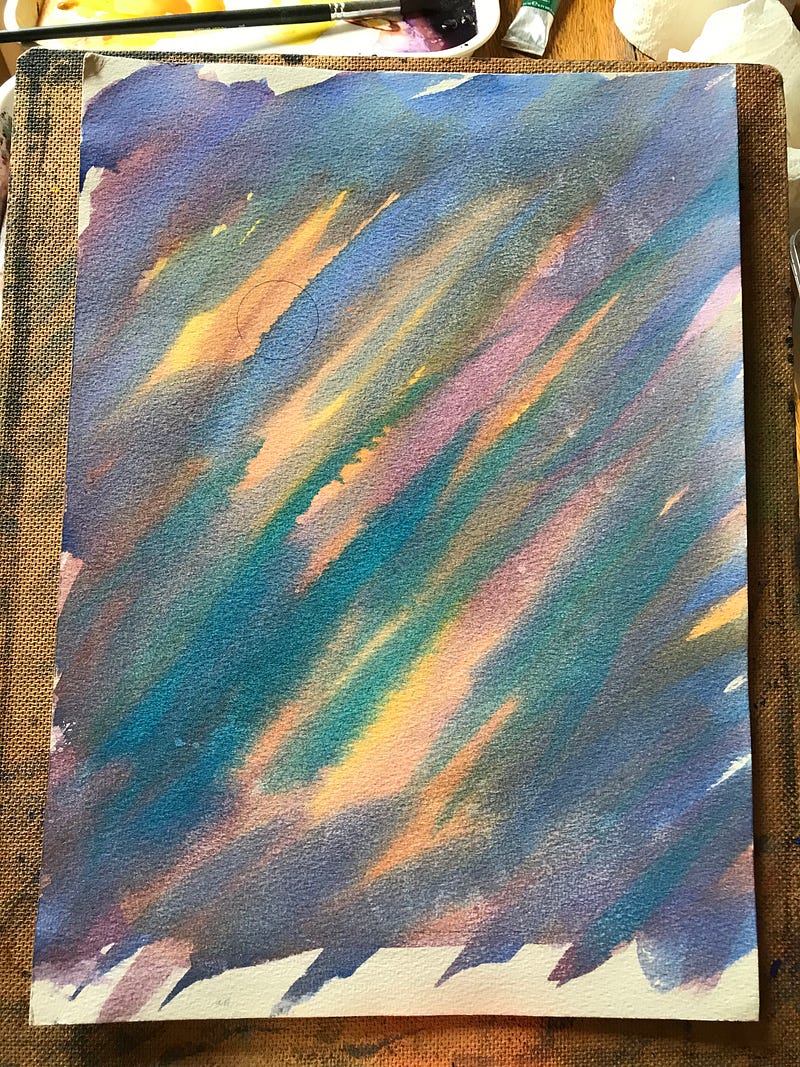
You need to have all your colours mixed up before you start putting them on the paper so that you can work quickly while they are still wet.
On the left above I have decided enough paint is enough; in the middle is the same painting only it’s dry. You can see how the colours lighten when dried, so you need to mix colours darker to make up for how they end up being lighter.
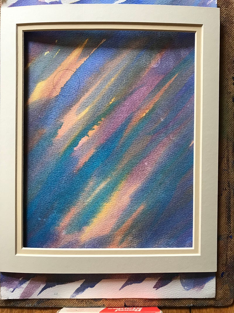
On the right is the dried painting with a mount on top of it so that I can plan in my mind where I’m going to put the land.
A mount is a very useful part of your kit. You can use it at any time to help visualise how your picture is going to turn out.
And, because I used the mount, it looked to me as if the picture could do with some darker colour on the right and at the top to balance the moon, and to give more atmosphere.
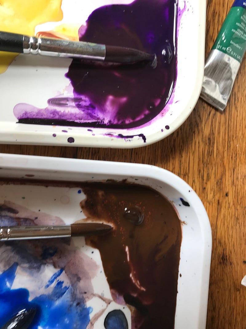
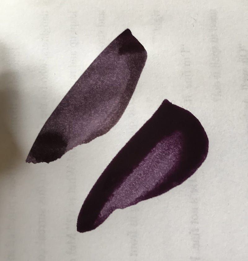
So I mixed up some of the purple with dark umber — tried it on scrap paper, and then, very gently swept some clean water over that part of the painting so that I could, equally as gently, apply this new, dark mix of paint and the edges would soften in the clear water already on the paper. This has to be done gently to avoid disturbing the paint underneath.
It’s better to do all the sky in one go rather than adding in bits later, like I have! But this shows that you can add in bits later if you want to.
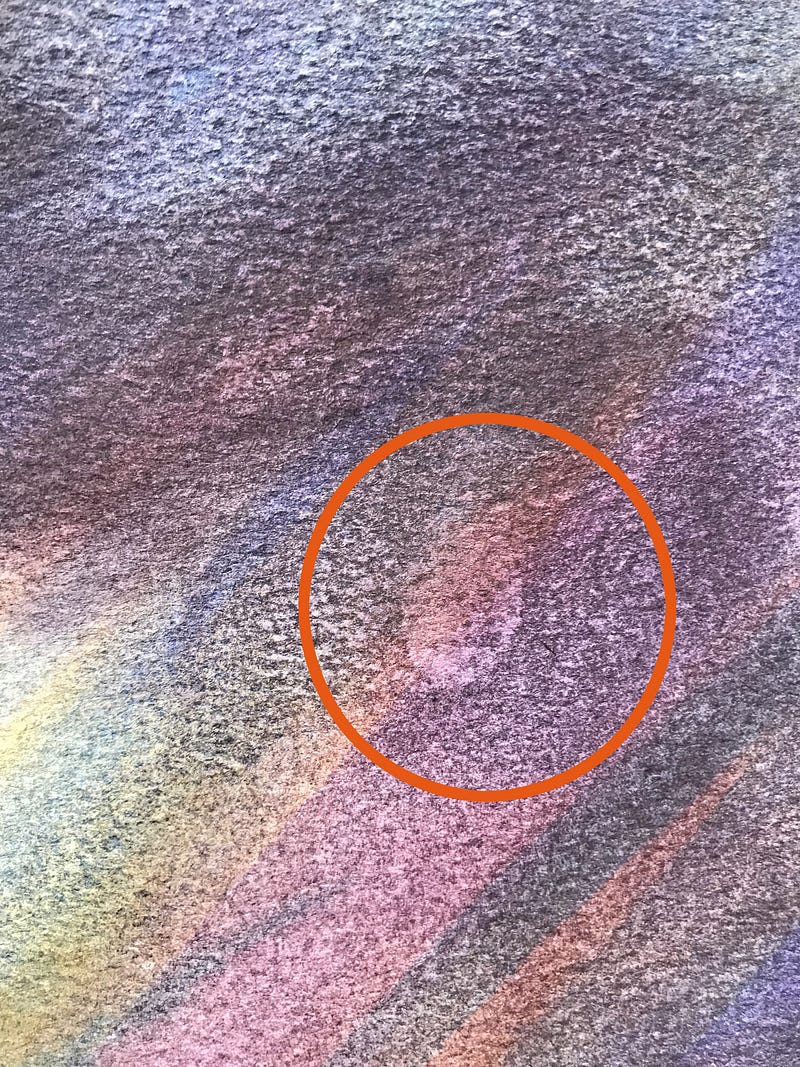
Whilst looking over the whole picture to make sure everything is where I want it, I noticed a fingerprint-like smudge — see left.
It’s like a fingerprint because it is a fingerprint.
Fingerprints are greasy. Grease and water don’t mix. Grease will repel watercolour paint so it doesn’t sit properly on the surface of the paper.
The moral of this story is: try to never touch the painting surface of your paper with your finger-tips.
I have dealt with it so it doesn’t show, but how to do so is not part of this session.
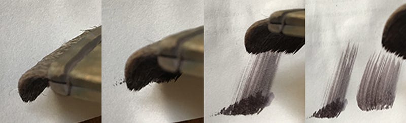
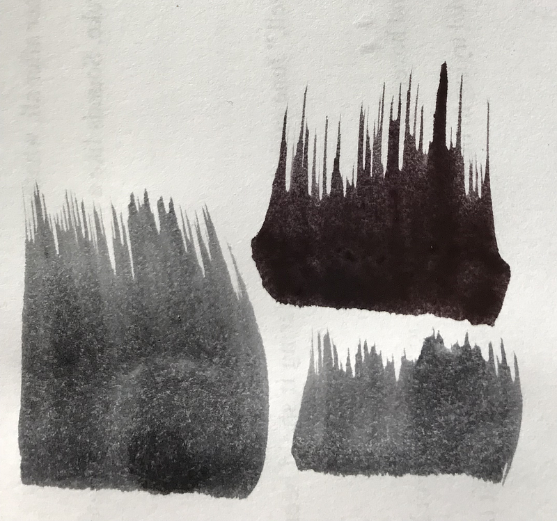
Having checked with the mount where I want the land to be, I mix up the colour I want to use — blue and dark umber, which needs to be darker and heavier than the colours so far used in the sky.
I check the colour on scrap paper. I check my technique on scrap paper.
The technique is to hold the hake, or flat brush, on its edge, slightly bent under (as above), and then flick it upwards. I expect that practising on scrap paper first comes naturally to you now. Oh, yes!
I have a couple of rigger brushes handy — the ones with very long tufts of hair — left — to put in other grasses with the same flicking motion as the big brush flick above.
With a rigger you get individual grasses. With a big, flat brush, you get banks of grasses.
Now I have my land with suitably grassy silhouettes. The land-paint is thicker than my usual washes so it takes a bit longer to dry.
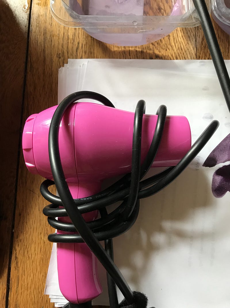
I’m in a hurry, so I get out my painting hairdryer and dry it off, using a low setting because I don’t want to set fire to my picture, especially as I’m quite pleased with it so far.
You can see see how a darker/heavier foreground ‘pushes back’ the sky and gives the whole picture depth. The sky is no longer ‘here’ — it’s ‘over there’.
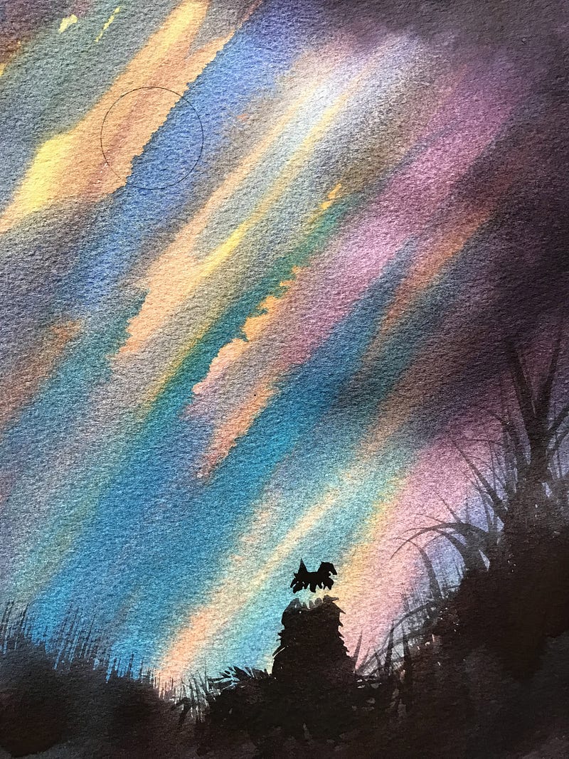
I already knew I was going to put a dog in the picture.
I like dogs as a subject, but it could just as well have been a hare, or a flower, or a house — anything that takes your fancy. I will be doing a session on how to make recognisable silhouettes, and will put a link in here when it’s done.
Using an even darker mix of paint, I paint in my dog silhouette leaving areas of no-paint where the white around the back of his neck would be, and the white on the tip of his tail.
These areas of no-paint then need to have as much of the paint underneath removed as possible, because they are supposed to be white. I don’t want to use white paint because, in contrast with the translucent quality of the watercolours used, white paint is opaque and often looks clumsy.
To remove the paint from the moon and the white part of the neck of the dog, and his tail, a bristle brush (for use with oil or acrylics) is required, rather than a softer, watercolour brush. The markings on my bristle brush have worn off, so I have no idea how big it is, or what make, but it doesn’t matter.
Using a clean, damp brush, carefully brush away the paint underneath and, using kitchen towel, soak up the moisture made on the paper, being careful to keep within the moon area, the dog’s neck area, and the tip of his tail, or you might disturb other paint you want to keep.
I like the effect on the moon because it then looks as if it’s slightly obscured by clouds.
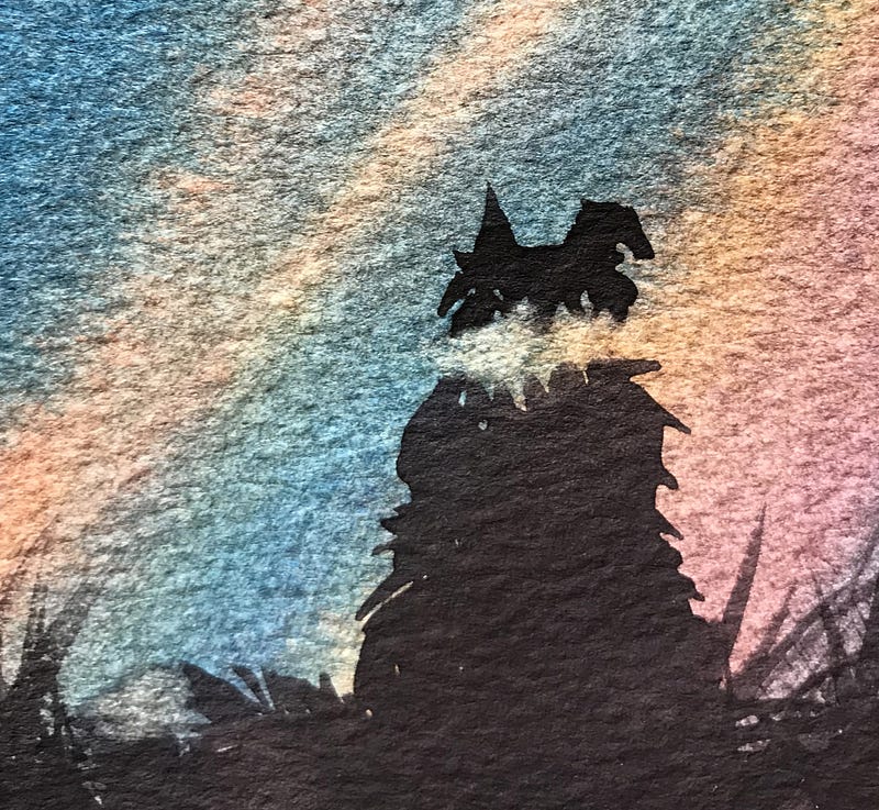
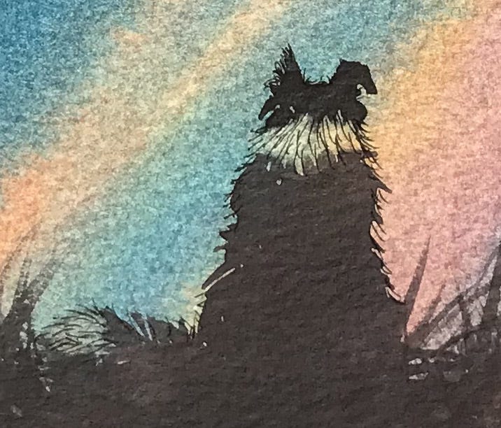
The dog on the left (above) looks as if his head is levitating above the rest of his body because the sky is showing through the gap.
However, as soon as fur is suggested on the neck of the dog with a few pen strokes, the neck becomes solid. It’s about making marks that create recognition in your brain. Your brain sees the fur-like marks and thinks: “Hey! That must be fur. Therefore there is no gap. That head is not levitating above the body.” Even though it previously only saw a gap …
Likewise, fur marks have been put in with pen on the tip of the tail, around the body of the dog and also used to shape the ear a little.
A lot of drawing and painting is making sure you create images that the brain recognises, and the brain recognises things by using many different clues that we might not necessarily think of — unless we’re doing the drawing or painting, which is when we think of them.
For example, you might see a friend at the end of your street. She’s too far away to recognise her face. But you know it’s her by the way she walks. You might not have realised it was her gait that made you ‘know’ it was her before you thought about it.
In the case of this painting the viewer knows it’s a Border Collie because there is a white patch on the back of his neck and on the tip of his tail. Unless it’s someone not in the slightest bit interested in dogs, of course. He’ll just see a dog. But at least he knows it is a dog. Because — ears, tail, communing with moon, like dogs do.
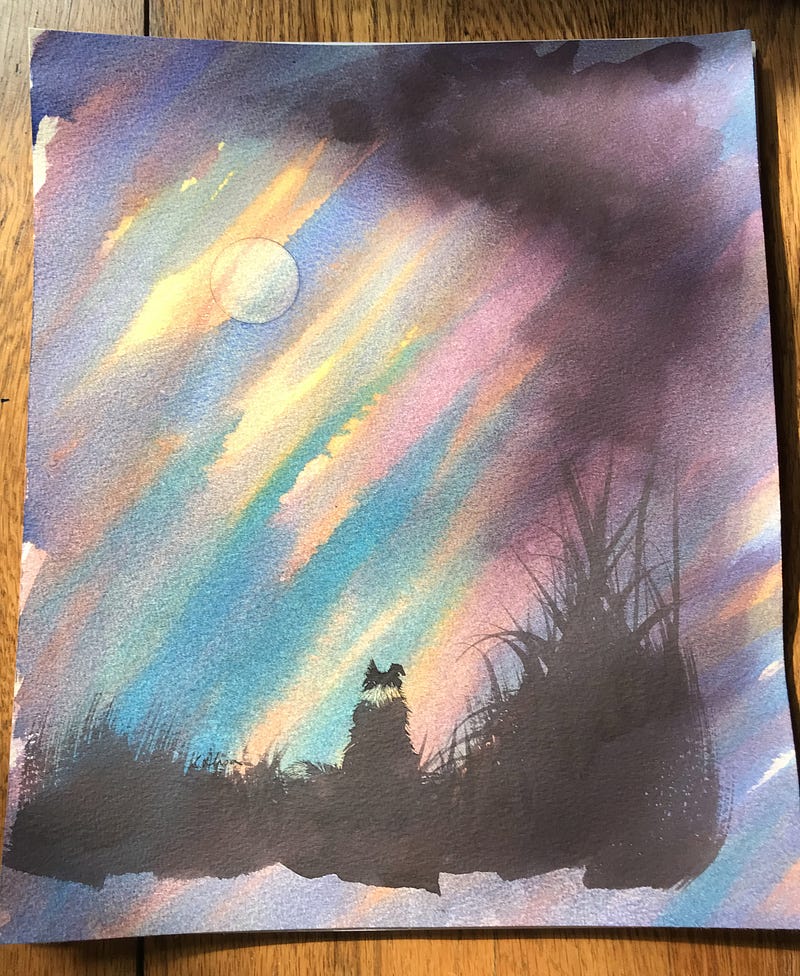
The end result is not too bad — except — doggo is smack-bang in the middle! Arghhh!!! The only reason I find this picture acceptable now is that, because the moon is offset, and the dark cloud is also offset, it balances out the dog being in the middle. But — doggo shouldn’t really be there. He should be about an inch or so to the right.
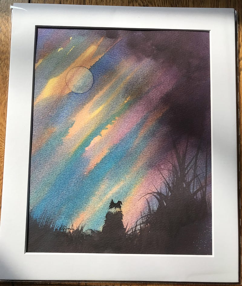
Despite that, I’m quite pleased with the finished picture and am actually going to put it up for sale. I don’t normally sell the original pictures from teaching lessons because I usually ruin them by using them to show other techniques, but I managed to restrain myself with this one.
Next up will be some questions that people have sent in about watercolour painting, with answers.
All paintings and photos are by the author.
These are useful:
Susan’s Amazon Page / Susan’s Etsy Store / Susan’s newsletter sign-up