
Color Theory
Color Theory: Tints and shades, it’s a matter of black or white.
Tints and shades are color theory terms used in art and design. They’re closely related to hue and monochromatic color. A tint is a hue that blends with white. A shade is a hue that blends with black.
There are examples of tints and shades in works of art, such as paintings and drawings. In a drawing, tints can create a light or ethereal feeling. Shades can be used to add depth and drama.
Tints and shades can also be used in graphic design. Tints are often used to create a feeling of warmth, while shades create a sense of coolness. Tints and shades can also be used to add interest to a design or to make a statement.
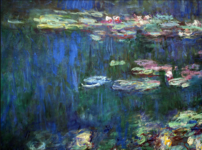
You can see examples of tints in the work of painters like Monet and Renoir. You can see examples of shades in the work of painters like Rembrandt and van Gogh. Monet’s painting of the water lilies is an example of a tint. Renoir’s painting of the dancers is an example of a shade.
There is an artist that uses charcoal to make tints and shades in her work. Her name is Kara Walker and she has a lot of experience with making tints and shades. The thing I love about her art is the way she is able to make such beautiful pictures with just a few simple colors.
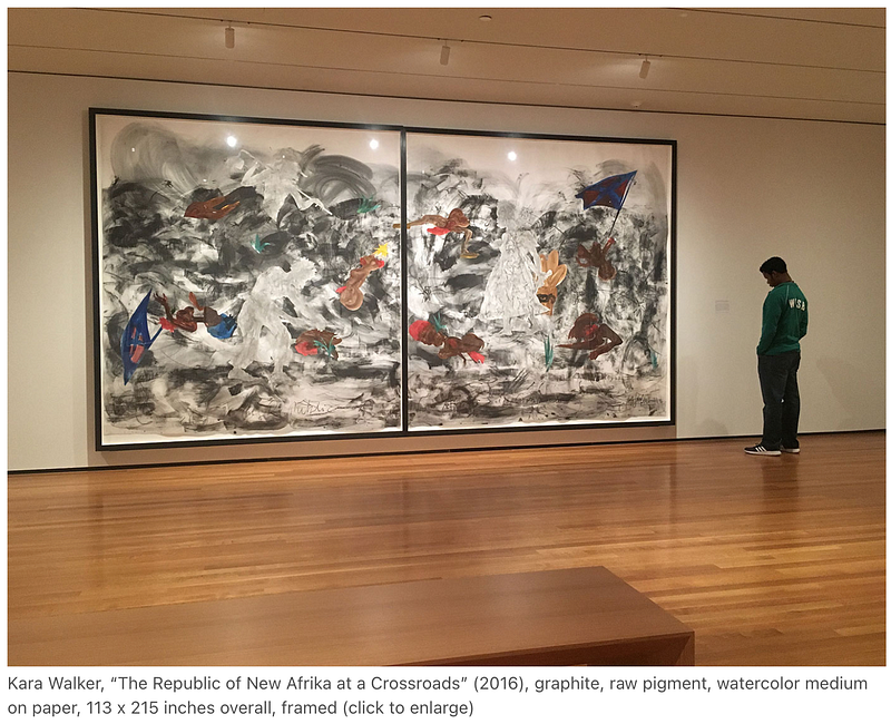
Walker created the look of tint by using a white pencil to add light. She created the look of shade by using a black pencil to add darkness.
In digital design, tints and shades can be seen on sites like Dribbble and Behance. You can see that digital artists have used tools like Photoshop to create tints and shades in their work by adding a white or black layer to their images or using a gradient tool.

On Dribbble, there is an artist named Chris Converse who has created a series of tutorials on how to create tints and shades in Photoshop. In his tutorial, he starts with a black and white image. He then adds a gradient map layer to add a tint. He adjusts the opacity of the gradient map layer to create a more subtle effect. Finally, he adds a black layer to create a shade.
Tints and shades are an important part of color theory. They can be used to create a certain feeling in a work of art or design. Tints can be used to create a feeling of warmth, while shades can be used to create a feeling of coolness. Tints and shades can also be used to add interest to a design or to make a statement.
If you want to learn more about color theory, read some of my other posts or scroll through my List.
Color Theory: Complementary colors are more than appealing, they’re used to maximize visibility.
Color Theory: Impossible colors can only be seen under special circumstances.
If you’ve enjoyed my writing, please consider supporting me by becoming a Medium Member, accessing unlimited Medium articles. Follow the link to subscribe for $5 a month or $50 per year. Thank you!


