
Color Theory
Color Theory: Complementary colors are more than appealing, they’re used to maximize visibility.
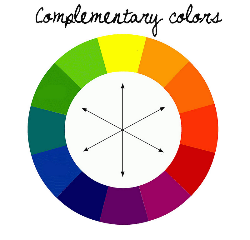
Complementary colors are designed to look good together but they’re also very practical because they maximize visibility.
Think of road signs, they use the colors that are opposite each other on the color wheel to make sure they’re seen. A stop sign in America is red and white for this reason. A yield sign is yellow and black.
Road signs are designed to be seen from a distance and in all kinds of weather so they use the most visible color combinations.
This also applies to website design and other areas where you want your text or product to stand out. If you have a light background, using a dark color for your text will make it easier to read. The same is true if you have a dark background and use a light color for your text.
There are other benefits to using complementary colors. They can create a sense of harmony and balance in your design. They can also make a bold statement or add intrigue.
Example of Complementary Color Combinations
Red and green
Blue and orange
Yellow and purple
Those are the common complementary color combinations, the foundational combinations, but you can create your own by using any two colors that are opposite each other on the color wheel.

Brands
Complementary colors can be used in many different ways to create contrast and really make something pop. Examples are found in big names brands like McDonald’s and Starbucks.
McDonald’s uses red and yellow as their complementary colors because they’re both very visible and create a sense of energy and excitement. This is an effective strategy for a fast-food restaurant because they want you to feel like you’re in and out quickly.
Starbucks uses green and white as their complementary colors. This creates a feeling of relaxation and peace. This is an effective strategy for a coffee shop because it’s a place people go to relax and unwind.

Emergency Services
Let’s also consider something like emergency services. Ambulances are almost always painted with orange and white stripes because these are two very visible colors. The same is true for fire trucks. They’re usually red and yellow.
Police cars are usually blue and white. Again, these are two very visible colors. The visibility of these color combinations is important because emergency services need to be seen quickly and easily.
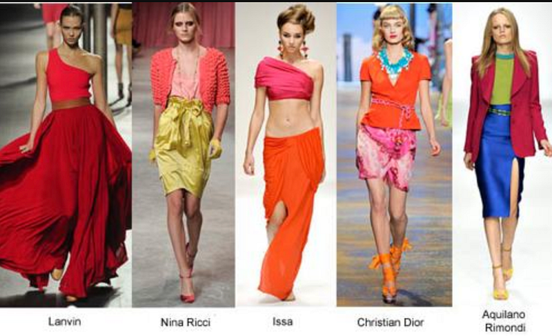
Fashion
Complementary colors can have a big impact on your design, whether you’re using them for text, products, or anything else. Choose your colors wisely and consider how they’ll work together to create the desired effect.
One way to use complementary colors is to create a color scheme with two dominant colors and an accent color. For example, you could have a blue shirt with red pants and an orange scarf.
You could wear a green dress with yellow shoes and a purple purse, or you could have a red dress, yellow shoes, and a purple purse.
The possibilities are endless, but the key is to remember that complementary color means you’re pairing colors that will create the highest possible contrast.
Color Theory: Matching colors are perceived as harmonious — subject to personal preference.
Color Theory: Impossible colors can only be seen under special circumstances.
If you’ve enjoyed my writing, please consider supporting me by becoming a Medium Member, accessing unlimited Medium articles. Follow the link to subscribe for $5 a month or $50 per year. Thank you!


