
Color Theory
Color Theory: Matching colors are perceived as harmonious — subject to personal preference.
Matching colors are also known as harmonious. The word “harmonious” can refer to a color combination, or it can refer to the relationship between colors. A color combination is said to be harmonious if the colors match each other.
There are many different ways to match colors. Some people prefer to match colors by using a color wheel, while others prefer to match colors by using a color chart. Some people even prefer to match colors by using their own personal preferences.
There is no right, but if you’re designing for an audience, you want to understand what their perception preference is to best appeal to them.
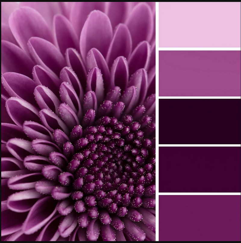
Monochromatic colors
Colors that are all the same hue are found in monochromatic color schemes. These schemes are easy on the eye, and can be either very light or very dark. They work well for web design because they give a clean and simple look.
Analogous colors
Colors that are next to each other on the color wheel are called analogous, and they have the same wavelength of light. Analogous color schemes are also easy on the eye, and can either be very light or very dark. They work well for web design because they give a clean and simple look.
Complementary colors
Colors that are opposite each other on the color wheel are called complementary, and they have different wavelengths of light. Complementary color schemes can be either very light or very dark, but they are usually more eye-catching than monochromatic or analogous schemes.
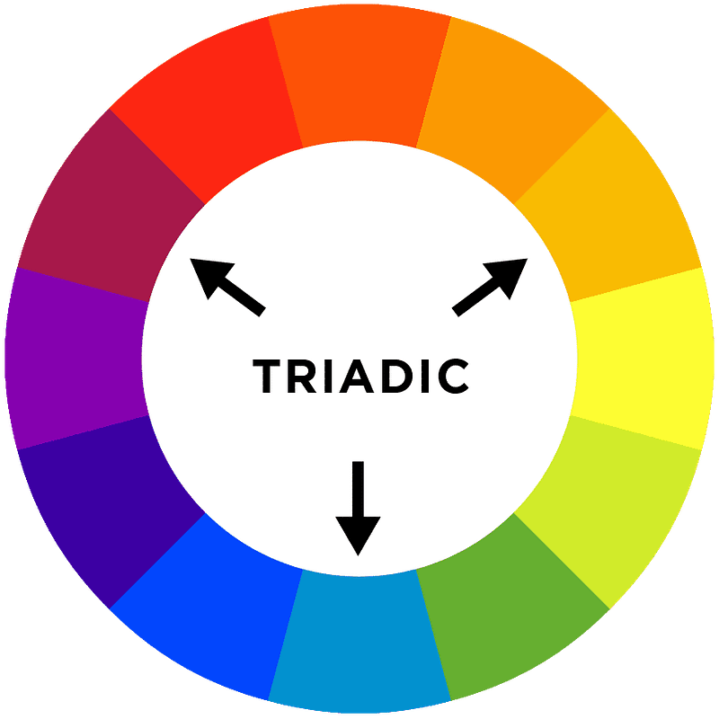
Triadic colors
Colors that are evenly spaced around the color wheel are called triadic, and they have different wavelengths of light. Triadic color schemes can be either very light or very dark, but they are usually more eye-catching than monochromatic or analogous schemes.
Warm Colors
Warm colors are those that tend to advance in space and can make a room or area feel more intimate. Warm colors include red, orange, and yellow, and their hues.
Cool Colors
Cool colors are those that recede in space and can make a room or area feel more spacious. Cool colors include green, blue, and violet, and their hues.
Neutral Colors
Neutral colors are those that don’t tend to make a space feel either warm or cool. Neutrals include black, white, gray, and brown.
Light Colors
Light colors are those that have a light value (lightness) and can make a space feel brighter. Mixing colors with white, black, or gray can create different shades of light colors.
Dark Colors
Dark colors are those that have a dark value (darkness) and can make a space feel more subdued. Mixing colors with black or white can create various values of light and dark.
Intended Symbolism
Color has been used to communicate meaning for centuries, and it is no different in web design. Different colors can be associated with holidays or brands. For example, Easter is typically associated with the colors yellow and green, while Christmas is often associated with red and green.
Taking it a step further there is a ‘Christmas Green’ so, not just any green is associated with Christmas. And an ‘Easter Yellow’ as well. These colors hold different values and meanings to different people, so it’s important to be aware of the symbolism associated with the colors you use in your design.
The concept of matching colors is critical for design, composition, film, fashion, communication, marketing, and creatives. If you have an eye and mind for selecting the right color combinations at the right time, you can create amazing and beautiful results.
Color Theory: Impossible colors can only be seen under special circumstances.
Color Theory: There is more than one set of universal Primary Colors — debunking the myths.
If you’ve enjoyed my writing, please consider supporting me by becoming a Medium Member, accessing unlimited Medium articles. Follow the link to subscribe for $5 a month or $50 per year. Thank you!


