
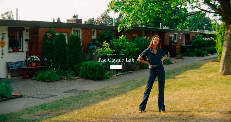
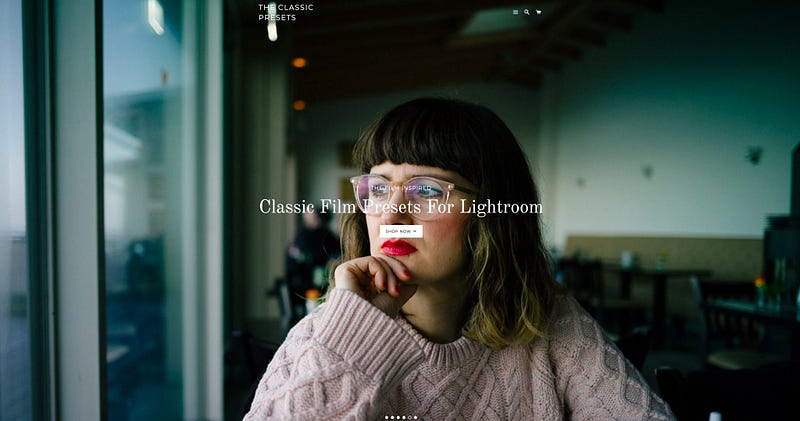
Classic Film Presets Collection for Lightroom / The Classic Lab — Frontier Edition ~~~Another option for Lightroom Film Presets
I first came across theclassicpresets (TCP) in 06/2018 when I was looking for Capture One film Presets and finally bought Classic Film Styles for Capture One — Full Collection. The result is quite good, and I like it. However, this time we are mainly introducing two sets of Lightroom Film Presets, Classic Film Presets Collection for Lightroom / The Classic Lab — Frontier Edition.
However, the style of the negative can vary from scanner to scanner.
I have been using vsco for a long time and has tried many Lightroom FIlm Preset such as RNI, Martins labs, c1ick.
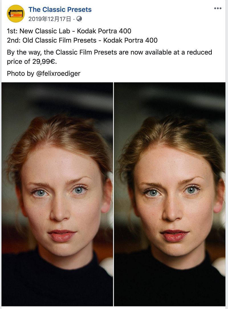
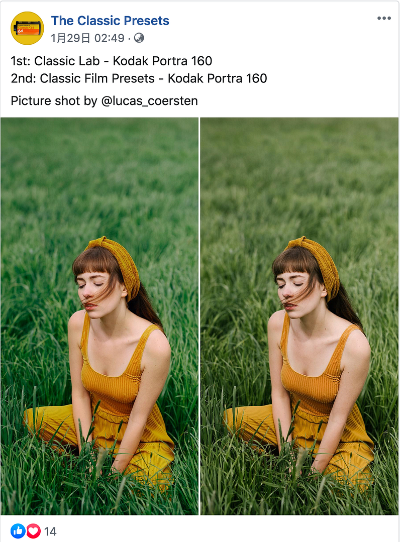
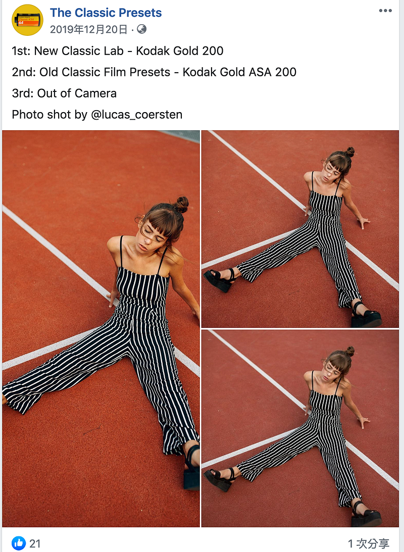
As theclassicpresets developer andré duhme says, the style of the Film Presets varies from company to company. Even if it is the same positive, the type of the image will be a bit different when you scan it at a printing shop vs your own development. It all depends on the experience/inclination of the printer Shop or myself to scan the Film. In the end, it is up to you to scan your black and white negative to get the black and white you want.
However, the style of the negative can vary from scanner to scanner.
I have been using vsco for a long time and has tried many Lightroom FIlm Preset such as RNI, Martins labs, c1ick.
As theclassicpresets developer andré duhme says, the style of the Film Presets varies from company to company. Even if it is the same positive, the type of the image will be a bit different when you scan it at a printing shop vs your own development. It all depends on the experience/inclination of the printer Shop or myself to scan the Film. In the end, it is up to you to scan your black and white negative to get the black and white you want.
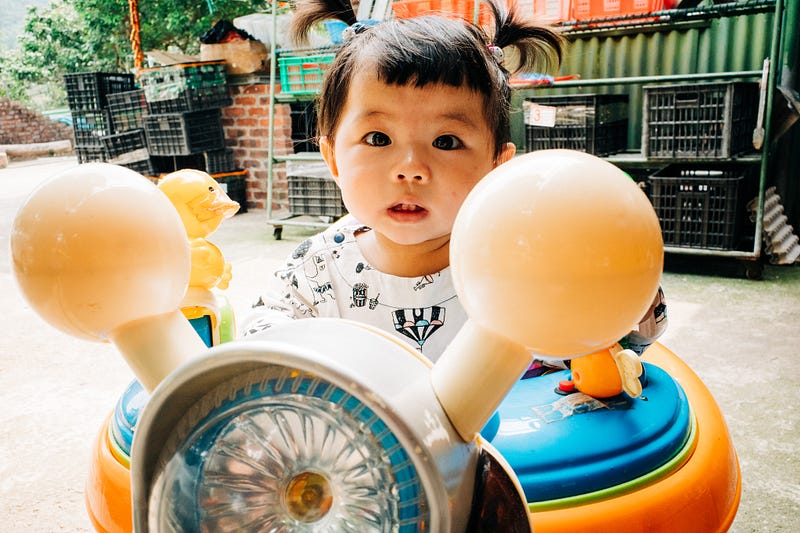
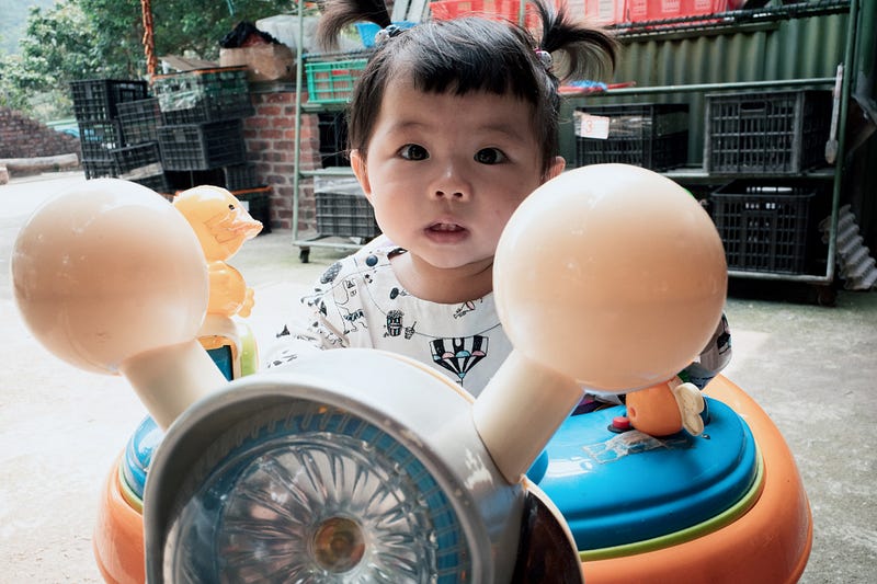

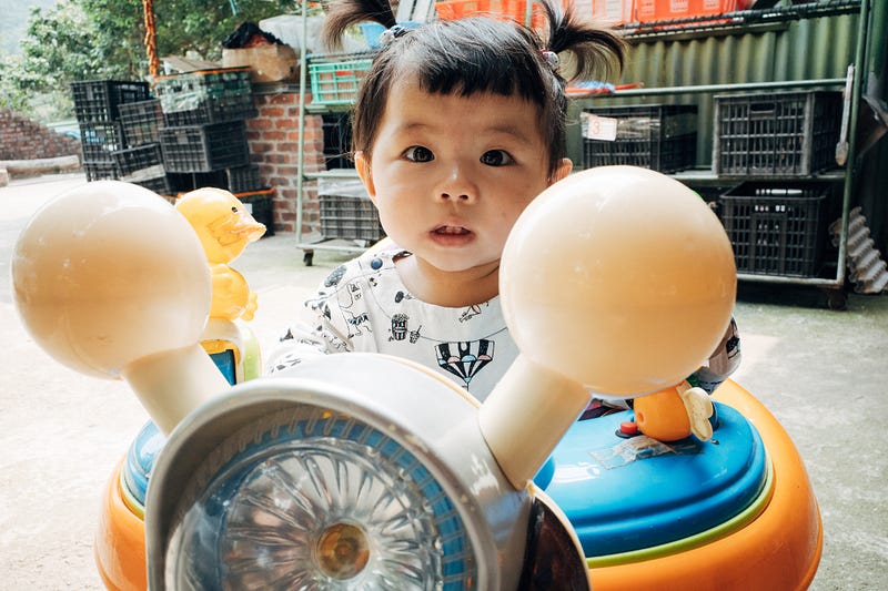
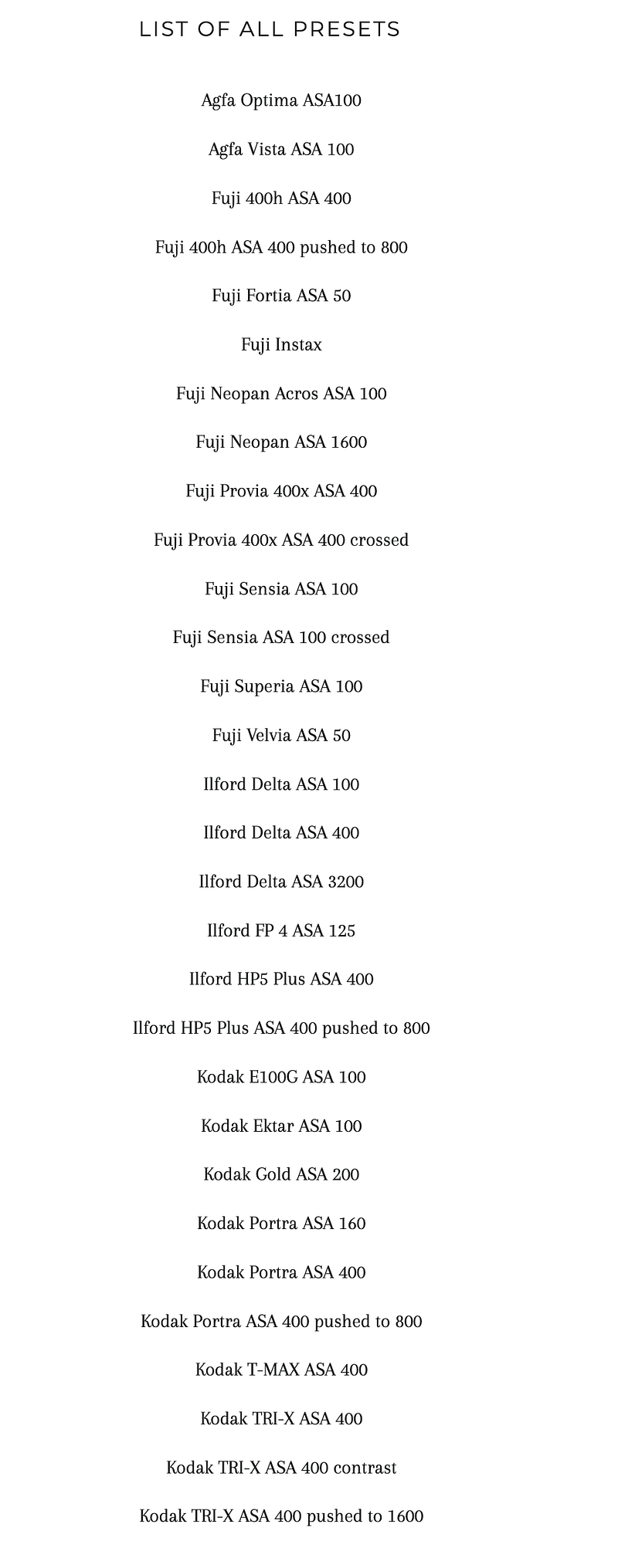
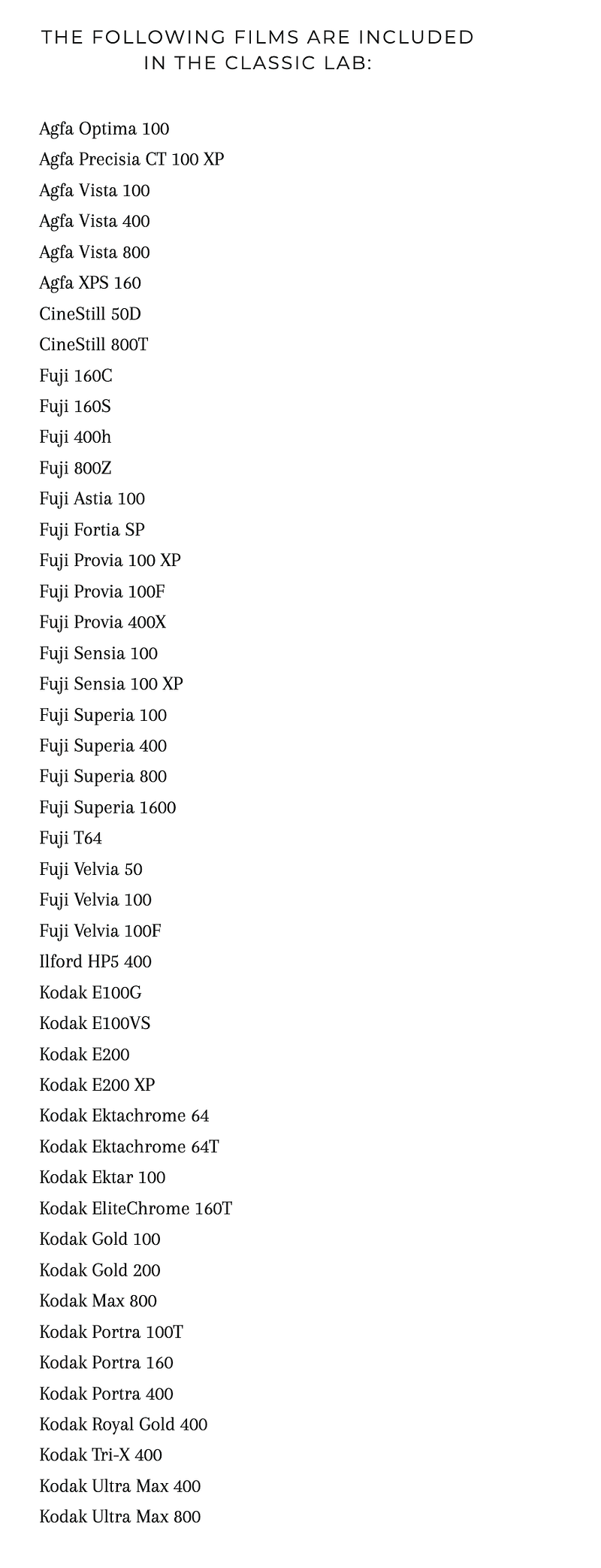
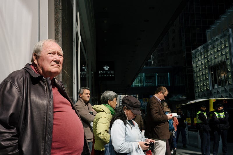
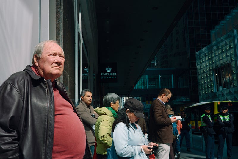
Which of the above film style files do you prefer?
There is no “best”. The above style files are just a simple selection, without any fine-tuning, and the result may be different from your view, and let’s see how the preset values of each factory are with a simple selection.
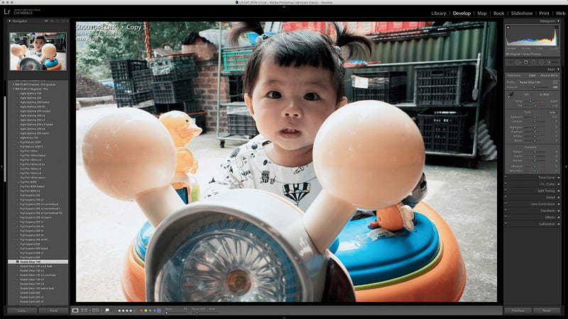
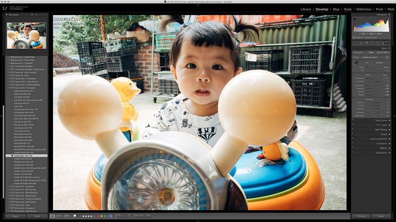
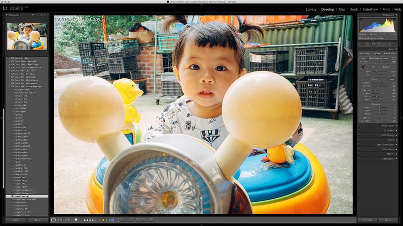
As mentioned earlier, each company may use different settings for each type of negative. The choice of style file sometimes depends on the amount of post-production space available after application. Ideally, you should find a style file/flavour that suits you without changing too many settings or making too many adjustments, which can use as a common combination. If you can, find a bunch of your favourites. If you can, find a pile of photos you like and test them out every time you get a new negative style.
It is more important to adjust the colour tone to your liking than to resemble the taste of the negative exactly.
The age of the negative, the final film will be affected by the batch of the negative, the freshness of the print, the personal preference of the printer shop. So don’t get too carried away with the negative flavour, not to mention how many people are still shooting negatives with a bunch of 81A and 81B filters to correct the colour temperature. Sometimes it is too much like the original negative, such as the RDP3, which is bluish, or the E100vs, which is magenta, not everyone likes it, or it is suitable for all environments. I do not care too much about the colour of the lens anymore because the colour of the processor and film preset style are more important in the digital age. It is probably more important to choose the right style file to bring visual effects than the lens.
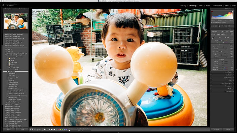
Make use of the fine-tuning tools provided in the style file
I’m sure we all understand that you often have to make simple adjustments when you use a style file, such as +/- ev values, WB, etc. But often, style files also provide a lot of tools to improve white balance, DR highlight/shadows values, etc.
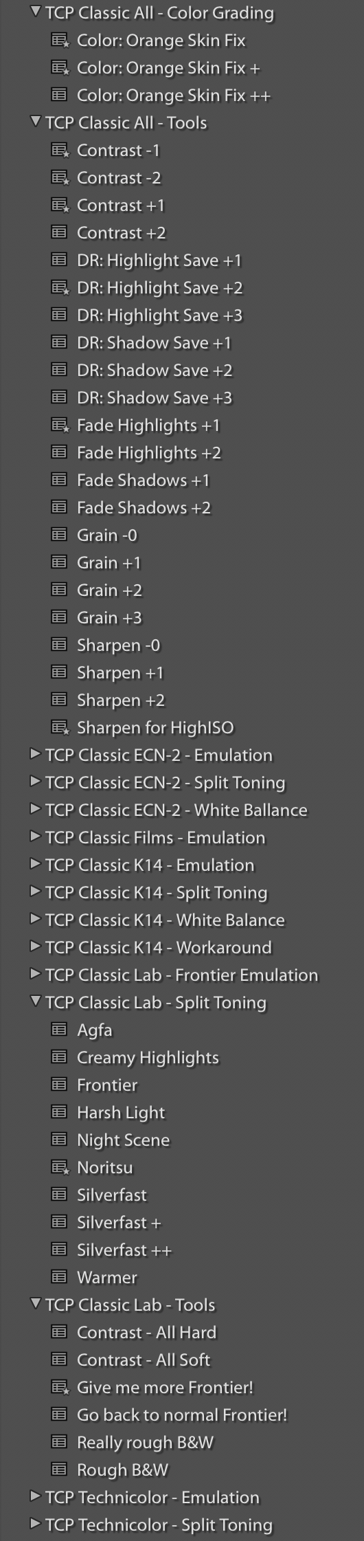


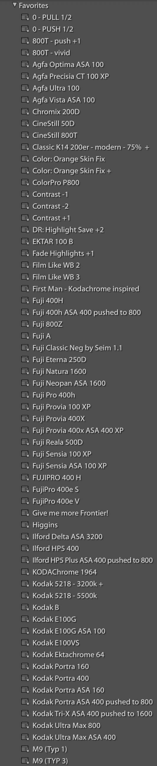
I feel that there may be as many as a dozen or more negative style files in a style set, but the most important thing is how many of them you can keep for long-term use. I always use only 1–2 Film style files as a common combination. It is as more minor as if you use them regularly. Can you fine-tune the final image/personal style more quickly and easily. Keep the style files you use or have access to in one folder. The Fuji 400H may have 3–4 different manufacturers that I have used on other occasions. It would be better for me to apply my style files and fine-tune them compared to the direct image of the camera.
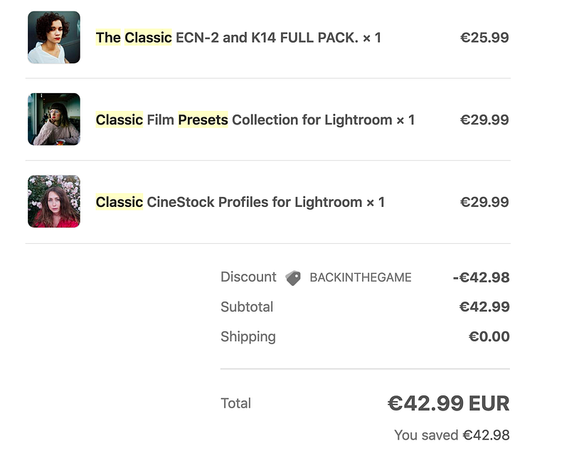
If you like it, you can buy it at the following website…
You can also get a rebate from the author through Affiliate links… https://theclassicpresets.com/?ref=o71q594tf2 Use Coupon Code “Rokkorx” for 15% off when you pay Or contact me on FB or IG for more special offers…
If you like this post, feel free to give me a pat on the back and let me know you like it too XD
You can also follow me by pressing the Follow button, but unfortunately, you can’t set up a sneak preview XD. If you are willing to pay USD 1 per month for a cup of coffee, you can support me in my “Words are worth it, photos are worth it”. I have been writing blogs for more than ten years so that you may have read my Minolta articles, other equipment and photo tips in the past. It is not easy to maintain this interest in blogging. Today, many photographers like to shoot youtube or use pictures instead of writing, so in-depth introduction and evaluation may be a chore for many people. Still, I believe that words and photos have a specific value. I have many more pictures and photographs that I would like to share with you, and a little financial contribution from you would help me go further or write.
If you are interested in paying for a cup of coffee every month, subscribe to the author Patreon at:
You can also sponsor me to write a one-off article through Payme

Thank you for reading.
Facebook : 攝影二三事 MeWe: https://mewe.com/p/rokkorx 街拍。日常: https://www.facebook.com/StreetRokkorx/ https://www.flickr.com/photos/rokkorx/ https://www.instagram.com/samlee.hk/
Thank you for reading.
Facebook : 攝影二三事 MeWe: https://mewe.com/p/rokkorx 街拍。日常: https://www.facebook.com/StreetRokkorx/ https://www.flickr.com/photos/rokkorx/ https://www.instagram.com/samlee.hk/