
Choco l’art
What do mutton pies, a new format for portraits, the protestant monarchy of England, poster art, and chocolate snack bars have in common?
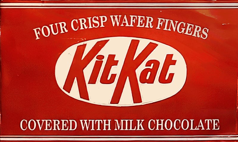
The KitKat chocolate wafer bar is a design classic. Prior to its launch in the mid-1930s, no one had seen its like. Before that, if one wanted to buy a biscuit, you’d go to a baker’s or grocer’s shop that had a biscuit counter and choose your selection by weight. They would be handed to you in a paper bag or, if it was a posher shop, a branded gift box. If you wanted chocolates, you would go to a confectioner’s and order your selection in much the same way. The idea of an individually wrapped, set of just four wafer biscuits, united by their generous chocolate coating and sold from a variety of outlets, was radical.
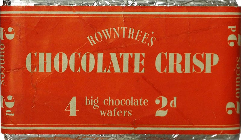
It wasn’t the only innovation to come from its makers at Rowntree’s, of York, that had an impact upon design, advertising and culture. They also introduced ‘Smarties’, in a tube, and ‘After Eight’ mint thins, in their little paper envelopes… To tell the surprising story of the KitKat, we must travel back in time to eighteenth-century London, then to nineteenth-century Paris, back to Britain in the twentieth-century and on to twenty-first century Japan… sweet!
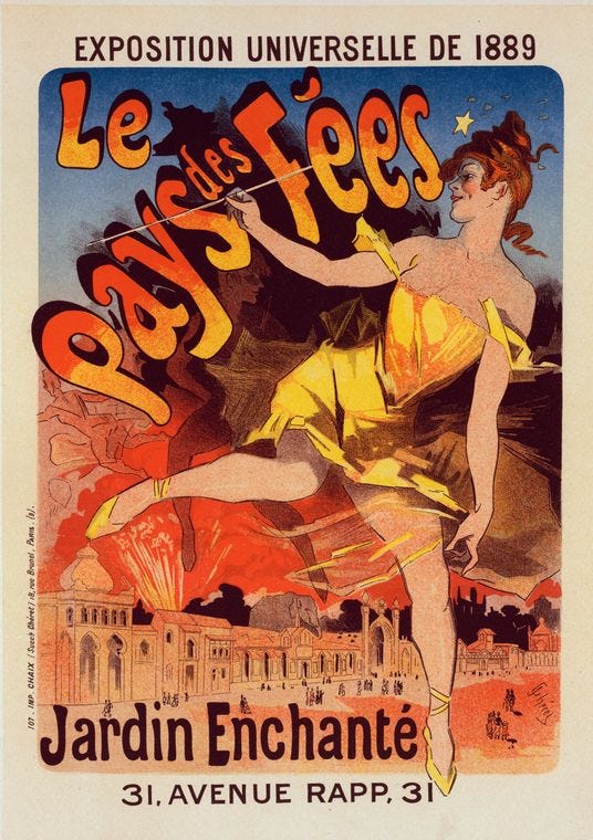
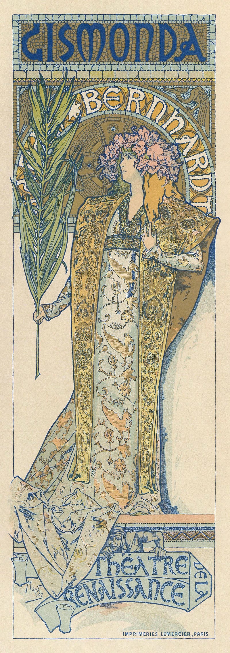
Poster design was revolutionised in the 1880s when French artist and lithographer, Jules Chéret, introduced his Three-Stone-Lithography process, allowing posters to be mass-produced in colour by carefully aligned impressions from three etched stone ‘plates’, using inks in the three primary colours. He borrowed his aesthetics from the earlier Rococo style, but the effect of his process gave his poster designs a distinctively ‘graphic’ and modern appearance.
Chéret may be considered the father of modern commercial design, the first ‘advertising mogul’. He designed and produced promotional posters for theatre companies, performing troupes, fashionable restaurants, perfumes, soaps, cosmetics, confectionery, drinks, pharmaceuticals and railways.
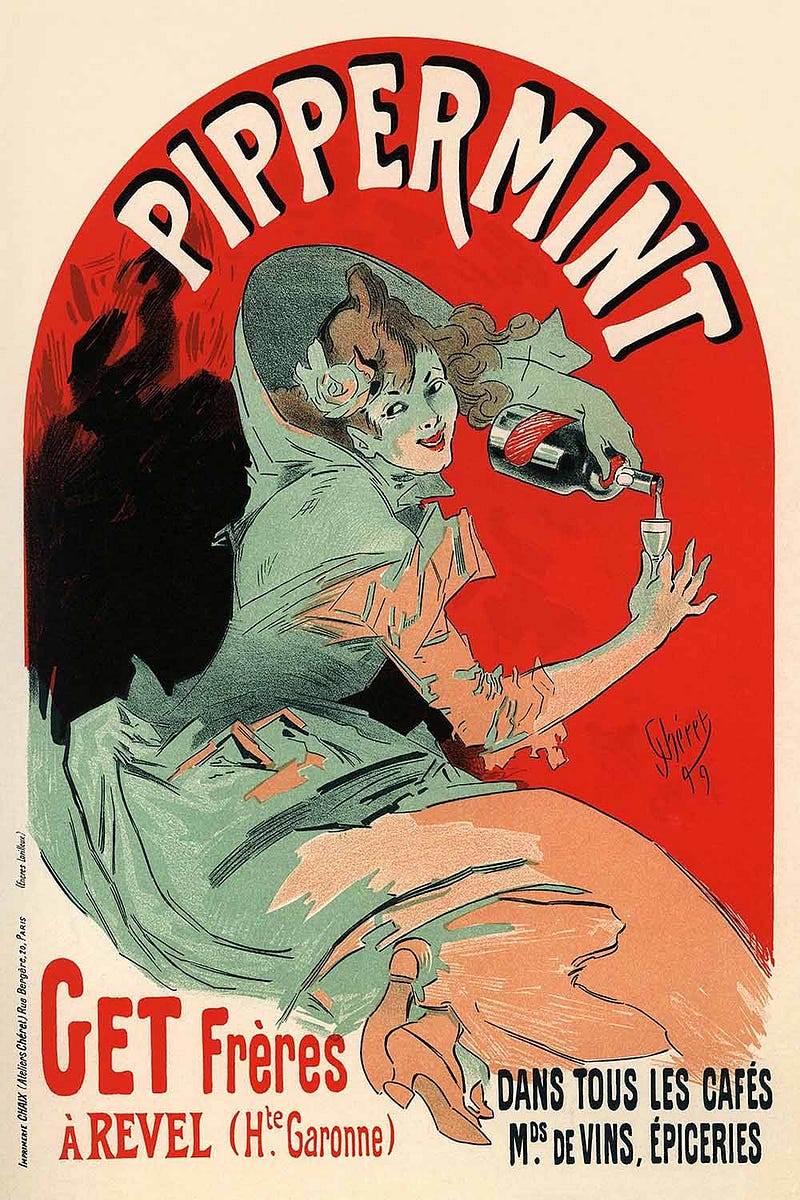
The focus of his designs were often happy, liberated women, shown independent of chaperones and wearing what, at the time, may’ve been considered risqué fashions. The posters were light, frivolous and joyous, depicting elegant young ladies enjoying modern pastimes. These girls became known as Cherettes and were indelibly linked to the Parisienne popular culture of La Belle Epoch.
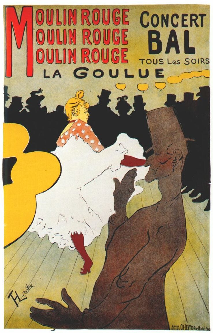
Posters were embraced by several other artists, most notably by Chéret’s contemporary and fellow Parisian, Henri Marie Raymond de Toulouse-Lautrec-Monfa — more usually called Toulouse-Lautrec, and Alphonse Mucha— the Czech artist who was living in Paris at the time. This trinity of artists made the medium ‘their own’ and the streets of Paris were transformed into free pedestrian art galleries. Posters became appreciated as a legitimate art form with broad appeal to collectors and dealers.
Interestingly, Chéret had trained in London during the early 1860s and had been influenced by innovations in the British marketing scene which had already embraced the printed poster as a method of product promotion. Later, around the same time that he was developing his three-stone technique, a duo of British artists, William Nicholson and his brother-in-law James Pryde — known as ‘The Beggarstaffs’ — were using a distinctive new paper stencilling method in their designs. It was not dissimilar to Banksy’s ‘cut-out’ approach, and created a striking, clean style more like the results achieved by screen-printing.
One of their prominent clients had been Rowntree’s and the poster they designed for the company’s signature brand of ‘Elect Cocoa’ became internationally famed for its visual boldness and simplicity. The style was very different to their continental counterparts. However, it turned out to have a greater effect on the art scene than on sales of the product! It seems the message was too cryptic for potential punters… which I can understand.
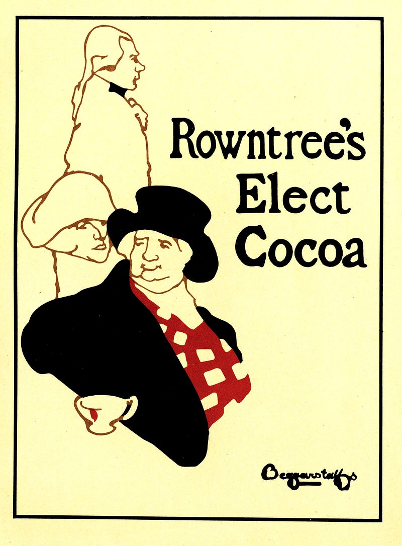
I mean, the cup is the only relevant component of the image, isn’t it? And what’s with the disembodied head staring at that other fellow’s hat. Oh, is he supposed to be whispering something in his ear, whilst his companion guards their backs? “Go on, have another cup of cocoa… you know you wanna...” Whatever the intended message, Rowntree dropped that poster campaign, though it was later recognised as an important contribution to graphic design in the golden age of poster art, mainly for its stark illustration, floating in a dramatic, uncluttered white space.
Rowntree’s were up against two other big British chocolate rivals, Cadbury’s and Fry’s, and when their new and strange advertising posters failed to pay-off, they realised that they must compete for their share of the market by offering innovative product and distinctive branding.
Now, this may be apocryphal, but reputedly it was one of their factory workers who came up with the idea of a big chocolate-covered biscuit — what we now call a ‘snack bar’ — wrapped in foil to keep it fresh. It could then be placed in their lunch boxes, alongside their sandwiches or cold pasties, where its wrapping kept it fresh and the flavours separate.
It’s said that the invention was tested among the workforce and sometimes a kindly employee would break their biscuit up to share it with envious workmates who didn’t find anything sweet in their lunchbox… and so, the idea of a large chocolate ‘biscuit’, that could easily be snapped into ‘fingers’ for sharing, was born. Chocolate bars are now a familiar concept at the centre of a global snack foods industry, estimated to be worth more than 440 billion dollars…
Oh, I’m getting ahead of myself… or should that, chronologically speaking, be behind ourselves? Well, bear with me, things are about to get a bit complicated…
Rowntree had already sold chocolate selection boxes under their trademarked brand of Kit-Cat since the 1920s but these had also failed to consolidate a significant market share and had been discontinued. Though it’s in this name that we stumble across another surprising, though obscure, art reference associated with Rowntree’s chocolate…
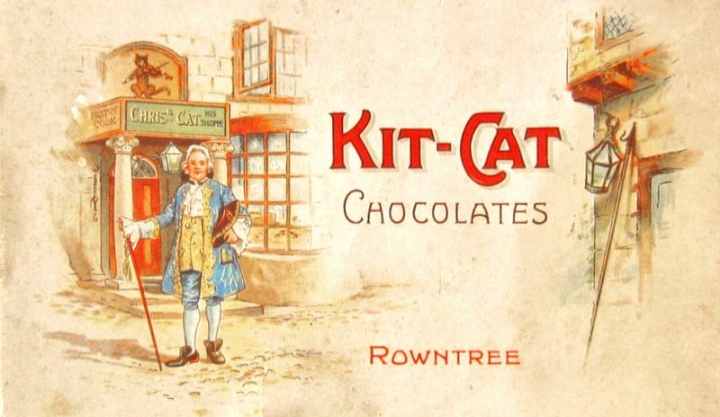
Apparently, Christopher Catt (sometimes called Catling) ran a tavern in Shire Lane, London, upon the spot where the grand Royal Courts of Justice now stand. In the early 1700s, he was renowned for his excellent ‘mutton pudding-pies’ which were the favourite meals of a group of influential young Whigs who regularly met at his establishment.
The Whigs were a party of eighteenth-century aristocratic liberals who thrived on political and literary debates and, at the time, were the only credible rivals to the Conservatives in Parliament. During the reign of Queen Anne (1702–1714), they advocated the supremacy of Parliament and supported the succession of a Protestant monarchy that would be independent of French and Catholic influences.
Christopher Catt’s delicious mutton pies became known as ‘Kit-Cats’, a simplified nickname, and the group of enthusiastic Whigs became so associated with their regular order of a round of Kit-Cats, that they were known as ‘The Kit-Cat Club’. The members included several Lords, Earls and Viscounts, as well as Enlightenment philosophers, notable playwrights and artists. Among them were physician and influential thinker, John Locke; distinguished architect, Sir John Vanbrugh; Sir Robert Walpole, who would become Britain's first ‘Prime Minister’; and the artist Sir Godfrey Kneller.
Over a two-decade period, the tradition evolved that Kneller would paint the portrait of notable members of the Kit-Cat Club and this series of what would be 48 portraits are the closest thing to a list of members that’s survived.
Kneller was already a notable artist and in much demand from wealthy patrons. King Charles II appointed him as the official portrait painter to the Royal Court. He had so much work that he founded a studio and established a template method of painting portraits that other artists adhered to for the next half-century.
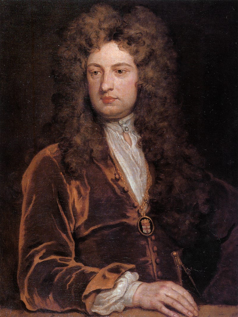
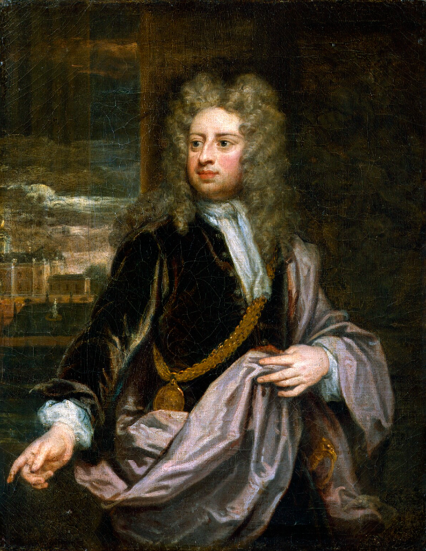
However, for portraits of his fellow Kit-Cat Club members, he introduced a distinctive new format that would become established as a third, formal format in addition to standard landscape and portrait proportions. The dimensions of what would become known as the Kit-Cat format were 28 by 36 inches. The ratio allowed for more of the torso, usually down to waist-level and including the subject’s hands, to be featured. His famed series of Kit-Cat portraits differed from the accepted standard and thus implied the subjects, his fellow Whigs, also challenged convention …as would the Rowntree chocolate bar centuries later!
…but, this association with the chocolate wafer snack may, indeed, be purely coincidental! It seems more likely that although the boxed Rowntree chocolate selection explicitly references Christopher Cat, maker of marvellous mutton pies, the KitKat brand was just as likely intended to associate the new snack bar with another establishment.
Situated in London’s Haymarket, the ‘new’ Kit Cat Club was an icon of the Roaring Twenties where international song and dance acts, jugglers, conjurers and acrobats, performed in opulent surroundings that comprised a restaurant, American bar, ballroom and lobbies. It soon became the most fashionable place in London for after-theater drinks, where the frivolity continued into the early hours. It was popular, newsworthy and also became notorious for bending the alcohol licencing laws.
When Rowntree’s adopted the new KitKat name and logo in 1937, it associated itself (not without irony) with the swinging, filthy-rich, reputation of the club whilst also linking to the earlier Rowntree brand and its historical connotations. The spelling was subtly changed for trademark reasons and so the repeated hard ‘K’ sound evoked the sound of swing-beat music and biscuits snapping.
With a design simplicity showing influences of both the British Arts and Crafts movement and the German Bauhaus, the wrapper around the foil featured a bold typographic logo in red and white that made it instantly recognisable wherever it was displayed.
Advertising campaigns would capitalise on the ritualistic opening of a KitKat: first sliding the paper O-wrapper off, to reveal the silver foil beneath that suggested luxury by its resemblance to an ingot of precious metal. Then, smoothing firmly under thumb or fingertip to magically delineate the chocolate fingers within as embossed ridges… Finally, the snapping of the bar so it neatly broke open the foil to release the aroma of cocoa.
The KitKat is a perfect case study of multidisciplinary design coming successfully together in harmony. The overall shape and proportions, the eye-catching label. An interactive element of unwrapping and snapping. The design of the food itself in terms of flavour, textures, colour and content… and the identification of an unfilled market niche that could satisfy a need that consumers were not even aware of.
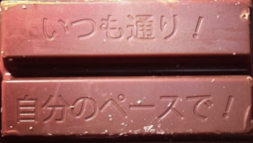
Finally, the name had added value in Japan where KitKat is one of the most popular snacks, available in a plethora of special and unexpected flavours including various teas, sweet potato, beans, pumpkin, chili, soy sauce, sake, and custard... KitKat are approached as a culinary art form and offered in boutique outlets were individual fingers can be prepared specially to order by an expert chocolatier. They sell in the millions to be given to students prior to exam days or to anyone embarking on a risky endeavour. You see, in Japanese, “Kit-Kat” sounds very much like “kitto-katsu,” which can be translated as, “never fail,” or, “sure to succeed!”
* All images are used with license or presented here for educational purposes under fair usage policy.


.jpg)
.jpg)
_1891.jpg)
.jpg)