THE ULTIMATE GUIDE — BUILD YOUR OWN FULL-STACK REACT APP
Learn how to use React-Router and Styled-Components to create a Landing Page, Profile, Signup/Login, About, Navbar, and Footer
Building the Frontend for a Milestone Referral Program (II/II)
This article is the second of a series of articles to develop, build, and deploy a full-stack app. The app itself is going to be a template for a milestone referral program. You can then easily customize the app for your use-cases. The idea behind a milestone referral program is that every referral somebody makes brings them closer to achieving a particular milestone and claim a prize. For our example, we are going to use cute kittens as milestones.
The series of articles are all intended as code-along articles and to be as self-contained as possible. There is a repo accompanying the series. In the repo, there will be at least one branch to reflect every step of the app development (medium series).
In part I, we have scaffolded a react app, swapped out some defaults, and built the first component. If you haven’t read part one, I advise you to go back there and quickly skim over it.
Alternatively, you can also download the GitHub repo as is at the end of part one.
Structure of this article
This article deals with setting up the foundation of our app and is the second (and last) part of the frontend series. We will only come back to the frontend later to connect it without a backend.
Table of contents:
- Recap: Main features and tech stack of the final app
- react-router
- styled-components
- Landing Page
- Signup/Login Modal
- Profile Page
- Navbar
- Footer
Recap: Main features and tech stack of the finished app
The idea behind this app is to serve as a basis for any milestone referral program. To increase the likelihood of referrals (i.e., signups), we have to make the process as seamless as possible and will thus include social login and sharing. To summarize the main features are:
- user management (creation, authentication, referral management)
- social login and sharing
- sending programmatic emails
I found many tutorials are covering parts of the journey, but no one is taking it upon itself to cover the complete journey from development to deployment.
This series is intended as an end-to-end series and will thus be based on an extended full-stack. For details on the different technologies used, check this overview from part I of the series.
React-Router

In the last part of this series, we hooked up our Milestones component directly with the app.js. However, as soon as we start adding new pages and components to our app, we need a way to structure that, i.e., include some form of page navigation. This is where react-router enters the scene.
React Router is a collection of navigational components that compose declaratively with your application. […] bookmarkable URLs for your web app
So let’s install react-router via:
yarn add react-router-domReact-router uses a handful of primary components. The most important one is the router itself. The router takes care of the routing within your app and typically wraps your entire or parts of your app. The second most important components are route matchers. Route matching components take care of keeping the URL part in sync with your application, i.e., when the URL changes, the matching component tells the app what to render. Let’s give it a try and change our App.js to look like this:
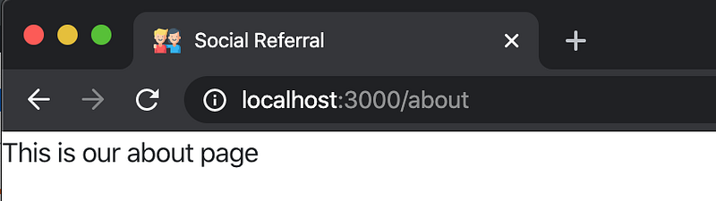
As you can see, we are referencing an about page that does not yet exist. Let’s create it real quick (i.e., create client/src/components/layout/About/index.jsx and client/src/components/layout/About/styles.js, where styles.js is going to be empty for now)
Perfect! Now if we yarn start our app, we will see that not much has changed. However, what is new is that if we change the URL to http://localhost:3000/about we will be directed to our newly created, blank about page. The redirect happens because we wrapped our about page with a route component with exact path="/about". This wrapper takes care of the URL-matching.
Styled Components
Before we move on, let’s quickly set up styled components and change our existing styles. The main argument for me to use styled components are:
- Usage of traditional CSS and not the slightly adopted pseudo-CSS passed to the styles prop. Using standard CSS also means that everybody knowing CSS can work on your designs. Whereas the JavaScript-CSS inline-styles are much less known.
- Ability to override styles locally. E.g., sometimes, you want to have a column with broader or narrower padding. Padding can be easily changed locally with styled-components but is a nightmare if you do it otherwise. Styles passed to the style prop might get ignored. That does not happen with styled-components.
- Ability to use pseudo-elements. CSS allows using pseudo-elements like
::before, ::after, ::first-line. Inline-CSS has not implemented pseudo-elements. - “Class collision tolerance,” since each
styled-componentcreates its unique class name. The resulting styles are narrowly scoped to the object they are styling. Additionally, you won’t have to worry about using class-names that some of your libraries are using. - Ability to use media-queries. With inline-CSS, it is not possible to use media queries easily.
styled componentsdon’t suffer such limitations. - Legibility. Since every
styled componentwraps an HTML element that is used in place of the unstyled HTML element, the number of characters used goes down a bit. Let’s prove that with an example:
Without styled-components:const topRightCorner = {
position: "absolute",
width: "40px",
height: "40px",
top: "-20px",
right: "-20px",
backgroundColor: "white"
}!! This is not CSS but a regular JavaScript object with special syntax !!const Example = () => {
return (
<div style={topRightCorner}>
Corner: 2/10
</div>
);
};With styled-components:const TopRightCorner = styled("div")`
position: absolute;
width: 40px;
height: 40px;
top: -20px;
right: -20px;
background-color: white;
`;!! This is just regular CSS!!
const Example = () => {
  return (
    <TopRightCorner>
      Corner: 2/10
    </TopRightCorner>
  );
};
In the case without styled-components we pass a style prop to the div tag, in the case with styled-components we use the wrapped div and rename it to something more descriptive. Let’s quickly adjust our Milestone styles and imports. For the sake of brevity, I have created a new branch on GitHub to reflect the changes. Check out the Milestone component and its styles.
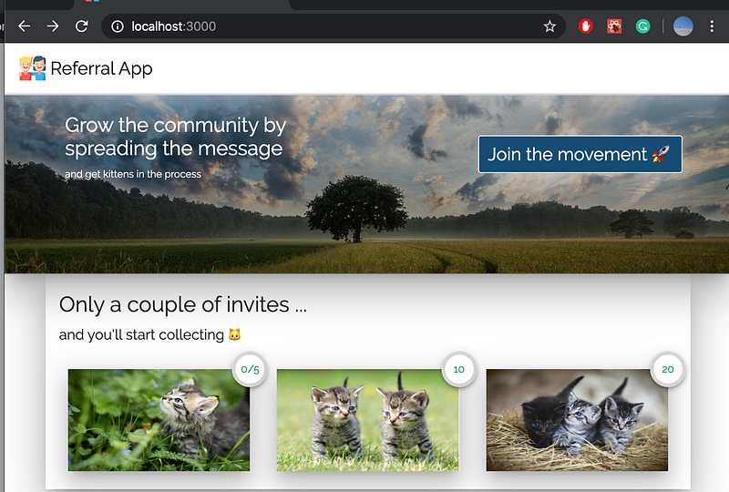
Landing Page
Alright, let’s go ahead and create a landing page, where we import our Milestones component. By now, you know the drill, let’s create a new folder in layouts called Landing in which you create a index.jsx (and a styles.js).
We also implement a small change in our Milestones component. Since we moved the container to the App.js we are going to remove it from Milestones.
Okay, we’ve got the structure set up, we can now add elements to our landing page.
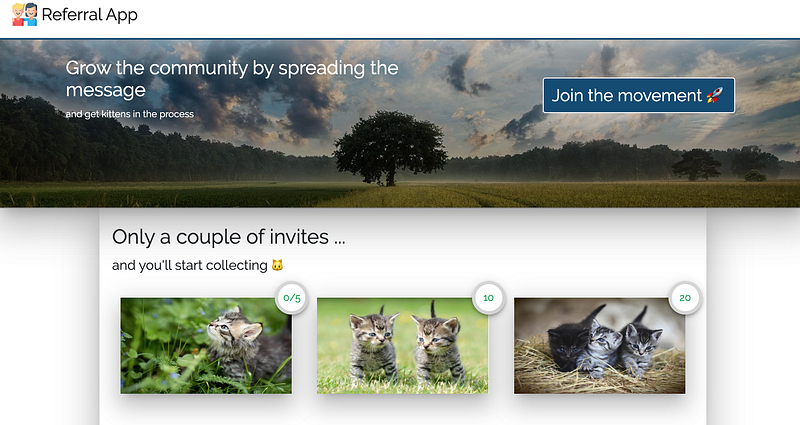
Cover Image
An image helps to draw attention and give the page some visual “oomph.” Again we stick to keeping our styles in a separate file. Let’s have a look at a part of the .jsx file:
and corresponding styles:
a couple of things stand out and are worth to be discussed:
- Gradient for the background image: The gradient adds a blackish transparent layer. Having the gradient makes sure that the text we put on top of it is legible.
- Device import:
deviceis an object we created in another file with device-specific media queries, e.g.${device.laptop} = `@media (min-width: 1024px)`we use those to make individual styles (like the size of our header) size-dependent. It’s a little bit easier to refer to and read this way.
The other styles are mostly there for aesthetic and placement reasons and could surely be implemented differently. After all, CSS is almost limitless in the options it offers.
Signup/Login Modal
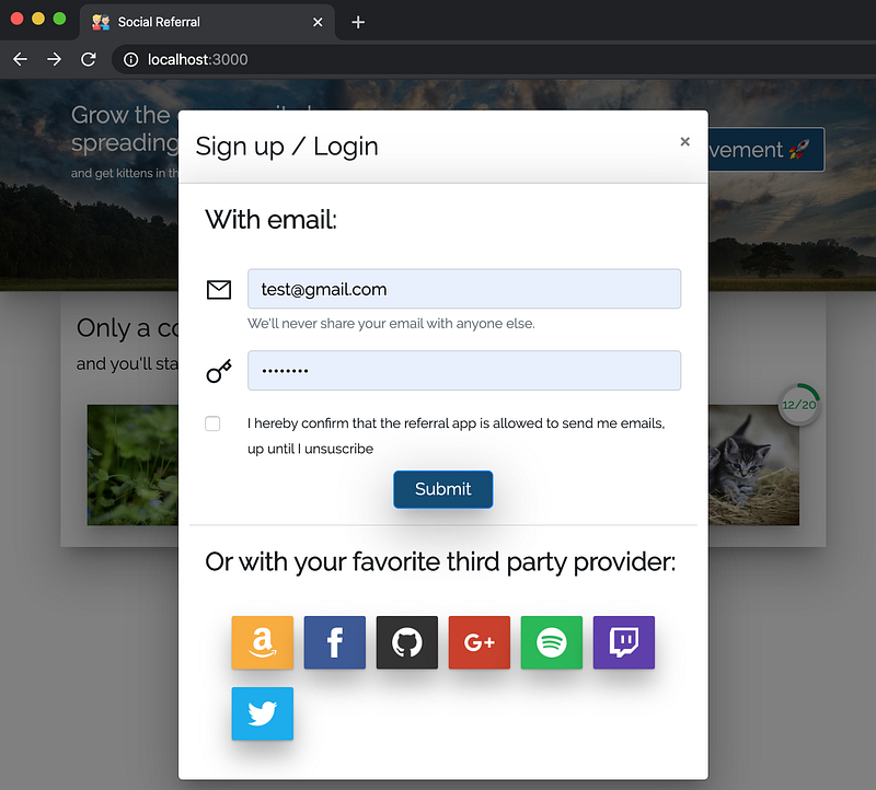
The pieces are slowly coming together! For our sign up / log in functionality, we are going to use a react-bootstrap modal. For now, we will exclusively focus on the layout. We will add the corresponding functionality as soon as we are moving to the backend part of this series.
Let’s create two new folders in src/components/layout:
- SignupLoginModal, and
- DelegatedAuthList
In both folders create an index.jsx and a styles.js. Additionally, we will create a folder called data in src/components. In this newly created data folder, we are going to create:
- a file called
providerData.js, - a folder called
icons
ProviderData
Let’s first talk about that data folder and its contents:
providerData.js contains a list of the third-party provider we want to allow authentication with. Every element in the list is an object specifying an img, name, href, alt, color, and txt. Most of them are relatively self-explanatory, but the href part deserves some explanation. The third-party provider wants to make sure that only registered apps can borrow their login capabilities. To guarantee that a third-party login attempt is legitimate, we will have to register our app with the provider first. After registration, we will receive a secret app id and a secret app key. Then every provider will get their unique backend endpoint, where the backend enriches requests with the corresponding secret app id and a secret app key. Since our backend will be accessible on different URIs depending on our environment, we use the process.env.REACT_APP_BACKEND_URI variable. For now, ignore this.
DelegatedAuthList
Let’s have a look at the component taking care of the visualization of our third-party login provider. Here we first import the providerData object, we then loop over every element in that list in DelegatedAuthList and create a DelegateAuthButton for every entry using the specified information.
SignupLoginModal
The modal code itself is fairly standard. I suggest you go over it in the corresponding GitHub repo. The one thing that should be explained, though, is how we open the modal. We add this part to our Landing/index.jsx
import React, { useState } from "react"; // useState is newconst Landing = () => {
const [show, setShow] = useState(false); // new... old code ...
<SignupLoginModal show={show} setShow={setShow} /> // new
... more old code ...}
React implemented Hooks in version 16.8. The useState allows adding state to an otherwise stateless component. Previously, when you wanted to add state to a functional component, you would have to turn it into a class, which would, in turn, make the code a bit messier.
In essence, when we set const [show, setShow] = useState(false), we define a variable and a function. Both the variable and the function are being passed to the modal but are bound to our Landing component. The variable determines whether or not we show the modal. The function controls the value of the variable.
Profile Page
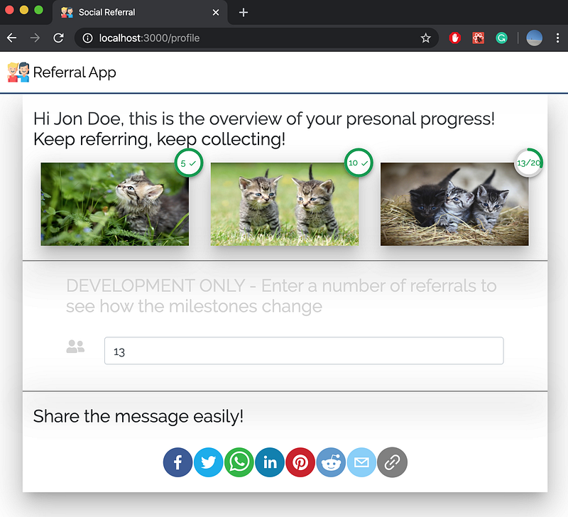
Our profile page is currently split into three sections. The first section is our Milestones component. Naturally, it makes sense to show people how close they are to achieving a particular Milestone. The second section is a development section where we allow to simulate the number of referrals somebody has. We will drop the development section in production and have our backend provide the count of referrals. The third section is the sharing section and houses all the functionality around sharing the links.
Interactive number of referrals (section one & two)
There is one functionality in Profile/index.jsx which is pretty typical of React and is worth explaining. In the development section, the number of simulated referrals can be changed, and the changes will be reflected immediately in the milestone progress bars, i.e., the component is reactive. Get it, react -> reactive? We do this by:
const [referrals, setReferrals] = useState(0); // adding state<MileStones referrals={referrals} /> // passing state to Milestones<Form.Control
type="number"
placeholder="Number of referrals you want to simulate"
onChange={e => {
e.preventDefault();
setReferrals(e.target.value);
}} // changing the state on change
/>Sharing functionality (section three)
The one thing we want to implement with the profile page right now is a sharing functionality because we want to make it as easy as possible for our users to invite their friends.
Luckily there is a library that helps to do exactly that. Let’s go ahead and yarn add react-share! We can now build a new component called ShareButtons. Let’s create a folder called ShareButtons in layouts. Again, we create an index.jsx file:
For now, we are going to use a default referral code in the ShareButtons/index.jsx, later on, this code is going to be informed by the user's personal referral code.
and a styles.js:
Navbar
The navbar is an element that sticks to the top of the screen no matter where in the app the user is. Adding a navbar with bootstrap is straight forward. Let’s add a new folder Nav in our layouts folder. Let’s then again create the index.jsx and the styles.js files.
Two more things to note: First, we have to import the Nav into our app and put it outside of the router like this:
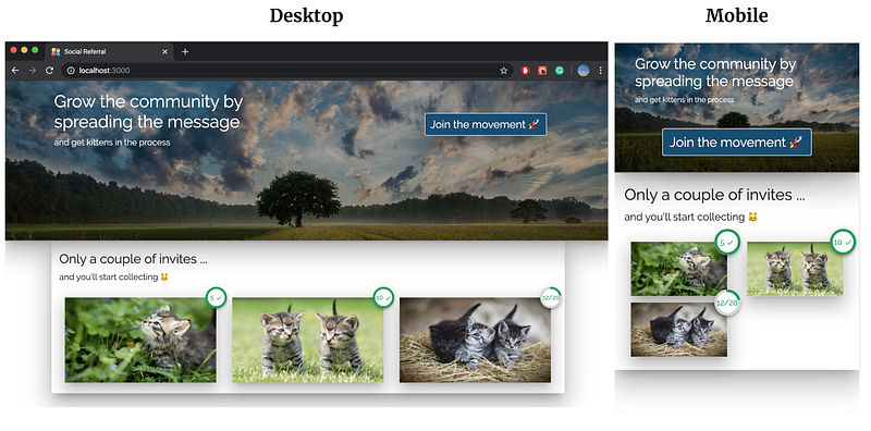
Second, we also have to adjust our landing page style as the image has moved up a bit. In Landing/styles.js change LandingBackground:
// from
background-position: 50% 50%;
// to
background-position: 50% 60%;Footer
Almost done. Adding a footer with bootstrap is also quite simple. We don’t want to overengineer it at this point, but rather make sure that we have the pages in place, once we fill them with content.
To create the footer component, let’s once again create a new folder, as well as the corresponding jsx and js file, in our layout directory. Let’s call the folder Footer.
As you can see we have chosen the sticky="bottom" property. This property is going to make the footer stick to the bottom of the page after the last element. However, this also means that when the last element does not cover the entire page, the footer will be somewhere in the middle. We can solve this by just giving our elements sensible min-height`s. E.g., for our landing page, we give the container a min-height of 800px.
Summary
In this article, you learn how to use react-router and styled-components to create beautiful and reusable components. You learned how to turn a list of objects into elements on the page for various social login provider we are going to use. Additionally, you learned how to create a landing page, profile page, signup/login modal, an about page, a navbar and a footer for the app we scaffolded in part I of this series.
Good job, and thanks for reading. See you next week, when we are going to start about hooking up the backend.
You can find the final repo here.


