
Building Supervised Machine Learning Streamlit Web App
Training/Testing SciKit-Learn Binary Classifiers, Hyperparameter Optimization (HPO) & Awesome SciKit-Plot/Yellowbrick ML Visualizations.

- This article is about building an interactive supervised Machine Learning (ML) web app with the Streamlit library in Python under the umbrella of Explainable AI (XAI).
- The core mission of XAI is to help build trust and confidence in ML models by making them more transparent.
- Streamlit is an open-source Python library that makes it easy to create and share user-friendly web apps for ML and data science applications [4–7].
- In this project, we’ll modify the ML web app [1] by incorporating the explainable SciKit-Plot and Yellowbrick ML diagnostics into the SciKit-Learn binary classification based on the Singular Vector Machine (SVM), Logistic Regression, Random Forest & HPO algorithms [1].
- SciKit-Learn is a common ML library in the Python environment, containing popular unsupervised and supervised regression and classification algorithms.
- SciKit-Plot [8,9] is a library based on sklearn and Matplotlib, primarily designed for visualizing well-trained models, with straightforward and easy-to-understand functionalities.
- Yellowbrick is a suite of visual analysis and diagnostic tools designed to facilitate machine learning with SciKit-Learn.
- Dataset: This dataset includes descriptions of hypothetical samples corresponding to 23 species of gilled mushrooms.
- Inspiration: What types of ML models and hyperparameter values perform best on this dataset? Which features are most indicative of a poisonous mushroom?
- Top real-world examples of deployed binary classification ML methods:
- Improved Multiple-Model ML/DL Credit Card Fraud Detection: F1=88% & ROC=91%
- 90% ACC Diabetes-2 ML Binary Classifier
- Comparison of 20 ML + NLP Algorithms for SMS Spam-Ham Binary Classification
- A Comparison of Scikit Learn Algorithms for Breast Cancer Classification — 2. Cross Validation vs Performance
- This article is structured as follows:
- Setup Your Environment
- Importing Python Libraries
- Preparing Input Data for ML
- Plotting ML Performance Diagnostics
- Training SciKit-Learn Binary Classifiers & HPO
- Complete ML Web App Demo
- Deploy Your App
- Conclusions
- References
- Explore More
Let’s get down to details of the proposed methodology.
Setup Your Environment
- Conda is a powerful CL tool for package and environment management.
- Let’s create and activate a new environment mushenv (e.g. using cmd on Windows)
conda create -n mushenv python=3.6.3 anaconda
conda activate mushenv
- To deactivate an environment on Windows, run
conda deactivate
- Let’s use the file requirements.txt
streamlit==0.61.0
vega-datasets==0.7.0
altair==4.1.0
scikit-image==0.15.0
scikit-learn==0.23.1
scipy==1.3.1
to specify the Python package requirements for the project by running the pip3 command
pip3 install -r requirements.txt
- Installing the additional data visualization Python libraries
pip3 install seaborn, yellowbrick, scikit-plot
- To list packages that are installed on your anaconda machine
conda list
- With pip3, list all installed packages and their versions via:
pip3 freeze
- On Windows, we can pipe this to
findstrto find the row for the particular package we're interested in
pip freeze | findstr seaborn
seaborn==0.11.2

pip freeze | findstr yellowbrick
yellowbrick==1.3.post1

pip freeze | findstr scikit-plot
scikit-plot==0.3.7- The first step is to create a new Python script. Let’s call it myapp.py.
- Open myapp.py in your favorite IDE or text editor and start adding the lines below.
- Upon completion: run this code as follows
streamlit run myapp.py

You can now view your Streamlit app in your browser.

  Local URL: http://localhost:xxxx
  Network URL: http://xxx.xxx.x.xxx:xxxx
Importing Python Libraries
- Importing all necessary libraries available to run the code successfully
from sklearn import metrics
import streamlit as st
import pandas as pd
import numpy as np
from sklearn.svm import SVC
from sklearn.linear_model import LogisticRegression
from sklearn.ensemble import RandomForestClassifier
from sklearn.preprocessing import LabelEncoder
from sklearn.model_selection import train_test_split
from sklearn.metrics import PrecisionRecallDisplay
from sklearn.metrics import precision_score, recall_score
from sklearn.metrics import ConfusionMatrixDisplay,confusion_matrix
from sklearn.metrics import RocCurveDisplay
import matplotlib.pyplot as plt
import seaborn as sns

import scikitplot as skplt

import sklearn
from sklearn.model_selection import train_test_split

from sklearn.ensemble import RandomForestClassifier, RandomForestRegressor, GradientBoostingClassifier, ExtraTreesClassifier
from sklearn.linear_model import LinearRegression, LogisticRegression
from sklearn.cluster import KMeans
from sklearn.decomposition import PCA

from yellowbrick.classifier import ClassificationReport
from yellowbrick.classifier import ClassPredictionError

from sklearn.metrics import plot_confusion_matrix, plot_roc_curve, plot_precision_recall_curve
from sklearn.metrics import precision_score, recall_score
Preparing Input Data for ML
- Defining the main window
def main():
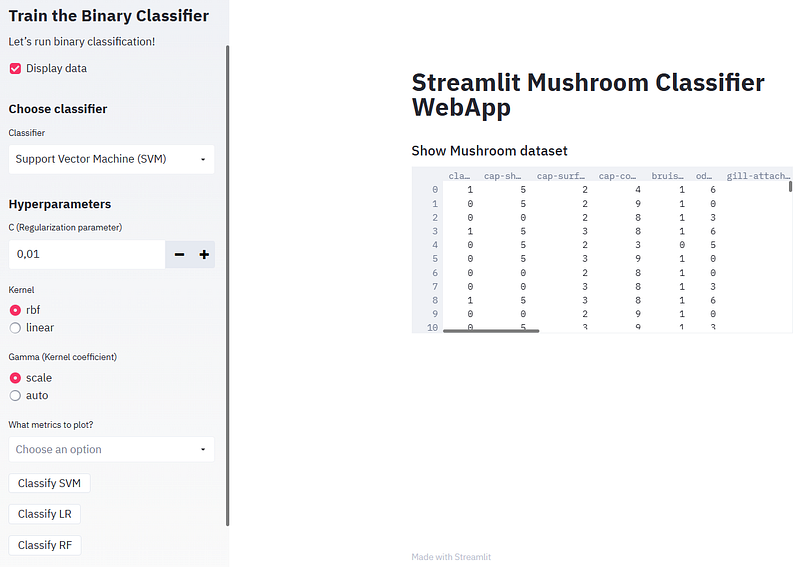
st.title('Streamlit Mushroom Classifier WebApp')
st.sidebar.title('Train the Binary Classifier')
st.sidebar.markdown('Let’s run binary classification!')
if __name__ == '__main__':
main()- Reading the input data
@st.cache(persist = True)
def load():
   data= pd.read_csv("data/mushrooms1.csv")
   label= LabelEncoder()
   for i in data.columns:
    data[i] = label.fit_transform(data[i])
   return data

df = load()

if st.sidebar.checkbox("Display data", False):
    st.subheader("Show Mushroom dataset")
st.write(df)- Train/test splitting the input data by defining the target variable type
@st.cache(persist=True)
def split(df):
   y = df.type
   x = df.drop(columns = ['type'])
   x_train, x_test, y_train, y_test =     train_test_split(x,y,test_size=0.3, random_state=0)
   return x_train, x_test, y_train, y_test
x_train, x_test, y_train, y_test = split(df)
Plotting ML Performance Diagnostics
- Defining the function plot_metrics of metrics_list
def plot_metrics(metrics_list):
if 'Confusion Matrix' in metrics_list:
st.subheader('Confusion Matrix')
plot_confusion_matrix(model, x_test, y_test, display_labels=class_names)
st.pyplot()
if 'ROC Curve' in metrics_list:
st.subheader('ROC Curve')
fig, ax = plt.subplots()
Y_test_probs = model.predict_proba(x_test)
skplt.metrics.plot_roc_curve(y_test, Y_test_probs,
title="ROC Curve",
ax=ax)
st.pyplot(fig)
if 'Precision-Recall Curve' in metrics_list:
st.subheader('Precision-Recall Curve')
fig, ax = plt.subplots()
Y_test_probs = model.predict_proba(x_test)
skplt.metrics.plot_precision_recall_curve(y_test, Y_test_probs,
title="Precision-Recall Curve",
ax=ax)
st.pyplot(fig)
if 'Elbow Plot' in metrics_list:
st.subheader('Elbow Plot')
fig, ax = plt.subplots()
skplt.cluster.plot_elbow_curve(KMeans(random_state=1),
x_test,
cluster_ranges=range(2, 20),
ax=ax);
st.pyplot(fig)
if 'Silhouette Analysis' in metrics_list:
st.subheader('Silhouette Analysis')
fig, ax = plt.subplots()
kmeans = KMeans(n_clusters=10, random_state=1)
kmeans.fit(x_train, y_train)
cluster_labels = kmeans.predict(x_test)
skplt.metrics.plot_silhouette(x_test,
cluster_labels,
ax=ax);
st.pyplot(fig)
if 'Learning Curve' in metrics_list:
st.subheader('Learning Curve')
fig, ax = plt.subplots()
kmeans = KMeans(n_clusters=10, random_state=1)
kmeans.fit(x_train, y_train)
cluster_labels = kmeans.predict(x_test)
skplt.estimators.plot_learning_curve(model, x_train, y_train,
cv=7, shuffle=True, scoring="accuracy",
n_jobs=-1, figsize=(6,4), title_fontsize="large", text_fontsize="large",
title="Learning Curve",ax=ax);
st.pyplot(fig)
if 'Calibration Plot' in metrics_list:
st.subheader('Calibration Plot')
fig, ax = plt.subplots()
lr_probas = LogisticRegression().fit(x_train, y_train).predict_proba(x_test)
rf_probas = RandomForestClassifier().fit(x_train, y_train).predict_proba(x_test)
gb_probas = GradientBoostingClassifier().fit(x_train, y_train).predict_proba(x_test)
et_scores = ExtraTreesClassifier().fit(x_train, y_train).predict_proba(x_test)
svm_scores=model.fit(x_train, y_train).predict_proba(x_test)
probas_list = [lr_probas, rf_probas, gb_probas, et_scores,svm_scores]
clf_names = ['Logistic Regression', 'Random Forest', 'Gradient Boosting', 'Extra Trees Classifier','SVM']
skplt.metrics.plot_calibration_curve(y_test,
probas_list,
clf_names, n_bins=15,
ax=ax
);
st.pyplot(fig)
if 'PCA Explained Variance' in metrics_list:
st.subheader('PCA Explained Variance')
fig, ax = plt.subplots()
pca = PCA(random_state=1)
pca.fit(x_train)
skplt.decomposition.plot_pca_component_variance(pca, ax=ax);
st.pyplot(fig)
if 'PCA 2D Projection' in metrics_list:
st.subheader('PCA 2D Projection')
fig, ax = plt.subplots()
pca = PCA(random_state=1)
pca.fit(x_train)
skplt.decomposition.plot_pca_2d_projection(pca, x_train, y_train,
ax=ax,
cmap="tab10");
st.pyplot(fig)
if 'KS Statistic' in metrics_list:
st.subheader('KS Statistic')
fig, ax = plt.subplots()
Y_probas = model.predict_proba(x_test)
skplt.metrics.plot_ks_statistic(y_test, Y_probas, ax=ax);
st.pyplot(fig)
if 'Cumulative Gains Curve' in metrics_list:
st.subheader('Cumulative Gains Curve')
fig, ax = plt.subplots()
Y_probas = model.predict_proba(x_test)
skplt.metrics.plot_cumulative_gain(y_test, Y_probas, ax=ax);
st.pyplot(fig)
if 'Lift Curve' in metrics_list:
st.subheader('Lift Curve')
fig, ax = plt.subplots()
Y_probas = model.predict_proba(x_test)
skplt.metrics.plot_lift_curve(y_test, Y_probas, ax=ax);
st.pyplot(fig)
if 'Classification Report' in metrics_list:
st.subheader('Classification Report')
fig, ax = plt.subplots()
viz = ClassificationReport(model,
classes=class_names,
support=True,
ax=ax)
viz.fit(x_train, y_train)
viz.score(x_test, y_test)
viz.show();
st.pyplot(fig)
if 'Class Prediction Error' in metrics_list:
st.subheader('Class Prediction Error')
fig, ax = plt.subplots()
viz = ClassPredictionError(model,
classes=class_names,
ax=ax)
viz.fit(x_train, y_train)
viz.score(x_test, y_test)
viz.show();
st.pyplot(fig)
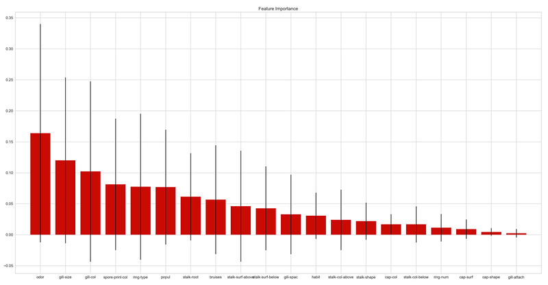
if 'Feature Importance' in metrics_list:
st.subheader('Feature Importance')
width = st.sidebar.slider("plot width", 1, 65, 30)
height = st.sidebar.slider("plot height", 1, 45, 15)
# fig, ax = plt.subplots(figsize=(80, 20))
fig, ax = plt.subplots(figsize=(width, height))
rf = RandomForestClassifier()
rf.fit(x_train, y_train)
# feature_names=list(x_train.columns)
feature_names=['cap-shape', 'cap-surf', 'cap-col', 'bruises', 'odor', 'gill-attach', 'gill-spac', 'gill-size', 'gill-col',
'stalk-shape', 'stalk-root', 'stalk-surf-above', 'stalk-surf-below', 'stalk-col-above', 'stalk-col-below', 'veil-type', 'veil-color',
'ring-num', 'ring-type', 'spore-print-col', 'popul', 'habit']
skplt.estimators.plot_feature_importances(rf, feature_names=feature_names,ax=ax,figsize=(12,5))
st.pyplot(fig)Training SciKit-Learn Binary Classifiers & HPO
- Defining the sidebar subheader, selectbox and the binary class names
st.sidebar.subheader("Choose classifier")
classifier = st.sidebar.selectbox("Classifier", ("Support Vector Machine (SVM)", "Logistic Regression", "Random Forest"))

class_names = ['edible', 'poisonous']- Implementing the Support Vector Machine (SVM) classifier
if classifier == "Support Vector Machine (SVM)":
st.sidebar.subheader("Hyperparameters")
C = st.sidebar.number_input("C (Regularization parameter)", 0.01, 10.0, step=0.01, key="C")
kernel = st.sidebar.radio("Kernel", ("rbf", "linear"), key="kernel")
gamma = st.sidebar.radio("Gamma (Kernal coefficient", ("scale", "auto"), key="gamma")
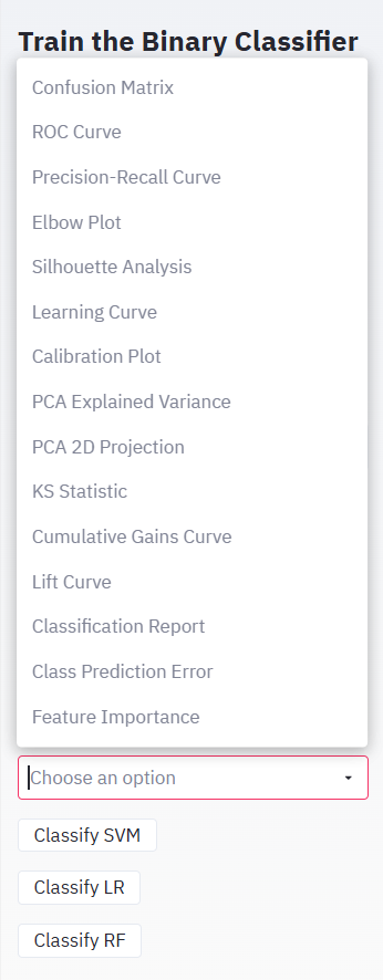
metrics = st.sidebar.multiselect("What metrics to plot?", ("Confusion Matrix",
"ROC Curve", "Precision-Recall Curve","Elbow Plot","Silhouette Analysis","Learning Curve",
"Calibration Plot","PCA Explained Variance","PCA 2D Projection","KS Statistic","Cumulative Gains Curve",
"Lift Curve","Classification Report","Class Prediction Error","Feature Importance"))
if st.sidebar.button("Classify SVM", key="classify1"):
st.subheader("Support Vector Machine (SVM) results")
model = SVC(C=C, kernel=kernel, gamma=gamma,probability=True)
model.fit(x_train, y_train)
accuracy = model.score(x_test, y_test)
y_pred = model.predict(x_test)
st.write("Accuracy: ", accuracy)
st.write("Precision: ", precision_score(y_test, y_pred, labels=class_names))
st.write("Recall: ", recall_score(y_test, y_pred, labels=class_names))
plot_metrics(metrics)- Implementing the Logistic Regression classifier
if classifier == 'Logistic Regression':
 st.sidebar.subheader("Model Hyperparameters")
 C = st.sidebar.number_input("C (Regularization Parameter)", 0.01, 10.0, step = 0.01, key = 'C_LR')
 max_iter = st.sidebar.slider("Maximum Number of Iterations", 100, 500, key='max_iter')
 metrics = st.sidebar.multiselect("What metrics to plot?", ('Confusion Matrix', 'ROC Curve', 'Precision-Recall Curve'))

if st.sidebar.button('Classify LR', key = 'classify'):
 st.subheader("Logistic Regression Results")
 model = LogisticRegression(C=C, max_iter = max_iter)
 model.fit(x_train, y_train)
 accuracy = model.score(x_test, y_test)
 y_pred = model.predict(x_test)
 st.write("Accuracy: ", accuracy.round(2))
 st.write("Precision: ", precision_score(y_test, y_pred, labels=class_names).round(2))
 st.write("Recall: ", recall_score(y_test, y_pred , labels=class_names).round(2))
plot_metrics(metrics)- Implementing the Random Forest classifier
if classifier == 'Random Forest':
st.sidebar.subheader("Model Hyperparameters")
n_estimators = st.sidebar.number_input("This is the no. of trees in forest", 100, 500, step = 10, key = 'n_estimators')
max_depth = st.sidebar.slider("The maximum depth of the tree", 1, 20, key='max_depth')
bootstrap = st.sidebar.radio("Bootstrap Samples when building Trees?" , ('True','False'), key='bootstrap')
metrics = st.sidebar.multiselect("What metrics to plot?", ('Confusion Matrix', 'ROC Curve', 'Precision-Recall Curve'))
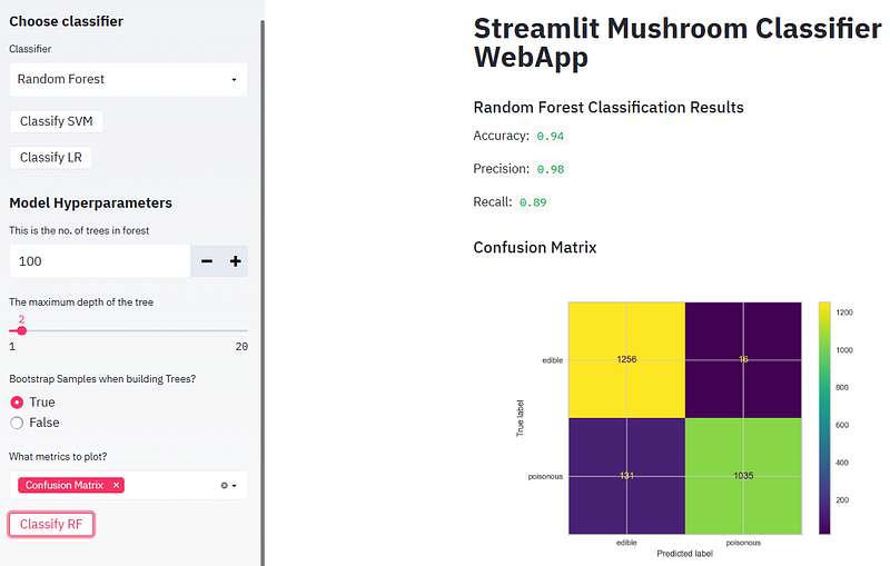
if st.sidebar.button('Classify RF', key = 'classify2'):
st.subheader("Random Forest Regression Results")
model = RandomForestClassifier(n_estimators=n_estimators, max_depth = max_depth, bootstrap=bootstrap, n_jobs = -1)
model.fit(x_train, y_train)
accuracy = model.score(x_test, y_test)
y_pred = model.predict(x_test)
st.write("Accuracy: ", accuracy.round(2))
st.write("Precision: ", precision_score(y_test, y_pred, labels=class_names).round(2))
st.write("Recall: ", recall_score(y_test, y_pred , labels=class_names).round(2))
plot_metrics(metrics)Complete ML Web App Demo
- Inspecting the input data by clicking on “Display data”
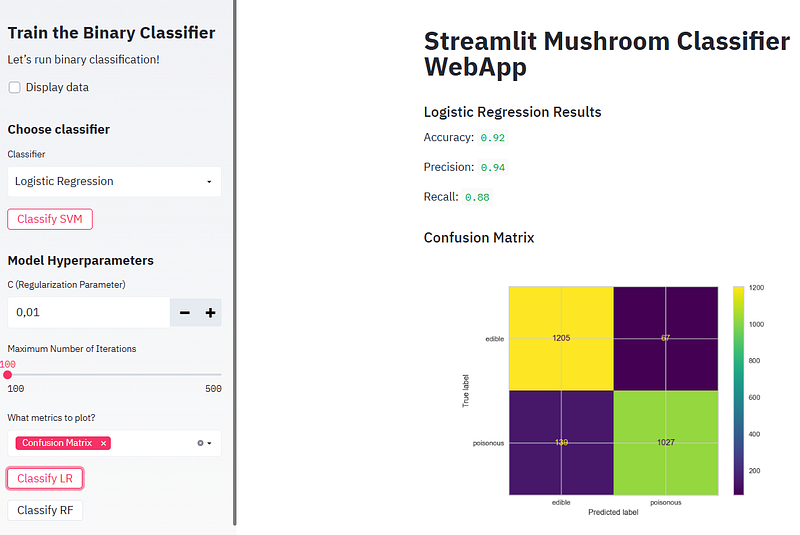
- Running SVM and plotting the confusion matrix
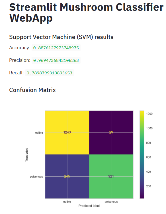
- In the above plot, the four quadrants are defined as True Negative (TN), True Positive (TP), False Positive (FP), False Negative (FN):
- True Negative: Whenever we say True, it means our predictions match the actuals. True Negative means both predictions and actuals are of a negative class.
- True Positive: Similarly when predictions and actuals are of positive class, it’s called a True Positive.
- False Positive: When a prediction is positive and the actual is negative it’s called a False Positive.
- False Negative: Similar to False Positive, False Negative is when the prediction is negative but the actual is positive.
- The confusion matrix thus represents the count of all TP, TN, FP, and FN instances.
- Consider other available ML performance options
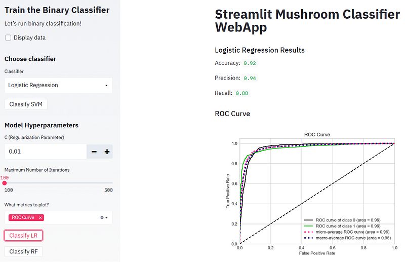
- Plotting the SVM ROC curve
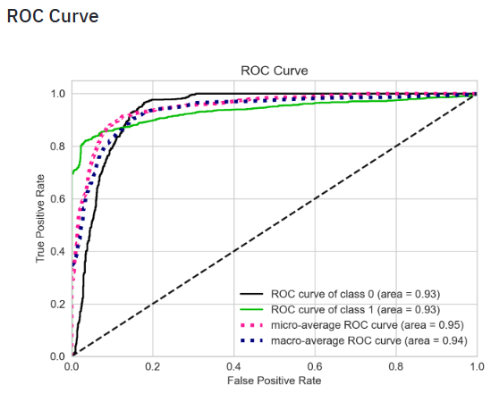
- ROC curve is a plot of the false positive rate (x-axis) versus the true positive rate (y-axis) for a number of different candidate threshold values between 0.0 and 1.0. Put another way, it plots the false alarm rate versus the hit rate. It describes how good the model is at predicting the positive class when the actual outcome is positive.
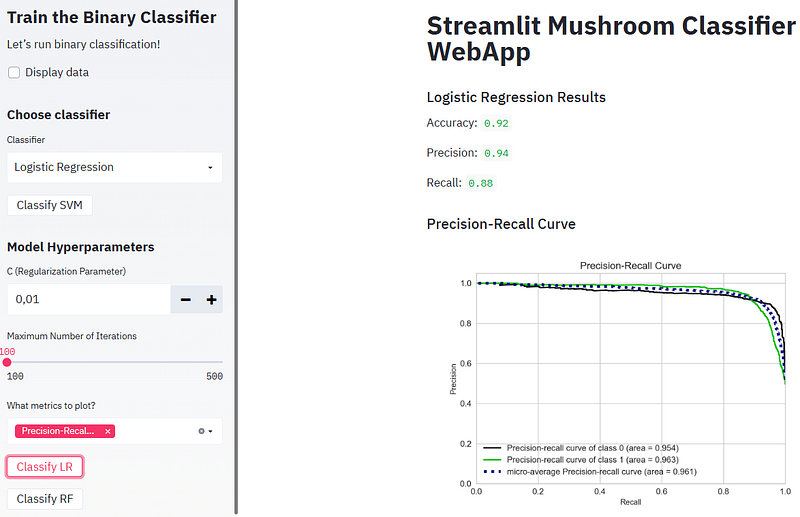
- Plotting the SVM Precision-Recall curve
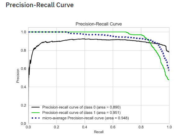
- The precision-recall curve shows the tradeoff between precision and recall for different threshold. A high area under the curve represents both high recall and high precision, where high precision relates to a low false positive rate, and high recall relates to a low false negative rate. High scores for both show that the classifier is returning accurate results (high precision), as well as returning a majority of all positive results (high recall).
- A system with high recall but low precision returns many results, but most of its predicted labels are incorrect when compared to the training labels. A system with high precision but low recall is just the opposite, returning very few results, but most of its predicted labels are correct when compared to the training labels. An ideal system with high precision and high recall will return many results, with all results labeled correctly.
- Plotting the Elbow Plot
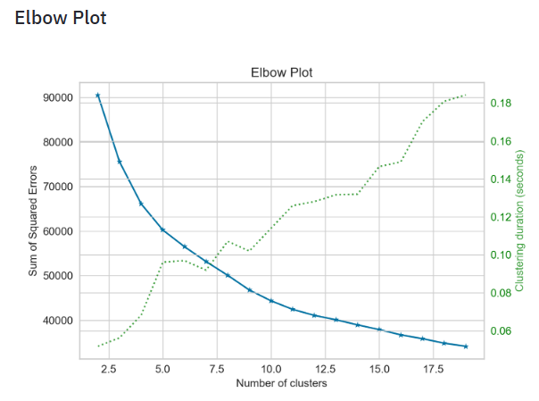
- The elbow method is a graphical representation of finding the optimal ‘K’ in a K-means clustering. It works by finding WCSS (Within-Cluster Sum of Square) i.e. the sum of the square distance between points in a cluster and the cluster centroid.
- Plotting the Silhouette Analysis
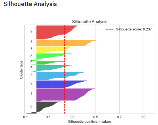
- Silhouette analysis can be used to study the separation distance between the resulting clusters. The silhouette plot displays a measure of how close each point in one cluster is to points in the neighboring clusters and thus provides a way to assess parameters like number of clusters visually. This measure has a range of [-1, 1].
- Silhouette coefficients (as these values are referred to as) near +1 indicate that the sample is far away from the neighboring clusters. A value of 0 indicates that the sample is on or very close to the decision boundary between two neighboring clusters and negative values indicate that those samples might have been assigned to the wrong cluster.
- In this example the silhouette analysis is used to choose an optimal value for
n_clustersabove the score of 0.237. - Also from the thickness of the silhouette plot the cluster size can be visualized.
- Plotting the SVM Learning Curve
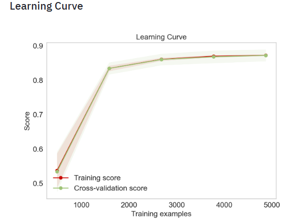
- Learning curves show the effect of adding more samples during the training process. The effect is depicted by checking the statistical performance of the model in terms of training score and testing score. To get an estimate of the scores uncertainty, this method uses a cross-validation procedure.
- Plotting the Calibration Plot: SVM, Extra Trees, Gradient Boosting, Random Forest, and Logistic Regression
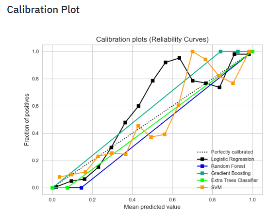
- Probability Calibration is a technique used to convert the output scores from a binary classifier into probabilities to correlate with the actual probabilities of the target class. here, we used the calibration_curve function from SciKit-Learn to compute the true positive rate and the predicted positive rate for a given set of predicted probabilities. We plotted these rates using the plot function from Matplotlib and added the 45-degree line to the plot to represent a perfectly calibrated classifier.
- Plotting the PCA Explained Variance
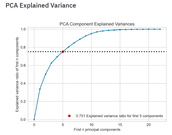
- The Cumulative Explained Variance plot is a graphical representation that shows the proportion of the dataset’s variance that is cumulatively explained by each component. The plot usually starts with the variance explained by the first principal component on the left. Each subsequent component adds to this cumulative value. Ideally, you want to choose a number of components such that you can capture a high percentage of the total variance with as few components as possible, which means a simpler model. Read more here.
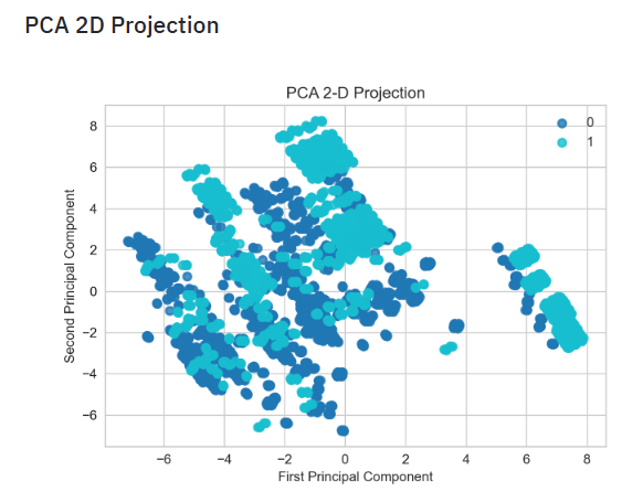
- Plotting the PCA 2D Projection
- Plotting the SVM KS Statistic
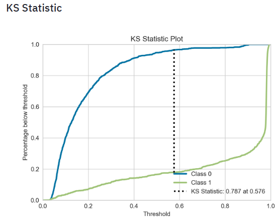
- The KS statistic plot, or the Kolmogorov Smirnov statistic plot, is a plot that tells you whether the model gets confused when it comes to predicting the different labels in your dataset.
- The KS statistic for two samples is simply the highest distance between their two CDFs, so if we measure the distance between the positive and negative class distributions, we can have another metric to evaluate classifiers.
- Read more here.
- Plotting the SVM Cumulative Gains Curve
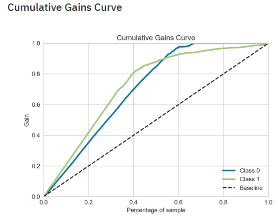
- The cumulative gains curve is an evaluation curve that assesses the performance of your model. It shows the percentage of targets reached when considering a certain percentage of your population with the highest probability to be target according to your model.
- To construct this curve, you can use the
.plot_cumulative_gain()method in thescikitplotmodule and thematplotlib.pyplotmodule. As for each model evaluation metric or curve, you need the true target values on the one hand and the predictions on the other hand to construct the cumulative gains curve. - Plotting the SVM Lift Curve
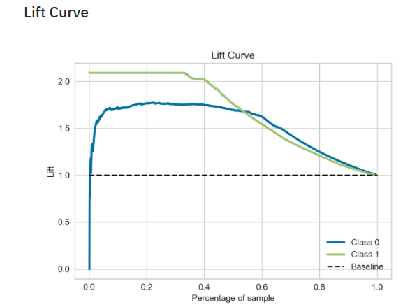
- The scikit-plot lift curve is used to determine the effectiveness of a binary classifier. A detailed explanation can be found at http://www2.cs.uregina.ca/~dbd/cs831/notes/lift_chart/lift_chart.html. The implementation here works only for binary classification.
- Plotting the SVM Classification Report
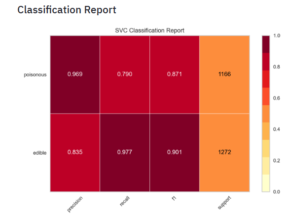
- The Yellowbrick classification report visualizer displays the precision, recall, F1, and support scores for the model. In order to support easier interpretation and problem detection, the report integrates numerical scores with a color-coded heatmap. All heatmaps are in the range
(0.0, 1.0)to facilitate easy comparison of classification models across different classification reports. - Plotting the SVM Class Prediction Error
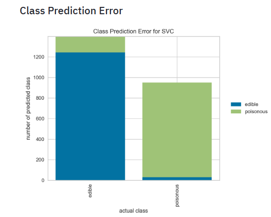
- The Yellowbrick Class Prediction Error chart shows the support for each class in the fitted classification model displayed as a stacked bar. Each bar is segmented to show the distribution of predicted classes for each class. It is initialized with a fitted model and generates a class prediction error chart on draw.
- Plotting the Random Forest (RF) Feature Importance
- Running RF and plotting the confusion matrix, ROC curve, and Precision-Recall curve
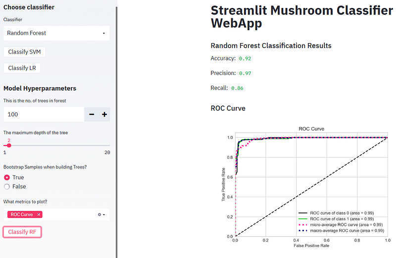
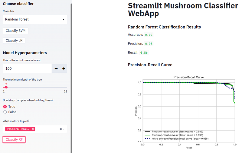
- Running Logistic Regression (LR) and plotting the confusion matrix, ROC curve, and Precision-Recall curve
Deploy Your App
- Streamlit Community Cloud (SCC) [3] lets you deploy your apps in just one click, and most apps will deploy in only a few minutes.
- SCC launches apps directly from your GitHub repo.
- Example: This article demonstrates the deployment of a basic Streamlit app to Streamlit Sharing.
- Streamlit Sharing is a powerful feature that allows developers to deploy and share their Streamlit apps with the world. This service, provided by SCC, simplifies the process of showcasing your data apps to a broader audience.
Conclusions
- We have built an interactive supervised ML web app with Streamlit and Python.
- We have implemented the most popular SciKit-Learn binary classification algorithms (SVM, Logistic Regression and Random Forest) with ML model tuning (HPO).
- We have tested and demonstrated the following SciKit-Plot and Yellowbrick XAI Features:
- Confusion Matrix
- ROC Curve
- Precision-Recall Curve
- Elbow Plot
- Silhouette Analysis
- Learning Curve
- Calibration Plot
- PCA Explained Variance
- PCA 2D Projection
- KS Statistic
- Cumulative Gains Curve
- Lift Curve
- Classification Report
- Class Prediction Error
- Feature Importance
- These are very powerful ML interpretation visuals that are widely used to explain the trained ML model behavior.
- In addition to supervised ML tasks, we have provided an explanation of how to perform clustering from data transformed using PCA. Clustering is an important component of data analytics for discovering patterns in multivariate datasets.
- We have shown that the present ML web app allows human users to comprehend and trust the results and output created by ML algorithms.
- The underlying transparent explainability of our product can help developers ensure that the system is working as expected, it might be necessary to meet regulatory standards, or it might be important in allowing those affected by a decision to challenge or change that outcome.
References
- Adrofier/Mushroom-Classification-using-Streamlit
- Kaggle Dataset: Mushroom Classification
- Deploying simple Streamlit apps
- Machine Learning Model Deployment as a Web App using Streamlit
- How to Deploy Machine Learning Models with Python & Streamlit
- Building a Machine Learning Web Application Using Streamlit
- Build a Machine Learning Web App with Streamlit and Python
- Scikit-plot Making Machine Learning Model Visualization Easier
- The Six Key Things You Need to Know About Scikit-plot
Explore More
- An Implemented Streamlit Crop Prediction App
- A Comparison of Binary Classifiers for Enhanced ML/AI Breast Cancer Diagnostics — 1. Scikit-Plot
- HPO-Tuned ML Diabetes-2 Prediction
- A Comparison of ML/AI Diabetes-2 Binary Classification Algorithms


