
Beyond the Cloud: 4 Visualizations with Python to use instead of Word Cloud
Creating 4 Visualizations with Python that can provide more information than Word Cloud

Word cloud is a visualization that can display a collection of words retrieved from text or document. Normally, text size and text color are used in Word Cloud to show words’ frequency. The result can get people’s attention at first sight.
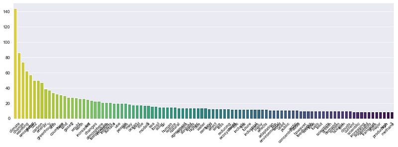
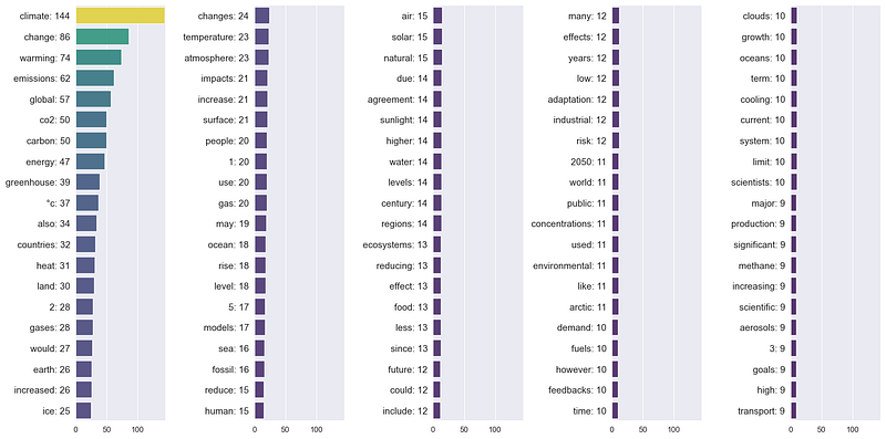
Talking about the Word Cloud characteristics, let’s compare the two graphs below. The first one is a Word Cloud containing the top 100 words of an article. The second is a bar chart comparing the amount of the same 100 words. It can be noticed that the words in the bar chart are hard to read. On the other hand, it can be seen that the Word Cloud is good at handling many words.
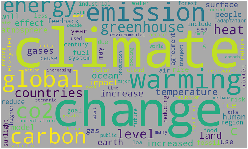
Word Cloud is able to handle many words and helps roughly compare the frequency.
However, the Word Cloud has some drawbacks. It is hard to tell which word appears more often than the others when dealing with too many words. Moreover, a document is usually composed of sections, such as paragraphs or chapters. Word Cloud shows only the words’ frequency of the overall document. It lacks providing details in each section.
This article will show 4 visualizations with Python code that can handle the limit of Word Cloud.
Let's get started…
Get data
For example, I will use text from the ‘Climate change’ article on Wikipedia. The environmental issue is a global phenomenon right now. I want to see what information we can get from this article—starting with importing libraries.
import numpy as np
import pandas as pd
import matplotlib.pyplot as plt
import seaborn as sns
import urllib
import re
import wikipedia
import nltk
from nltk.corpus import stopwords%matplotlib inlineContinue with downloading and cleaning the text.
wiki = wikipedia.page('Climatechange')
text = wiki.content
# Clean text
text_c = re.sub('[^A-Za-z0-9°]+', ' ', text)
text_c = text_c.replace('\n', '').lower()
text_cTo compare with the results from the four visualizations later, let’s create a Word Cloud with the obtained data. I followed the useful and practical steps from this insightful article: Simple word cloud in Python.
Prepare data
To make the process easy, we will define a function to create a DataFrame. Since we have to work with multiple words, using color will help us distinguish them. We will also define another function to get a color dictionary for use later.
Apply the function with the text to get a DataFrame
df_words = get_df(text_c)
df_words.head(10)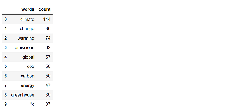
Visualization
Here comes the fun part. Besides creating the graphs, there will also be recommended methods to improve the results. The four visualizations that we are going to work with:
- Grid of bar charts
- Sunburst graph
- Treemap
- Circle packing
1. Turning multiple bar charts into a Grid of bar charts.
As mentioned before, a simple bar chart has a limit on displaying text due to having a small text area. We can rearrange them by creating multiple bar charts and combining them to save space.
Voila!!
Improve the Grid of bar charts by comparing topics
Documents are usually composed of sections, such as chapters or paragraphs. The Climate change article on Wikipedia also consists of many contents such as Terminology, Observed temperature rise, etc. Comparing word frequency between these sections will help us see more insightful details.
Start with manually creating a list of content and then use the list elements to slice the text.
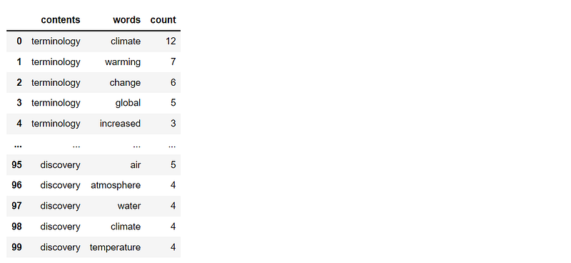
Next, cleanse the text and apply the defined function to get DataFrame from each text. In the code below, I will create a DataFrame containing the top 10 most frequent words from each DataFrame.
Prepare a color dictionary and a list of each DataFrame.
Now that everything is ready let’s get the Grid of bar charts containing the top 10 most frequent words from each content of the Climate Change article.
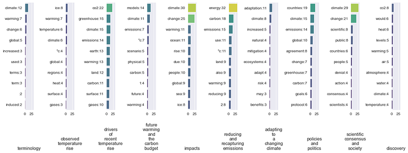
It can be seen that when looking at the whole article, ‘climate’ is the word that appears the most. However, when the article is divided following its contents, the term ‘Climate’ does not show up in the Reducing and recapturing emissions content. It turns out that ‘energy’ is the word that appears the most in this content.
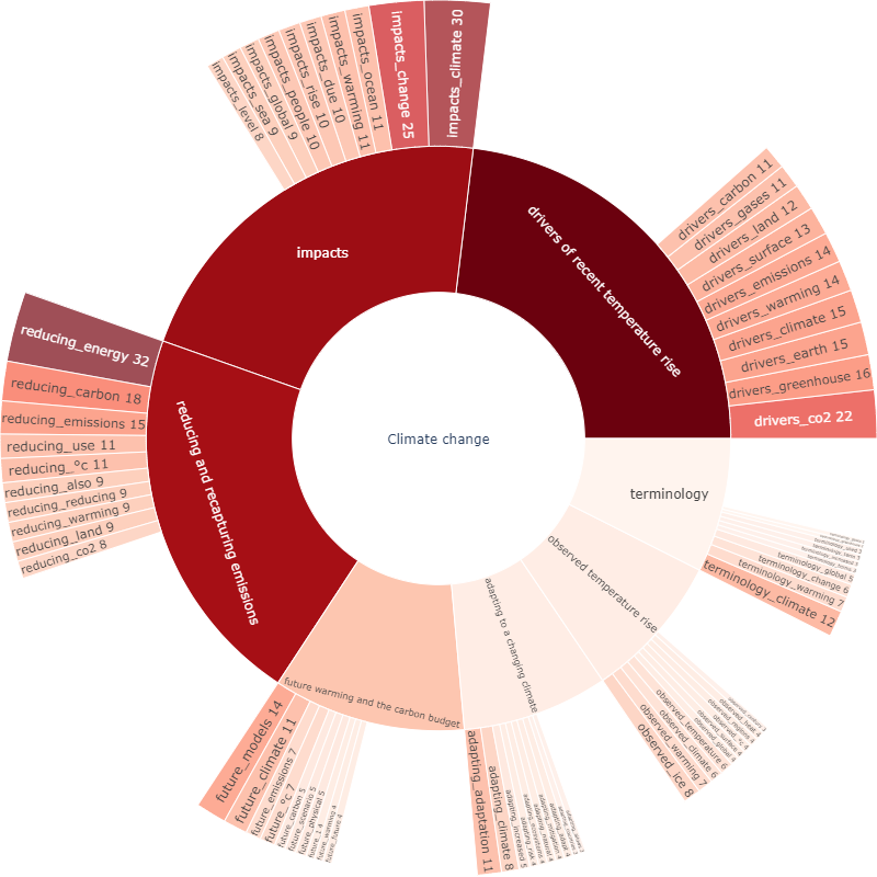
2. Increasing hierarchy from donut chart to Sunburst graph
The second visualization is the Sunburst graph. We are going to start with a Donut chart that has the same basic concept. The code below shows a simple way to create a Donut chart with Plotly.
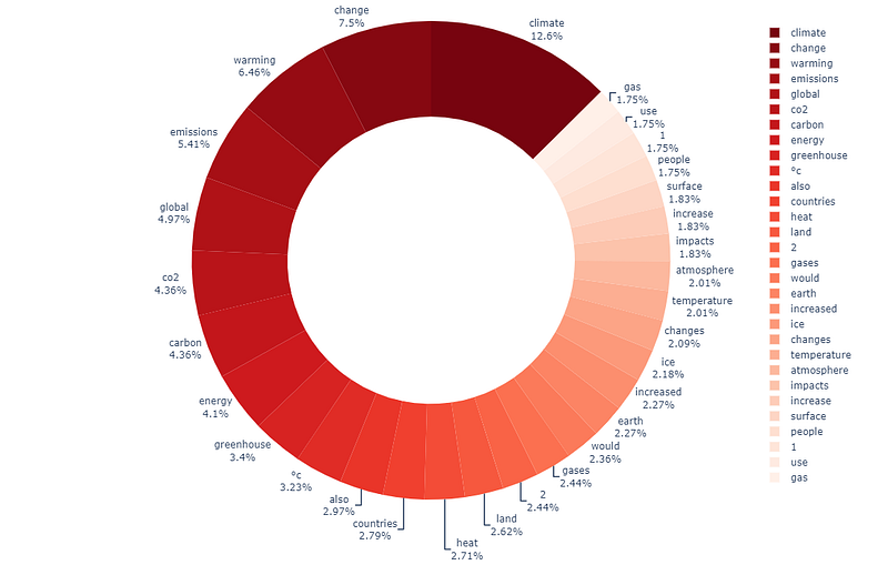
As a result, the donut chart is almost full with only 30 words. We can improve the donut chart by increasing the hierarchy of the graph from only one level to two levels. The first level is the contents, and the second level is the top 10 words of each content. Continue with preparing data.
Next, create a color dictionary for applying to each level.
Lastly, plot the Sunburst graph. A good thing about using Plotly is that the obtained chart is interactive. You can play with the result by clicking on the contents. For more information about creating the Sunburst graph: link.
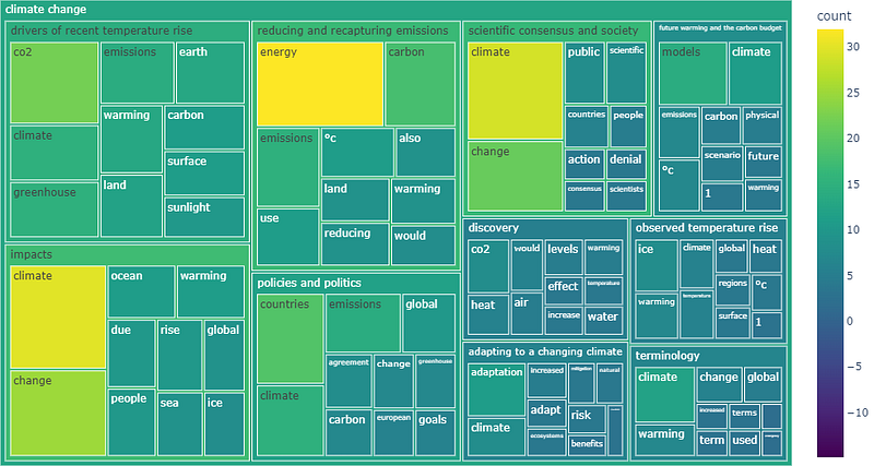
3. Using figures with Treemap
Treemap is an excellent graph to visualize hierarchical data using figures. The data we have so far is ready for plotting a Treemap. We can directly use the code below. Start with a simple treemap with the top 100 words.
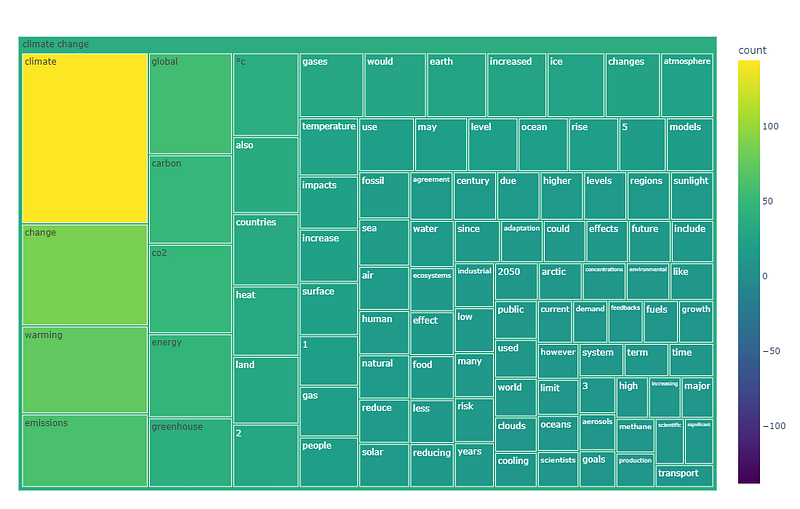
Improve Treemap: increasing hierarchy
Let’s go further by creating a treemap with hierarchies. The first level is the content and the second level is the top 10 words of each content. The result below is interactive. You can play with the graph by clicking on the contents. For more information about creating the Treemap: link.
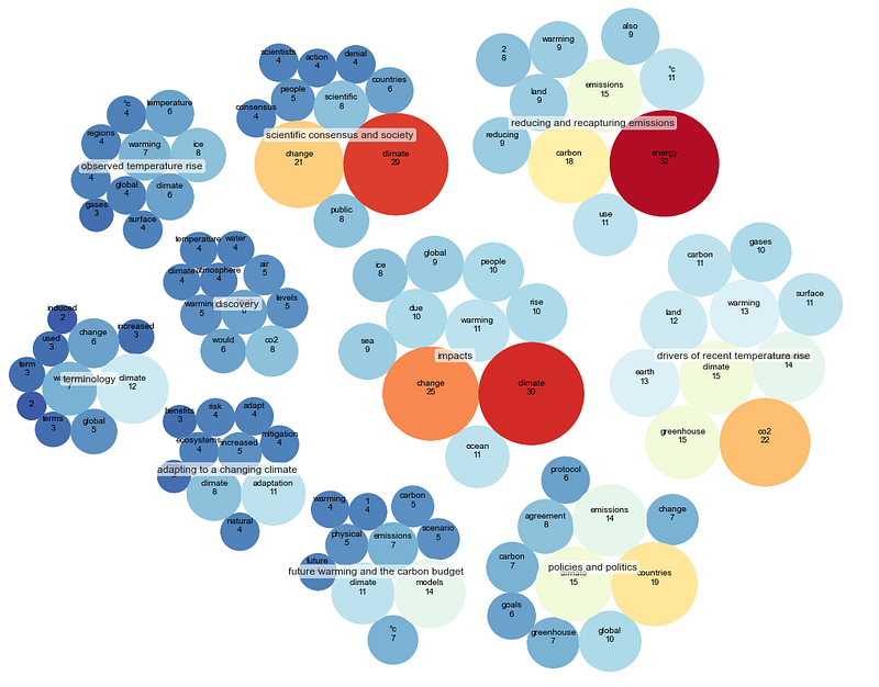
4. Grouping bubbles with a Circle packing.
The last visualization is circle packing. Practically, it is a bubble plot with no overlapping area. We will use the circlify library to calculate the bubbles’ size and position.
Plot the circle packing with the article’s top 30 words most appear.
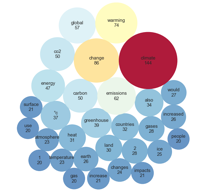
Improve Circle packing: clustering
The Circle packing can be improved by clustering each content’s top 10 words. To do that, we need to change the data format. The required format for calculating with the circlify library: ‘id,’ ‘datum,’ and ‘children.’
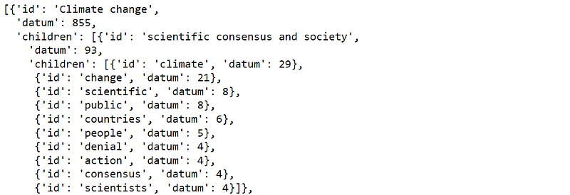
Use the circlify library to calculate each cluster’s bubbles’ size and position.
Finally, plot the Circle packing. For more information about creating the Circle packing: link
Ta-da!!
Summary
Word Cloud is another visualization that has its pros and cons. It is suitable for getting attention and can display many words. However, Word Cloud seems not to be a good choice for providing insightful information.
This article has shown 4 visualizations that can be used in place of Word Cloud. Besides being attractive and can handle many words, they can deliver more information. Besides showing the codes, this article has also recommended ways to improve them.
I’m sure there are other graphs not mentioned here that can be used to replace Word Cloud. This article just gives some practical ideas. If you have any questions or suggestions, please feel free to leave a comment.
Thanks for reading
These are other articles about data visualization that you may find interesting:
- 8 Visualizations with Python to Handle Multiple Time-Series Data (link)
- 9 Visualizations with Python that Catch More Attention than a Bar Chart (link)
- 9 Visualizations with Python to show Proportions instead of a Pie chart (link)
- Maximizing Clustering’s Scatter Plot with Python (link)
Reference
- Wikimedia Foundation. (2022, July 12). Climate change. Wikipedia. Retrieved July 16, 2022, from https://en.wikipedia.org/wiki/Climate_change
- Luvsandorj, Z. (2021, October 10). Simple wordcloud in Python. Medium. Retrieved July 16, 2022, from https://towardsdatascience.com/simple-wordcloud-in-python-2ae54a9f58e5


