
Maximizing Clustering's Scatter Plot with Python
Mix and match plots to get more information from a scatter plot

I'm a big fan of superhero movies. Typically, many superheroes have extraordinary abilities, bodies, or powers. However, some superheroes are just ordinary guys, for example, Tony Stark (aka Iron man).
The thing that makes him a superhero is the Iron man's armor. By suiting up with the equipment, he can do more things, such as flying or using the Unibeam.
Like Iron man, in data visualization, adding more components to a chart can provide more information to users. Theoretically, each type of chart has its purpose in presenting data with graphics or figures. Combining charts' characteristics may result in enhancing the result.

A scatter plot is a simple chart that uses cartesian coordinates to display values for typically two continuous variables. This chart is commonly used to show the results of some clustering analysis since it can exhibit the data points' positions and help distinguish each cluster.
To improve clustering scatter plot, this article will guide how to add different types of plots to provide more information.
Get data
Start with import libraries.
import numpy as np
import pandas as pd
import matplotlib.pyplot as plt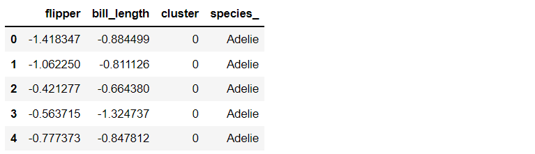
import seaborn as sns%matplotlib inlineFor example, I will work with the penguins' dataset that can be downloaded directly from the Seaborn library. This dataset contains data for three species of penguins, Adelie, Chinstrap, and Gentoo.
Get penguins dataset
df_pg = sns.load_dataset('penguins', cache=True, data_home=None)
df_pg.head()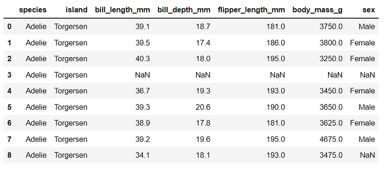
Explore the dataset with describe()
df_pg.describe()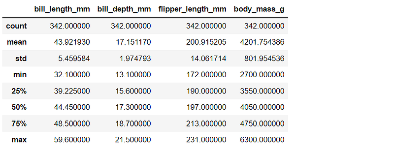
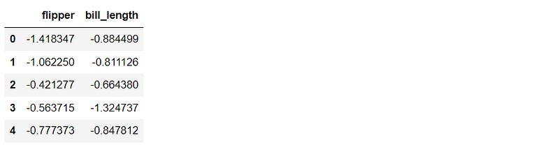
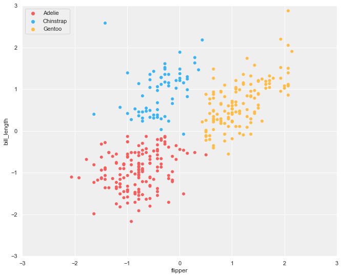
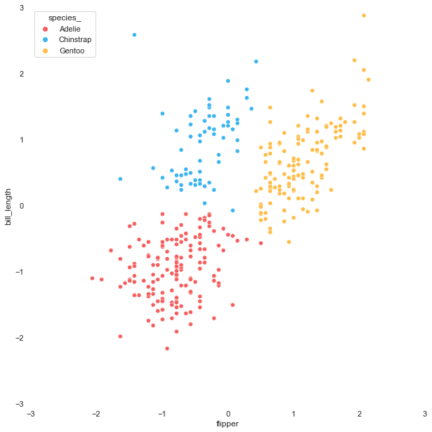
As a simple example, I will create a scatter plot using the flipper and bill length values. If you want to use different pair of variables or other datasets, please feel free to modify the code below.
In the explore step above, it can be noticed that each variable has different ranges. Before plotting, let's scale the values with StandardScaler.
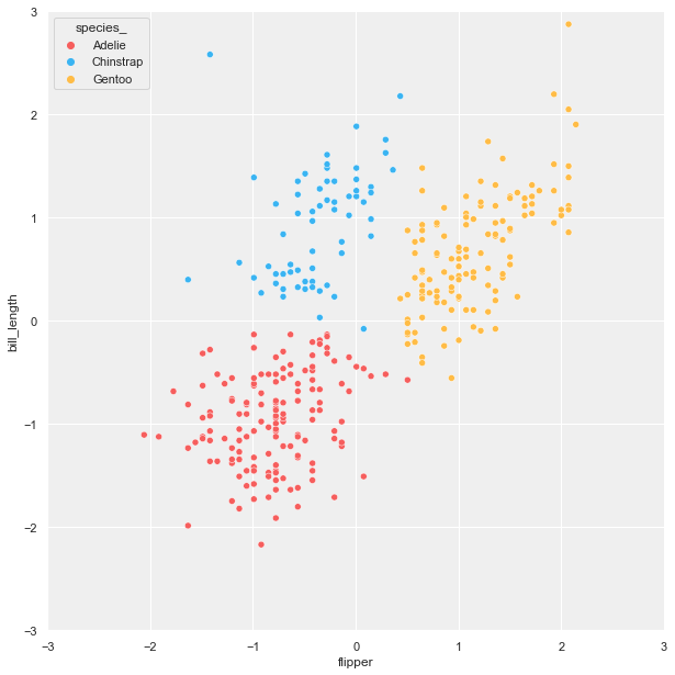
The three colors below will be used to visualize each cluster.
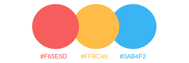
color_dict = {'Adelie':'#F65E5D',
              'Chinstrap':'#3AB4F2',
              'Gentoo':'#FFBC46'}
Clustering
This article will use the k-mean clustering. This unsupervised algorithm applies vector quantization to partition n data points, with the nearest mean (centroid), into k clusters.
There are also other clustering methods such as MeanShift, DBSCAN, etc. If you want to try different algorithms, more methods can be found here.
Apply the K-mean clustering with sklearn
Plot the scatter plot from the clustering result.
Selecting the type of plots for merging
In this section, I will explain the scatter plot and other plots that can be merged and how to create them. In total, there are five plots that we are going to work with:
- scatter plot
- KDE plot
- hexbin plot
- line plot
- regression plot
Scatter plot
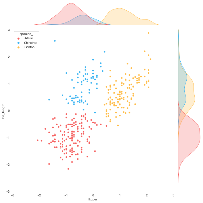
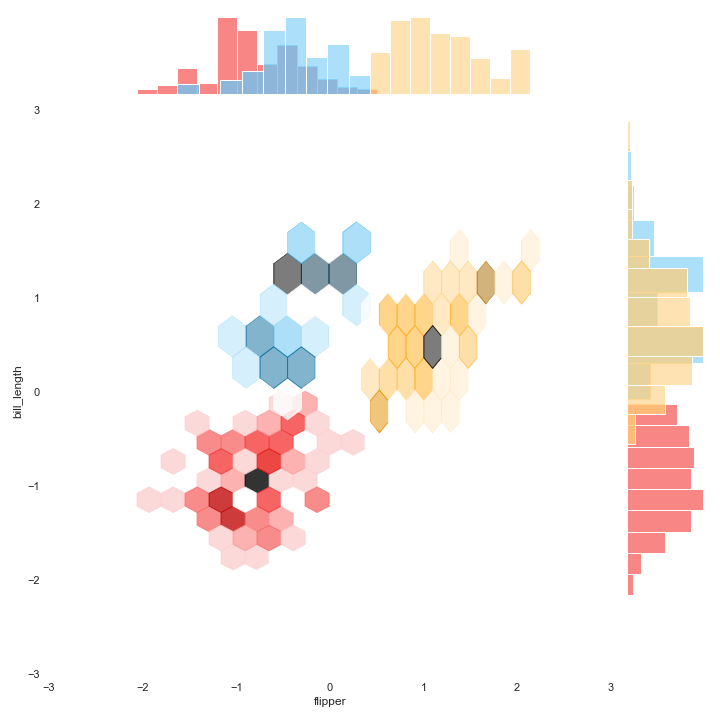
To perfectly fit the scatter plot with other plots, we are going to use the seaborn jointplot in which the 'kind' parameter can be set to obtain different data visualizations. By doing this, we can control the output format. Moreover, there is an option to show the relationship between two variables on marginal axes.
Let's start with creating three versions of the scatter plot for easily layering later. The first two plots are without marginal axes, one with a background and the other with transparent background. The last plot is with marginal axes with transparent background.
Please consider that the result will be exported onto your computer for import later.
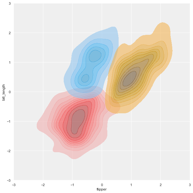
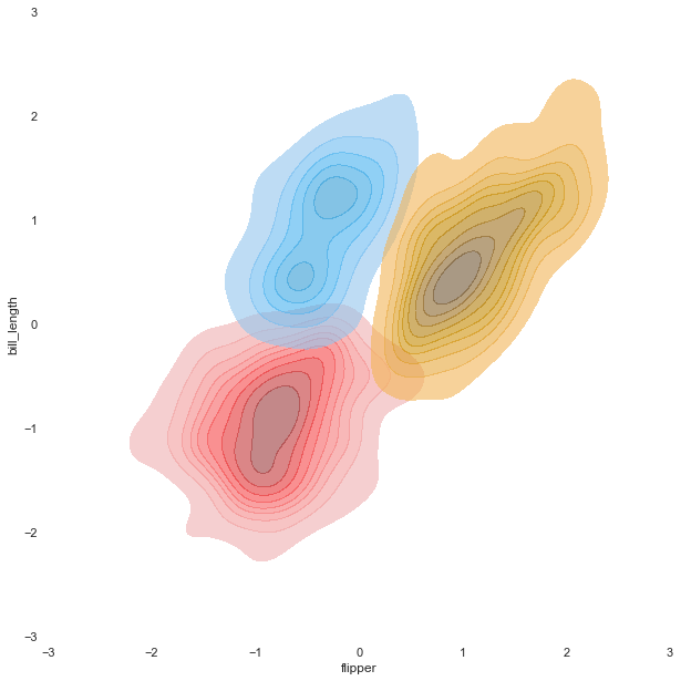
KDE plot
Theoretically, Kernel Density Estimation (KDE) is a method using the kernel function to estimate an unknown probability density function. The KDE plot visualizes the data by showing a continuous probability density curve in one or more dimensions.
KDE has the advantage of producing a less cluttered plot and is more interpretable, especially when drawing multiple distributions. However, it can introduce distortions if the underlying distribution is bounded or not smooth.
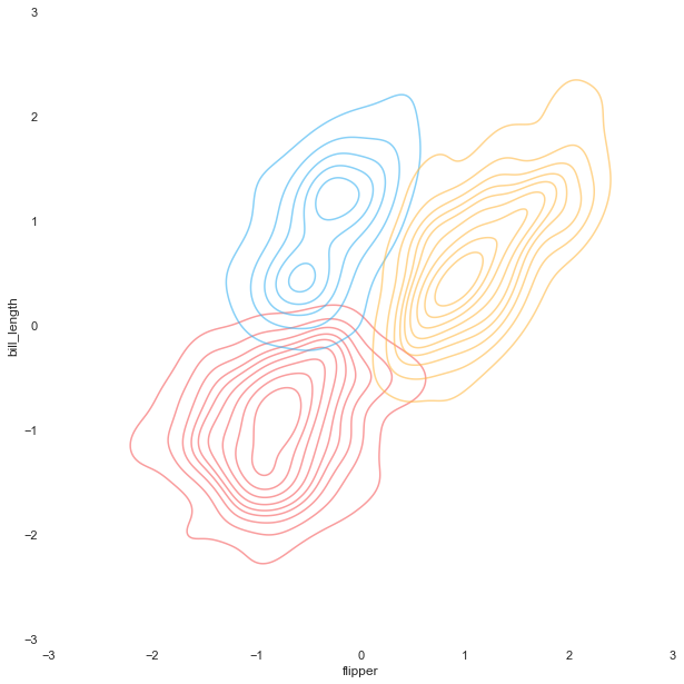
Like the scatter plot, we will create three different KDE plots for later use as a background or overlay. For the version with transparent background, we are going to make the KDE plots filled with and without colors.
Hexbin plot
A hexbin plot is a helpful data visualization that applies several hexagons to divide the area and uses a color gradient to represent each hexagon's number of data points.
Firstly, we need to create each cluster's hexbin plot individually and save each one with transparent background. The last step is merging them.
Image.open('hex_tr.png')
Image.open('j_hex_tr.png')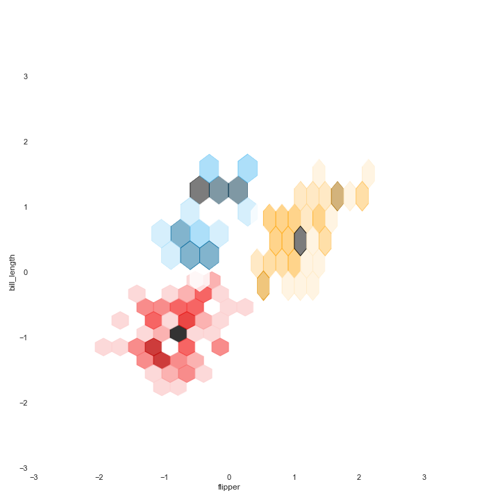
Line plot
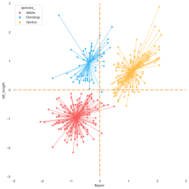
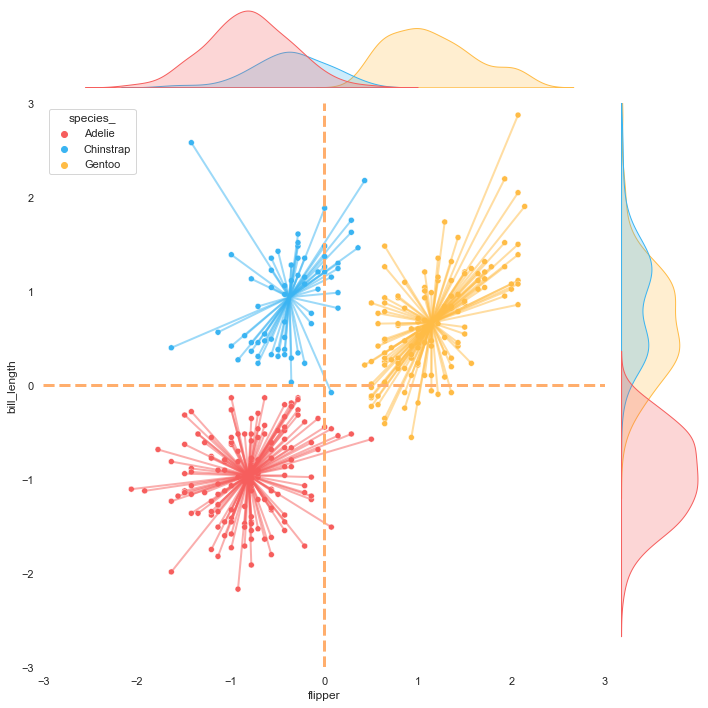
The K-means algorithm is a centroid-based clustering in which each cluster has its centroid. Showing the position of centroids can provide more insight into the scatter plot.
I found this practical and helpful article Visualizing Clusters with Python's Matplotlib, which demonstrates and recommends methods to connect data points with each cluster centroid. Moreover, the article also suggests showing average lines, which can help explain the result.
Let's draw lines from each data point to its centroid and create reference lines for showing the average on each axis. Before starting to plot the lines, we need to get the centroid values.
x_avg = df_std['flipper'].mean()
y_avg = df_std['bill_length'].mean()
centroids = [list(i) for i in list(kmeans.cluster_centers_)]
centroids#output:
#[[-0.8085020383937745, -0.9582361857580423],
# [-0.37008778973321976, 0.938075318440887],
# [1.1477907585857148, 0.6665893202302959]]Plot the lines
Regression plot
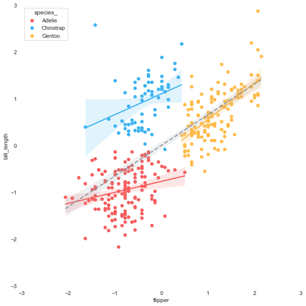
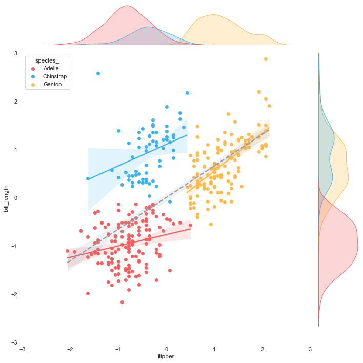
The purpose of this article is to maximize the scatter plot information. After getting the result of each cluster, we can go further by plotting the linear regression line of each group.
The linear regression can be easily fitted to each cluster by using the seaborn regplot.
Merging the plots
Here comes the fun part!! To facilitate the merging step, we will define a function using Image from Pillow, a useful library for working with images.
Now that everything is ready let's combine all the plots.
Merging 2 plots
#1 scatter plot + KDE plot
background = 'kde.png'
layer_list = ['scatter_tr.png']merge_plot(background, layer_list)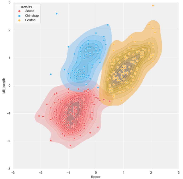
#2 scatter plot + hexbin plot
background = 'scatter.png'
layer_list = ['hex_tr.png', 'scatter_tr.png']merge_plot(background, layer_list)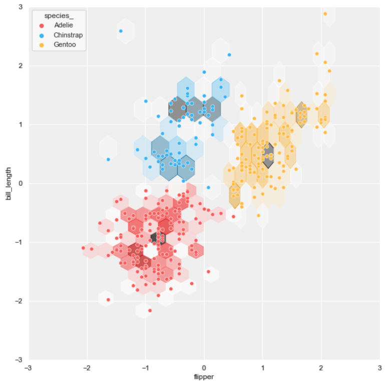
#3 scatter plot + regression plot
background = 'scatter.png'
layer_list = ['reg_tr.png']merge_plot(background, layer_list)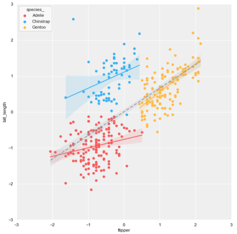
Merging 2 plots (based on joint scatter plot)
#4 joint scatter plot + KDE plot
background = ‘j_scatter.png’
layer_list = [‘kde_tr_fill.png’, ‘scatter_tr.png’]merge_plot(background, layer_list)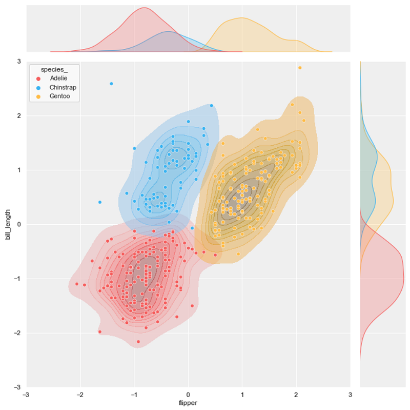
#5 joint scatter plot + hexbin plot
background = ‘j_scatter.png’
layer_list = [‘j_hex_tr.png’, ‘j_scatter_tr.png’]merge_plot(background, layer_list)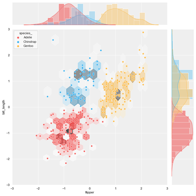
#6 joint scatter plot + regression plot
background = ‘j_scatter.png’
layer_list = [‘reg_tr.png’]merge_plot(background, layer_list)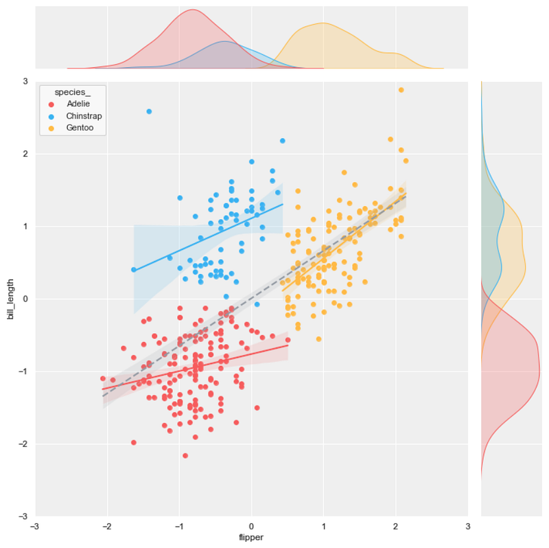
Merging 3 plots
#7 joint scatter plot + KDE plot + hexbin plot
background = 'j_scatter.png'
layer_list = ['kde_tr.png','j_hex_tr.png', 'j_scatter_tr.png']merge_plot(background, layer_list)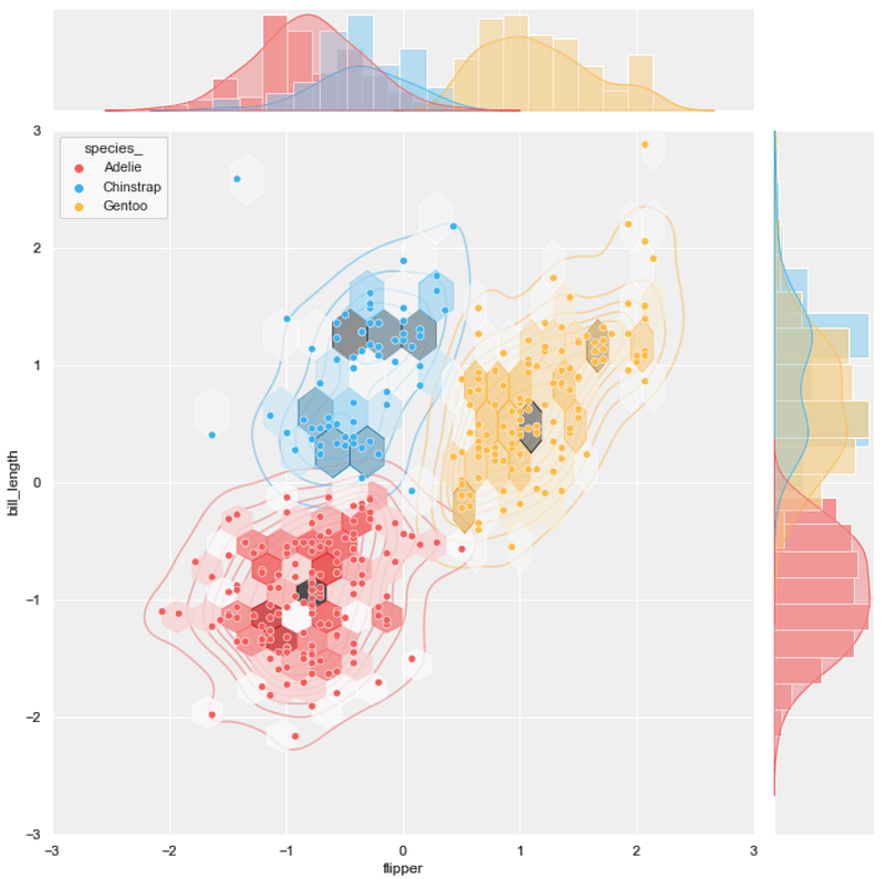
#8 joint scatter plot + KDE plot + regression plot
background = 'j_scatter.png'
layer_list = ['kde_tr_fill.png', 'reg_tr.png']merge_plot(background, layer_list)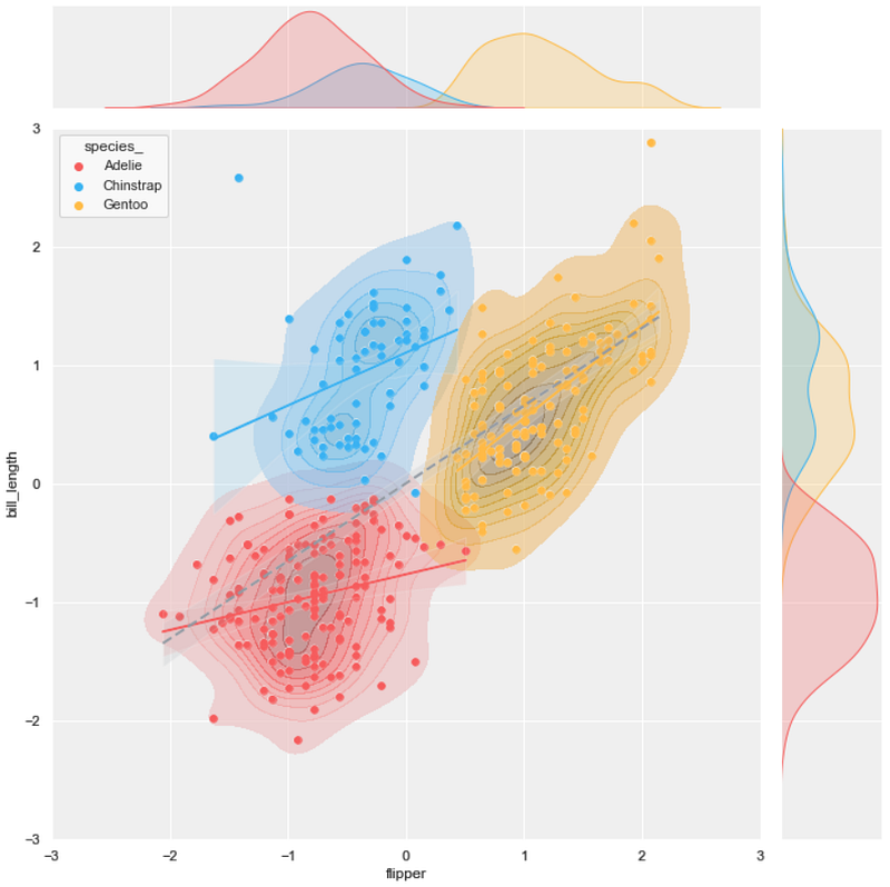
#9 joint scatter plot + hexbin plot + regression plot
background = 'j_scatter.png'
layer_list = ['j_hex_tr.png', 'reg_tr.png', 'j_scatter_tr.png']merge_plot(background, layer_list)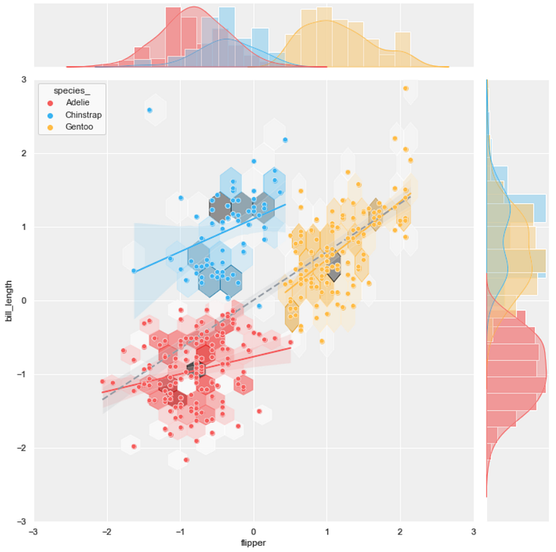
#10 joint scatter plot + hexbin plot + line plot
background = 'j_scatter.png'
layer_list = ['j_hex_tr.png', 'line_tr.png', 'j_scatter_tr.png']merge_plot(background, layer_list)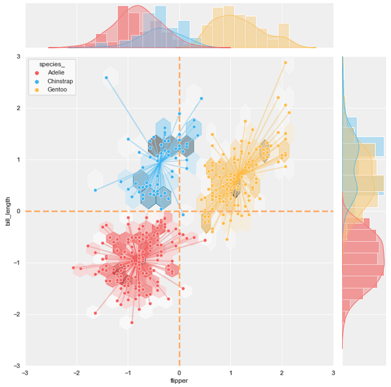
Merging 4 plots
#11 joint scatter plot + KDE plot + hexbin plot + line plot
background = 'j_scatter.png'
layer_list = ['kde_tr.png', 'j_hex_tr.png',
              'line_tr.png', 'j_scatter_tr.png']
merge_plot(background, layer_list)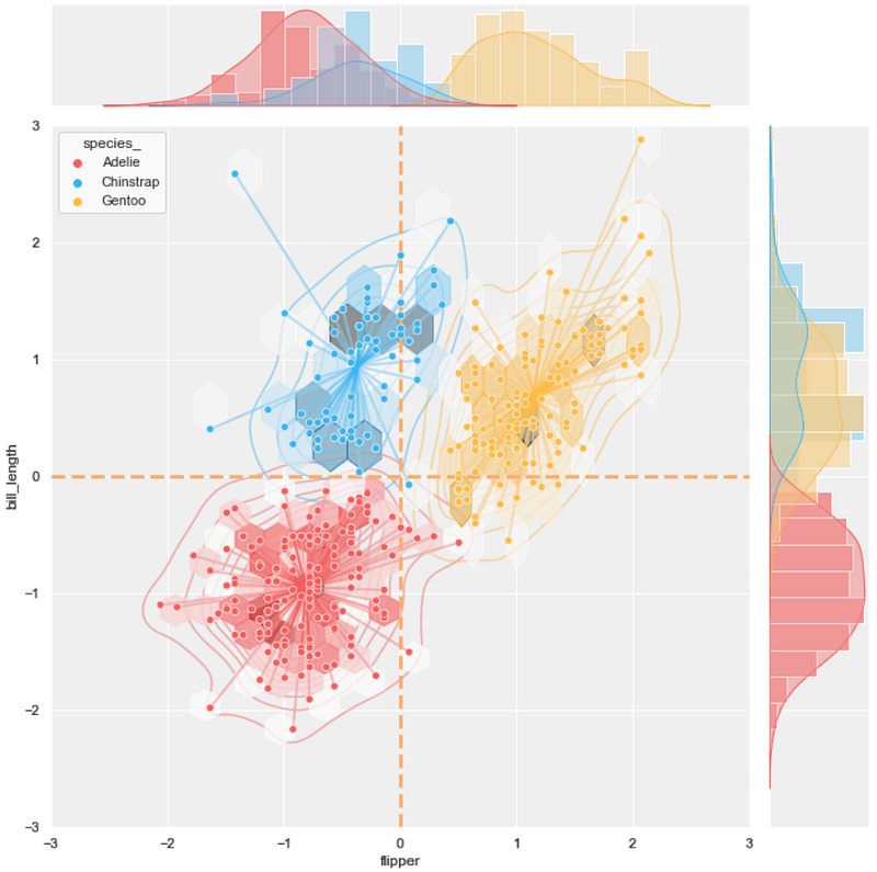
#12 joint scatter plot + KDE plot + hexbin plot + regression plot
background = 'j_scatter.png'
layer_list = ['kde_tr.png', 'j_hex_tr.png',
              'reg_tr.png', 'j_scatter_tr.png']
merge_plot(background, layer_list)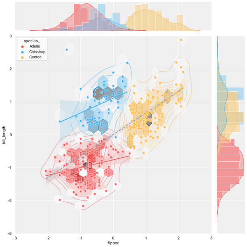
#13 joint scatter plot + hexbin plot + regression plot + line plot
background = 'j_scatter.png'
layer_list = ['j_hex_tr.png', 'reg_tr.png',
              'line_tr.png', 'j_scatter_tr.png']
merge_plot(background, layer_list)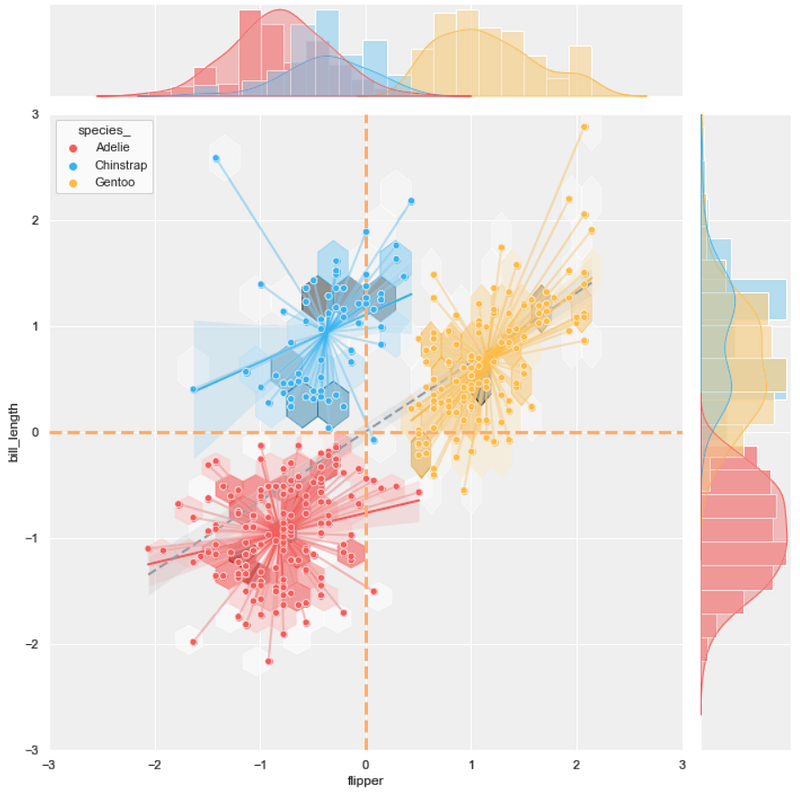
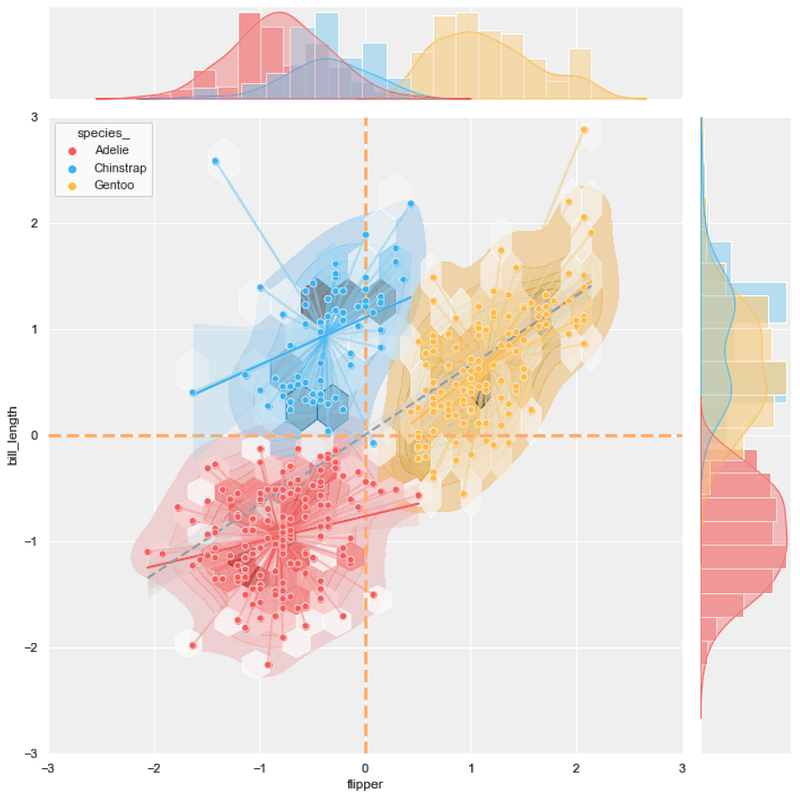
Merging 5 plots
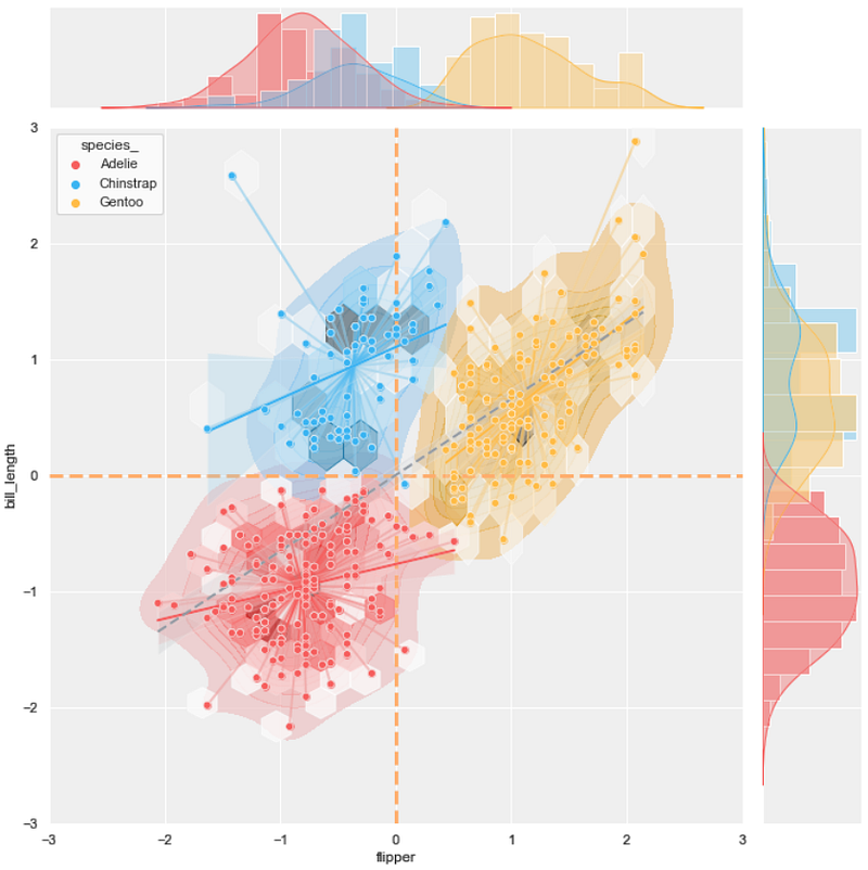
Lastly, it's time for the ultimate final combo!!
#14 joint scatter plot + KDE plot + hexbin plot + line plot + regression plot
background = 'j_scatter.png'
layer_list = ['kde_tr_fill.png', 'j_hex_tr.png', 'line_tr.png',
              'reg_tr.png', 'j_scatter_tr.png']
merge_plot(background, layer_list)
Voila!!
#15 joint scatter plot + KDE plot + hexbin plot + line plot (with no fill color) + regression plot
If the previous plot is too dense, let's try the KDE plot with no fill color.
background = 'j_scatter.png'
layer_list = ['kde_tr.png', 'j_hex_tr.png', 'line_tr.png',
              'reg_tr.png', 'j_scatter_tr.png']
merge_plot(background, layer_list)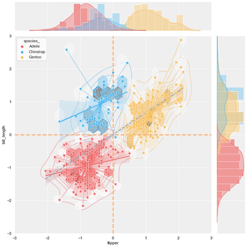
It can be seen in the last two results that some details can be modified to change the output. There are multiple ways to merge the five plots and create different results.
Discussion
This article aims to guide possible ways to extract more information from the scatter plot. By merging the four plots, which are the KDE plot, hexbin plot, line plot, and regression plot, into the scatter plot, it can be noticed that more information can be added to the result.
To improve the result further, there might be other types of charts, besides those mentioned here, that can be merged into the scatter plot. Moreover, the method explained in this article can also be applied to other data visualizations.
Lastly, you might expect me to conclude which one is the best or should avoid. All I can tell is that it is hard to decide since each person can find the usefulness of each combination differently. Some people may like the simple scatter plot, while others may find the multi-layer plots useful. It depends on many factors, so I will let you decide.
If you have any suggestions, please feel free to leave a comment.
Thanks for reading
These are other articles about data visualization that you may find interesting:
- 8 Visualizations with Python to Handle Multiple Time-Series Data (link)
- 9 Visualizations with Python to show Proportions or Percentages instead of a Pie chart (link)
- 9 Visualizations with Python that Catch More Attention than a Bar Chart (link)
- 6 Visualization Tricks with Python to Handle Ultra-Long Time-Series Data (link)
Reference
- Wikimedia Foundation. (2022, July 27). K-means clustering. Wikipedia. Retrieved September 19, 2022, from https://en.wikipedia.org/wiki/K-means_clustering
- Carvalho, T. (2022, August 19). Visualizing clusters with Python's matplotlib. Medium. Retrieved September 19, 2022, from https://towardsdatascience.com/visualizing-clusters-with-pythons-matplolib-35ae03d87489
- Seaborn.jointplot. seaborn.jointplot — seaborn 0.12.0 documentation. Retrieved September 20, 2022, from https://seaborn.pydata.org/generated/seaborn.jointplot.html


