
ASP.NET Core Blazor Components
Razor file: page components and non-page components
Table of Contents
• Component Class • Component Folder • Nested Components • Data Binding dan Event Binding • References
Blazor application is built based on components. Components represent parts of the user interface (UI) such as pages, dialogs, or forms. The component is a .NET class that: • Defines a flexible UI rendering logic. • Events handling. • Can be nested and reused. • Can be shared and distributed as a Razor class library.

Component Class
A component is implemented in a razor file type. Its name begins with an uppercase letter; for example, MyComponent.razor is valid but myComponent.razor is invalid. So, each razor file is a component.
The component uses a combination of HTML and C#. HTML is used to define UI, while C# is used for dynamic rendering logic, such as expressions, conditionals, and loops. When compiled, HTML and C# rendering logic is converted to component classes. The resulting class name is the same as the file name.
The component class members are defined in a @code block. The @code block specifies component state (properties, fields) with methods for (1) event handling or (2) defining other component logic.
Component Folder
Components can be placed anywhere in a project. Components that produce web pages are usually in Pages folder, while other components are often placed in Shared folder or special folder that is added to the project.
Look back at the discussion about Blazor Project Structure in the previous article.
Next is the Visual Studio screenshot that displays a list of components in the Pages folder and the Shared folder in the BlazorWebAssemblyApp project.
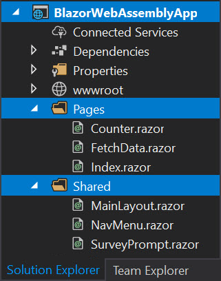
From the above screenshot appears that:
- The
Pagesfolder contains three files page components, these areCounter.razor,FetchData.razor, andIndex.razor. - The
Sharedfolder contains three files non-page components, namelyMainLayout.razor,NavMenu.razor, andSurveyPrompt.razor. - All component file names begin with uppercase letters and have
.razorextensions.
Nested Components
- A component can be nested and used by other components.
- The following is an example of how the
BlazorWebAssemblyAppapplication’s homepage is displayed.
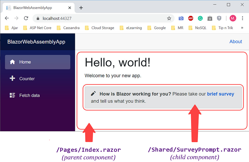
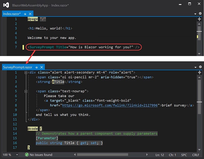
- The
Index.razorcomponent that is in thePagesfolder as a parent component uses theSurveyPrompt.razorcomponent that is in theSharedfolder as a child component. - Through the statement on line 7, the
Index.razorcomponent sends theTitleparameter value to theSurveyPrompt.razorcomponent. - The
@codeblock of theSurveyPrompt.razorcomponent accepts theTitleparameter value. - HTML in lines 1 to 11 of the
SurveyPrompt.razorcomponent renders the display in the form of a pencil icon,Titleparameter value, and a link to the survey page https://go.microsoft.com/fwlink/?linkid=2127996.
Data Binding dan Event Binding
The following page appears when the Counter menu is selected.
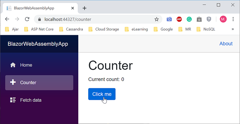
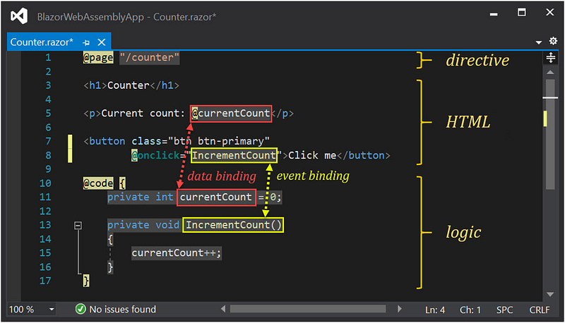
- The
Counter.razorcomponent consists of three parts, namely directive, HTML, and logic. - The
Counter.razorcomponent is run when theCountermenu is selected. - Each time the
Click mebutton is clicked, theIncrementCount()function on the@Codeblock is called, and the value of thecurrentCountvariable increases by one. - Statement line 5 in the HTML section will display the new
currentCountvariable values. - The binding between the
IncrementCount()function in the logic section on line 13 and the event that calls it in the HTML section on line 8 is called the event binding. - The binding of
currentCountvariable data in the logic section at line 11 with its output in the HTML section at line 5 is called data binding. - Event binding and data binding will be discussed separately on other occasions.


