
Apple’s macOS Ventura Is a Lot of the Same Because Apple Isn’t Stupid
If it ain’t broke…
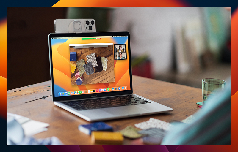
Apple recently released macOS 13 Ventura as the successor to macOS 12 Monterey. This release of macOS brought with it more than a few new features that I’ve already started to enjoy. But more importantly, Ventura is a lot of the same as we had in Monterey, and that’s good.
Ventura isn’t meant to be a complete overhaul
While I have little doubt that some people would love to see Apple redesign aspects of macOS from the ground up, Ventura isn’t that. MacOS Ventura represents the next step toward Apple’s vision for a more seamless and unified Apple ecosystem and brings better feature parity with the iPhone and iPad.
But unlike some past releases of macOS, Ventura doesn’t look or feel much different from Monterey or even Catalina. In fact, just the other day, I asked a client how she’s liking macOS Ventura on her MacBook, and she replied that she really hasn’t seen anything different.
That doesn’t mean that there aren’t new features and good things there, but the user experience is the same enough that those who aren’t weird like me can keep trucking along using their Macs without having to think too much about what version of the OS they’re using.
I argue that’s a very good thing.
Ventura comes with quite a few nice new features — some of which excite me, more than others. But the user experience? Pretty much the same as in Monterey.
Change for the sake of change is dumb
Over the years, Microsoft has made change after change to its software and operating systems for seemingly arbitrary reasons.
Microsoft seems to feel the need to change things up with every major release. Just compare the user interface of Windows 8 with Windows 10 and now with Windows 11. Each of those three versions of Windows looks and feels very different in key ways from the other two, and that’s been a source of no small amount of frustration for many people — myself included.
If you have been a user of Microsoft Office for many years, you likely remember many of the strange and arbitrary user interface changes that Microsoft has forced on us over time. Even recently, they’ve yet again changed the layout of Microsoft Outlook so that certain UI elements are in a completely different location from where they were previously.
I can’t even count the number of times I’ve heard clients complain about the fact that Microsoft thinks it’s okay to shake things up every few years, arbitrarily moving important interface elements and making things more difficult to find or hiding useful options in strange places — or even removing them entirely.
For example, in Windows 10, I loved the ability to choose to use “small taskbar icons” on the taskbar so that it would take up less vertical real estate on my screen. On smaller screens especially, vertical space is important. Now, in Windows 11, that option is gone without a weird registry hack which doesn’t do quite the same thing and can break other UI elements. Now, once again, those of us who were used to a useful feature of the OS will have to learn to do without it or find another workaround because Microsoft has made an arbitrary change.
Changing something just to change it is idiotic, and it does nothing more than frustrate users. Apple seems to get this. If and when an existing feature is significantly changed in Apple’s OS, it’s usually for good reason.
Apple’s strategy is refinement, not revolution
While Microsoft seems to think it’s okay to throw arbitrary drastic changes at its users, Apple by all appearances seems to take a more cautious, careful approach. Instead of changing something just to change it, Apple doesn’t make a change without a good reason.
With each release of macOS, there are a few major new features with a laundry list of new features, but the name of the game tends to be refinement, not overhaul — as opposed to what Microsoft did with Windows 7 to 8, 8 to 10, and 10 to 11.
In my opinion, Apple is playing the long game. They would rather take their time with new features, instead focusing attention on refining the OS, keeping largely the same UI from year to year so that a user on Ventura will feel just as at home as he would have on Catalina or Big Sur.
The same appears to be true for iOS and iPadOS.
I can appreciate that. I wish Microsoft would copy that page out of Apple’s notebook. They’ve already copied enough from Apple. Maybe one day they’ll copy this slow game strategy too.