

Android Design - Coordinator Layout #2: Creating Custom Behaviors
So in the previous article we learnt about what the Coordinator Layout does, and how it facilitates interactions between its nested views. In this article, we shall create a very simple Behavior.
Our Behavior shall do the following: When a Snackbar appears, it shall light up a custom ToggleButton we created. This is a very simple example that will form the groundwork for more complex Behaviors you can implement later on. I shall take you through every step, even the actually very simple creation of our custom ToggleButton.
There are 4 simple steps when it comes to creating Behaviors: 1. Create a Custom View (Optional). 2. Create the Behavior. 3. Override methods in the Behavior Class. 4. Piece everything together.
1. Create a Custom View (Optional)
To start off we need to create a custom view. Now you’re probably thinking this is such a long and perhaps difficult step! Well it can be, but for this simple example we shall just extend an existing view, a simple toggle button for that matter. We shall creatively call our new viewCustomToggleButton as it will extend from a ToggleButton. In our new class we shall annotate it with @CoordinatorLayout.DefaultBehavior(CustomToggleButtonBehaviour.class) to assign a CoordinatorLayout based Behavior to this particular class. In our case, it’s a Behavior in a class called CustomToggleButtonBehaviour which we shall create in step 2.
EC-1:Our Custom View Class @CoordinatorLayout.DefaultBehavior(CustomToggleButtonBehaviour.class)
public class CustomToggleButton extends ToggleButton {
public CustomToggleButton(Context context) { super(context); }
public CustomToggleButton(Context context, AttributeSet attrs) {
super(context, attrs);
}
public CustomToggleButton(Context context, AttributeSet attrs, int defStyleAttr) {
super(context, attrs, defStyleAttr);
}
}… and SHAZAM! we are done, all the complexity of the toggle button is hidden away in the ToggleButton super-class and all we had to do is override some constructors! wasn’t so difficult was it?
Why is this optional?
The reason I have elected to create a custom view is to showcase the @CoordinatorLayout.DefaultBehavior annotation that is used programmatically to attach a behavior to a view. In essence if we want to attach a Behavior to an existing view we can use the XML app:layout_behavior=”.link.to.your.behavior” format on that view.
Now we create the Behavior!
2. Create the Behavior
To create the Behavior we must extend the CoordinatorLayout.Behavior<V> class, were the V represents a View. In our case we want the view that this Behavior is attached to, to be the CustomToggleButton we created in step 1. Notice we also override both constructors as shown in EC-2:
EC-2: Our Custom Behaviorpublic class CustomToggleButtonBehavior extends CoordinatorLayout.Behavior<CustomToggleButton> { public CustomToggleButtonBehavior() {
super();
//Used when the layout has a behavior attached via the Annotation;
}
public CustomToggleButtonBehavior(Context context, AttributeSet attrs) {
super(context, attrs);
//Used when the layout has a behavior attached via xml (Within the xml file e.g.
//<app:layout_behavior=".link.to.your.behavior">
}1. The Default Constructor: Called if your view i.e CustomToggleButton has a Behavior attached via the annotation. In our case this is true (See Step 1).
2. The 2nd Constructor w/ 2 Arguments: This is called if you attached your Behavior to your view via XML. Not true in our case.
It is recommended to override both of these constructors to prevent errors in initialization. Now we override the important methods!
3. Override the Relevant Methods from CoordinatorLayout.Behavior
When we extend the CoordinatorLayout.Behavior<V> class there are methods we must override in order to handle how our view will respond to other views. As mentioned in our previous article, these methods include:
1. layoutDependsOn(…)
2. onDependentViewChanged(…)
3. onDependentViewRemoved(…)
There are several more, however these are good enough for our demonstration.
1. layoutDependsOn()
This method simply returns a boolean if the view dependency matches the view your view depends on. In our case, we shall depend on the appearance and disappearance of the Snackbar (See EC-3 below)
EC-3: Overriding layoutDepends()
@Override
public boolean layoutDependsOn(CoordinatorLayout parent, CustomToggleButton child, View dependency) {
    return dependency instanceof Snackbar.SnackbarLayout;
}
2. onDependentViewChanged()
This method provides the host CoordinatorLayout, as well as our CustomToggleButton, as well as our dependency i.e our SnackBar since we depend on the appearance and disappearance of the Snackbar . In this method check to ensure our dependency is our Snackbar, and if so we manipulate our CustomToggleButton to be checked and set its text to “I See a Snackbar” only when the SnackBar appears. (See EC-4 below)
EC-4: Overriding onDependeViewChanged()
@Override
public boolean onDependentViewChanged(CoordinatorLayout parent, CustomToggleButton child, View dependency) {
    if(dependency instanceof  Snackbar.SnackbarLayout) {
        child.setChecked(true);
        child.setText("I see a Snackbar");
        return true;
    }
    return false;
}
3. onDependentViewRemoved()
This method is identical to onDependentViewChanged(), however this one only cares about if the view has been removed from sight. In this case once the Snackbar leaves, we set the text of our CustomToggleButton to text “Snackbar Vanished :(” and setChecked to false. (See EC-5 below)
EC-5: Overriding onDependentViewRemoved()
@Override
public void onDependentViewRemoved(CoordinatorLayout parent, CustomToggleButton child, View dependency) {
    super.onDependentViewRemoved(parent, child, dependency);
    if(dependency instanceof  Snackbar.SnackbarLayout) {
        child.setChecked(false);
        child.setText("Snackbar Vanished :(");
    }
}
We’re done with our Behavior! Let’s create our Activity to run the code!
4. Piece Everything Together
Since our Behavior is now attached and we have handled the different interactions, we now create the layout and see if it worked! Let’s create an Activity called CoordinatorLayoutActivity from the Basic Activity template. So navigate to File > New > Activity > Basic Activity . We are using the Basic Activity template because it comes pre-made with:
1. A Coordinator layout that contains an AppBarLayout and FloatingActionButton.
2. A Snackbar that reveals itself Once the FloatingActionButton is clicked. (Remember we are reacting to a Snackbar so it’s important we have one.)
In our res > layout folder. Navigate to activity_coordinator_layout.xml and create our custom view. Your code should look like the code in EC-6 below.
EC-6 Coordinator Layout XML with our Custom Button
<android.support.design.widget.CoordinatorLayout
   //CoordinatorLayout implementation>

    <android.support.design.widget.AppBarLayout
       //AppBarLayout Implementation
       //Toolbar
    </android.support.design.widget.AppBarLayout>

    <include layout="@layout/content_coordinator_layout" />

 <io.martinomburajr.androidplayground.ui.coordinatorlayout.custom.CustomToggleButton
        android:layout_width="match_parent"
        android:layout_height="wrap_content"
        android:layout_gravity="center_vertical"
        android:text="Custom Button"/>

    <android.support.design.widget.FloatingActionButton
        android:id="@+id/fab"
        android:layout_width="wrap_content"
        android:layout_height="wrap_content"
        android:layout_gravity="bottom|end"
        android:layout_margin="@dimen/fab_margin"
        app:srcCompat="@android:drawable/ic_dialog_email" />

</android.support.design.widget.CoordinatorLayout>
The section in bold showcases our custom layout that we have. It is as easy as calling our CustomToggleButton class that we created in Step 1. Last but not least, let’s run the application, navigate to our activity and press the FloatingActionButton, we should get something like what’s demonstrated below.
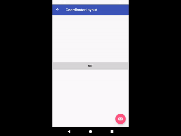
We see the text changes and our toggle button is enabled and disabled whenever the Snackbar pops in and out of the view. Our implementation works!!!
Conclusion
Like I mentioned earlier, this example is very simplistic, but it acts as a stepping stone for designers and mobile front-end developers to build upon and add more detailed and complex behaviors. Always remember to follow the Material Design spec linked here so as to not violate key Material Design Principles. In a future article we shall cover Scroll-Based Behaviors (See previous article), and dive into more complex interactions between our views.
For any questions feel free to reach me on @martinomburajr on Twitter or in the comments section below. Once again, thanks for reading!
Peace!


