
Android Constraint Layout — About Guidelines, Groups, and Barriers
A deep dive into the Constraint Layout helper components

The ConstraintLayout is one of the most dynamic and powerful available Android ViewGroup components. Besides its variety of possibilities, it allows us to implement a flat view hierarchy, leading to improved performances when it comes to layout inflation compared to deeply nested layouts.
When it comes to the alignment of different components, the ConstraintLayoutprovides various helper components.
In this article, I want to talk about some of these helper components. In particular, we will review the Guideline, Barrier and Group components.
The Constraint Layout
The layout editor window allows us to adapt the View constraints directly inside the window without writing a single line of code.
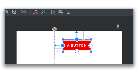
You can click on the “Guidelines” menu at the top of the window to access the respective helper methods.
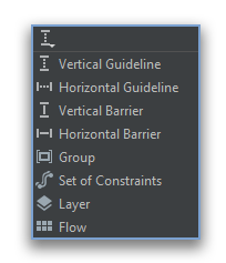
Guidelines
If you want to add a guideline ConstraintLayout you can do it either by using the mentioned “Guidelines” menu or by adding a Guideline view component programmatically inside the respective XML layout file.
To edit the layout code, you can switch from the “Design” to “Split” or “Code” view in the top right corner of the layout editor.
To add the shown guideline from the screenshot above, use the following code snippet inside your ConstraintLayout:
As you can see in the XML snippet, we use the android:orientationtag to specify if our Guideline should be orientated horizontally or vertically.
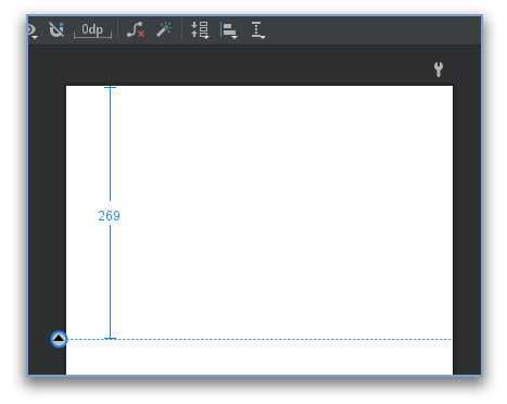
The app:layout_constraintGuide_begin tag on the other hand defines at what distance to the top of the screen, or in a vertical orientation to the screen, the Guideline should be placed.
But what if we don’t want to rely on density point values but percentages of the screen?
No problem, to do so you can replace the app:layout_constraintGuide_begin tag with the app:layout_constraintGuide_percent tag like in the following code snippet:
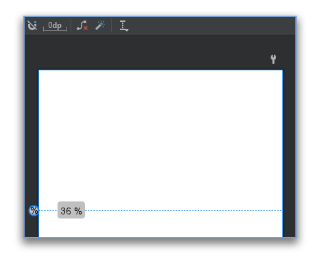
In the screenshot below you can see the Guideline component aligned to 36% of the vertical screen height.
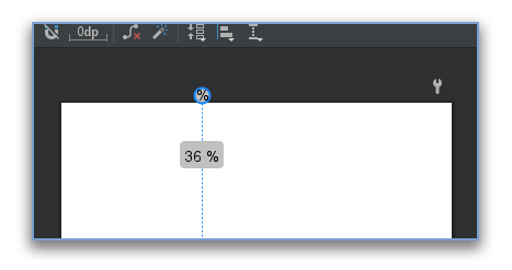
If you change the orientation to a vertical orientation, the guidelines look like the following:
When using the Guideline component, we can safely rely on fixed anchor points. Therefore we do not run the risk of suddenly changing layout sizes.
On the other hand, aligning View components to each other can sometimes lead to odd behavior when changing the visibility state on runtime.
If you want to align a View component to a Guideline you can use the same constraint tags that you use with aligning View components to each other.
The resulting Layout from the code snippet above is shown in the screenshot below.
If we want to change the position of our Guideline component, we can adapt the respective XML tag or just move the Guideline with the handle from the layouts’ “Design” view.
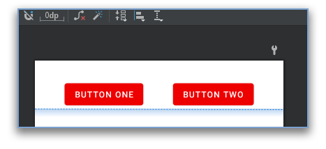
Barriers
Another very handy helper component is Barrier. In contrast to the Guideline, a Barrier cannot work as a stand-alone component. It needs to rely on one more View components inside the respective ConstraintLayout.
On the other hand, just like the Guideline, other View components can be aligned to a Barrier.
Therefore, this component can be very helpful if you have multiple View components with potentially changing positions, but you always want to align other View components below all these changing components.
To define a Barrier, you can select one or more View components from the “Design” view, open the “Guidelines” menu and select the Barrier.
If you want to add it directly in the XML, you can use the following code snippet:
The resulting layout looks like the screenshot of the “Design” layout editor view from below.
The app:barrierDirection tag defines the direction of the barrier. It can either be aligned at the start, end, top, or bottom of the referenced View components.
With the help of this tag, the Barrier provides an orientation option just like the Guideline. Start and end can be used as a vertical barrier. Setting top or bottom as direction transforms the Barrier into a horizontal barrier.
You can dynamically add or remove View components that get considered by the Barrier by adapting the ids from the app:constraint_referenced_ids tag.
This is where the big difference becomes noticeable once again. Without a View reference, the Barrier has no anchor point it can rely on. Therefore the Barrier requires at least one View component.
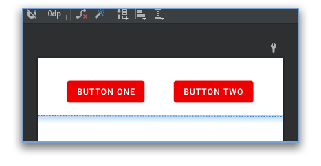
If you want to set a margin to your Barrier, you can use the app:barrierMargin tag like you can see in the screenshot below:
Groups
The last component we will talk about in this article is the Group component. In contrast to the Barrier and Guideline, the Group cannot be used as an anchor.
Nevertheless, the declaration is pretty similar to the one for the Barrier. Just as before you can select View components from the “Design” view and then select the Group component from the “Guidelines” menu.
To directly declare a Group component in your XML layout, you can use the following code snippet:
By doing so, you can directly declare the android:visibility tag on the Group component in your XML or set it on runtime like you would do it normally on any other View.
So, by using the Group component, you can easily change the visibility of a set of View components all at once. You no longer need to rely on hacky ViewGroup nesting or changing the visibility one by one.
Conclusion
In this article, we went over what are probably the three most useful helper components of the ConstraintLayout.
We have reviewed how the components can be integrated into the ConstraintLayout and also had a look at the different setting options as well as the integration with different view components.
I hope you had some takeaways, clap if you liked my article, and follow for more!


