
CODEX
Android Material Navigation Rail
A first look at the new Material Android library component

The recently published Android material library version 1.4.0-alpha01 includes updates to various Material components. For example multiple bug fixes for the new ProgressIndicator of which I just wrote an article about.
But besides these updates, this library version also includes an early outlook at the upcoming exciting the NavigationRail component.
The Navigation rail acts as a side navigation component or sidebar and can hold from three, up to seven destination views. Each view consists of an icon and a respective label, just as we know it from the Bottom view. In contrast to the Bottom view, it is aligned vertically and can also be used in combination with a NavigationDrawer.
To test out the NavigationRail component in your project, make sure you have the following dependency included:
Afterwards, create a new layout file or just add the NavigationRailView to one of your existing layouts like in the following XML snippet.
Note: the navigation rail takes up
72 dpby default. To change its width you just have to adapt thelayout_width.
As you can see the component takes two references. The first one is the app:headerLayout which takes a layout reference as a parameter. The header is displayed at the very top of the NavigationRail and can include for example a FloatingActionButton or any other View. You can also add and remove the header at runtime if you like.
The next parameter is the app:menu. No surprise, this parameter takes a menu reference and holds all the navigation views to be displayed in the NavigationRailas menu items.
An example menu could look like this:
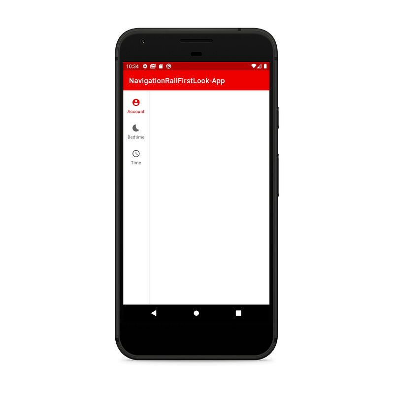
The result of a NavigationRail with just a menu can be seen in the screenshot below.
To handle click events on the menu items, you can add a respective OnNavigationItemSelectedListener like via setOnNavigationItemSelectedListener(..)on the NavigationRailView. A listener implementation can look like in the following code snippet:
If you want to also listen for reselection events, you can additionally use the OnNavigationItemReselectedListener.
Additionally, the Navigation Rail also supports the usage of badges. You can either add a badge only or a badge with a number. Creating and displaying badges is very easy. Take a look at this code snippet:
The result can be seen in the following screenshot:

If you want to take a deeper look into the component, go visit the documentation on GitHub.
Conclusion
In my opinion, Navigation rail is a very cool new possibility to implement navigation into your Android apps. Because of its size, it is perhaps for larger displays like you have in tablets. Also, the potential possibility to use a combination of NavigationDrawer and NavigationRail seems quite interesting to me.
That way you could show the top-level navigation items in an always-visible manner and open sub-directions via NavigationDrawer. If your app supports tablets and has not more than 7 navigation directions, the NavigationRail can maybe even considered as a replacement for the NavigationDrawer.
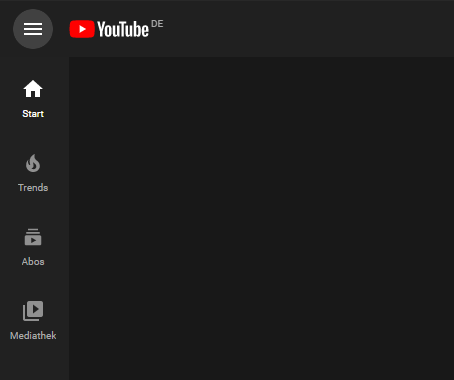
If you want to look at some real-life-examples for the component in use, you can for example look at the YouTube-Web-App:
To summarize, I am looking forward to further updates to this component and am excited for testing out the usage in one of my apps as soon as the Navigation Rail gets released in a stable version of the Material Android library.


