
Analyzing graph networks: Utilizing advanced methods
Story overview
- Introduction
- Data and imports
- Node influence
- Degree of nodes
- Strength of nodes
- Node centrality
- The average time between connections
- Correlation between metrics
- Creating new networks
- Plotting link weights in new networks
- Simulating infection spread in new networks
- Conclusion

Introduction
This is the second part of my series on analyzing network graphs. You can check out part 1 here, where I calculate different metrics for the graph. In this article, I will use some more advanced methods to find interesting attributes for the same graph network. You do not have to read part 1 to be able to follow this article, as I will add links to the dataset and all necessary code to be able to do the calculations shown in this article.
Data and imports
As from the part 1 article, you can download the dataset from here. Furthermore, below are all imports you need:
#imports
import igraph as ig
import pandas as pd
import numpy as np
import matplotlib.pyplot as plt
from tqdm import tqdm
from decimal import Decimal
import networkx as nx
import copy
import random
Additionally, you have to pip install the openpyxl package to read Excel files with Python (but you do not need an import in the code for this, only the pip installation):
pip install openpyxl
We can now import the data into a graph variable:
df = pd.read_excel("./temporal_graph.xlsx")

#preprocess data by removing duplicate rows (where node1, node2 and timestamp are the same) NOTE: was not duplicates in the dataset:
nonDuplicateDf = df.drop_duplicates(subset=['node1', 'node2', 'timestamp'])

#nonDuplicateDf = df.drop_duplicates(subset=['node1', 'node2'])
edges = nonDuplicateDf[["node1", "node2", "timestamp"]].to_numpy() #array with all arcs, each row is an arc, with first column being origin node, second column is destination node
numberOfVertices = len(np.unique(edges[:, :2])) #number of vertices = the number of unique value in the two first columns of th eexcel sheet
g = ig.Graph(numberOfVertices, edges[:, :2])  #for edges, use all rows, but only two first columns (ignore timestamp)
I also prefer to have a separate, but equal dataframe (with the “infoSpreadDf”), in case I do changes to the dataframe later in the code. This is done with a deepcopy of the dataframe:
infoSpreadDf = df.copy(deep = True) #separate df to find info spread
infoSpreadNpArray = df.to_numpy()
Simulating infection spread
Now we finally get to the fun part where we will run an infection simulation. This is highly relevant, for example for simulating the spread of different diseases, like for example with COVID-19. It is therefore an interesting topic to look at.
The infection simulation will work as follows. We start off with 1 infected node to run each simulation. The simulation is then run for all nodes (so we run n number of simulations, where n is the number of nodes we have). Then, if an infected node has a link to another node at a given timestep, the other node is infected. So if node 1 starts off as infected, and has a link to node 2 at timestep 3, node 2 will be infected at timestep 3. Then, from timestep 4 and onwards, node 2 can infect other nodes in the same way, if it has a link to another node (so it takes 1 timestep from a node that is infected, till it can infect another node).
We then calculate the number of infected nodes at each timestep, and average this over all simulations (for all starting infected nodes). We will then get a graph representing the average number of infected per timestep.
The infection simulation can be done with the following code:
num_vertices=167
dfNpArr = df.to_numpy()
T = range(57792)

T = range(57792)
yNp = list(np.zeros((57792, num_vertices)))
for first_infected_node in tqdm(range(1,num_vertices+1)):
    infected= {first_infected_node}

    currTimestep = 1
    currTimestepInfected = set()

    for row in dfNpArr:
        if (row[2] > currTimestep):
            currTimestep = row[2]
            infected.update(currTimestepInfected)
            currTimestepInfected = set()

        if row[0] in infected and row[1] not in infected:
            currTimestepInfected.add(row[1])
        if row[1] in infected and row[0] not in infected:
            currTimestepInfected.add(row[0])

        #print(row['timestamp'])
        yNp[row[2]][first_infected_node-1]=len(infected)

yNp = np.array(yNp)
average_infection=yNp.mean(axis=1)
std_infection=yNp.std(axis=1)

plt.figure(1)
plt.errorbar(T,average_infection,yerr=std_infection, ecolor='r')
plt.xlabel('Timestamp')
plt.ylabel('Average Infected nodes with the error bar of std')
plt.savefig('task9.eps', format='eps')

plt.show()

np.savetxt("Task9.txt", yNp)
Which will give the following plot representing the average number of infected nodes:
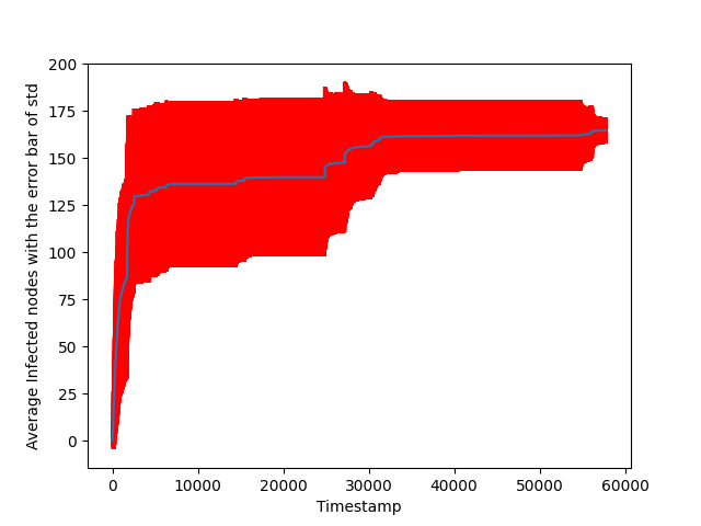
The blue line is the average, while the red line represents the standard deviation. From the graph, we can see that the infection in the beginning is quite fast, and it then stagnates a bit, before it manages to infect all nodes in the end.
Node influence
We can then use the previously calculated result, to find the influence of each node. Note that the node influence here is a self-defined metric and not something you find a definition for online. The influence of each node represents how connected the node is to other nodes. So a highly influential node will be a node that infects other nodes quickly. The precise definition I use for node influence here is how many timesteps a node used to infect 70 % of the other nodes, where a lower value means the node is more influential (since it infected 70 % of nodes faster)
#Find influence of nodes (how long it takes to infect 70% of graph)
nodeInfluences = [] #list for each of the 167 nodes, how long it took to infect >= 70% of the nodes = 116.9  = 117. So atleast 117 of the nodes need to be infected

for idx, node in enumerate(yNp.T):
 added = False
 a = len(node)
 for i in range(len(node)):
  if (node[i] >= 117):
   nodeInfluences.append((idx+1, i)) #idx is the id of the node, i is the timestep
   added = True
   break

nodeInfluences.sort(key=lambda x: x[1], reverse=False) #sort list my time it took to infect 70 percent of nodes, still have node id to know which node is which
#NOTE: sorted ascending, because the lower times it takes to infect many nodes, the more influential a node is
Note that 117 here is 70 percent of the nodes (the number of nodes is 167, and 70 percent of 167 is approximately 117).
For now, I will keep the result in an array, and use it a bit later (we will find correlation with node influence and other metrics).
Note that I store the node influences together with the index for a given node, so I can know which node has which influence. This will also be done for the different metrics calculated below.
Degree of nodes in aggregated network
We will now find the degree for each node in the aggregated network. Aggregated network here refers to only looking at unique edges, and ignoring the timestamps.
#degree of aggregated network
degreeArr = g.degree()[1:] #ignore first node, since igraph is 0 indexed, but we start node id at 1, then first element in this array is 0

degreeArrWithIndices = []
for i in range(len(degreeArr)):
 degreeArrWithIndices.append((i+1, degreeArr[i]))
degreeArrWithIndices.sort(key=lambda x: x[1], reverse=True) #sort according to degree descending
Again, this data will be used to calculate correlation to node influence later.
Strength of nodes
We also want to find the strength of the nodes in the network, which is the weights of the link. So if node 1 and node 2 have connections at timestamps 3, 5, 7. And node 1 and node 3 have connections at timestamps 4, 5, 10, 14 -> the strength of node 1 is then 7 (amount of links a node has to other nodes, including links between the same nodes at different timesteps). To find the strength, we make a new dataframe do the calculations with the following code:
groupedDf = df.groupby(["node1", "node2"])["timestamp"].apply(list).reset_index(name="weight")
for i in range(len(groupedDf)):
    arr = groupedDf.iloc[i]["weight"]
    groupedDf.at[i,'weight'] = len(arr)

strengthOfNodes = [] #array that contains strength of all 167 nodes
groupedDfNpArr = groupedDf.to_numpy()
for nodeIdx in tqdm(range(1, 167+1)):
 sumForNode = 0
 for i in range(len(groupedDf)):
  if (groupedDfNpArr[i][0] == nodeIdx or groupedDfNpArr[i][1] == nodeIdx):
   sumForNode += groupedDfNpArr[i][2]
 strengthOfNodes.append((nodeIdx, sumForNode))

strengthOfNodes.sort(key=lambda x: x[1], reverse=True) #sort according to weight descending
The correlation between the node strength and node influence will then be analyzed later.
Node centrality
We can then find the centrality of the nodes in a network with a networkx method (first make the networkx graph, as we use a method from the networkx package to calculate node centrality):
#make aggregated network:
df = pd.read_excel("./temporal_graph.xlsx")
df = df.drop_duplicates(subset=['node1', 'node2']) #aggregate by just removing all duplicates of node edges
edges = df[["node1", "node2", "timestamp"]].to_numpy() #array with all arcs, each row is an arc, with first column being origin node, second column is destination node
numberOfVertices = len(np.unique(edges[:, :2])) #number of vertices = the number of unique value in the two first columns of th eexcel sheet
g = ig.Graph(numberOfVertices, edges[:, :2])  #for edges, use all rows, but only two first columns (ignore timestamp)

#also make networkx graph to use certain metrics from networkx package
G = nx.Graph()
G.add_edges_from(edges[:, :2])

# centrality of aggregated network
loadCentrality = nx.load_centrality(G)
loadCentralityAndIndices = (list(loadCentrality.items())) #centrality is a dictionary so use items to grab both index and the centrality per node
loadCentralityAndIndices.sort(key=lambda x: x[1], reverse=True) #sort list my time it took to infect 70 percent of nodes, still have node id to know which node is which
Centrality can be understood as what are important nodes in the network, with a higher centrality value indicating higher importance for a node. You can read more about the centrality metric here.
The average time between connection
This is another self-defined metric, which refers to the average time between the timestamps of which a node is in a connection. For example, if we look at the timesteps 0–>9 and we have 2 links: (1,2) at timestamp 4, and (1,3) at timestamp 7. Then node 1 will have an average time between connections of (4+3+2)/3 = 3. The 4 comes from the time to the first link (timestep 0 to timestep 4), the 3 refers to the second link (timestep 4 to timestep 7), and the 2 refers to time till the end of the timestamps we are looking at (timestep 7 to timestep 9). This then gives an average of 3. A lower average time between connections can then be understood as a more connected node.
You can find the average time between connections with the following code:
connectionTimestepsAllNodes = [] #for every node, contains a list of every timestep it had a connection
dfNpArr = df.to_numpy()
for i in tqdm(range(1, 167+1)): #for all node id's
    nodeConnectionTimesteps = set()
    for row in dfNpArr:
        if row[0] == i or row[1] == i:
            nodeConnectionTimesteps.add(row[2])
    connectionTimestepsAllNodes.append(sorted(list(nodeConnectionTimesteps)))

T = 57791

def getAverageTimeBetweenConnections(timestamps):
    timestamps.insert(0, 0)
    timestamps.append(T) #add the final timestep
    diffs = np.diff(timestamps) #create new array with difference between each element (is equally long as timestamps since T is appended to it)
    return sum(diffs)/len(diffs)

averageTimeBetweenConnections = [] #for every node, store average time between connection

for i in tqdm(range(len(connectionTimestepsAllNodes))):
    averageTimeBetweenConnections.append(getAverageTimeBetweenConnections(connectionTimestepsAllNodes[i]))

averageTimeBetweenConnectionsWithIndices = []
for i in range(len(averageTimeBetweenConnections)):
    averageTimeBetweenConnectionsWithIndices.append((i+1, averageTimeBetweenConnections[i]))
averageTimeBetweenConnectionsWithIndices.sort(key=lambda x: x[1], reverse=False) #sort list my time it took to infect 70 percent of nodes, still have node id to know which node is which
#reverse False, as low time between connection = more influential node
Calculating the correlation between metrics
We have now calculated the following metrics:
- Node influence
- Node degree
- Node strength
- Node centrality
- The average time between connections for node
We will then see how the different metrics are correlated to node influence. This could be interesting to find out what properties in the network are representative of important nodes (if important nodes are defined by node influence).
To plot the correlation, we use the following code:
def topFRecognitionRate(f, R, compareSet):
    """compareset can be strength, connectivity, ... other metrics you want to use, have to have an element for each node in graph"""
    Rf = getTopFPercentFromSet(R, f) #top f fraction of influence of nodes
    RfWithOnlyNodeId = (np.array(list(Rf))[:, 0]) #all rows, but just first column which contains the node id
    compareSetf = getTopFPercentFromSet(compareSet, f) #top f fraction of degree of nodes
    compareSetfWithOnlyNodeId = (np.array(list(compareSetf))[:, 0])
    return (len(set(RfWithOnlyNodeId).intersection(set(compareSetfWithOnlyNodeId)))/len(RfWithOnlyNodeId))

def getTopFPercentFromSet(setToRetrieveFrom, f):
    numberOfElements = int(Decimal(len(setToRetrieveFrom)*f).to_integral_value()) #NOTE round value up if 0.5 or larger, down else
    return (list(setToRetrieveFrom)[:numberOfElements])

#Compare all 4 metrics to find out which best describes node influence
R = nodeInfluences
D = degreeArrWithIndices
S = strengthOfNodes
C = loadCentralityAndIndices
T = averageTimeBetweenConnectionsWithIndices

r_rd = []
r_rs = []
r_rc = []
r_rt = []

fArray = np.arange(start=0.05, stop=0.5+1e-10, step=0.05) #stop at just above 0.5 to include 0.5
for f in fArray:
    r_rd.append(topFRecognitionRate(f, R, D))
    r_rs.append(topFRecognitionRate(f, R, S))
    r_rc.append(topFRecognitionRate(f, R, C))
    r_rt.append(topFRecognitionRate(f, R, T))

#plot the results, the f's are the x axis, and the calculated values are the y axis

plt.plot(fArray, r_rd, label="r_rd", color="blue")
plt.plot(fArray, r_rs, label="r_rs", color="green")
plt.plot(fArray, r_rc, label="r_rc", color="purple")
plt.plot(fArray, r_rt, label="r_rt", color="red")
plt.title("Plotting different metrics for predicting r as a function of f")
plt.xlabel("f")
plt.ylabel("r_rd / r_rs / r_rc / r_rt")
plt.legend()
plt.savefig('task12Plot.eps', format='eps')

plt.show()
We basically calculate the intersection between the node influence set and the other metrics set, which represents how similar the sets are, and can therefore be used to calculate the correlation between the different metrics and node influence.
The code then gives the following plot:
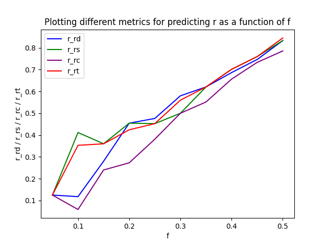
A higher value in this case is better, so we can print the sum of the values for the different metrics:
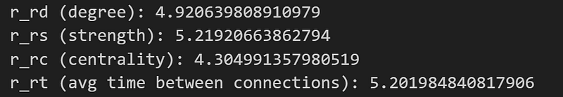
From this, we can see that the node strength seems to be the strongest proxy (highest correlation) for node influence, with the average time between connections following as a close second.
Creating new networks
Now we will create 2 new networks to analyze, from the same data of the original network. For all networks, an aggregated version is made as well. We will still keep the original network G:
df = pd.read_excel("./temporal_graph.xlsx")
#make G
GDf = df.copy(deep = True)
GEdges = GDf[["node1", "node2", "timestamp"]].to_numpy()
GNumberOfVertices = len(np.unique(GEdges[:, :2]))
G = ig.Graph(GNumberOfVertices, GEdges[:, :2])

#make aggregated G:
GAggregatedDf = GDf.groupby(["node1", "node2"])["timestamp"].apply(list).reset_index(name="aggregatedTimestamps") #merges all node1/node2 that are equal
GAggregatedEdges = GAggregatedDf[["node1", "node2", "aggregatedTimestamps"]].to_numpy()
GAggregatedNumberOfVertices = len(np.unique(GAggregatedEdges[:, :2]))
G_AGGREGATED = ig.Graph(GAggregatedNumberOfVertices, GAggregatedEdges[:, :2])
G2 will be similar to G, except all the timestamps are randomized, with no timestamps being in the same position as in G. In other words, we need to create a derangement. This can be done in 2 main ways. You can calculate a guaranteed way to get a derangement (just Google some code if you want to find it), but it will take quite some time for the code to run. Another way to do it is just to randomize the array, and check if it is a derangement, if not, just randomize the array again. For the exact array we are working with here, this usually takes less than a minute (though there is no guarantee, as you can be unlucky).
def isDerangement(l_original, l_proposal):
    return all([l_original[i] != item for i, item in enumerate(l_proposal)])

def getDerangement(arr):
    l_proposal = copy.copy(arr)

    while not isDerangement(arr, l_proposal):
        random.shuffle(l_proposal)
    return l_proposal

timestamps = df["timestamp"].to_numpy()
randomTimestamps = getDerangement(timestamps)

G2Df = df.copy(deep = True)
G2Df["timestamp"] = randomTimestamps #assign the random timesteps to the dataframe again
G2edges = G2Df[["node1", "node2", "timestamp"]].to_numpy()
G2NumberOfVertices = len(np.unique(G2edges[:, :2]))
G2 = ig.Graph(G2NumberOfVertices, G2edges[:, :2])

G2AggregatedDf = G2Df.groupby(["node1", "node2"])["timestamp"].apply(list).reset_index(name="aggregatedTimestamps") #merges all node1/node2 that are equal
G2AggregatedEdges = G2AggregatedDf[["node1", "node2", "aggregatedTimestamps"]].to_numpy()
G2AggregatedNumberOfVertices = len(np.unique(G2AggregatedEdges[:, :2]))
G2_AGGREGATED = ig.Graph(G2AggregatedNumberOfVertices, G2AggregatedEdges[:, :2])
The code above will create G2. First, we make some methods to get a derangement. Then we take the array of timestamps, make a derangement of it, and then assign it to the dataframe again. After that, we create the network as normal
G3 is made by grabbing all the timestamps again, and randomly assigning them to links (so in this case, a link can receive more timestamps than it originally had, or it could receive no timestamps). To make G3, you can use the following code:
T = 57791

newTimeStamps = [ [] for i in range(len(timestamps))] #list of empty lists for all links ()
timestamps = df["timestamp"].to_numpy()
for time in timestamps:
    idx = random.randint(0, len(timestamps)-1) #random index, inclusive on 0 and 166
    newTimeStamps[idx].append(time)

G3Df = df.copy(deep = True)
G3Df["timestamp"] = newTimeStamps
G3Edges = G3Df[["node1", "node2", "timestamp"]].to_numpy()
G3NumberOfVertices = len(np.unique(G3Edges[:, :2]))
G3 = ig.Graph(G3NumberOfVertices, G3Edges[:, :2])

#make aggregated G3
G3AggregatedDf = G3Df.groupby(["node1", "node2"])["timestamp"].apply(list).reset_index(name="timestamp") #merges all node1/node2 that are equal

newTimeStamps = [ [] for i in range(3250)] #list of empty lists for all links ()
timestamps = df["timestamp"].to_numpy()
for time in timestamps:
    idx = random.randint(0, 3250-1) #random index, inclusive on all 3250 links
    newTimeStamps[idx].append(time)

G3AggregatedDf["timestamp"] = newTimeStamps
G3AggregatedEdges = G3AggregatedDf[["node1", "node2", "timestamp"]].to_numpy()
G3AggregatedNumberOfVertices = len(np.unique(G3AggregatedEdges[:, :2]))
G3_AGGREGATED = ig.Graph(G3AggregatedNumberOfVertices, G3AggregatedEdges[:, :2])

#NOTE: Doing this is basically making the non-aggregated G3Df
allRows = []
for row in tqdm(G3Df.to_numpy()):
    a,b = row[0], row[1]
    timesteps = row[2]
    for t in timesteps: #this is 1 -> 57791 inclusive (not 0) #NOTE here, if a link did not receive timesteps, then it is ignored (so have fewer links)
        allRows.append([a,b,t])

G3ExpandedDf = pd.DataFrame(allRows, columns = ['node1','node2','timestamp'])
G3ExpandedNp = np.array(allRows)
G3ExpandedDf = G3ExpandedDf.sort_values(by=['timestamp'])
G3ExpandedDf = G3ExpandedDf[(G3ExpandedDf.T != 0).all()] #drop rows that are 0 (because numpy array was init with all 0)

G3SortedDf = G3ExpandedDf.copy(deep=True)
G3SortedDf = G3SortedDf.astype({"node1":"int","node2":"int", "timestamp":"int"}) #have to convert all values to int (since they are going to be used to access array)
Plotting link weights of new networks
With the new timestamp assignment, we will now see something interesting happen to the distribution of the link weights.
#Plotting link weigh distribution for G, G2, G3:

GWithLinkWeights = GAggregatedDf.copy(deep = True)
G2WithLinkWeights = G2AggregatedDf.copy(deep = True)
G3WithLinkWeights = G3AggregatedDf.copy(deep = True)

#weight = the total number of contacts between two nodes = length of the aggregatedTimestamps column

for i in tqdm(range(len(G3AggregatedDf))): #=3250, for all unique links between nodes
    GArr = GWithLinkWeights.iloc[i]["aggregatedTimestamps"]
    GWithLinkWeights.at[i,'aggregatedTimestamps'] = len(GArr)

    G2Arr = G2WithLinkWeights.iloc[i]["aggregatedTimestamps"]
    G2WithLinkWeights.at[i,'aggregatedTimestamps'] = len(G2Arr)

    G3Arr = G3WithLinkWeights.iloc[i]["timestamp"]
    G3WithLinkWeights.at[i,'timestamp'] = len(G3Arr)


GLinkWeights = GWithLinkWeights["aggregatedTimestamps"].to_numpy()
G2LinkWeights = G2WithLinkWeights["aggregatedTimestamps"].to_numpy()
G3LinkWeights = G3WithLinkWeights["timestamp"].to_numpy()

x = np.arange(start=1, stop=len(GLinkWeights)+1, step=1)

bins = np.linspace(0, 200, 200)
plt.hist(GLinkWeights, bins = bins, color="red", label="G", alpha=0.5)
plt.hist(G2LinkWeights, bins = bins, color="green", label="G2", alpha=0.5)
plt.hist(G3LinkWeights, bins = bins, color="blue", label="G3", alpha=0.5)

plt.title("Plotting distribution of link weights for different graphs")
plt.xlabel("Link weight")
plt.ylabel("Number of links") #NOTE make sure that x and y axis makes sense
plt.legend()
plt.savefig("linkWeightDistribution.png")
plt.show()
The code above plots the link weights from graphs G, G2, and G3 (similar to the way we calculated the link weight plot in part 1), we then get the following plot:
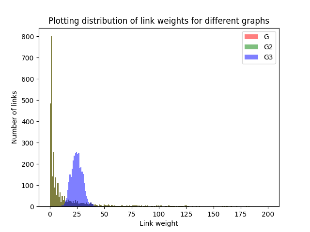
The link weights for G and G2 fully overlap, so they are completely equal. They are also a power-law distribution (which was discussed in Part 1). G3 is different, however, as it seems to follow a normal distribution, with most values around the mean, and the distribution being quite symmetric. This happens because of the random assignment of link weights.
Simulating infection spread with new graphs
Similarly to what we did in part 1, we will also simulate an infection spread here, but with the different graphs, we created.
We use the following function to simulate the infection spread:
def simInfoSpreadFast(df, resultsFilename):
 num_vertices=167
 dfNpArr = df.to_numpy()
 T = range(57792)
 y = list(np.zeros((57792, num_vertices)))
 for first_infected_node in tqdm(range(1,num_vertices+1)):
  infected= {first_infected_node}

  currTimestep = 1
  currTimestepInfected = set()

  for row in dfNpArr:
   if (row[2] > currTimestep):
    currTimestep = row[2]
    infected.update(currTimestepInfected)
    currTimestepInfected = set()

   if row[0] in infected and row[1] not in infected:
    currTimestepInfected.add(row[1])
   if row[1] in infected and row[0] not in infected:
    currTimestepInfected.add(row[0])

   y[row[2]][first_infected_node-1]=len(infected)

 np.savetxt(resultsFilename, y)
I save the results to a text file for easy access. Note that saving to a numpy file (.npy) would probably be faster and better.
Then we simulate infection spread for the different graphs. Because of the way I wrote the simulation function, the timestamps have to be ordered (this does not change the graph, but is a requirement for the function to give correct output):
simInfoSpreadFast(GDf, "Task15Results/G_info_spread.txt")

G2Df = G2Df.sort_values(by=['timestamp'])
simInfoSpreadFast(G2Df, "Task15Results/G2_info_spread.txt")


simInfoSpreadFast(G3SortedDf, "Task15Results/G3_info_spread.txt")
We can calculate the mean and standard deviation:
#Plot:
GRes = np.loadtxt("Task15Results/G_info_spread.txt")
G2Res = np.loadtxt("Task15Results/G2_info_spread.txt")
G3Res = np.loadtxt("Task15Results/G3_info_spread.txt")

GAvg = GRes.mean(axis = 1)
GStd = GRes.std(axis = 1)

G2Avg = G2Res.mean(axis = 1)
G2Std = G2Res.std(axis = 1)

G3Avg = G3Res.mean(axis = 1)
G3Std = G3Res.std(axis = 1)
And then plot the results. For clarity, I will plot it in three different ways:
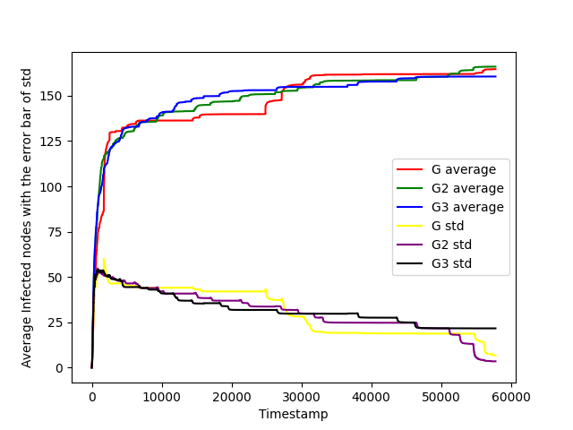
Plot with standard deviation as a separate function
#plot with std as separate function
x = [i for i in range(1, 57792+1)] #x axis is each timestep

plt.plot(x, GAvg, label="G average", color="red")
plt.plot(x, G2Avg, label="G2 average", color="green")
plt.plot(x, G3Avg, label="G3 average", color="blue")

plt.plot(x, GStd, label="G std", color="yellow")
plt.plot(x, G2Std, label="G2 std", color="purple")
plt.plot(x, G3Std, label="G3 std", color="black")

plt.xlabel('Timestamp')
plt.ylabel('Average Infected nodes with the error bar of std')
plt.savefig('task15.eps', format='eps')
plt.savefig('task15.png', format='png')
plt.legend()

plt.show()
Which gives the plot:
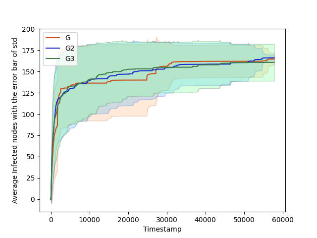
Plot with standard deviation as error bar
#plot with errorbar:
plt.plot(x, GAvg, 'k', color='#CC4F1B', label="G")
plt.fill_between(x, GAvg-GStd, GAvg+GStd,
    alpha=0.2, edgecolor='#CC4F1B', facecolor='#FF9848')
plt.plot(x, G2Avg, 'k', color='#1B2ACC', label="G2")
plt.fill_between(x, G2Avg-G2Std, G2Avg+G2Std,
    alpha=0.2, edgecolor='#1B2ACC', facecolor='#089FFF')
plt.plot(x, G3Avg, 'k', color='#3F7F4C', label="G3")
plt.fill_between(x, G3Avg-G3Std, G3Avg+G3Std,
    alpha=0.3, edgecolor='#3F7F4C', facecolor='#7EFF99')

plt.xlabel('Timestamp')
plt.ylabel('Average Infected nodes with the error bar of std')
plt.savefig('task15.eps', format='eps')
plt.savefig('task15.png', format='png')
plt.legend()

plt.show()
Which gives the following plot:
Plots for different graphs side by side
#with plots side by side
cm = 1/2.54
fig, (ax1, ax2, ax3) = plt.subplots(1,3, figsize=(40*cm,12*cm))
fig.suptitle('G vs G2 vs G3 infected spread')
fig.legend()

# ax1.plot(x, GAvg, label="G", color="red")
ax1.errorbar(x,GAvg, GStd, ecolor="red")
ax1.set_title("G")
ax1.set_xlabel("Timestamp")
ax1.set_ylabel("Average Infected nodes with the error bar of std")
ax1.set_label("G")

ax2.errorbar(x,G2Avg, G2Std, ecolor="red")
ax2.set_title("G2")
ax1.set_xlabel("Timestamp")
ax1.set_ylabel("Average Infected nodes with the error bar of std")
ax1.set_label("G2")

ax3.errorbar(x,G3Avg, G3Std, ecolor="red")
ax3.set_title("G3")
ax1.set_xlabel("Timestamp")
ax1.set_ylabel("Average Infected nodes with the error bar of std")
ax1.set_label("G3")
Note the code can give an error message, which you can ignore with no problem. The code then gives the following plot:
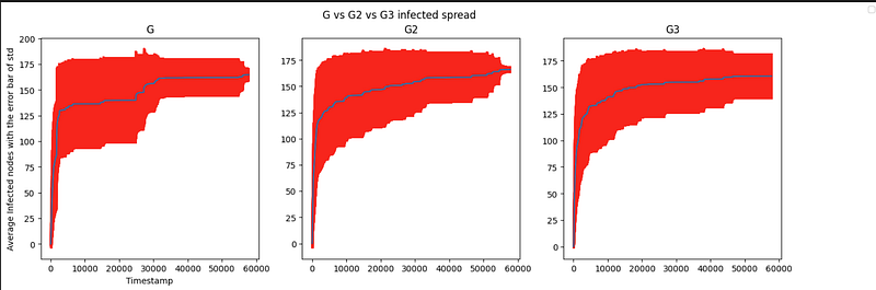
Here you can see that the infection spreads happen a bit differently. For G2 and G3 the spread seems to be more consistent than with G, as well as the middle infections (timestep 10k — 30k) seem to be a bit higher, so people are more quickly infected on graphs G2 and G3.
Remember that there is some randomness when making the graphs (since the timestamps are randomly assigned), so your graphs might not look exactly the same as I have shown here in this article.
Conclusion
And that was the end of my series analyzing graph networks with Python. Thank you for reading!
If you want to read some of my other articles, please check out:
- ✅ Fine-tuning EasyOCR
- ✅ Empower Your Donut Model for Receipts with Self-Annotated Data
- ✅ Download and run Llama2 locally on Windows
- ✅ Download and run Llama2 locally on Windows
You can also read my articles on WordPress.


