
Analysing Medium Topics
with Beautiful Soup and Plotly
This article explains how I analysed data from the Medium website to answer the question: “Where are the articles in each Medium Topic published?”.
Here are the four key steps:
- Inspecting the HTML
- Parsing the HTML with Beautiful Soup
- Creating Charts with Plotly
- Generating the HTML for a Medium article
1. Inspecting the HTML
Clicking a topic on the Medium homepage takes you to a page such as https://medium.com/topic/math , which contains a list of the recent articles.
If we right-click and “Inspect” one of the articles, we find that each article is contained in a <section> tag.
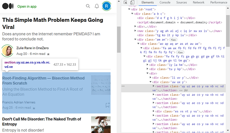
The class names are not particularly useful, as they differ when the same page is opened in different browser sessions.
But I just needed a way of identifying each article and determining whether it belonged to a particular publication. Notice how the second article below contains the words “in Cantor’s Paradise” after the author’s name (Cantor’s Paradise is the publication name).
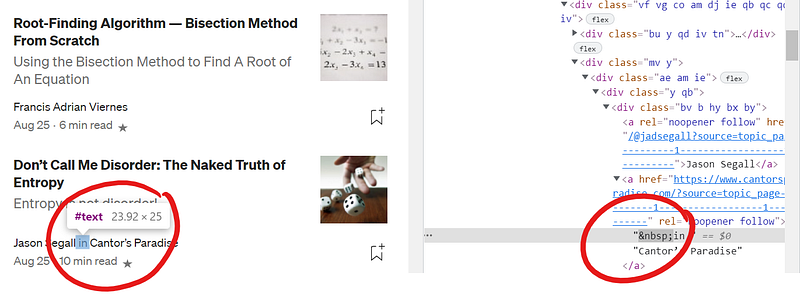
Note that is the HTML character for a “non-breaking space”. So if there is an <a> tag inside the <section> which starts with a space, then the string “in”, it should be followed by the publication name. If this <a> tag does not exist, it should be a self-published article.
2. Parsing the HTML with Beautiful Soup
Beautiful Soup is a Python library for parsing HTML files. After running pip install beautifulsoup4 from the command line, we are ready to use it in our Python code.
The above code assumes I have already downloaded the HTML file into the current working directory. If you (hypothetically) wanted to automate the process to access a large number of pages, you could use the Selenium library as described here.
The variable soup above refers to a BeautifulSoup object, which contains many methods for parsing HTML data. For example, above I use the find_all() method to find all <section> tags in the file.
The sect variable returned by the find_all() method is also a BeautifulSoup object. Below I use the .text property of this object to find the required <a> tags within the <section> to identify the publication name:
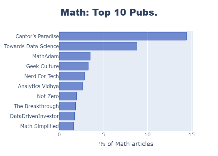
Next I collated and sorted the data using Python. For my Plotly bar chart, I just needed a list of the top ten publication names and the number of articles in each one:
3. Creating Charts with Plotly
This is the fun part!
Plotly is a graphing library for both Javascript and Python. There are lots of options for building dynamic and interactive charts, but for this project I just want some nice looking bar and pie charts.
Here is the Python code to generate one of the horizontal bar charts:
Here is the code for a pie chart in Plotly:
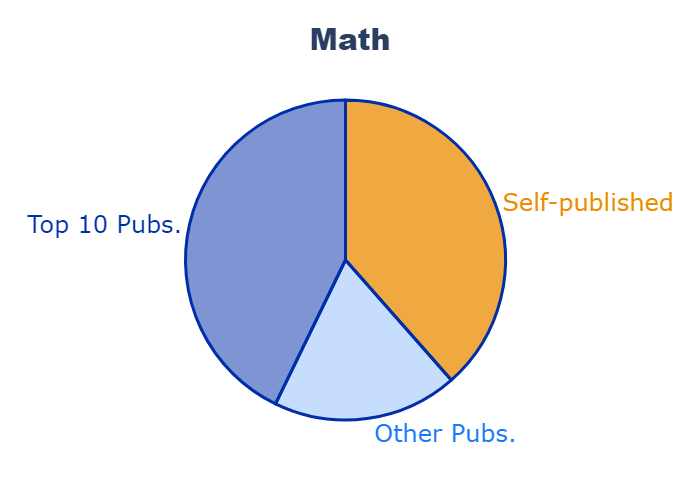
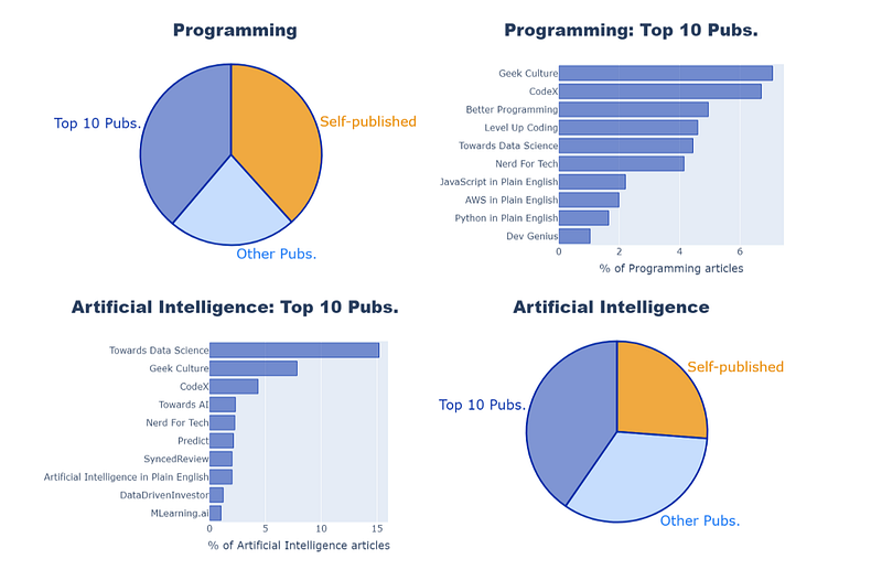
I think the pie chart works well here, as there are only 3 sectors and I’m just looking to give a broad comparison. The two shades of blue represent the publication articles, while the complementary orange color highlights the self-published articles.
4. Generating the HTML for a Medium article
Of course I could just copy and paste each of the charts as PNG files into my Medium article, but there are more than 50 of them.
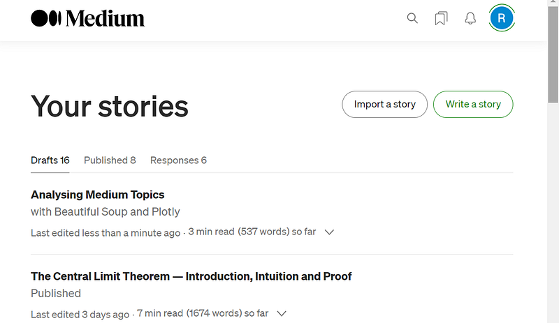
So I chose to generate a HTML file using Python, then use the “Import a story” option (in Medium under “Your stories”).
Here is the code I used to write my HTML file. I didn’t worry about the <html> and <body> tags, as the browser adds them by default.
In order to use the “Import story” option, Medium needs to be able to find the file online. So I uploaded the HTML file plus images to a public GitHub folder, then imported it into Medium.
I discovered that Medium does have an API that allows users to publish stories automatically. But I wanted to upload my story as a draft, then edit it before submitting to a publication, which does not yet seem to be possible through the API.
Done! 😎
You can see the final published version of the article here:


