
An Integrated Quant Trading Analysis of US Big Techs using Quantstats, TA, PyPortfolioOpt, and FinanceToolkit

- In this post, the focus is on a comparative quant trading analysis of US Big Techs (v.i.) by integrating technical, fundamental analysis tools and modern Portfolio Optimization (PO) algorithms in Python.
What is US Big Tech
- Big Four (Alphabet, Amazon, Apple, Meta)
- Big Five (Alphabet, Amazon, Apple, Meta, Microsoft)
- Magnificent Seven (Alphabet, Amazon, Apple, Meta, Microsoft, Nvidia, Tesla)
- Others: According to the report, AMD saw massive brand growth since 2023, increasing by 53% year-over-year. Moreover, AMD’s brand value reached $51.86 million in the Business Technology and Services Platforms category. It’s easy to guess where that intense growth is coming from — AMD is leaning into AI, just like its rivals Intel and Nvidia have done in recent years.
Business Case
- The US stock market has offered remarkable growth opportunities in recent years, with Big Tech leading the charge. Can the bull market continue?
- Big Tech firms are facing the biggest wave of antitrust legislation in their history.
- A global tax war is looming. It could hit Big Tech hard.
- Bottom Line: Despite these impressive performances, investors are cautioned against betting on overhyped tech stocks at high valuations, especially in the current economic climate of high inflation and interest rates. While AI applications, like Nvidia chips and Meta’s large language model show promise, their market value will ultimately depend on the actual consumer benefits and realized productivity improvements.
Project Goals
- Our ultimate goal is to integrate Technical Analysis (TA) indicators, stock fundamentals and PO considering risk and return simultaneously.
- Markowitz (1952) [1] advocates the diversification of investment portfolios, demonstrating that such a process reduces the variance of investment.
- These concepts of diversification have given rise to the Modern Portfolio Theory (MPT), which brings the idea of choosing between two conflicting objectives: risk and return.
- TA indicators are widely used by market participants to identify trends in asset prices and in trading volumes. Following recent studies [2], we bridge the gap between MPT and TA by devising a PO strategy in which optimal weights are directly parameterized as a function of multiple TA signals.
- While some traders prefer TA over Fundamental Analysis (FA), the most successful strategies often emerge from a synergistic application of both, allowing traders to capitalize on both immediate price movements and longer-term economic forecasts [3]. This integrated PO approach not only enhances the understanding of market dynamics but also equips traders with a comprehensive toolkit for making robust investment decisions.
Technical Analysis (TA)
- TA gives traders a framework for analyzing markets, providing them with indicators to identify trends, support/resistance levels, and entry/exit points [5].
- The 2 key TA assumptions are as follows [5]: (1) a security’s price reflects all relevant information, including fundamental factors; (2) price movements follow an upward, downward, or sideways trend.
Fundamental Analysis (FA)
- Whereas TA only identifies short-term patterns, FA will highlight assets whose share price undervalues (or overvalues) their real worth [5, 7].
- In simple terms, making smart investment decisions is the main advantage of FA. It involves understanding how much a company makes and spends, how many products it sells, and how is it affected by external factors [7].
TA vs FA
- FA analysis focuses on the quality of an asset, while TA looks at market trends as an indicator of value. Both methods are used for forecasting future trends in stock prices [4].
Portfolio Optimization
- PO is a process in which an investor chooses their assets to minimize financial risks while maximizing ROI [8].
- Return on investment (ROI) is a familiar metric across all industries.
- In financial terms, risk is the possibility that an investment’s returns will differ from what’s expected.
Tools:
- Quantstats provides extensive functionality for portfolio analytics. It caters to quantitative analysts, traders, and portfolio managers who seek to gain deeper insights into their investment strategies.
- TA is a TA library to financial time series datasets. It is useful to do feature engineering from financial time series datasets (Open, Close, High, Low, Volume). It is built on Pandas and Numpy.
- PyPortfolioOpt is a library that implements PO methods, including classical MPT and Black-Litterman allocation, as well as more recent developments in the field like shrinkage and Hierarchical Risk Parity, along with some novel experimental features like exponentially-weighted covariance matrices.
- FinanceToolkit is an open-source toolkit in which 150+ financial ratios, indicators and performance measurements are written down in the most simplistic way allowing for complete transparency of PO. The Toolkit not only supports Equities. Even for Options, Currencies, Cryptocurrencies, ETFs, Mutual Funds, Indices, Money Markets, Commodities, Key Economic Indicators and more, the Toolkit can be used to obtain historical data as well as important performance and risk measurements such as the Sharpe Ratio and VaR.
Resources
Project Milestones
- Big Four 2020–2024 (BF) Basic Risk-Return Analysis
- Performance Analysis of an Equal-Weighted BF Portfolio
- Optimizing BF for Max Sharpe Ratio (Efficient Frontier) vs S&P 500
- (NVDA, AMD) vs Benchmark Cumulative Returns & VaR
- (NVDA, AMD) Profitability Analysis & Greek Sensitivities
- Correlations of NVDA & AMD with Fama-French Factors
- (AAPL, AMZN, META, MSFT, GOOG) FA & Stock Price Simulations
- TA Ichimoku Cloud Charts: NVDA vs AMD
- META Stock TA, Backtesting RSI vs EMA Strategies
This comprehensive guide will deeply dive into the above project milestones. The project is implemented in Jupyter Notebook after creating a virtual Anaconda environment.
Basic Imports & Installations
- Installing and importing necessary Python libraries
!pip install quantstats, ta, pypfopt, plotly, yfinance, sklearn, seaborn, scipy
# Importing Libraries

# Data handling and statistical analysis
import pandas as pd
#from pandas_datareader import data
import numpy as np
from scipy import stats

# Data visualization
import matplotlib.pyplot as plt
import seaborn as sns
import plotly.express as px
import plotly.graph_objects as go
from plotly.subplots import make_subplots

# Optimization and allocation
from pypfopt.efficient_frontier import EfficientFrontier
from pypfopt import risk_models
from pypfopt import expected_returns
from pypfopt import black_litterman, BlackLittermanModel

# Financial data
import quantstats as qs
import ta
import yfinance as yf

# Linear Regression Model
from sklearn.linear_model import LinearRegression

# Enabling Plotly offline
from plotly.offline import init_notebook_mode
init_notebook_mode(connected=True)


# Importing libraries for portfolio optimization
from pypfopt.efficient_frontier import EfficientFrontier
from pypfopt import risk_models
from pypfopt import expected_returns

# Datetime and hiding warnings
import datetime as dt
import warnings
warnings.filterwarnings("ignore")
Big Four 2020–2024 (BF) Basic Return-Volatility Analysis
- Reading the input BF stock data 2020–2024
#Big Four
tickers = ["AAPL", "GOOG","AMZN","META"]
aapl = qs.utils.download_returns(tickers)
aapl = aapl.loc['2020-01-01':'2024-07-10']- Plotting BF stock daily returns
# Plotting Daily Returns for each stock
print('\n')
print('\nStock Daily Returns Plot:\n')
qs.plots.daily_returns(aapl,benchmark='SPY')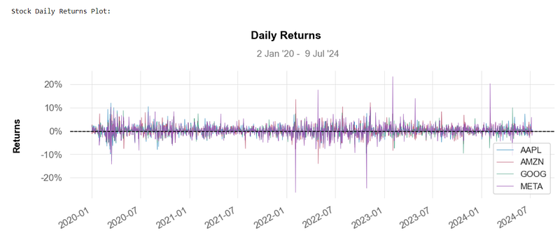
- One of the best ways to evaluate how well your stocks are performing is to calculate their daily return v.s.
- Basically, the above plot tells you how much a stock’s value changed over a day. Using this basic info, you can determine whether you want to invest more in a company or try investing elsewhere.
- Plotting BF stock cumulative returns
# Plotting Cumulative Returns for each stock
print('\n')
print('\nStock Cumulative Returns Plot\n')
qs.plots.returns(aapl)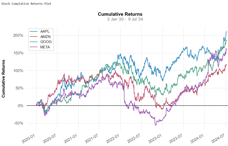
- The cumulative return v.s. is the total change in the investment price over a set time.
- This is an aggregate nominal return that does not account for the effects of inflation and other external factors.
- A positive return represents a profit, while a negative return marks a loss.
- Taxes can often substantially reduce the cumulative returns for most investments.
BF’s Kurtosis
- Calculating and plotting kurtosis of BF daily returns
# Using quantstats to measure kurtosis
print('\n')
print("BF's kurtosis: ", qs.stats.kurtosis(aapl).round(2))

AAPL     5.03
AMZN     4.00
GOOG     3.63
META    17.71
dtype: float64

qs.stats.kurtosis(aapl).round(2).plot.bar(label='Kurtosis')
plt.legend()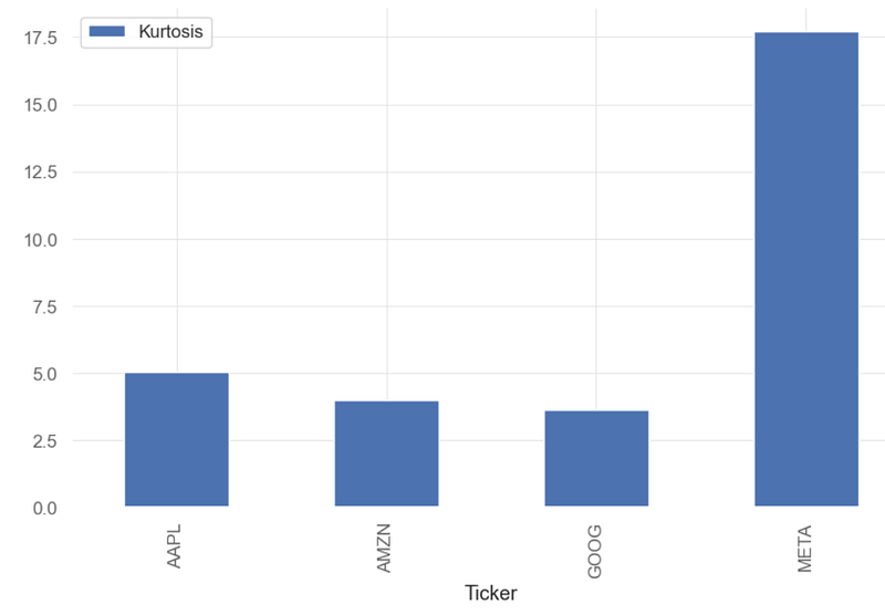
- Kurtosis (kur) measures the tailedness of a distribution.
- Kurtosis is used in financial analysis to measure an investment’s risk of price volatility. Kurtosis measures the amount of volatility that an investment’s price has experienced regularly. High kurtosis of the return distribution implies that an investment will yield occasional extreme returns. Be mindful that this can swing both ways — meaning high kurtosis indicates either large positive returns or extreme negative returns.
- We can see that the BF daily returns can be considered as the leptokurtic distributions (kurtosis > 3.0). These distribution appears as a curve with long tails (outliers).
- Inference: kur(META) >> kur(AAPL) > kur(AMZN) ~ kur(GOOG)
BF’s Skewness
- Calculating and plotting skewness (skew) of BF daily returns
# Measuring skewness with quantstats
print('\n')
print("Stock skewness: ", qs.stats.skew(aapl).round(2))

Stock skewness:  Ticker
AAPL    0.12
AMZN    0.12
GOOG   -0.06
META   -0.29
dtype: float64

qs.stats.skew(aapl).round(2).plot.bar(label='Skewness')
plt.legend()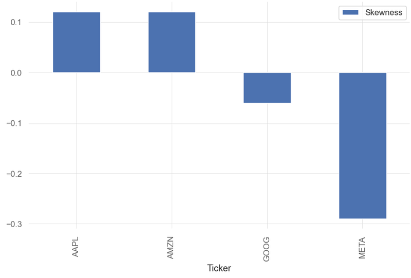
- Skewness indicates the direction and degree to which the data deviates from a symmetrical bell curve.
- A distribution with zero skewness is perfectly symmetrical, meaning the left and right sides of the distribution are mirror images. Positive skewness means that the right tail is longer or fatter than the left, suggesting that the data has a tendency to have higher values. Negative skewness indicates that the left tail is longer or fatter, implying a tendency towards lower values.
- Generally, a value between -0.5 and 0.5 indicates a slight level of skewness.
- Inference: skew(META)=-0.29
- There is strong evidence of negative cross-sectional relationship between realized skewness and future prices — stocks with negative skewness are compensated with high future returns for higher volatility.
- The negative skewness of GOOG indicates that an investor may expect frequent small gains and a few large losses. In reality, many trading strategies employed by traders are based on negatively skewed distributions.
- When accompanied by low to moderately positive skewness (cf. AAPL and AMZN), such distributions would imply at stable returns and low risk.
BF’s Standard Deviation
- Calculating and plotting standard deviation (STD) of BF daily returns
# Calculating Standard Deviations
print('\n')
print("Stock Standard Deviation: ", aapl.std().round(3))

Stock Standard Deviation:  Ticker
AAPL    0.021
AMZN    0.023
GOOG    0.021
META    0.029
dtype: float64

aapl.std().round(3).plot.bar(label='STD')
plt.legend()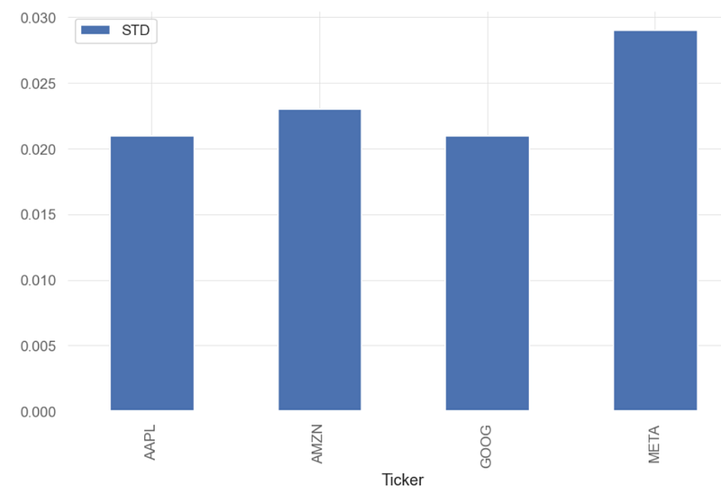
- Standard deviation is a basic way to compare investments, measuring the variation or dispersion, in data. Higher standard deviation equals higher risk.
- If data points are further from the mean, there is a higher deviation within the data set. It is calculated as the square root of the variance.
- A volatile stock has a high standard deviation, while the deviation of a stable blue-chip stock is usually rather low.
- Inference: std(AAPL, AMZN, GOOG) ~0.02 , std(META)~0.03.
BF Correlation Analysis
- Pairplots and correlation matrices are useful tools to visualize correlation among assets.
- Creating the pairplots of BF daily returns
# Pairplots
sns.pairplot(aapl, kind = 'reg')
plt.show()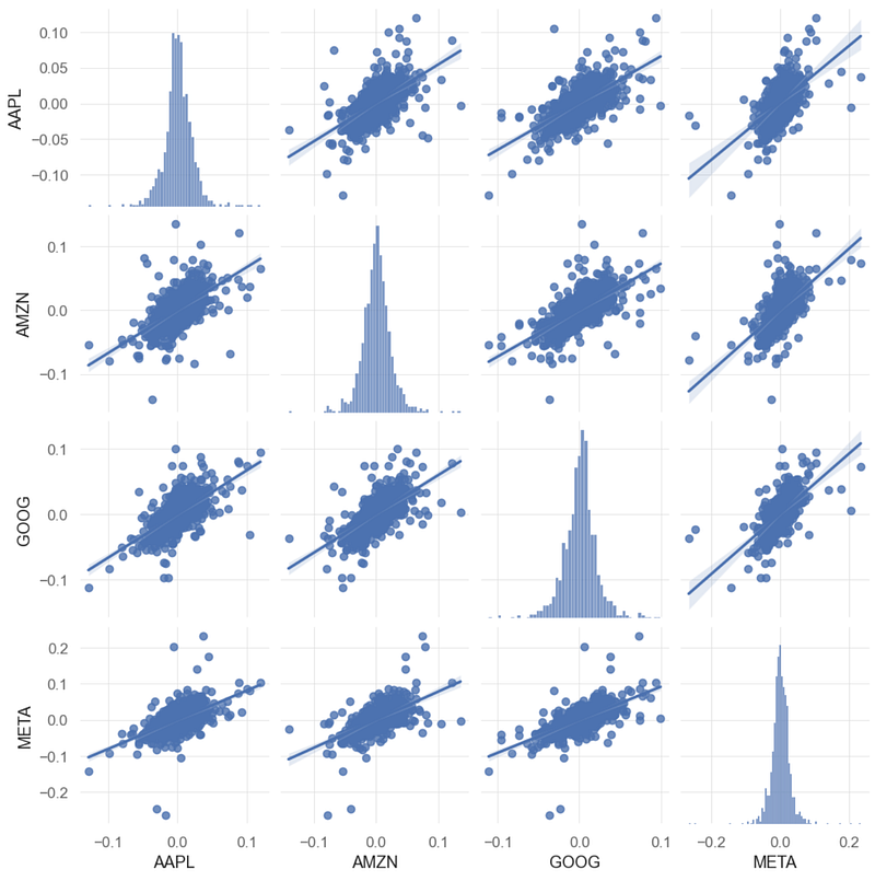
- The above plot shows an interesting linear relationship between Google and META’s prices.
- Plotting the correlation matrix of BF daily returns
# Correlation Matrix
corr = aapl.corr()
mask = np.zeros_like(corr, dtype=bool)
mask[np.triu_indices_from(mask)] = True
sns.heatmap(corr, annot=True, mask = mask)
plt.show()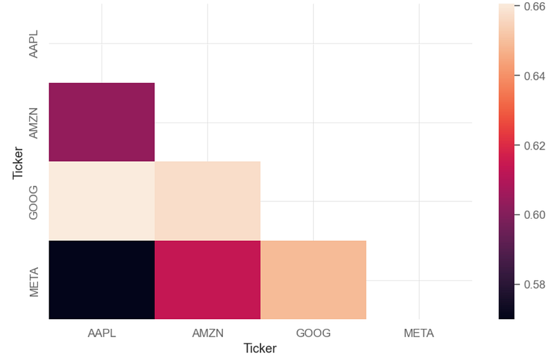
- We can see a relatively strong positive correlation of 0.64–0.66 between GOOG and other 3 stocks (AAPL, AMZN, META).
BF’s Beta Coefficient
- A stock’s beta coefficient is a measure of its volatility over time compared to a market benchmark. A beta of 1 means that a stock’s volatility matches up exactly with the markets. A higher beta indicates great volatility, and a lower beta indicates less volatility.
- Using Linear Regression to calculate the BF’s beta coefficient w.r.t. the benchmark SPY
bench = ["SPY"]
spy = qs.utils.download_returns(bench)
spy = spy.loc['2020-01-01':'2024-07-10']

# Removing indexes
spy_no_index = spy.reset_index(drop = True)
aapl_no_index = aapl.reset_index(drop = True)

# Fitting linear relation among Apple's returns and Benchmark

asset='AAPL'
X = spy_no_index.values.reshape(-1,1)
y = aapl_no_index[asset].values.reshape(-1,1)

linreg = LinearRegression().fit(X, y)

beta = linreg.coef_[0]
alpha = linreg.intercept_
print('\n')
print('AAPL beta: ', beta.round(3))
print('\nAAPL alpha: ', alpha.round(3))


asset_beta = []
asset_beta.append(beta.round(3)[0])
#print(asset_beta)

AAPL beta:  [1.203]

AAPL alpha:  [0.001]

asset='AMZN'
X = spy_no_index.values.reshape(-1,1)
y = aapl_no_index[asset].values.reshape(-1,1)

linreg = LinearRegression().fit(X, y)

beta = linreg.coef_[0]
alpha = linreg.intercept_
print('\n')
print('AMZNL beta: ', beta.round(3))
print('\nAMZN alpha: ', alpha.round(3))

asset_beta.append(beta.round(3)[0])

AMZNL beta:  [1.075]

AMZN alpha:  [0.]

asset='META'
X = spy_no_index.values.reshape(-1,1)
y = aapl_no_index[asset].values.reshape(-1,1)

linreg = LinearRegression().fit(X, y)

beta = linreg.coef_[0]
alpha = linreg.intercept_
print('\n')
print('META beta: ', beta.round(3))
print('\nMETA alpha: ', alpha.round(3))

asset_beta.append(beta.round(3)[0])

META beta:  [1.324]

META alpha:  [0.001]

asset='GOOG'
X = spy_no_index.values.reshape(-1,1)
y = aapl_no_index[asset].values.reshape(-1,1)

linreg = LinearRegression().fit(X, y)

beta = linreg.coef_[0]
alpha = linreg.intercept_
print('\n')
print('GOOG beta: ', beta.round(3))
print('\nGOOG alpha: ', alpha.round(3))

asset_beta.append(beta.round(3)[0])

GOOG beta:  [1.139]

GOOG alpha:  [0.]

print(asset_beta)
[1.203, 1.075, 1.324, 1.139]
- Plotting the BF’s beta coefficient
fig, ax = plt.subplots(figsize=(6, 6))

x = asset_beta
tickers1=['AAPL', 'AMZN', 'META', 'GOOG']

ax.pie(x, labels=tickers1, autopct='%.1f%%',
       wedgeprops={'linewidth': 3.0, 'edgecolor': 'white'},
       textprops={'size': 'x-large'})
ax.set_title('Asset Beta', fontsize=18)
plt.tight_layout()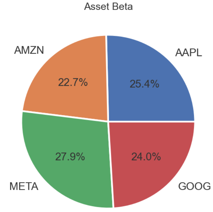
#import numpy as np
#import matplotlib.pyplot as plt


courses = tickers
values = x

fig = plt.figure(figsize = (10, 5))

# creating the bar plot
plt.bar(courses, values, color ='maroon',
        width = 0.4)

plt.xlabel("Assets")
plt.ylabel("Beta Value")
plt.title("Asset Beta Values")
plt.show()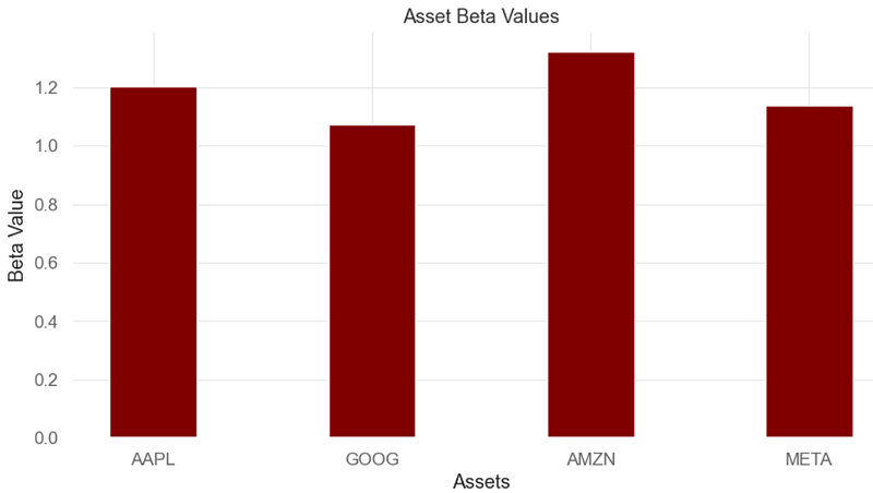
- By definition, the market, such as the S&P 500 Index, has a beta of 1.0, and individual stocks are ranked according to how much they deviate from the market.
- Inference: BF stocks swing more than the market over time because their beta is above 1.0.
BF’s Sharpe Ratio
- The Sharpe Ratio is a measure of the risk-adjusted return of an investment.
- Calculating and plotting the BF’s Sharpe Ratio
# Calculating Sharpe ratio
print('\n')
print("Sharpe Ratio for Stocks: ", qs.stats.sharpe(aapl).round(2))
Sharpe Ratio for Stocks:  Ticker
AAPL    0.93
AMZN    0.65
GOOG    0.87
META    0.69
dtype: float64

qs.stats.sharpe(aapl).round(2).plot.bar(label='Sharpe Ratio')
plt.legend()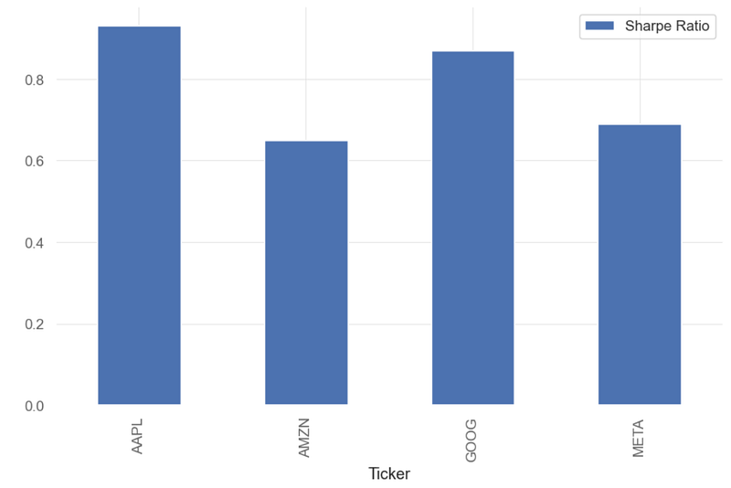
- A higher Sharpe ratio indicates that an investment provides higher returns for a given level of risk compared to other investments with a lower Sharpe ratio.
- Inference: AAPL can provide higher returns for a given level of risk compared to other 3 stocks (AMZN, GOOG, META). The AAPL’s Sharpe ratio of close to 1 means that the investment’s average return is practically equal to the risk-free rate of return.
Performance Analysis of an Equal-Weighted BF Portfolio
- Let’s examine the performance of BF PO with equal weights, i.e.
- Weight of each security = 1 / Number of securities in the portfolio
- In our BF portfolio with 4 stocks, each stock holds a 25% weight.
weights = [0.25, 0.25, 0.25, 0.25] # Defining weights for each stock
ap=aapl['AAPL']
am=aapl['AMZN']
me=aapl['META']
ms=aapl['GOOG']
portfolio = ap*weights[0] + am*weights[1] + me*weights[2] + ms*weights[3] # Creating portfolio multiplying each stock for its respective weight
portfolio # Displaying portfolio's daily returns

Date
2020-01-02    0.023684
2020-01-03   -0.008015
2020-01-06    0.016586
2020-01-07   -0.000268
2020-01-08    0.006574
                ...
2024-07-02    0.012870
2024-07-03   -0.000289
2024-07-05    0.029234
2024-07-08   -0.006084
2024-07-09    0.001275
Length: 1136, dtype: float64- Plotting the portfolio daily returns, histogram, and cumulative returns
portfolio.plot()
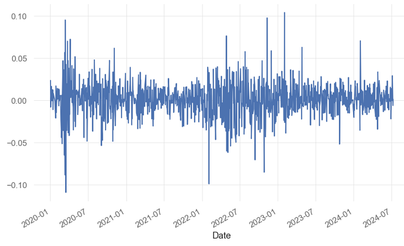
portfolio.hist()
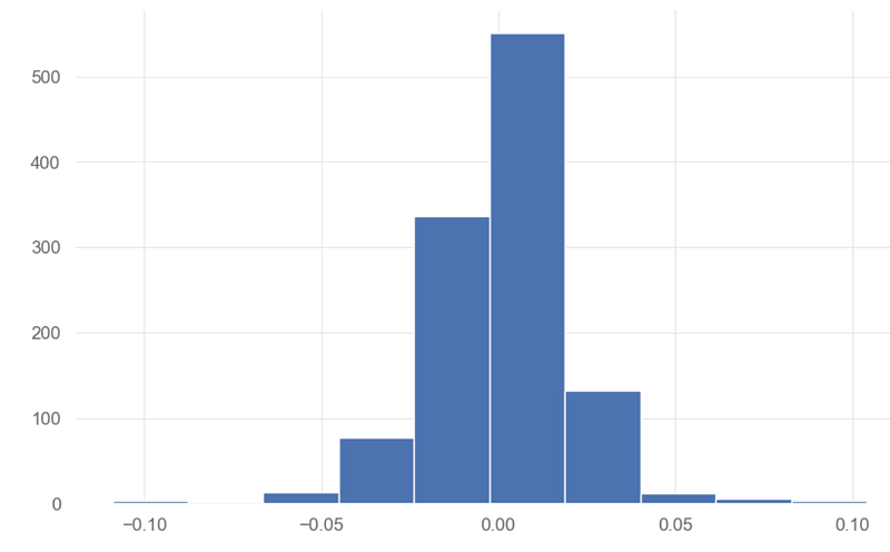
qs.plots.returns(portfolio)
- Generating the Equal-Weighted BF Portfolio performance report and strategy visualization vs SPY benchmark
qs.reports.full(portfolio, benchmark = spy)
Performance Metrics
Benchmark Strategy
------------------------- ----------- ----------
Start Period 2020-01-02 2020-01-02
End Period 2024-07-09 2024-07-09
Risk-Free Rate 0.0% 0.0%
Time in Market 100.0% 100.0%
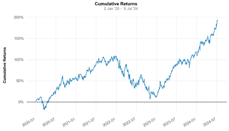
Cumulative Return 72.69% 191.47%
CAGR﹪ 8.7% 17.75%
Sharpe 0.67 0.91
Prob. Sharpe Ratio 91.92% 97.3%
Smart Sharpe 0.6 0.82
Sortino 0.93 1.31
Smart Sortino 0.84 1.18
Sortino/√2 0.66 0.93
Smart Sortino/√2 0.59 0.83
Omega 1.18 1.18
Max Drawdown -34.1% -49.12%
Longest DD Days 745 690
Volatility (ann.) 21.66% 31.42%
R^2 0.67 0.67
Information Ratio 0.05 0.05
Calmar 0.26 0.36
Skew -0.54 -0.14
Kurtosis 11.14 4.01
Expected Daily % 0.05% 0.09%
Expected Monthly % 1.0% 1.96%
Expected Yearly % 11.55% 23.86%
Kelly Criterion 4.81% 5.39%
Risk of Ruin 0.0% 0.0%
Daily Value-at-Risk -2.19% -3.14%
Expected Shortfall (cVaR) -2.19% -3.14%
Max Consecutive Wins 10 8
Max Consecutive Losses 7 6
Gain/Pain Ratio 0.14 0.18
Gain/Pain (1M) 0.7 1.12
Payoff Ratio 0.92 0.96
Profit Factor 1.14 1.18
Common Sense Ratio 1.08 1.14
CPC Index 0.57 0.61
Tail Ratio 0.95 0.97
Outlier Win Ratio 4.9 3.06
Outlier Loss Ratio 4.78 3.19
MTD 2.13% 5.18%
3M 7.15% 16.73%
6M 17.11% 36.32%
YTD 16.94% 34.8%
1Y 26.74% 54.69%
3Y (ann.) 5.54% 9.97%
5Y (ann.) 8.7% 17.75%
10Y (ann.) 8.7% 17.75%
All-time (ann.) 8.7% 17.75%
Best Day 9.06% 10.41%
Worst Day -10.94% -10.9%
Best Month 12.7% 20.41%
Worst Month -13.0% -15.13%
Best Year 27.04% 91.38%
Worst Year -19.48% -44.71%
Avg. Drawdown -2.12% -3.55%
Avg. Drawdown Days 21 23
Recovery Factor 1.91 2.63
Ulcer Index 0.1 0.18
Serenity Index 0.44 0.42
Avg. Up Month 4.73% 7.66%
Avg. Down Month -5.82% -7.11%
Win Days % 54.41% 53.7%
Win Month % 63.64% 65.45%
Win Quarter % 73.68% 68.42%
Win Year % 80.0% 80.0%
Beta - 1.19
Alpha - 0.12
Correlation - 81.71%
Treynor Ratio - 161.56%
None
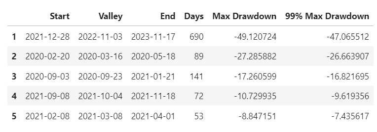
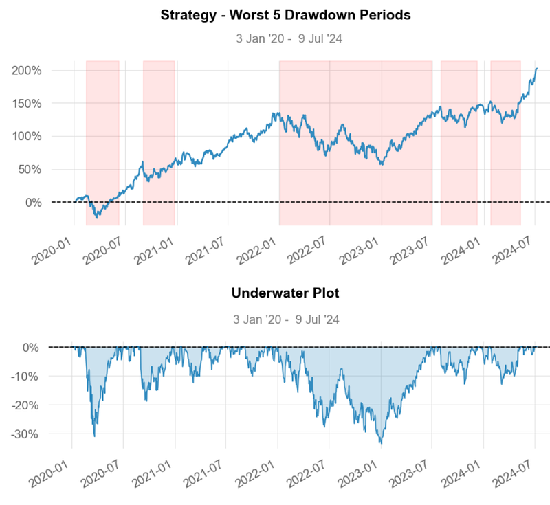
Worst 5 Drawdowns
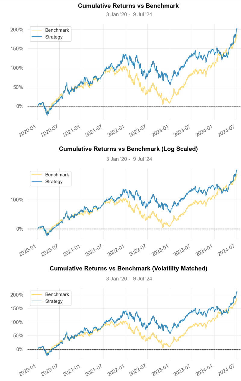
- Strategy Visualization vs SPY Benchmark
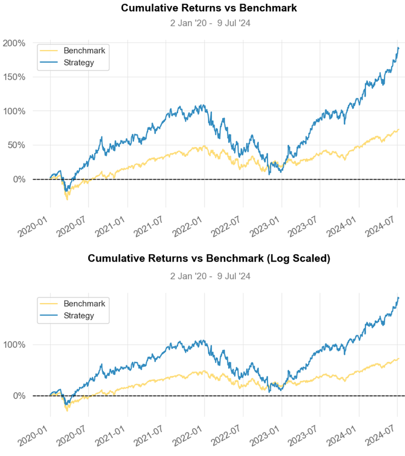
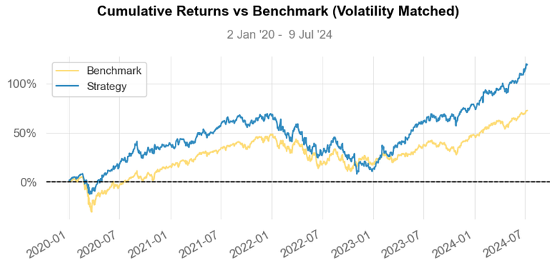
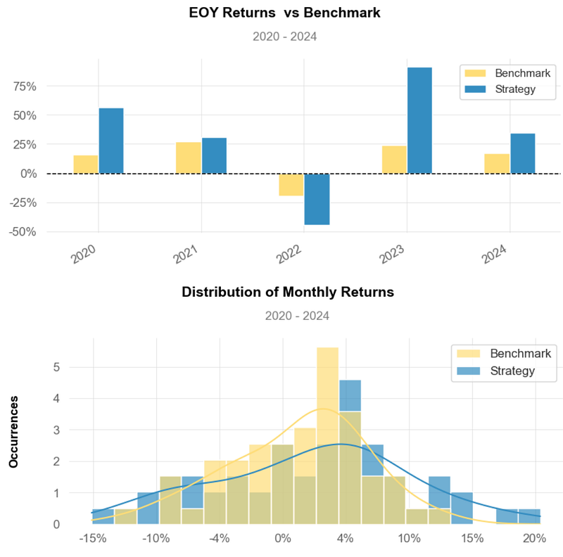
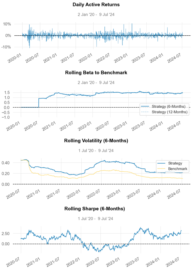
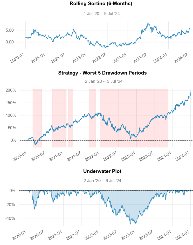
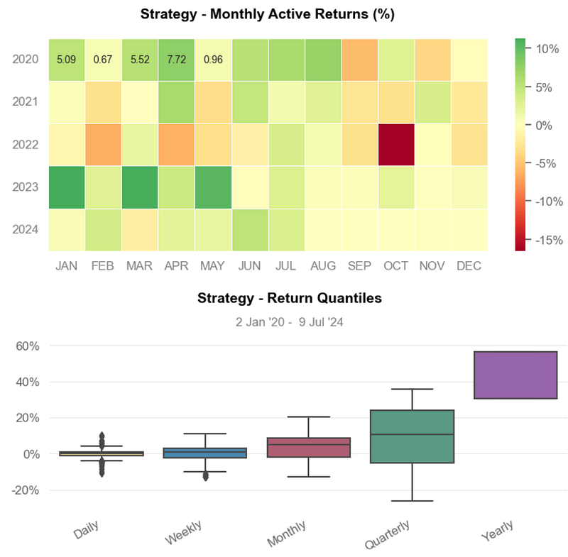
- Inferences:
- Strategy Cumulative Returns ~200% vs Benchmark ~75%.
- Strategy Cumulative Returns (Volatility Matched) ~ 125%.
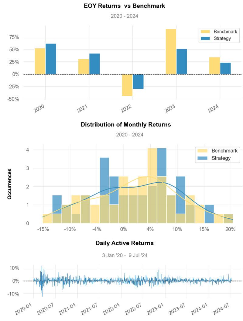
- EOY Strategy Returns ~ 30% vs Benchmark ~ 15%.
- Distribution of Monthly Returns: Strategy ~ 5% vs Benchmark ~ 3%.
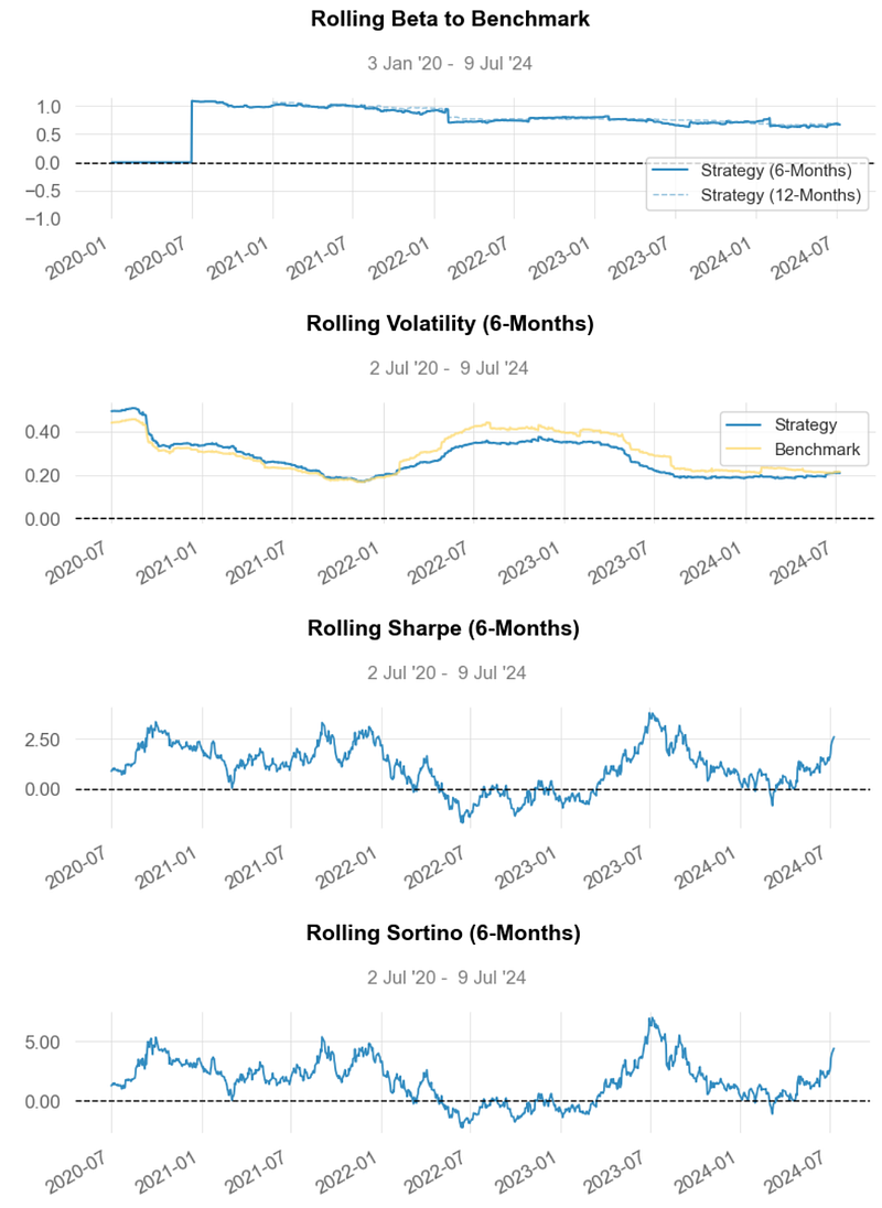
- Rolling Beta ~ 1.5
- Rolling Volatility ~ 0.2 vs Benchmark ~ 0.1
- Rolling Sharpe Ratio ~ 2.5
- Rolling Sortino Ratio ~ 5.0
- Worst Drawdown ~ -47% on 2021–12–28
- Min Monthly Active Returns ~ -15% (2022–10)
- Strategy Return Quantiles: ~ 10% quarterly and ~ 45% yearly.
- The Cumulative Return and the Sharpe Ratio of the strategy are higher than those of Benchmark, indicating that it generates better returns for the level of risk taken.
- Usually, any Sharpe Ratio greater than 1.0 is considered acceptable to good by investors. A Ratio higher than 2.0 is rated as very good. The Sharpe Ratio of our strategy is ~ 2.5.
- As a rule of thumb, a Sortino Ratio of 2 and above is considered ideal. Our strategy yields the Sortino Ratio of ~ 5.0.
- Beta Greater than 1: A beta greater than 1.0 indicates that the security’s price is theoretically more volatile than the market. If a stock’s beta is 1.2, it is assumed to be 20% more volatile than the market (cf. Rolling Volatility vs Benchmark). Technology stocks tend to have higher betas than the market benchmark.
- Overall, the proposed Equal-Weighted BF Portfolio has generated acceptable ROI, but it also comes with a higher degree of volatility as compared to SPY.
BF’s Efficient Frontier PO for Max Sharpe Ratio
- The PyPortfolioOpt library provides the EfficientFrontier class, which takes the covariance matrix and expected returns as inputs. The weights variable stores the optimized weights for each asset based on the max Sharpe Ratio objective [1,2].
- Importing libraries for PO and reading the stock data v.s.
# Importing libraries for portfolio optimization
from pypfopt.efficient_frontier import EfficientFrontier
from pypfopt import risk_models
from pypfopt import expected_returns

df=yf.download(tickers, start = '2020-01-01')['Adj Close']
df.tail()

Ticker     AAPL       AMZN       GOOG       META
Date
2024-07-02 220.270004 200.000000 186.610001 509.500000
2024-07-03 221.550003 197.589996 187.389999 509.959991
2024-07-05 226.339996 200.000000 191.960007 539.909973
2024-07-08 227.820007 199.289993 190.479996 529.320007
2024-07-09 228.679993 199.339996 190.440002 530.000000- Calculating and plotting the annualized expected returns and the annualized sample covariance matrix
# Calculating the annualized expected returns and the annualized sample covariance matrix
mu = expected_returns.mean_historical_return(df) #expected returns
S = risk_models.sample_cov(df) #Covariance matrix

# Visualizing the annualized expected returns
mu

Ticker
AAPL    0.288713
AMZN    0.179139
GOOG    0.255711
META    0.229041
dtype: float64

mu.plot.bar(label='Annualized Expected Returns')
plt.legend()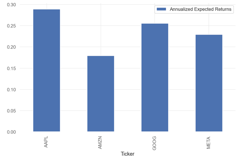
- Visualizing the covariance matrix
# Visualizing the covariance matrix
S

Ticker AAPL    AMZN    GOOG      META
Ticker
AAPL 0.106707 0.071803 0.070835 0.086041
AMZN 0.071803 0.132787 0.078590 0.103355
GOOG 0.070835 0.078590 0.107778 0.098501
META 0.086041 0.103355 0.098501 0.213837

S.style.background_gradient(cmap='coolwarm')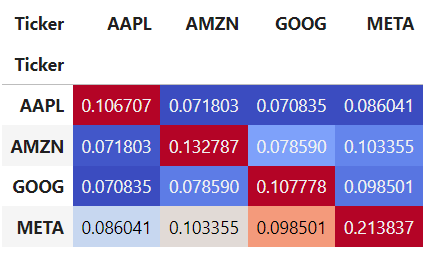
- PO for Max Sharpe Ratio (MSR)
# Optimizing for maximal Sharpe ratio
ef = EfficientFrontier(mu, S) # Providing expected returns and covariance matrix as input
weights = ef.max_sharpe() # Optimizing weights for Sharpe ratio maximization

clean_weights = ef.clean_weights() # clean_weights rounds the weights and clips near-zeros

# Printing optimized weights and expected performance for portfolio
clean_weights

OrderedDict([('AAPL', 0.66721),
             ('AMZN', 0.0),
             ('GOOG', 0.33279),
('META', 0.0)])- Creating the MSR optimized portfolio
# Creating new portfolio with optimized weights
new_weights = [0.66721, 0.33279]
optimized_portfolio = df['AAPL']*new_weights[0] + df['GOOG']*new_weights[1]
optimized_portfolio # Visualizing daily returns

Date
2020-01-02     71.406448
2020-01-03     70.821647
2020-01-06     71.763386
2020-01-07     71.520408
2020-01-08     72.480875
                 ...
2024-07-02    209.068292
2024-07-03    210.181895
2024-07-05    214.898680
2024-07-08    215.393625
2024-07-09    215.954106
Length: 1136, dtype: float64- Plotting the MSR cumulative return
optimized_portfolio.plot(label='Optimized Portfolio')
plt.legend()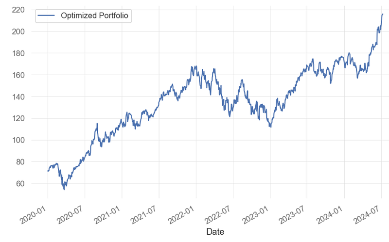
- Clearly, the MSR PO yields 220% returns by considering only 2 assets (AAPL and GOOG) instead of BF. This is a potential candidate for pair trading, being referred to as B2.
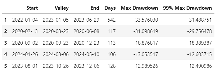
- Generating the MSR B2 Portfolio performance report and strategy visualization vs SPY benchmark
# Displaying new reports comparing the optimized portfolio to the first portfolio constructed
qs.reports.full(optimized_portfolio, benchmark = portfolio)


Performance Metrics
                           Benchmark    Strategy
-------------------------  -----------  ----------
Start Period               2020-01-03   2020-01-03
End Period                 2024-07-09   2024-07-09
Risk-Free Rate             0.0%         0.0%
Time in Market             100.0%       100.0%

Cumulative Return          184.73%      202.43%
CAGR﹪                     17.34%       18.43%

Sharpe                     0.9          0.96
Prob. Sharpe Ratio         97.08%       97.9%
Smart Sharpe               0.79         0.84
Sortino                    1.29         1.4
Smart Sortino              1.13         1.23
Sortino/√2                 0.91         0.99
Smart Sortino/√2           0.8          0.87
Omega                      1.19         1.19

Max Drawdown               -49.12%      -33.58%
Longest DD Days            690          542
Volatility (ann.)          31.42%       30.32%
R^2                        0.8          0.8
Information Ratio          0.0          0.0
Calmar                     0.35         0.55
Skew                       -0.14        -0.07
Kurtosis                   4.02         4.66

Expected Daily %           0.09%        0.1%
Expected Monthly %         1.92%        2.03%
Expected Yearly %          23.28%       24.77%
Kelly Criterion            5.11%        8.13%
Risk of Ruin               0.0%         0.0%
Daily Value-at-Risk        -3.14%       -3.03%
Expected Shortfall (cVaR)  -3.14%       -3.03%

Max Consecutive Wins       8            11
Max Consecutive Losses     6            6
Gain/Pain Ratio            0.17         0.19
Gain/Pain (1M)             1.1          1.14

Payoff Ratio               0.95         0.98
Profit Factor              1.17         1.19
Common Sense Ratio         1.14         1.16
CPC Index                  0.6          0.63
Tail Ratio                 0.97         0.98
Outlier Win Ratio          3.8          3.97
Outlier Loss Ratio         3.55         3.62

MTD                        5.18%        7.14%
3M                         16.73%       31.57%
6M                         36.32%       26.89%
YTD                        34.8%        23.43%
1Y                         54.69%       29.71%
3Y (ann.)                  9.97%        10.51%
5Y (ann.)                  17.34%       18.43%
10Y (ann.)                 17.34%       18.43%
All-time (ann.)            17.34%       18.43%

Best Day                   10.41%       11.17%
Worst Day                  -10.9%       -12.32%
Best Month                 20.41%       18.65%
Worst Month                -15.13%      -12.31%
Best Year                  91.38%       62.29%
Worst Year                 -44.71%      -29.98%

Avg. Drawdown              -3.59%       -4.0%
Avg. Drawdown Days         23           26
Recovery Factor            2.58         3.91
Ulcer Index                0.18         0.12
Serenity Index             0.42         0.94

Avg. Up Month              7.75%        8.26%
Avg. Down Month            -6.91%       -6.96%
Win Days %                 53.66%       54.54%
Win Month %                65.45%       58.18%
Win Quarter %              68.42%       57.89%
Win Year %                 80.0%        80.0%

Beta                       -            0.86
Alpha                      -            0.05
Correlation                -            89.32%
Treynor Ratio              -            234.87%
None- Worst 5 Drawdowns
- MSR PO Strategy Visualization
- Inferences:
- Strategy Cumulative Returns ~220%.
- Strategy Cumulative Returns (Volatility Matched) ~ 210%.
- Distribution of Monthly Returns: Strategy ~ 7% vs Benchmark ~ 3%.
- Rolling Beta ~ 0.6
- Rolling Volatility ~ 0.2
- Rolling Sharpe Ratio ~ 2.5
- Rolling Sortino Ratio ~ 5.0
- Worst Drawdown ~ -31% on 2021–01–04
- Min Monthly Active Returns ~ -10% (2022–10)
- Strategy Return Quantiles: ~ 10% quarterly and ~ 50% yearly.
- The Cumulative Return and the Sharpe Ratio of the strategy are higher than those of Benchmark, indicating that it generates better returns for the level of risk taken.
- A beta of less than 1 indicates that MSR B2 is less volatile than the overall market.
- Overall, the Optimized MSR B2 Portfolio has outperformed the Equal-Weighted BF Portfolio in terms of the risk-return tradeoff with the 50% BF-to-B2 portfolio cost reduction.
(NVDA, AMD) vs S&P 500 Profitability Analysis
- Let’s delve into the specifics of (NVDA, AMD) vs S&P 500 profitability analysis using FinanceToolkit [9].
- Fetching input historical data, income statements, profitability ratios, FA and TA indicators [9]
import matplotlib.pyplot as plt
import matplotlib.ticker as mtick
import pandas as pd
import seaborn as sns
from matplotlib import patheffects

from financetoolkit import Toolkit

API_KEY = "YOUR API KEY"

companies = Toolkit(["NVDA", "AMD"], api_key=API_KEY, start_date="2017-12-31")

# income statement
historical_data = companies.get_historical_data()

# a Financial Statement example
income_statement = companies.get_income_statement()

# profitability ratios
profitability_ratios = companies.ratios.collect_profitability_ratios()

# greeks
all_greeks = companies.options.collect_all_greeks(expiration_time_range=180)


# factor asset correlations
factor_asset_correlations = companies.performance.get_factor_asset_correlations(
    period="quarterly"
)

# VaR
value_at_risk = companies.risk.get_value_at_risk(period="weekly")

# a TA indicator
ichimoku_cloud = companies.technicals.get_ichimoku_cloud()
Cumulative Returns
- Plotting the cumulative returns of NVDA, AMD, and S&P 500 [9]
display(historical_data)

# Copy to clipboard (this is just to paste the data in the README)
pd.io.clipboards.to_clipboard(
    historical_data.xs("NVDA", axis=1, level=1).iloc[:-1].head().to_markdown(),
    excel=False,
)

# Create a line chart for cumulative returns
ax = historical_data["Cumulative Return"].plot(
    figsize=(15, 5),
    lw=2,
)

# Customize the colors and line styles
ax.set_prop_cycle(color=["#007ACC", "#FF6F61", "#4CAF50"])
ax.set_xlabel("Year")
ax.set_ylabel("Cumulative Return")
ax.set_title(
    "Cumulative Returns of NVDA and AMD including the S&P 500 as Benchmark"
)

# Add a legend
ax.legend(["NVDA", "AMD", "S&P 500"], loc="upper left")

# Add grid lines for clarity
ax.grid(True, linestyle="--", alpha=0.7)

plt.show()
Volatility
- Plotting Volatility of NVDA & AMD vs S&P 500
print(historical_data['Volatility'].iloc[-1])
NVDA        0.0324
AMD         0.0345
Benchmark   0.0125
Name: 2024-07-09, dtype: float64

historical_data['Volatility'].iloc[-1].plot.bar(title='Volatility')
- We can see that Volatility of our 2 assets is ~3 times higher than that of Benchmark.
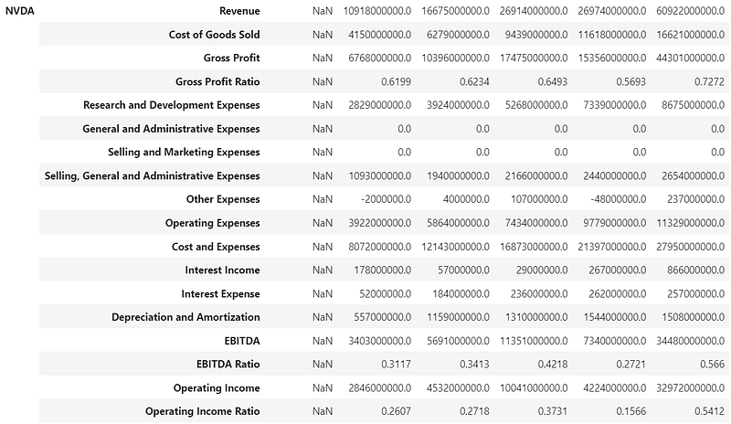
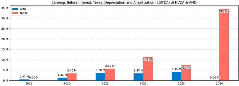
Income Statements
- Comparing the NVDA & AMD income statements 2019–2024 [9]
display(income_statement)

# Copy to clipboard (this is just to paste the data in the README)
pd.io.clipboards.to_clipboard(
    income_statement.loc["NVDA"].head().to_markdown(), excel=False
)

# Create the bar plot
ebitda_data = income_statement.loc[:, "EBITDA", :].T
colors = ["#007ACC", "#FF6F61"]
ax = ebitda_data.plot.bar(figsize=(15, 5), color=colors)

# Add data labels on top of the bars with custom formatting (divided by 1,000,000 for millions and thousand separator)
for p in ax.patches:
    ebitda_millions = p.get_height() / 1_000_000_000
    label = f"{ebitda_millions:,.2f} M"
    x = p.get_x() + p.get_width() / 2.0
    y = p.get_height()

    # Check if the label is too close to the top of the chart
    if y < 0.2 * ax.get_ylim()[1]:
        va = "bottom"
        xytext = (0, 5)
    else:
        va = "top"
        xytext = (0, -5)

    # Create a stroke effect for the text
    text = ax.annotate(
        label,
        (x, y),
        ha="center",
        va=va,
        fontsize=10,
        color="black",
        xytext=xytext,
        textcoords="offset points",
    )
    text.set_path_effects([patheffects.withStroke(linewidth=3, foreground="white")])

# Customize the axis labels
plt.xlabel("", fontsize=10)
plt.ylabel("", fontsize=10)

# Change the degree of the x ticks
plt.xticks(rotation=0)

# Customize the title
plt.title(
    "Earnings Before Interest, Taxes, Depreciation and Amortization (EBITDA) of NVDA & AMD",
    fontsize=12,
)

# Add a horizontal grid for clarity
plt.grid(axis="y", linestyle="--", alpha=0.7)

# Add a thousand separator to the y-axis
ax.yaxis.set_major_formatter(
    mtick.FuncFormatter(lambda x, _: f"{x / 1_000_000_000:,.0f} M")
)

# Show the plot
plt.show()
Profitability Ratios
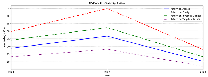
- Visualizing the NVDA & AMD profitability ratios 2019–2024 [9]
display(profitability_ratios)

# Copy to clipboard (this is just to paste the data in the README)
pd.io.clipboards.to_clipboard(
    profitability_ratios.loc["NVDA"].head().to_markdown(), excel=False
)

ratios_to_plot = [
    "Return on Assets",
    "Return on Equity",
    "Return on Invested Capital",
    "Return on Tangible Assets",
]

# Create the plot
ax = (
    (profitability_ratios.dropna(axis=1) * 100)
    .loc["NVDA", ratios_to_plot, :]
    .T.plot(figsize=(15, 5), title="NVDA's Profitability Ratios", lw=2)
)

# Customize the line styles and colors
line_styles = ["-", "--", "-.", ":"]
line_colors = ["blue", "red", "green", "purple"]
for i, line in enumerate(ax.get_lines()):
    line.set_linestyle(line_styles[i])
    line.set_color(line_colors[i])

# Customize the legend
ax.legend(ratios_to_plot)

# Add labels and grid
plt.xlabel("Year", fontsize=12)
plt.ylabel("Percentage (%)", fontsize=12)
plt.grid(True, linestyle="--", alpha=0.7)

# Customize the title
plt.title("NVDA's Profitability Ratios")

# Show the plot
plt.show()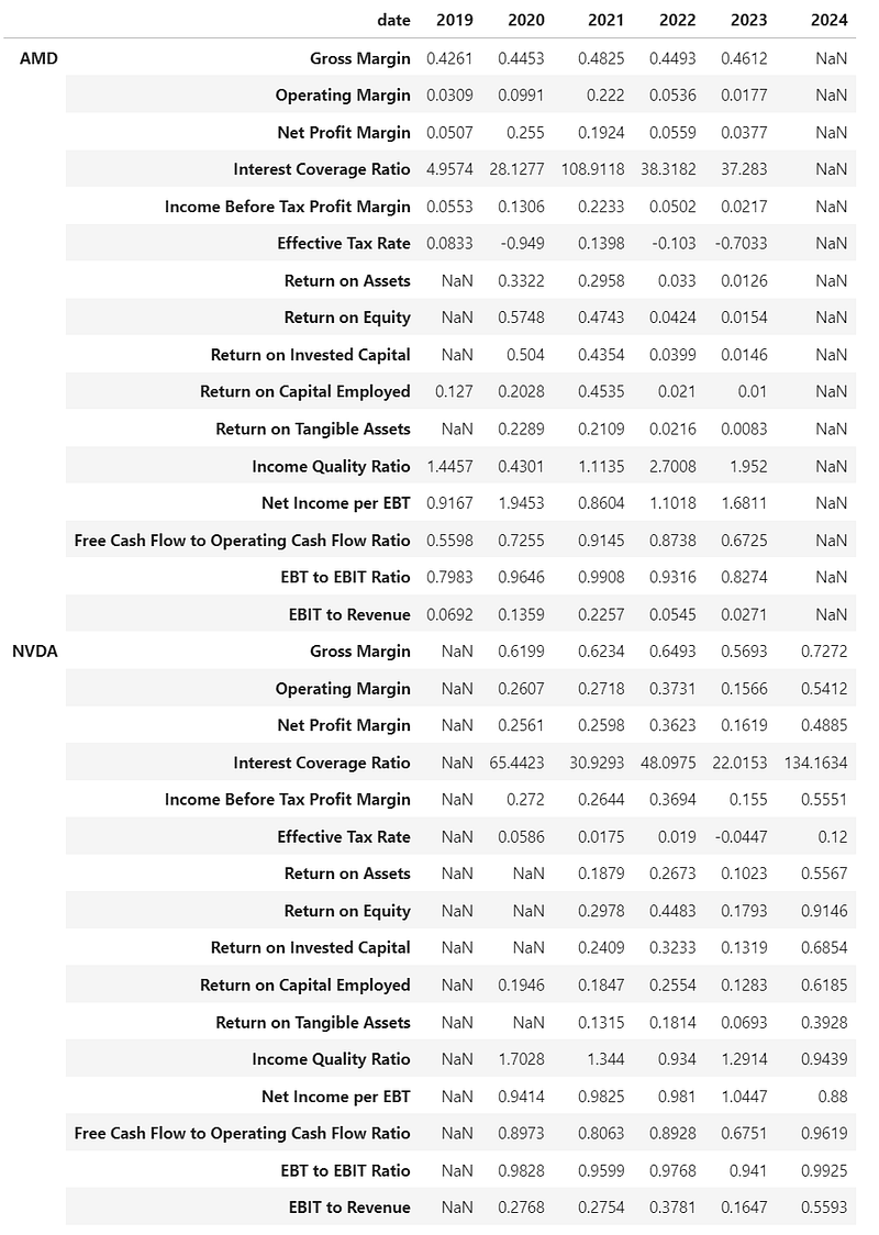
- Plotting the AMD’s Profitability Ratios
# Copy to clipboard (this is just to paste the data in the README)
pd.io.clipboards.to_clipboard(
    profitability_ratios.loc["AMD"].head().to_markdown(), excel=False
)

ratios_to_plot = [
    "Return on Assets",
    "Return on Equity",
    "Return on Invested Capital",
    "Return on Tangible Assets",
]

# Create the plot
ax = (
    (profitability_ratios.dropna(axis=1) * 100)
    .loc["AMD", ratios_to_plot, :]
    .T.plot(figsize=(15, 5), title="AMD's Profitability Ratios", lw=2)
)

# Customize the line styles and colors
line_styles = ["-", "--", "-.", ":"]
line_colors = ["blue", "red", "green", "purple"]
for i, line in enumerate(ax.get_lines()):
    line.set_linestyle(line_styles[i])
    line.set_color(line_colors[i])

# Customize the legend
ax.legend(ratios_to_plot)

# Add labels and grid
plt.xlabel("Year", fontsize=12)
plt.ylabel("Percentage (%)", fontsize=12)
plt.grid(True, linestyle="--", alpha=0.7)

# Customize the title
plt.title("AMD's Profitability Ratios")

# Show the plot
plt.show()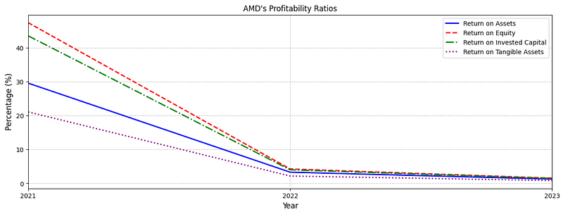
- Examining NVDA vs AMD Profitability Ratios in 2023
print(profitability_ratios['2023'])

AMD   Gross Margin                                   0.4612
      Operating Margin                               0.0177
      Net Profit Margin                              0.0377
      Interest Coverage Ratio                        37.283
      Income Before Tax Profit Margin                0.0217
      Effective Tax Rate                            -0.7033
      Return on Assets                               0.0126
      Return on Equity                               0.0154
      Return on Invested Capital                     0.0146
      Return on Capital Employed                       0.01
      Return on Tangible Assets                      0.0083
      Income Quality Ratio                            1.952
      Net Income per EBT                             1.6811
      Free Cash Flow to Operating Cash Flow Ratio    0.6725
      EBT to EBIT Ratio                              0.8274
      EBIT to Revenue                                0.0271
NVDA  Gross Margin                                   0.5693
      Operating Margin                               0.1566
      Net Profit Margin                              0.1619
      Interest Coverage Ratio                       22.0153
      Income Before Tax Profit Margin                 0.155
      Effective Tax Rate                            -0.0447
      Return on Assets                               0.1023
      Return on Equity                               0.1793
      Return on Invested Capital                     0.1319
      Return on Capital Employed                     0.1283
      Return on Tangible Assets                      0.0693
      Income Quality Ratio                           1.2914
      Net Income per EBT                             1.0447
      Free Cash Flow to Operating Cash Flow Ratio    0.6751
      EBT to EBIT Ratio                               0.941
      EBIT to Revenue                                0.1647
Name: 2023, dtype: float64

plt.figure(figsize=(14, 8))
prof=profitability_ratios['2023']
cols = ['NVDA', 'AMD']
prof[cols].plot(kind='bar')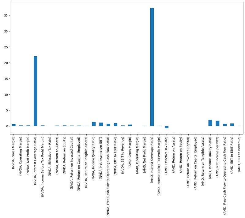
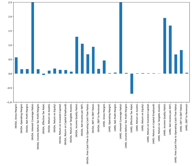
- NVDA vs AMD Profitability Ratios in 2023 Zoomed
plt.figure(figsize=(14, 8))
prof=profitability_ratios['2023']
cols = ['NVDA', 'AMD']
prof[cols].plot(kind='bar')
plt.ylim(-1, 2.5)
Greek Sensitivities for AMD vs NVDA
- Examining the Greek sensitivities for AMD [9]
import matplotlib.pyplot as plt
from matplotlib import cm

fig, ax = plt.subplots(figsize=(15, 10), ncols=2, nrows=2)

delta_over_time_df = pd.DataFrame()
dates = all_greeks.columns.get_level_values(0)

# Loop through different times
for i, time in enumerate(range(30, 210, 30)):

    try:
        period_column = dates[time]
    except IndexError:
        period_column = dates[-1]

    color = cm.viridis(i / 5)  # Using viridis colormap for color variation

    # Delta plot
    ax[0, 0].plot(all_greeks.loc["AMD", (period_column, "Delta")], color=color)

    # Gamma plot
    ax[0, 1].plot(all_greeks.loc["AMD", (period_column, "Gamma")], color=color)

    # Theta plot
    ax[1, 0].plot(all_greeks.loc["AMD", (period_column, "Theta")], color=color)

    # Vega plot
    ax[1, 1].plot(all_greeks.loc["AMD", (period_column, "Vega")], color=color)

    delta_over_time_df = pd.concat(
        [delta_over_time_df, all_greeks.loc["AMD", (period_column, "Delta")]], axis=1
    )

date_labels = [
    "1 Month",
    "2 Months",
    "3 Months",
    "4 Months",
    "5 Months",
    "6 Months",
]

delta_over_time_df.columns = date_labels

# Show the DataFrame
display(delta_over_time_df.iloc[7:12])

# Copy to clipboard (this is just to paste the data in the README)
pd.io.clipboards.to_clipboard(delta_over_time_df.iloc[7:12].to_markdown(), excel=False)

# Titles and labels
for number1, number2 in [(0, 0), (1, 0), (0, 1), (1, 1)]:
    ax[number1, number2].set_xlim(
        [all_greeks.loc["AMD"].index.min(), all_greeks.loc["AMD"].index.max()]
    )
    ax[number1, number2].grid(True, linestyle="--", alpha=0.7)
    ax[number1, number2].set_xlabel("Strike Price")
    ax[number1, number2].set_facecolor("#F5F5F5")

ax[0, 0].set_title("Delta")
ax[0, 1].set_title("Gamma")
ax[1, 0].set_title("Theta")
ax[1, 1].set_title("Vega")

# Adjust layout
fig.legend(
    date_labels,
    loc="upper center",
    ncol=6,
    bbox_to_anchor=(0.5, 0),
    frameon=False,
)
fig.suptitle(
    "Greek Sensitivities for AMD", fontsize=30, x=0.5, y=0.98, fontfamily="cursive"
)

fig.tight_layout()

# Show the plot
plt.show()

    1 Month 2 Months 3 Months 4 Months 5 Months 6 Months
165 0.872 0.8067 0.7692 0.7398 0.7236 0.7113
170 0.7487 0.698 0.6728 0.6544 0.6449 0.638
175 0.5863 0.5721 0.5664 0.5631 0.562 0.5615
180 0.4124 0.442 0.458 0.471 0.4786 0.4848
185 0.2582 0.3212 0.3555 0.3828 0.3985 0.4108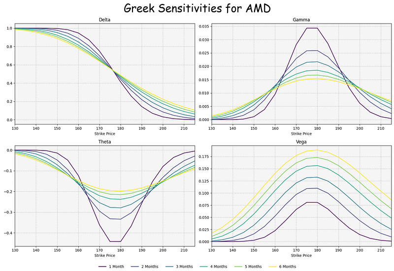
- Examining the Greek sensitivities for NVDA [9]
import matplotlib.pyplot as plt
from matplotlib import cm

fig, ax = plt.subplots(figsize=(15, 10), ncols=2, nrows=2)

delta_over_time_df = pd.DataFrame()
dates = all_greeks.columns.get_level_values(0)

# Loop through different times
for i, time in enumerate(range(30, 210, 30)):

    try:
        period_column = dates[time]
    except IndexError:
        period_column = dates[-1]

    color = cm.viridis(i / 5)  # Using viridis colormap for color variation

    # Delta plot
    ax[0, 0].plot(all_greeks.loc["NVDA", (period_column, "Delta")], color=color)

    # Gamma plot
    ax[0, 1].plot(all_greeks.loc["NVDA", (period_column, "Gamma")], color=color)

    # Theta plot
    ax[1, 0].plot(all_greeks.loc["NVDA", (period_column, "Theta")], color=color)

    # Vega plot
    ax[1, 1].plot(all_greeks.loc["NVDA", (period_column, "Vega")], color=color)

    delta_over_time_df = pd.concat(
        [delta_over_time_df, all_greeks.loc["NVDA", (period_column, "Delta")]], axis=1
    )

date_labels = [
    "1 Month",
    "2 Months",
    "3 Months",
    "4 Months",
    "5 Months",
    "6 Months",
]

delta_over_time_df.columns = date_labels

# Show the DataFrame
display(delta_over_time_df.iloc[7:12])

# Copy to clipboard (this is just to paste the data in the README)
pd.io.clipboards.to_clipboard(delta_over_time_df.iloc[7:12].to_markdown(), excel=False)

# Titles and labels
for number1, number2 in [(0, 0), (1, 0), (0, 1), (1, 1)]:
    ax[number1, number2].set_xlim(
        [all_greeks.loc["NVDA"].index.min(), all_greeks.loc["NVDA"].index.max()]
    )
    ax[number1, number2].grid(True, linestyle="--", alpha=0.7)
    ax[number1, number2].set_xlabel("Strike Price")
    ax[number1, number2].set_facecolor("#F5F5F5")

ax[0, 0].set_title("Delta")
ax[0, 1].set_title("Gamma")
ax[1, 0].set_title("Theta")
ax[1, 1].set_title("Vega")

# Adjust layout
fig.legend(
    date_labels,
    loc="upper center",
    ncol=6,
    bbox_to_anchor=(0.5, 0),
    frameon=False,
)
fig.suptitle(
    "Greek Sensitivities for NVDA", fontsize=30, x=0.5, y=0.98, fontfamily="cursive"
)

fig.tight_layout()

# Show the plot
plt.show()

    1 Month 2 Months 3 Months 4 Months 5 Months 6 Months
135 0.3367 0.3835 0.4084 0.4282 0.4395 0.4484
140 0.1525 0.2277 0.2722 0.3087 0.3298 0.3466
145 0.0539 0.1188 0.1666 0.2099 0.2363 0.2578
150 0.0149 0.0547 0.0939 0.1349 0.1619 0.1848
155 0.0033 0.0224 0.049 0.0822 0.1063 0.128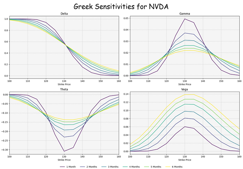
Interpretation: Option Greeks are financial measures of the sensitivity of an option’s price to its underlying determining parameters, such as volatility or the price of the underlying asset. The Greeks are utilized in the analysis of an options portfolio and in sensitivity analysis of an option or portfolio of options. The measures are considered essential by many investors for making informed decisions in options trading.
Delta: if the price of the underlying asset increases by $1, the price of the option will change by Delta amount.
Gamma is a measure of the delta’s change relative to the changes in the price of the underlying asset. If the price of the underlying asset increases by $1, the option’s delta will change by the gamma amount.
Vega is an option Greek that measures the sensitivity of an option price relative to the volatility of the underlying asset. If the volatility of the underlying asses increases by 1%, the option price will change by the vega amount.
Theta is a measure of the sensitivity of the option price relative to the option’s time to maturity. If the option’s time to maturity decreases by one day, the option’s price will change by the theta amount. The Theta option Greek is also referred to as time decay.
Inferences:
- At the money (ATM) is a situation where an option’s strike price is identical to the current market price of the underlying security. An ATM call option has a delta of 0.50.
- We can see that ATM Strike Price USD of NVDA/AMD is 130/175.
- Theta, usually expressed as a negative number for long positions, indicates how much of the option’s value is being lost.
- Our plots show that ATM Theta of NVDA/AMD is ca. -0.3/-0.45.
- Gamma is highest when the Delta is in the . 40-. 60 range, or typically when an option is ATM. So if an option’s delta is +40 and the gamma is 10, a $1 increase in the underlying price would result in that option’s delta becoming +50.
- In our example, we have ATM Gamma of NVDA/AMD is 0.05/0.035.
- Options Vega essentially reports on the sensitivity of an option to fluctuations in volatility. A higher vega value implies that the option price will be more sensitive to changes in volatility, while a lower vega indicates that the option price will be less sensitive to changes in volatility.
- Our diagrams indicate that ATM Vega of NVDA/AMD is 0.14/0.18.
NVDA & AMD VaR vs Benchmark
- Plotting NVDA & AMD Value-at-Risk (VaR) vs Benchmark [9]
display(value_at_risk)

# Copy to clipboard (this is just to paste the data in the README)
pd.io.clipboards.to_clipboard(value_at_risk.iloc[:-1].tail().to_markdown(), excel=False)

# Filter out the occasional positive return
value_at_risk = value_at_risk[value_at_risk < 0]

# Create an area chart for Value at Risk (VaR) with custom styling
fig, ax = plt.subplots(figsize=(15, 5))

# Customize the colors and transparency
ax.set_prop_cycle(color=["#007ACC", "#FF6F61", "#4CAF50"])
ax.set_xlabel("Year", fontsize=12)
ax.set_ylabel("VaR", fontsize=12)

# Add a title with a unique font style
ax.set_title("Value at Risk (VaR)")

# Stack the area chart for a better visual representation
value_at_risk.plot.area(ax=ax, stacked=False, alpha=0.7)

# Add grid lines with a unique linestyle
ax.grid(True, linestyle="--", alpha=0.5)

# Customize the ticks and labels with a unique font
ax.tick_params(axis="both", which="major", labelsize=10)

# Add a background color to the plot area for a unique touch
ax.set_facecolor("#F0F0F0")

# Add a unique border color to the plot area
ax.spines["top"].set_color("#E0E0E0")
ax.spines["bottom"].set_color("#E0E0E0")
ax.spines["left"].set_color("#E0E0E0")
ax.spines["right"].set_color("#E0E0E0")

# Set a unique background color for the entire plot
fig.set_facecolor("#F8F8F8")

# Add an annotation box at a specific date
annotation_date = value_at_risk.sort_values(by="Benchmark").index[0]
annotation_value = value_at_risk.loc[value_at_risk.sort_values(by="AMD").index[0]][
    "Benchmark"
]
ax.annotate(
    "Impact of the Initial Publications about COVID-19",
    xy=(annotation_date, annotation_value),
    xytext=(-180, -30),
    textcoords="offset points",
    arrowprops=dict(arrowstyle="->", color="black"),
    fontsize=10,
    bbox=dict(boxstyle="round", edgecolor="black", facecolor="white"),
)

# Display the prettier VaR chart with the annotation
plt.show()

                       NVDA     AMD   Benchmark
2017-01-02/2017-01-08 -0.0198 -0.0141 -0.0007
2017-01-09/2017-01-15 -0.0146 -0.0356 -0.0031
2017-01-16/2017-01-22 -0.0217 -0.0627 -0.0037
2017-01-23/2017-01-29 NaN -0.004 -0.0024
2017-01-30/2017-02-05 -0.0131 -0.0192 -0.005
... ... ... ...
2024-06-03/2024-06-09 -0.0096 -0.0215 -0.001
2024-06-10/2024-06-16 -0.0042 -0.0376 NaN
2024-06-17/2024-06-23 -0.0349 -0.0214 -0.0025
2024-06-24/2024-06-30 -0.0573 -0.0147 -0.0038
2024-07-01/2024-07-07 -0.0079 -0.0255 NaN
392 rows × 3 columns
Inference 2024–07: VaR of NVDA, AMD and S&P 500 are ca. 5%, 3% and 1%, respectively.
Correlations of NVDA & AMD with the Fama-French Factors
- Investors have been seeking financial models that quantify risk and use it to estimate the expected return on equity. The Fama French five-factor model is one of the most classic models (Fama and French, 2015).
- Exploring correlations of NVDA & AMD with the Fama-French Factors [9]
display(factor_asset_correlations)

# Copy to clipboard (this is just to paste the data in the README)
pd.io.clipboards.to_clipboard(
    factor_asset_correlations.xs("NVDA", axis=1, level=0)
    .iloc[:-1]
    .tail()
    .to_markdown(),
    excel=False,
)

# Define your factor_asset_correlations DataFrame (replace YourDataFrame)
correlations_aapl = factor_asset_correlations.xs("NVDA", axis=1, level=0)
correlations_msft = factor_asset_correlations.xs("AMD", axis=1, level=0)

# Create subplots with shared x-axis and customize styles
fig, (ax1, ax2) = plt.subplots(2, 1, figsize=(10, 8), sharex=True)

# Set a color palette for the lines
colors = ["#007ACC", "#FF6F61", "#4CAF50", "#FFD700", "#FF6347", "#6A5ACD", "#FF8C00"]

# Plot correlations for AAPL
correlations_aapl.plot(
    ax=ax1, title="Correlations of NVDA with the Fama-French Factors", color=colors
)
ax1.set_ylabel("Correlation")
ax1.legend(loc="upper right", frameon=False)

# Plot correlations for MSFT
correlations_msft.plot(
    ax=ax2, title="Correlations of AMD with the Fama-French Factors", color=colors
)
ax2.set_xlabel("Date")
ax2.set_ylabel("Correlation")
ax2.legend(loc="upper right", frameon=False)

# Add grid lines for clarity
ax1.grid(True, linestyle="--", alpha=0.5)
ax2.grid(True, linestyle="--", alpha=0.5)

# Customize the legend and labels
ax1.legend(loc="upper right", frameon=False)
ax2.legend(loc="upper right", frameon=False)

# Set background colors for the subplots
ax1.set_facecolor("#F9F9F9")
ax2.set_facecolor("#F9F9F9")

# Remove spines on the top and right side of the subplots
ax1.spines[["top", "right"]].set_visible(False)
ax2.spines[["top", "right"]].set_visible(False)

# Set a tight layout to optimize spacing
plt.tight_layout()

# Show the plots
plt.show()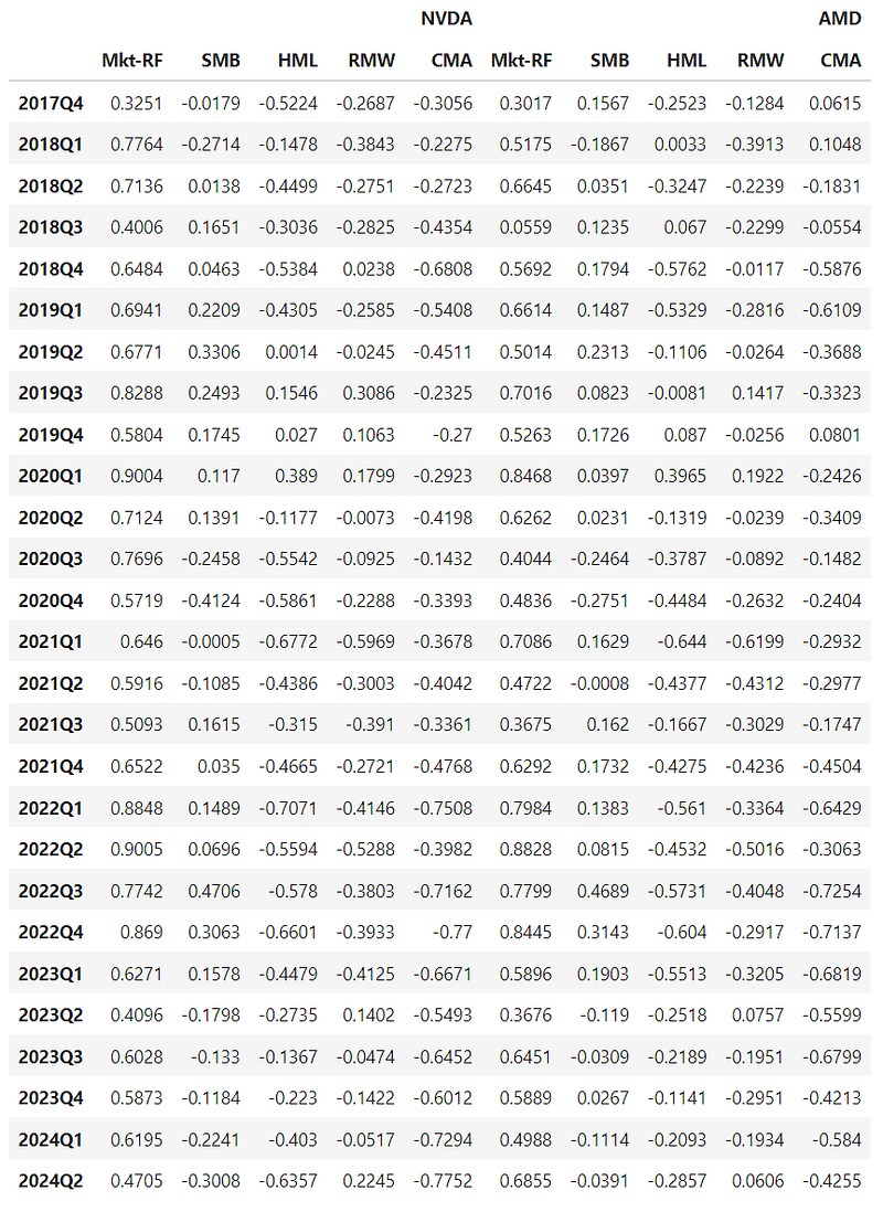
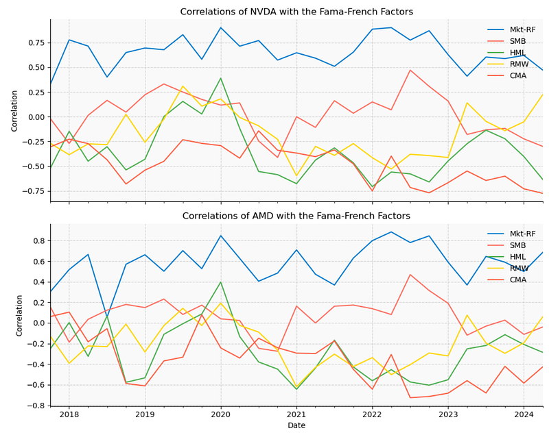
- MKT is the excess return of the market. It is the return on the value-weighted market portfolio.
- SMB is the return on a diversified portfolio of small-cap stocks minus the return on a diversified portfolio of big-cap stocks.
- HML is the difference between the returns on diversified portfolios of stocks with high and low Book-to-Market ratios.
- RMW is the difference between the returns on diversified portfolios of stocks with robust (high and steady) and weak (low) profitability.
- CMA is the difference between the returns on diversified portfolios of the stocks of low and high investment firms, which we call conservative and aggressive. Here, low/high investment means reinvestment ratio is low/high.
- Inferences 2024:
- HML(NVDA)
- If you believe that value stocks will outperform growth stocks, you should tilt your portfolio towards assets with a high HML factor.
- Our example is that of a large-cap company with a low book-to-market ratio, falling into the “big size” and “low value” categories. According to the Fama-French model, this company would be expected to provide lower returns over the long term, as both the SMB and HML factors would be negative.
- Defined analogously to the HML factor, the profitability factor (RMW) is the difference between the returns of firms with robust (high) and weak (low) operating profitability. We can see that
- RMW(NVDA) ~0.25 and RMW(AMD) ~0.1.
TA Ichimoku Cloud: NVDA vs AMD
- The TA Ichimoku Cloud can give a snapshot of market sentiment and price momentum to help traders identify trends.
- Comparing the TA Ichimoku Clouds [9] for NVDA & AMD
display(ichimoku_cloud)

# Define your Ichimoku Cloud data DataFrames
ichimoku_data_aapl = ichimoku_cloud.xs("NVDA", level=1, axis=1)
ichimoku_data_msft = ichimoku_cloud.xs("AMD", level=1, axis=1)

# Copy to clipboard (this is just to paste the data in the README)
pd.io.clipboards.to_clipboard(ichimoku_data_aapl.tail().to_markdown(), excel=False)

# Take the last 500 rows
ichimoku_data_aapl = ichimoku_data_aapl.iloc[-500:]
ichimoku_data_msft = ichimoku_data_msft.iloc[-500:]

# Create a figure and two axes for horizontal subplots
fig, (ax1, ax2) = plt.subplots(1, 2, figsize=(15, 6))

# Convert the PeriodIndex to a DatetimeIndex
ichimoku_data_aapl.index = ichimoku_data_aapl.index.to_timestamp()
ichimoku_data_msft.index = ichimoku_data_msft.index.to_timestamp()

# Plot Ichimoku Cloud for NVDA
ax1.plot(
    ichimoku_data_aapl.index,
    ichimoku_data_aapl["Conversion Line"],
    color="blue",
    label="Conversion Line (Tenkan-sen)",
    linewidth=2,
)
ax1.plot(
    ichimoku_data_aapl.index,
    ichimoku_data_aapl["Base Line"],
    color="red",
    label="Base Line (Kijun-sen)",
    linewidth=2,
)
ax1.fill_between(
    ichimoku_data_aapl.index,
    ichimoku_data_aapl["Leading Span A"],
    ichimoku_data_aapl["Leading Span B"],
    where=ichimoku_data_aapl["Leading Span A"] >= ichimoku_data_aapl["Leading Span B"],
    facecolor="green",
    alpha=0.2,
    label="Bullish Cloud",
)
ax1.fill_between(
    ichimoku_data_aapl.index,
    ichimoku_data_aapl["Leading Span A"],
    ichimoku_data_aapl["Leading Span B"],
    where=ichimoku_data_aapl["Leading Span A"] < ichimoku_data_aapl["Leading Span B"],
    facecolor="red",
    alpha=0.2,
    label="Bearish Cloud",
)

# Customize the legend and labels for NVDA
ax1.legend(loc="upper left")
ax1.set_xlabel("Date", fontsize=14)
ax1.set_ylabel("Price", fontsize=14)
ax1.set_title("Ichimoku Cloud Chart (NVDA)", fontsize=16)
ax1.grid(True, linestyle="--", alpha=0.5)
ax1.set_facecolor("#f7f7f7")
ax1.tick_params(axis="both", which="major", labelsize=12)

# Plot Ichimoku Cloud for MSFT
ax2.plot(
    ichimoku_data_msft.index,
    ichimoku_data_msft["Conversion Line"],
    color="blue",
    label="Conversion Line (Tenkan-sen)",
    linewidth=2,
)
ax2.plot(
    ichimoku_data_msft.index,
    ichimoku_data_msft["Base Line"],
    color="red",
    label="Base Line (Kijun-sen)",
    linewidth=2,
)
ax2.fill_between(
    ichimoku_data_msft.index,
    ichimoku_data_msft["Leading Span A"],
    ichimoku_data_msft["Leading Span B"],
    where=ichimoku_data_msft["Leading Span A"] >= ichimoku_data_msft["Leading Span B"],
    facecolor="green",
    alpha=0.2,
    label="Bullish Cloud",
)
ax2.fill_between(
    ichimoku_data_msft.index,
    ichimoku_data_msft["Leading Span A"],
    ichimoku_data_msft["Leading Span B"],
    where=ichimoku_data_msft["Leading Span A"] < ichimoku_data_msft["Leading Span B"],
    facecolor="red",
    alpha=0.2,
    label="Bearish Cloud",
)

# Customize the legend and labels for AMD
ax2.legend(loc="upper left")
ax2.set_xlabel("Date", fontsize=14)
ax2.set_ylabel("Price", fontsize=14)
ax2.set_title("Ichimoku Cloud Chart (AMD)", fontsize=16)
ax2.grid(True, linestyle="--", alpha=0.5)
ax2.set_facecolor("#f7f7f7")
ax2.tick_params(axis="both", which="major", labelsize=12)

# Adjust spacing between subplots
plt.tight_layout()

# Show the plot
plt.show()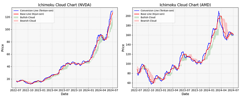
- This plot shows that NVDA and AMD follow the bullish and bearish shorter-term trends, respectively. Looking at the AMD plot v.s., we see a clear crossover of the Tenkan Sen (blue line) and the Kijun Sen (red line) in 2024–07.
1Y BigTech Stock Price Predictions
- Can FinanceToolkit make 1Y BigTech stock forecasting?
- Initializing the Toolkit with company tickers and plotting 1Y stock price simulations [9]
# Initialize the Toolkit with company tickers
companies = Toolkit(
    ["AAPL", "MSFT", "GOOGL", "AMZN"], api_key=API_KEY, start_date="2005-01-01"
)

stock_price_simulations = companies.options.get_stock_price_simulation(timesteps=10)

fig, ax = plt.subplots(2, 2, figsize=(15, 10))

stock_price_simulations_transposed = stock_price_simulations.T
stock_price_simulations_transposed.index = (
    stock_price_simulations_transposed.index.astype("datetime64[ns]")
)

for i, ticker in enumerate(companies._tickers):
    ax[i // 2, i % 2].plot(stock_price_simulations_transposed[ticker])
    ax[i // 2, i % 2].set_title(ticker)
    ax[i // 2, i % 2].xaxis.set_tick_params(rotation=20)
    ax[i // 2, i % 2].yaxis.set_tick_params(labelsize=8)
    ax[i // 2, i % 2].grid(linestyle="--", alpha=0.5)

fig.suptitle("Stock Price Simulations", fontweight="bold")
fig.tight_layout()
plt.show()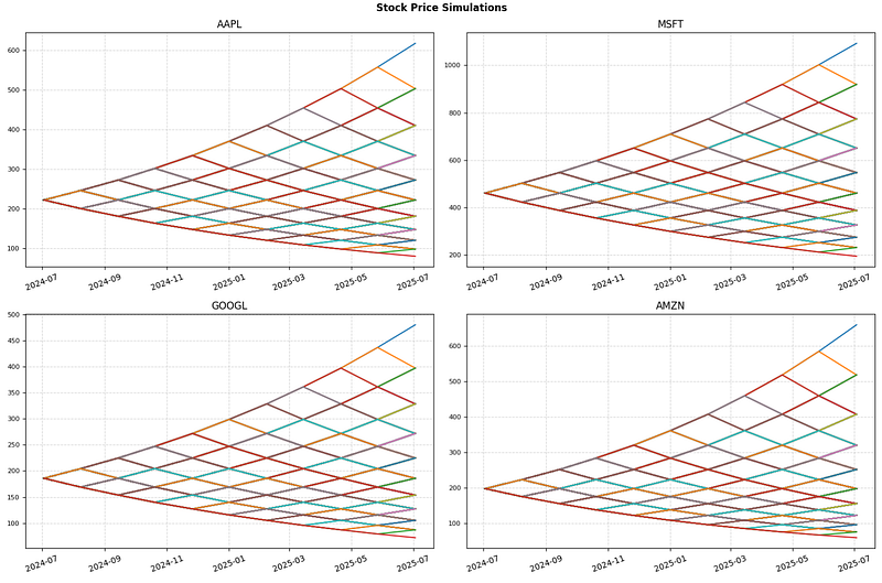
- These predictions are based on a binomial return distribution of equity pricing over time. With the model, there are two possible outcomes with each iteration — a move up or a move down that follow a binomial tree.
- Plotting these two values over time is known as building a binomial tree. For details about the binomial model, see Pricing and Analyzing Equity Derivatives (Financial Toolbox).
- The model is intuitive and is used more frequently in practice than the well-known Black-Scholes model.
META Candlesticks & TA Indicators
- Finally, let’s explore the META TA strategies for the last 729 days.
- Reading the stock data
ticker="META"
dfme = yf.download(ticker, start = '2020-01-01')- Plotting the META Candlestick Chart 2020–2024 with TA indicators
# Adding Moving Averages
dfme['EMA9'] = dfme['Adj Close'].ewm(span = 9, adjust = False).mean() # Exponential 9-Period Moving Average
dfme['SMA20'] = dfme['Adj Close'].rolling(window=20).mean() # Simple 20-Period Moving Average
dfme['SMA50'] = dfme['Adj Close'].rolling(window=50).mean() # Simple 50-Period Moving Average
dfme['SMA100'] = dfme['Adj Close'].rolling(window=100).mean() # Simple 100-Period Moving Average
dfme['SMA200'] = dfme['Adj Close'].rolling(window=200).mean() # Simple 200-Period Moving Average

# Adding RSI for 14-periods
delta = dfme['Adj Close'].diff() # Calculating delta
gain = delta.where(delta > 0,0) # Obtaining gain values
loss = -delta.where(delta < 0,0) # Obtaining loss values
avg_gain = gain.rolling(window=14).mean() # Measuring the 14-period average gain value
avg_loss = loss.rolling(window=14).mean() # Measuring the 14-period average loss value
rs = avg_gain/avg_loss # Calculating the RS
dfme['RSI'] = 100 - (100 / (1 + rs)) # Creating an RSI column to the Data Frame

# Adding Bollinger Bands 20-periods
dfme['BB_UPPER'] = dfme['SMA20'] + 2*dfme['Adj Close'].rolling(window=20).std() # Upper Band
dfme['BB_LOWER'] = dfme['SMA20'] - 2*dfme['Adj Close'].rolling(window=20).std() # Lower Band

# Adding ATR 14-periods
dfme['TR'] = pd.DataFrame(np.maximum(np.maximum(dfme['High'] - dfme['Low'], abs(dfme['High'] - dfme['Adj Close'].shift())), abs(dfme['Low'] - dfme['Adj Close'].shift())), index = dfme.index)
dfme['ATR'] = dfme['TR'].rolling(window = 14).mean() # Creating an ART column to the Data Frame

# Plotting Candlestick charts with indicators
fig = make_subplots(rows=4, cols=1, shared_xaxes=True, vertical_spacing=0.05,row_heights=[0.6, 0.10, 0.10, 0.20])

# Candlestick
fig.add_trace(go.Candlestick(x=dfme.index,
                             open=dfme['Open'],
                             high=dfme['High'],
                             low=dfme['Low'],
                             close=dfme['Adj Close'],
                             name='META'),
              row=1, col=1)

# Moving Averages
fig.add_trace(go.Scatter(x=dfme.index,
                         y=dfme['EMA9'],
                         mode='lines',
                         line=dict(color='#90EE90'),
                         name='EMA9'),
              row=1, col=1)

fig.add_trace(go.Scatter(x=dfme.index,
                         y=dfme['SMA20'],
                         mode='lines',
                         line=dict(color='yellow'),
                         name='SMA20'),
              row=1, col=1)

fig.add_trace(go.Scatter(x=dfme.index,
                         y=dfme['SMA50'],
                         mode='lines',
                         line=dict(color='orange'),
                         name='SMA50'),
              row=1, col=1)

fig.add_trace(go.Scatter(x=dfme.index,
                         y=dfme['SMA100'],
                         mode='lines',
                         line=dict(color='purple'),
                         name='SMA100'),
              row=1, col=1)

fig.add_trace(go.Scatter(x=dfme.index,
                         y=dfme['SMA200'],
                         mode='lines',
                         line=dict(color='red'),
                         name='SMA200'),
              row=1, col=1)

# Bollinger Bands
fig.add_trace(go.Scatter(x=dfme.index,
                         y=dfme['BB_UPPER'],
                         mode='lines',
                         line=dict(color='#00BFFF'),
                         name='Upper Band'),
              row=1, col=1)

fig.add_trace(go.Scatter(x=dfme.index,
                         y=dfme['BB_LOWER'],
                         mode='lines',
                         line=dict(color='#00BFFF'),
                         name='Lower Band'),
              row=1, col=1)

fig.add_annotation(text='META',
                    font=dict(color='white', size=40),
                    xref='paper', yref='paper',
                    x=0.5, y=0.65,
                    showarrow=False,
                    opacity=0.2)


# Relative Strengh Index (RSI)
fig.add_trace(go.Scatter(x=dfme.index,
                         y=dfme['RSI'],
                         mode='lines',
                         line=dict(color='#CBC3E3'),
                         name='RSI'),
              row=2, col=1)

# Adding marking lines at 70 and 30 levels
fig.add_shape(type="line",
              x0=dfme.index[0], y0=70, x1=aapl.index[-1], y1=70,
              line=dict(color="red", width=2, dash="dot"),
              row=2, col=1)
fig.add_shape(type="line",
              x0=dfme.index[0], y0=30, x1=aapl.index[-1], y1=30,
              line=dict(color="#90EE90", width=2, dash="dot"),
              row=2, col=1)

# Average True Range (ATR)
fig.add_trace(go.Scatter(x=dfme.index,
                         y=dfme['ATR'],
                         mode='lines',
                         line=dict(color='#00BFFF'),
                         name='ATR'),
              row=3, col=1)


# Volume
fig.add_trace(go.Bar(x=dfme.index,
                     y=dfme['Volume'],
                     name='Volume',
                     marker=dict(color='gold', opacity=1.0)),
              row=4, col=1)

fig.update_traces(marker_color = 'yellow',
                  marker_line_width = 0,
                  selector=dict(type="bar"))

fig.update_layout(bargap=0,
                  bargroupgap = 0,
                 )


# Layout
fig.update_layout(title='META Candlestick Chart 2020-2024',
                  yaxis=dict(title='Price (USD)'),
                  height=1000,
                 template = 'plotly_dark')

# Axes and subplots
fig.update_xaxes(rangeslider_visible=False, row=1, col=1)
fig.update_xaxes(rangeslider_visible=False, row=4, col=1)
fig.update_yaxes(title_text='Price (USD)', row=1, col=1)
fig.update_yaxes(title_text='RSI', row=2, col=1)
fig.update_yaxes(title_text='ATR', row=3, col=1)
fig.update_yaxes(title_text='Volume', row=4, col=1)

fig.show()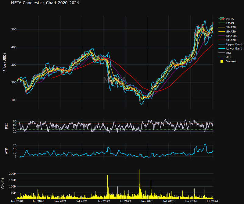
META RSI vs MA Backtesting
- TA Backtesting: Comparing expected returns of RSI & MA strategies on the daily META data for the last 729 days
end_date = dt.datetime.now() # Defining the datetime for March 21st
start_date = end_date - dt.timedelta(days=729) # Loading hourly data for the last 729 days

hourly_eur_usd = yf.download('META', start=start_date, end=end_date, interval='1d')
hourly_eur_usd

           Open       High       Low        Close      Adj Close   Volume
Date
2022-07-12 164.800003 165.910004 162.100006 163.270004 162.935181 16639700
2022-07-13 160.160004 164.979996 159.610001 163.490005 163.154739 16555100
2022-07-14 161.220001 162.589996 157.279999 158.050003 157.725891 23765200
2022-07-15 160.539993 164.979996 159.820007 164.699997 164.362244 23342800
2022-07-18 166.750000 171.690002 165.639999 167.229996 166.887054 23574300
... ... ... ... ... ... ...
2024-07-02 500.760010 510.500000 499.450012 509.500000 509.500000 7739500
2024-07-03 506.369995 511.279999 506.019989 509.959991 509.959991 6005600
2024-07-05 511.600006 540.869995 511.600006 539.909973 539.909973 21354100
2024-07-08 542.349976 542.809998 526.650024 529.320007 529.320007 14917500
2024-07-09 533.750000 537.479980 528.190002 530.000000 530.000000 8753200
501 rows × 6 columns- Implementing the RSI backtesting strategy
# Calculating the RSI with the TA library
hourly_eur_usd['rsi'] = ta.momentum.RSIIndicator(hourly_eur_usd['Adj Close'], window = 14).rsi()

# Defining the parameters for the RSI strategy
rsi_period = 14
overbought = 80
oversold = 40

# Creating a new column to hold the signals
hourly_eur_usd['signal'] = 0 # When we're not positioned, 'signal' = 0

# Generating the entries
for i in range(rsi_period, len(hourly_eur_usd)):
    if hourly_eur_usd['rsi'][i] > overbought and hourly_eur_usd['rsi'][i - 1] <= overbought:
        hourly_eur_usd['signal'][i] = -1 # We sell when 'signal' = -1
    elif hourly_eur_usd['rsi'][i] < oversold and hourly_eur_usd['rsi'][i - 1] >= oversold:
        hourly_eur_usd['signal'][i] = 1 # We buy when 'signal' = 1

# Calculating the pair's daily returns
hourly_eur_usd['returns'] = hourly_eur_usd['Adj Close'].pct_change()
hourly_eur_usd['cumulative_returns'] = (1 + hourly_eur_usd['returns']).cumprod() - 1 # Total returns of the period

# Applying the signals to the returns
hourly_eur_usd['strategy_returns'] = hourly_eur_usd['signal'].shift(1) * hourly_eur_usd['returns']

# Calculating the cumulative returns of the strategy
hourly_eur_usd['cumulative_strategy_returns'] = (1 + hourly_eur_usd['strategy_returns']).cumprod() - 1

# Setting the initial capital to $100
initial_capital = 100

# Calculating total portfolio value
hourly_eur_usd['portfolio_value'] = (1 + hourly_eur_usd['strategy_returns']).cumprod() * initial_capital

# Printing the number of trades, initial capital, and final capital
num_trades = hourly_eur_usd['signal'].abs().sum()
final_capital = hourly_eur_usd['portfolio_value'].iloc[-1]
total_return = (final_capital - initial_capital) / initial_capital * 100

print('\n')
print(f"Number of trades: {num_trades}")
print(f"Initial capital: ${initial_capital}")
print(f"Final capital: ${final_capital:.2f}")
print(f"Total return: {total_return:.2f}%")
print('\n')

# Plotting the portfolio total value
fig = go.Figure()

fig.add_trace(go.Scatter(x=hourly_eur_usd.index,
                         y=hourly_eur_usd['portfolio_value'].round(2),
                         mode='lines',
                         line=dict(color='#00BFFF'),
                         name='Portfolio Value'))

fig.update_layout(title='Expected Return RSI Strategy on META Data',
                  xaxis_title='Date',
                  yaxis_title='Value ($)',
                  template='plotly_dark',
                 height = 600)

fig.show()

Number of trades: 11
Initial capital: $100
Final capital: $107.97
Total return: 7.97%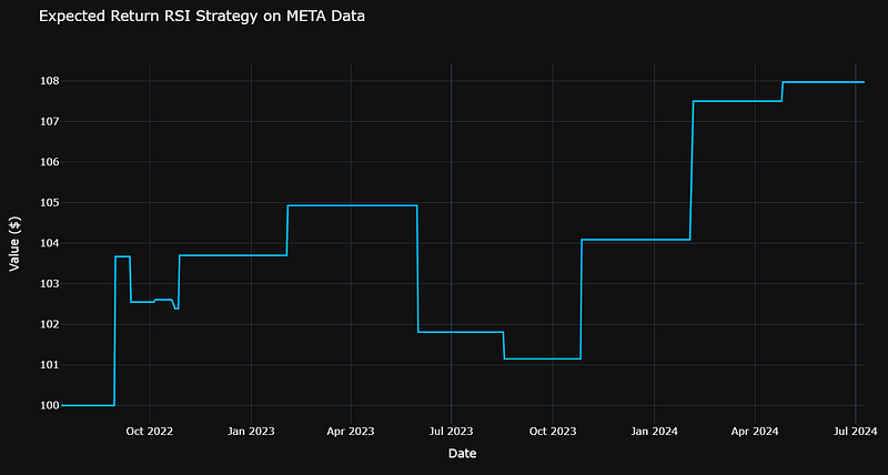
- Implementing the MA backtesting strategy
# Creating the EMA with the TA library
ws=5
wl=10
hourly_eur_usd['ema9'] = ta.trend.ema_indicator(hourly_eur_usd['Adj Close'], window=ws)

# Creating the SMA with the TA library
hourly_eur_usd['sma20'] = ta.trend.sma_indicator(hourly_eur_usd['Adj Close'], window=wl)

# Defining the parameters for the moving average crossover strategy
short_ma = 'ema9'
long_ma = 'sma20'

# Creating a new column to hold the signals
hourly_eur_usd['signal'] = 0

# Generating the entry signals
for i in range(1, len(hourly_eur_usd)):
    if hourly_eur_usd[short_ma][i] > hourly_eur_usd[long_ma][i] and hourly_eur_usd[short_ma][i - 1] <= hourly_eur_usd[long_ma][i - 1]:
        hourly_eur_usd['signal'][i] = 1 # buy signal
    elif hourly_eur_usd[short_ma][i] < hourly_eur_usd[long_ma][i] and hourly_eur_usd[short_ma][i - 1] >= hourly_eur_usd[long_ma][i - 1]:
        hourly_eur_usd['signal'][i] = -1 # sell signal

# Calculating total returns
hourly_eur_usd['returns'] = hourly_eur_usd['Adj Close'].pct_change()
hourly_eur_usd['cumulative_returns'] = (1 + hourly_eur_usd['returns']).cumprod() - 1

# Applying the signals to the returns
hourly_eur_usd['strategy_returns'] = hourly_eur_usd['signal'].shift(1) * hourly_eur_usd['returns']

# Calculating the cumulative returns
hourly_eur_usd['cumulative_strategy_returns'] = (1 + hourly_eur_usd['strategy_returns']).cumprod() - 1

# Setting the initial capital
initial_capital = 100

# Calculating total portfolio value
hourly_eur_usd['portfolio_value'] = (1 + hourly_eur_usd['strategy_returns']).cumprod() * initial_capital

# Printing the number of trades, initial capital, and final capital
num_trades = hourly_eur_usd['signal'].abs().sum()
final_capital = hourly_eur_usd['portfolio_value'].iloc[-1]
total_return = (final_capital - initial_capital) / initial_capital * 100

print('\n')
print(f"Number of trades: {num_trades}")
print(f"Initial capital: ${initial_capital}")
print(f"Final capital: ${final_capital:.2f}")
print(f"Total return: {total_return:.2f}%")
print('\n')

# Plotting strategy value
fig = go.Figure()

fig.add_trace(go.Scatter(x=hourly_eur_usd.index,
                         y=hourly_eur_usd['portfolio_value'].round(2),
                         mode='lines',
                         line=dict(color='#00BFFF'),
                         name='Portfolio Value'))

fig.update_layout(title='Expected Return Moving Average Crossover Strategy on META Data',
                  xaxis_title='Date',
                  yaxis_title='Value ($)',
                  template='plotly_dark',
                 height = 600)

fig.show()

Number of trades: 50
Initial capital: $100
Final capital: $108.00
Total return: 8.00%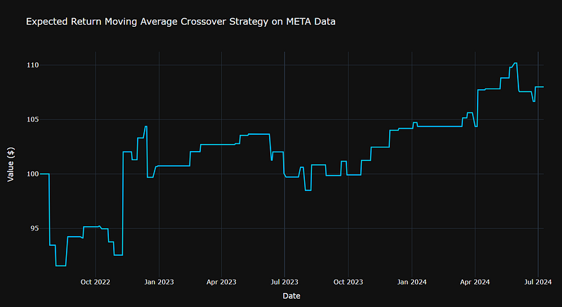
- We can see that both RSI and MA strategies yield ca. 8% expected return on META data 2022–2024. However, the RSI strategy is more optimal in terms of the number of trades, viz. 11 (RSI) vs 50 (MA).
Conclusions
- The growing digitalization of our society has led to a meteoric rise of US large technology companies (Big Tech), which have amassed tremendous wealth and influence through their ownership of digital infrastructure and platforms.
- In this post, we have presented a comparative quant trading analysis of US Big Techs by integrating technical, fundamental analysis tools and modern Portfolio Optimization (PO) algorithms in Python.
- We have integrated Technical Analysis indicators, stock fundamentals and PO considering risk and return simultaneously.
- We have used the following Python libraries throughout our study: Quantstats, TA, PyPortfolioOpt, Plotly, and FinanceToolkit.
- We have analyzed the following financial metrics: cumulative returns, kurtosis, skewness, correlations, STD, Beta, and the Sharpe Ratio.
- We have compared the Equal-Weighted and Max Sharpe Ratio Portfolios vs S&P Strategy in terms of their financial performance 2020–2024 (Sortino, Sharpe, Calmar, Treynor ratios, Kelly Criterion, MTD, Max Drawdown, Beta, Alpha, CAGR, etc.).
- We have examined the NVDA vs AMD income statements and profitability ratios 2019–2024. We have visualized their Greek Sensitivities, Value-at-Risk (VaR) vs Benchmark, and Correlations with the Fama-French 5 Factors.
- We have visualized the 1Y Big Tech stock price predictions using a binomial return distribution of equity pricing over time. With the model, there are two possible outcomes with each iteration — a move up or a move down that follow a binomial tree.
- We have used the TA Ichimoku Cloud to get a snapshot of tech market sentiment and price momentum.
- We have explored the META TA strategies for the last 729 days by comparing expected returns of RSI vs MA crossover trading signals (backtesting).
- The awesome META Candlestick Chart 2020–2024 with TA indicators has demonstrated the power of Plotly in stock data visualization.
Bibliography
- Markowitz, H., 1952, PORTFOLIO SELECTION. The Journal of Finance.
- Markowitz meets technical analysis: Building optimal portfolios by exploiting information in trend-following signals
- Mastering Market Movements: Integrating Technical and Fundamental Analysis in Trading
- Fundamental vs. Technical Analysis: An Overview
- The Advantages and Disadvantages of Technical Analysis
- The pros and cons of fundamental analysis
- Fundamental Analysis: Advantages And Disadvantages
- Portfolio Optimization: How to Find Your Investment Balance
- Financial Analysis with the Finance Toolkit in Python
Explore More
- Stock Portfolio Risk/Return Optimization
- Joint Analysis of Bitcoin, Gold and Crude Oil Prices
- Towards Max(ROI/Risk) Trading
- NVDA Technical Analysis using 75 Simplified FinTA Indicators
Contacts
Disclaimer
- The following disclaimer clarifies that the information provided in this article is for educational use only and should not be considered financial or investment advice.
- The information provided does not take into account your individual financial situation, objectives, or risk tolerance.
- Any investment decisions or actions you undertake are solely your responsibility.
- You should independently evaluate the suitability of any investment based on your financial objectives, risk tolerance, and investment timeframe.
- It is recommended to seek advice from a certified financial professional who can provide personalized guidance tailored to your specific needs.
- The tools, data, content, and information offered are impersonal and not customized to meet the investment needs of any individual. As such, the tools, data, content, and information are provided solely for informational and educational purposes only.
A Message from InsiderFinance

Thanks for being a part of our community! Before you go:
- 👏 Clap for the story and follow the author 👉
- 📰 View more content in the InsiderFinance Wire
- 📚 Take our FREE Masterclass
- 📈 Discover Powerful Trading Tools


