

How to Detect the Trend in the Time Series Data and Detrend in Python
Before choosing any time series forecasting model, it is very important to detect the trend, seasonality, or cycle in the data. Half the job is to understand the data properly. This tutorial will show you how to capture trends in the data and get rid of them as well.
What is Trend?
The trend is a long-term increase or decrease in the data. It does not have to be linear all the time. The change of direction in the data for a sustained period can be called a trend.
It will be clearer with the examples below. To demonstrate the trend, we will use Pollution US 2000 to 2016 data from Kaggle. Please feel free to download the dataset from this link:
U.S. Pollution Data (kaggle.com)
Here, we are using pd.read_csv() method to read the data into a pandas DataFrame:
import pandas as pd
import statsmodels
df = pd.read_csv('/content/uspollution_pollution_us_2000_2016.csv')
This dataset is pritty big. We do not need all the columns. I will take the ‘Date Local’ and ‘CO Mean’ columns. Also, let’s change the column names to something.
df_co = df[['Date Local', 'CO Mean']]
df_co = df_co.rename(columns={'Date Local': 'Date', 'CO Mean': 'CO'})
df_co
As you can see from the ‘Date’ column above, there are data available from 2000 to 2006. Before diving into the trend detection, let’s convert the ‘Date’ column to datetime format and set to index. That will help with the graph preparation later.
df_co['Date'] = pd.to_datetime(df_co['Date'])
df_co = df_co.set_index('Date')
df_short = pd.DataFrame(df_co.groupby(df_co.index.to_period('d'))['CO'].mean())
You can see from the table above that, multiple data are there for one date. I will group by using the ‘Date’ part from the ‘Date’ column and take the mean ‘CO’ value for each date:
The data is ready now for analysis.
The preliminary way to check the trend, seasonality, or cycle is to have a look at the graph.
import matplotlib.pyplot as plt

plt.figure(figsize=(15, 5))
df_short['CO'].plot()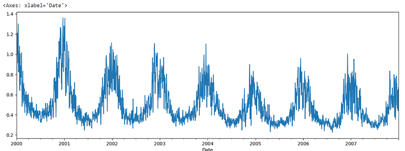
The trend is clearly visible in the data. You can extract the trend in the data using the ‘rolling’ function.
There are several ways to detect trends and detrending the data. Sometimes, it is visible clearly in the graph the way we can see in the graph above.
Rolling
You can extract the trend in the data using the ‘rolling’ function. We can get a smooth trend line using the rolling() function that takes a parameter called ‘window’. Here, a window of 10 is passed that should take 10 consecutive data and take the mean. You can use sum or median as well. In short, it should center the data.
plt.figure(figsize=(10, 5))
df_short.CO.rolling(window=10).mean().plot()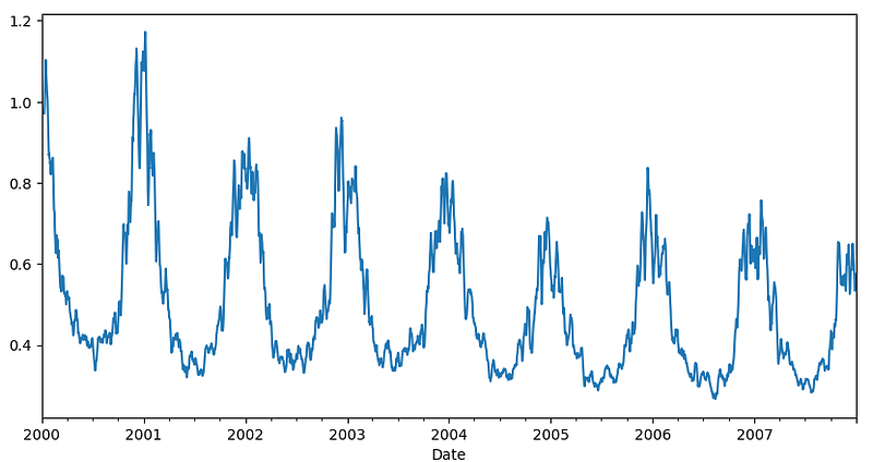
This is a much smoother graph. You can use a bigger window or use the window function twice on it to get the even smoother curve.
plt.figure(figsize=(10, 5))
df_short.CO.rolling(window=10).mean().rolling(window=10).mean().plot()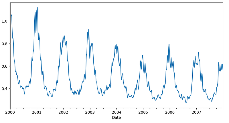
This data can be detrended by deducting this trend data from the original data.
plt.figure(figsize=(15, 6))
df_short['co_rolling'] = df_short.CO.rolling(window=10).mean().rolling(window=10).mean()
df_short['detrend_co'] = df_short['CO'] - df_short['co_rolling']
df_short['detrend_co'].plot()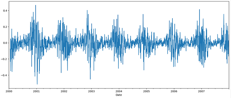
The trend is gone, and the data looks stationary now.
HPFilter
Detecting cycle and trend is very simple and easy using Hodrick-Prescott (HP) filter. Please feel free to have a look at the link. The HP filter is good for removing short-term fluctuations from the data.
Cycle and trend can be extracted from the data using hpfilter from statsmodels library:
from statsmodels.tsa.filters.hp_filter import hpfilter
sw_cycle, sw_trend = hpfilter(df_short['CO'], lamb=100)

plt.figure(figsize=(10, 5))
sw_trend.plot()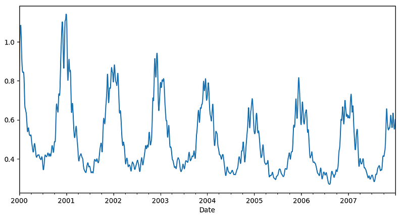
Here is the cycle as well which is detrended data. Here is the plot.
plt.figure(figsize=(10, 6))
sw_cycle.plot()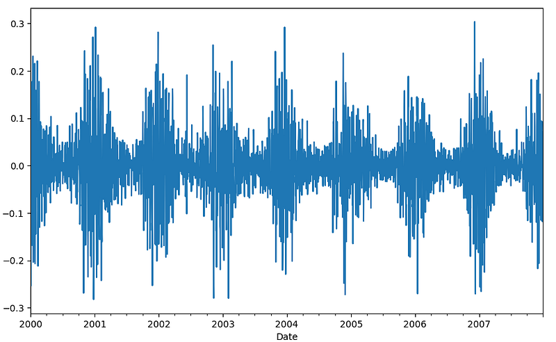
Look, the cycle plot is detrended, stationary data.
Differencing
One more way to detrend the data is differencing.
That means subtracting t from t+1.
df_short['co_diff'] = df_short['CO'].diff()
df_short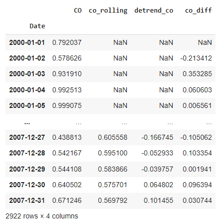
If you notice, co_diff is the data from taking differencing. In 2000–01–02 CO value was 0.578626 and in 2000–01–01 the CO value was 0.792037. So, the differencing co_diff for 2000–01–02 becomes 0.578626–0.792037. In the same way, every date’s co_diff becomes the CO valaue of that date minus the CO value of the previous date. That’s why the first one is NaN. Because there is no date before that.
Let’s see the plot:
plt.figure(figsize=(15, 6))
df_short['CO'].diff().plot()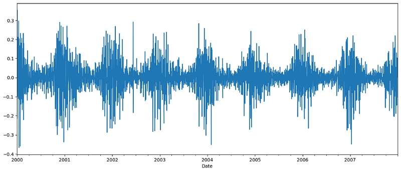
That’s all about trends.
Conclusion
In this article, we talked about how to detect the trends and detrend the data, which is important in time series analysis and to choose a model for forecasting. In the next article, I will demonstrate how to detect seasonality and remove it from the data. Please stay tuned.
More Reading
Developing Your First Neural Network in PyTorch | by Rashida Nasrin Sucky | Towards AI (medium.com)


