
WHAT’S UNFOLDING ABOVE THE FOLD
Above the Fold Information & Web Design
What is “above the fold” and why is it so crucial are two questions many website designers fail to assimilate.
Some developers don’t even know enough to ask these questions. Web designers are very techy. Many don’t understand what or why something works unless it involves code.
Maybe that seems a little unfair. But if you’ve ever worked extensively with a programming language, you know it takes hours to write a code to make something happen on a webpage.

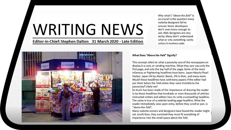
What Does “Above the Fold” Signify?
This concept refers to what a passerby saw of the newspapers on display in a rack, or vending machine. That was, in most cases, only the first page and only the top half of that page. Some of the most infamous or frightening headlines have been, Japan Attacks Pearl Harbor, JFK Assassinated, Hijacked Planes Attack the World Trade Center, and many more. Would those headlines have sold many papers if the editor had put them below the fold where they were invisible to the passersby? Likely not!
So much has been made of the importance of drawing the reader in by those headlines that hundreds or even thousands of articles have instructed writers and editors how to write a compelling headline.
The same is true of a website landing page headline. What the reader immediately sees upon entry, before they scroll or pan, is “above the fold”.
Many website owners and designers have feared the reader might not scroll; thus, they surmised they must fit everything of importance into the small space above the fold.
Although the very nature of smartphone use and social media has compelled readers to scroll, the visual content within that space must still be alluring to keep the reader on the page, scrolling and panning.
Two of the most compelling pieces of information must be above the fold, those are the contact information and the call-to-action (CTA).
You have only a scant few seconds, in many cases, to catch the attention of the reader to get them to react before leaving. Perhaps, the most crucial is to get them to register. They may not be ready to commit to a sale or service you offer.
However, when you get them to register, you can send discount offers or even coupons to entice them into buying. You could send them a review of the product they looked at on your page. If they do not react to your CTA, you will likely never see them again.
Understanding “Mobilegedden”
Can you blame a designer for not knowing what Google intended when they changed their algorithms to a “mobile-friendly” or “mobile-first” initiative?
Most were not ready for the alteration. Many website owners were caught flat on their feet by the modification and their PageRank plummeted. Some never recovered.
While many users scroll even on a desktop, the information “above the fold” is still the most crucial for website design.
However, to be mobile-friendly is not just one of Google’s 200 or so SEO functional algorithms. It is likely now the most vital of those measures. Let’s take a look at this measure to see why it’s imperative.
Making the Most of the Above the Fold Area
Designers can make the most of that real estate by recalling the adage, “location, location, location”. Put your CTA and registration form within that space. Include pertinent pictures and compelling content within this space as well. These images and content will help keep them on the page.
If your developer or designer uses the Net Market Share Report or tester to determine the visibility of these items in that area, they can convert more potential customers into registered readers. Eventually, those who register will become paying clients of your goods or services.
These reports show the percentage of browser usage. Therefore, a designer could set the resolution screen for an iOS or Android, which are typically the smallest and thus safest to incorporate most users.
Is the Fold Still Relevant?
According to Click Tale’s article, Unfolding the insights into webpage scroll, “What is above the fold in desktop is not necessarily above the fold in mobile.” However, they did analyze data that shows that 76 percent of users did some scrolling or panning, and 22 percent scrolled to the bottom of the page.
Does that make everything we’ve said so far pointless? Definitely not!
In fact, new “eye tracking” data demonstrates that 57 percent of the users’ time gets spent above the fold, and 74 percent within the first two pages or screens (2160 px).
Likewise, Sleek Note proposed in their article, Hook Potential Buyers with These 9 Above the Fold Examples, well-designed pages do attract attention down “deep below the fold”. This pattern is becoming more prevalent in the 2020s as readers spend more and more time on their phones, scrolling and panning.
They point to a study by the Nielsen Norman Group, Page Fold Manifesto, which states, “What is visible on the page without requiring any action is what encourages us to scroll.”
If what we see above the fold does not entertain us, we are more liable to leave without scrolling or answering a CTA. Why would you register for a boring page where you did not feel compelled to scroll?
Therefore, user experience (UX) is most crucial above the fold. Thus, you must increase the potential clients’ interest and UX in this area. However, it would be wise to limit the number of ads above the fold. Think about it. What comes to mind when you open a page loaded with ads?
The most crucial piece of information above the fold must be what brought them to your page in the first place. If you place a coupon for an item on social media, the reader who clicks that coupon better see that item when they hit the page, or they are likely to leave and never return.
Resources:
The EveryInteraction.com article, The myth of “above the fold”
The Nielsen Norman Group study, Page Fold Manifesto
The Click Tale article, Unfolding the insights into webpage scroll
The CXL.com article, Is Above the Fold Really that Important?
If you liked this, you might also like:

Stephen Dalton is a retired US Army First Sergeant with a degree in journalism from the University of Maryland and a Certified US English Chicago Manual of Style Editor. Top Writer in Fiction, Short Story, NFL, VR, Design, & Creativity. Editor of Pop Off, Top Dalton’s Blog, 100WordStory, B.O.S.S., and SportsShorts100WordsOnly
You can see his portfolio here. Email [email protected]
Website | Facebook | Twitter | Instagram | Reddit | Ko-fi