
CREATIVE COMPOSITION
About Taking Landscape Photos
and manipulating photos you’ve already taken
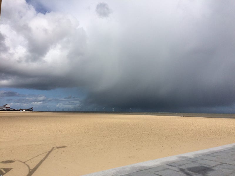
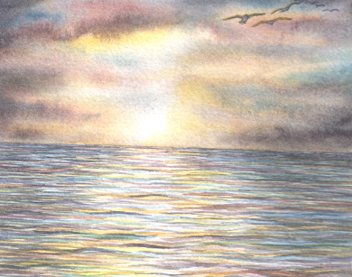
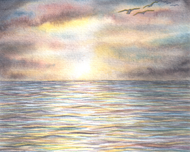
I found this photo as I was going through my phone. I think it’s Great Yarmouth beach.
Anyway, someone asked me to do something about composition of photos. And this is a good photo for me to use.
For a start I’d straighten up the horizon line. It immediately looks better, a bit more polished, and a bit more ‘real’— above right.
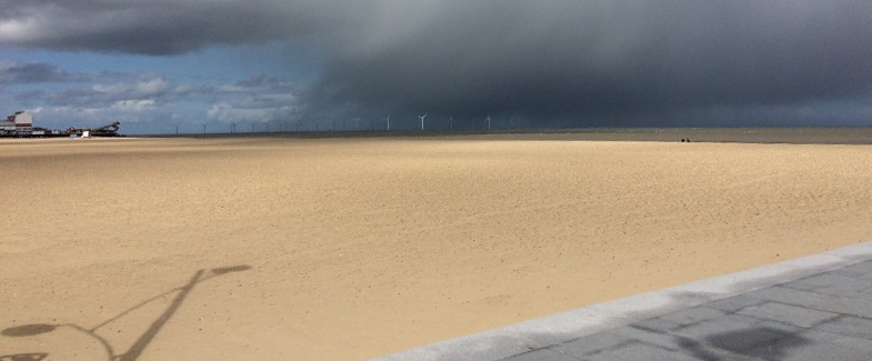
Then I have to consider what I am going for — am I going for a photo of lovely clean and empty sands?
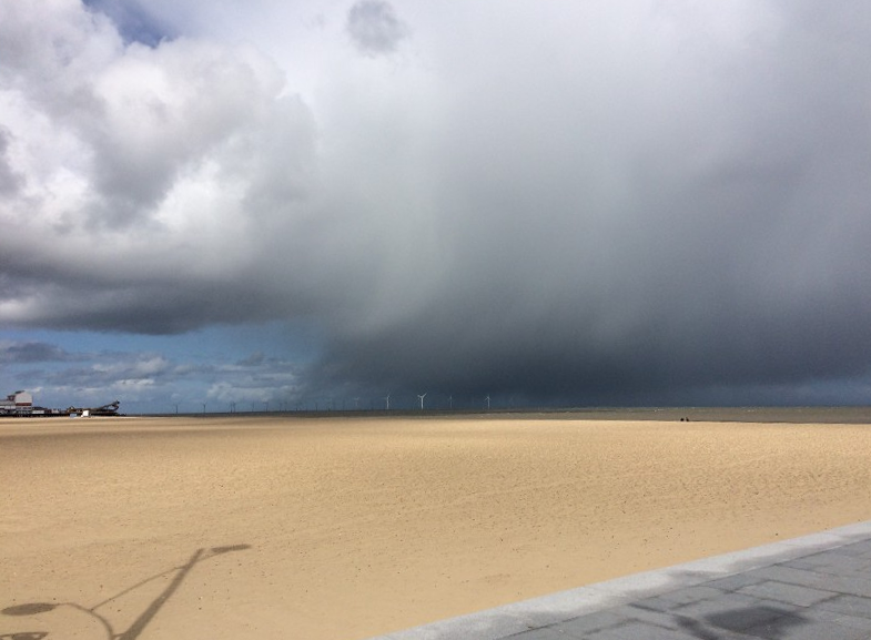
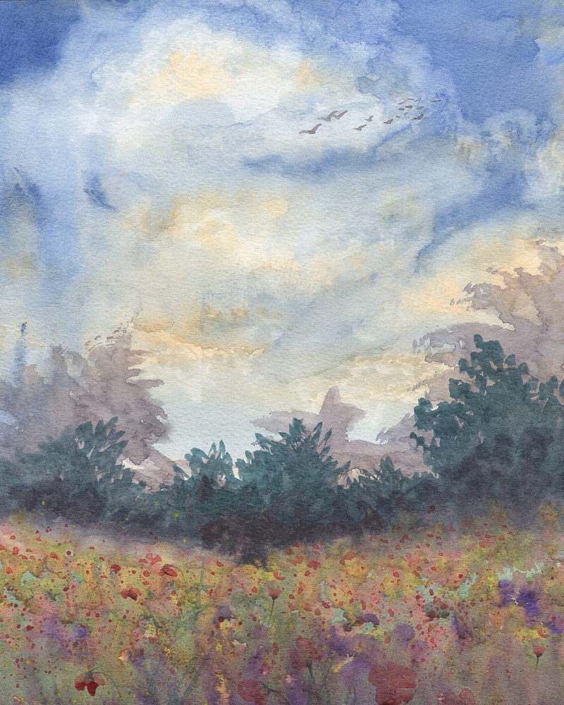
Or, am I going for a picture of a big sky with looming clouds.
Two completely different pictures, with completely different moods are created simply from altering the balance of sand to sky.
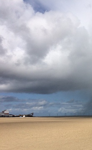
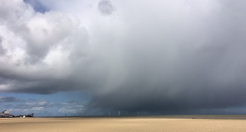
I might actually be going for a more traditional picture that conveys a more balanced composition with a quarter of land, a quarter of blue sky and half(ish) heavy clouds.
All these pictures are oddly abstract in a way.
I’ll do it again with another picture.
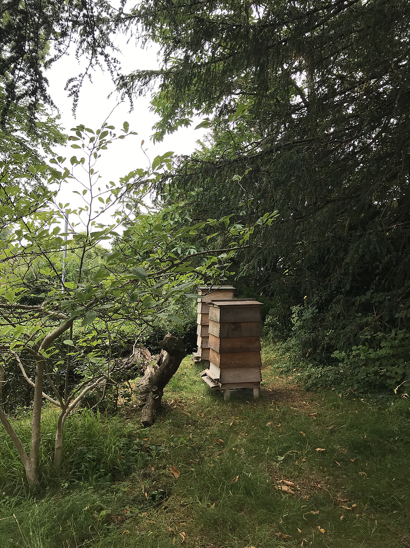
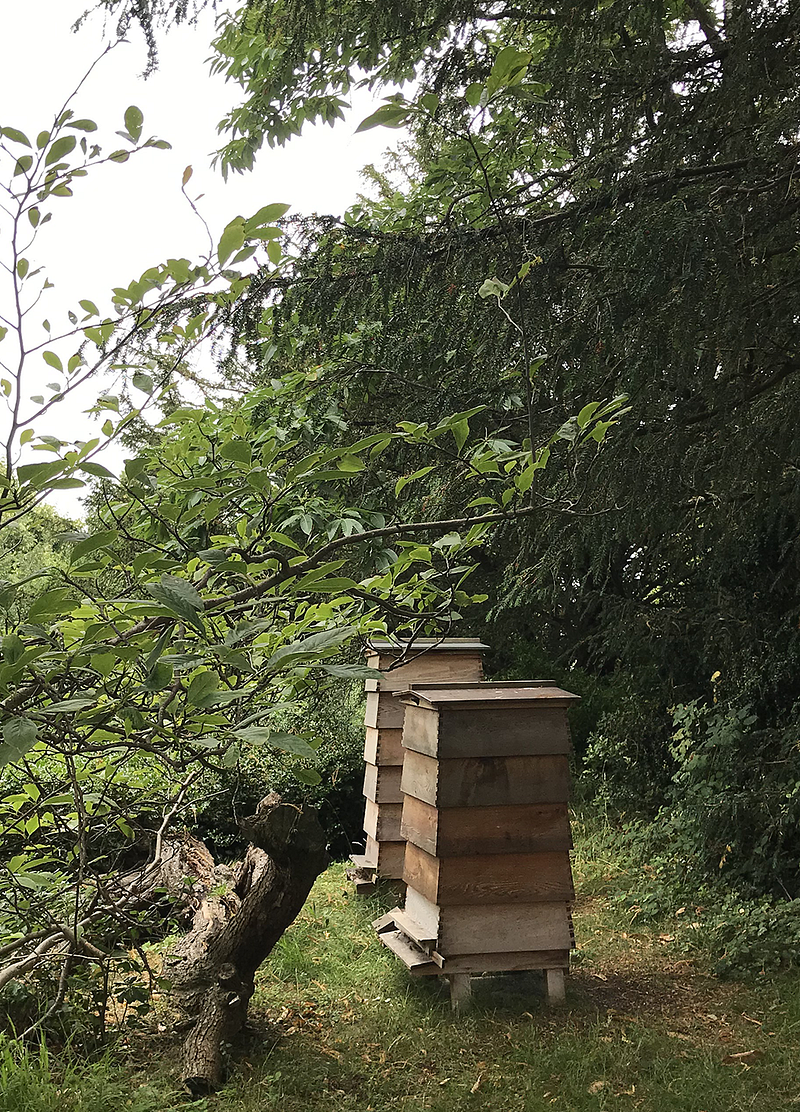
A reasonably pleasant picture of a couple of beehives.
But — they’re too far away if the picture is about beehives. They’re also too close to the centre of the picture. It’s hard to know what that photo is about as it stands.
Things look better if they’re not in the middle — and if they’re not evenly spaced with other things.
So I’ve made the beehives closer to the viewer by cropping off excess foreground. Then I’ve cropped the picture so the beehives are on the right, rather than in the middle.
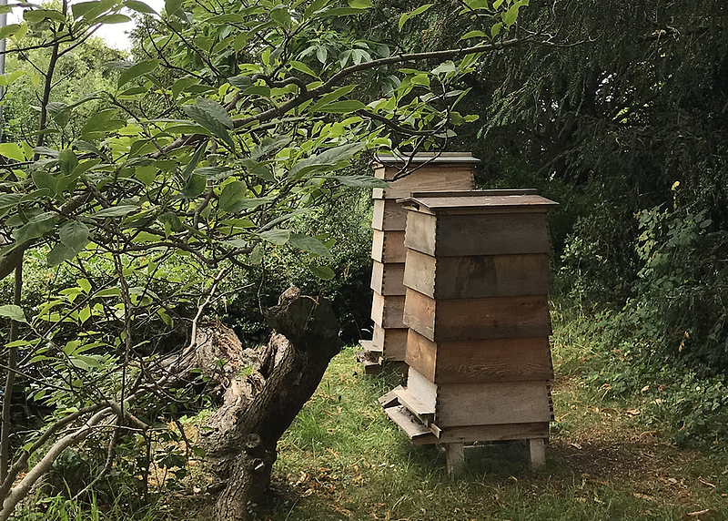
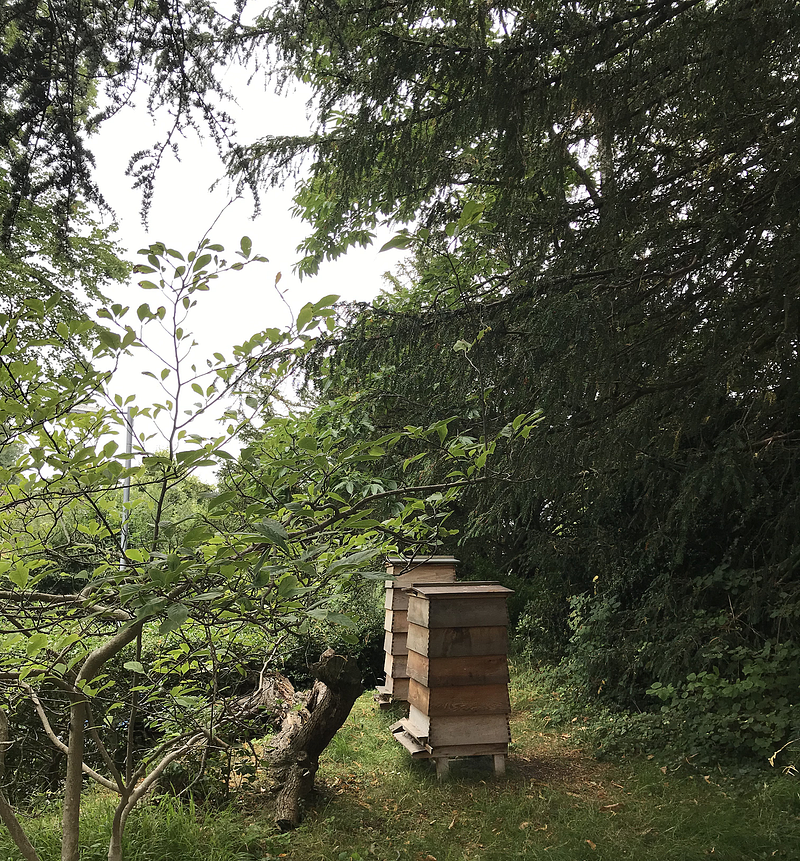
However, if the focus of this picture is the beehives, they really need to be even bigger in their background.
They might look better in a landscape format (longer width, shorter height), rather than a portrait format (taller height, smaller width).
Now that I’m looking at this picture closely enough to really consider all its compositional facets I’m wishing I’d taken if from a different angle because the heaviness of that tree trunk just to the left is taking emphasis away from the beehives.
That actually means that I either go back and take the picture again — not practical in this case, or settle for the portrait format (above) because the tree trunk isn’t so ‘weighty’ in that photo.
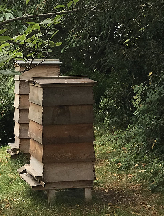
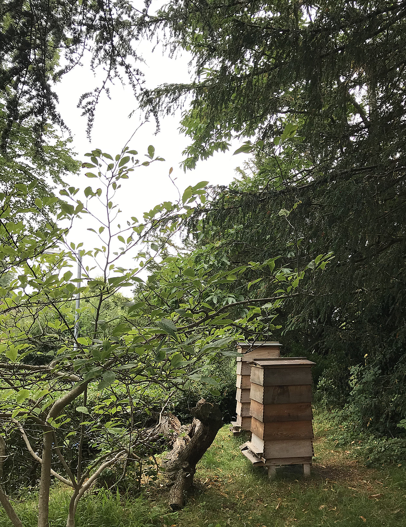
OR I could go back and crop the beehives the other way …
This might be better — it depends what my article is about.

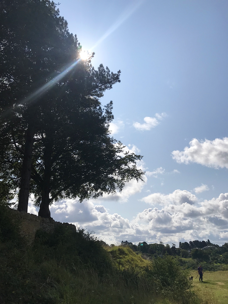
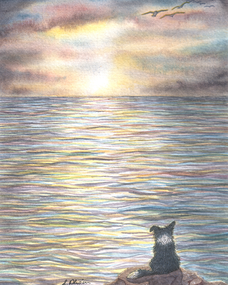
This photo was taken on Rodborough Common. I wanted to catch the way the light was glancing off the rather dramatic shapes of the trees against the blue of the sky, but yet with some lively looking clouds to give it a bit more life.
And then, by sheer luck, along came a dog and his human giving the picture some wonderful scale. Scale is something else to consider when taking a photo. Look at this photo without doggo and walker, and then with — they make the landscape look that much more take-your-breath-away.
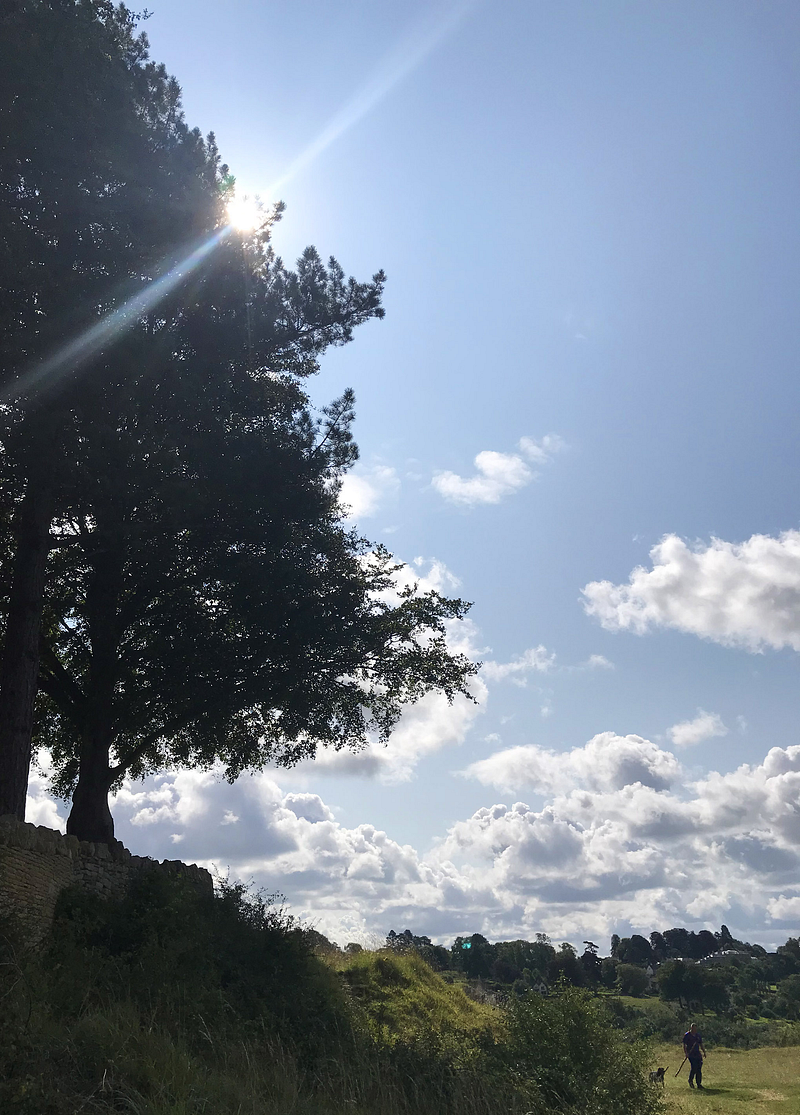
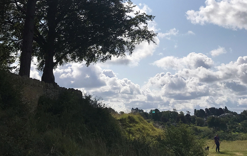
It depends what you’re going for — big sky, big landscape, focus of interest, intimate landscape, telling a story.
Try cropping your photos in different ways to see what you get.
Straight off, though, all photos and pictures will look better if the horizon line is horizontal. The picture above right immediately looks better even though — arrrghhh — the horizon line is smack-bang in the middle of it!
The horizon line being horizontal is especially important if the photo involves water.
Water cannot be on a slant. If you present a picture with slanted water the onlooker’s brain goes into spasm — it knows the photo in front of it is not possible. It might not put into words what’s wrong with that picture but it will know something is wrong. Something uncomfortable.
You’re shooting yourself in the foot with slanted water.
So at least the horizon line — of water — has to make sense.
I see a lot of photos where the lake or the ocean looks as if its life-water is pouring out of the edge of the picture and off the edge of the world.
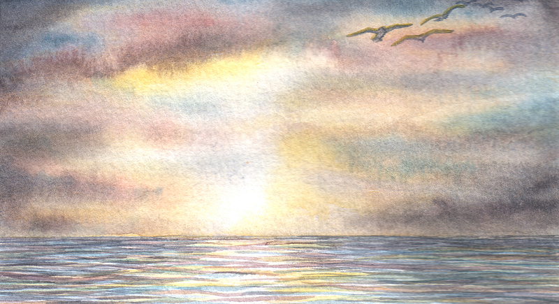
I also see a lot of photos that give equal space/weight to, for example, sea and sky. It makes for a fairly uninteresting composition. It also makes the picture unstable in that it looks as if one half — or the other — might slide away. Giving equal weight to sea and sky makes them both bland.
I mean, what’s the interest in the picture — the sea? the sky? The line through the middle? Your interest will either be divided or too general. Not that you are consciously thinking any of this. Your subconscious is doing all that for you and you’re just left with an impression of … meh.
Go for more sky — or more sea. This is an easy way to make composition more interesting. The dog above is an added extra and not essential. (Although he might say otherwise.)
There are many ways of cropping a picture. You might find one on your phone that you think is a bit … meh. But, with a bit of judicious cropping could turn out to be … wow!
I’m a picture person. I RT a lot of pictures on Twitter. I don’t RT the ones where there’s a line so centred it must have been measured — either horizontally or vertically — the line can be the horizon, or a tree or a fence — or — horrors — a pylon.
All photos and paintings by Susan Alison.
I might do more of these articles as I’ve had a couple of photos sent in for comment.
This article uses many of the same principles as the one above:
Susan’s Amazon Page / Susan’s Etsy Store / Susan’s newsletter sign-up
Read more from me: © Susan Alison 2021


