
A Guide to CSS Animation — Part 2
Applying animations. Let’s start tweaking things! 🛠
Hey! You’re back 🙌
In Part 1, we got things moving. Now we will dig into applying animations. We already introduced animation-name and animation-duration, but there’s much more to look at.
Don’t forget, all the code is available in the following CodePen collection 👍 That way you can edit and play around with the examples.
animation-iteration-count
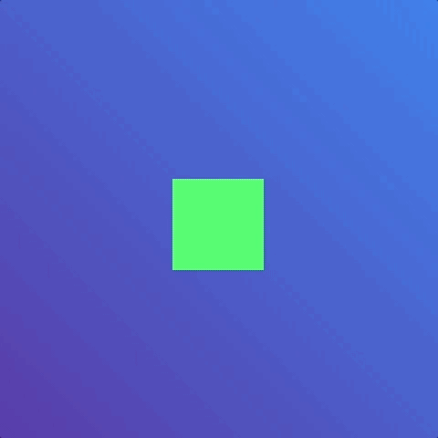
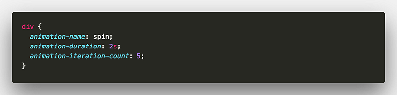
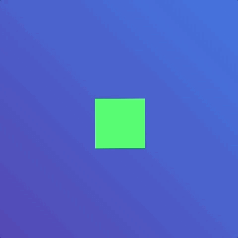
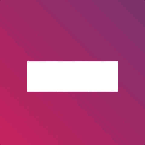
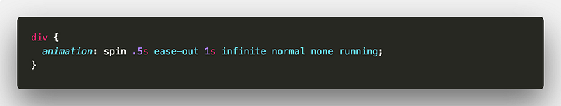
Let’s pick up from where we left off with by modifying our first animation. If you need a little refresher, this is what we had.
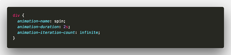
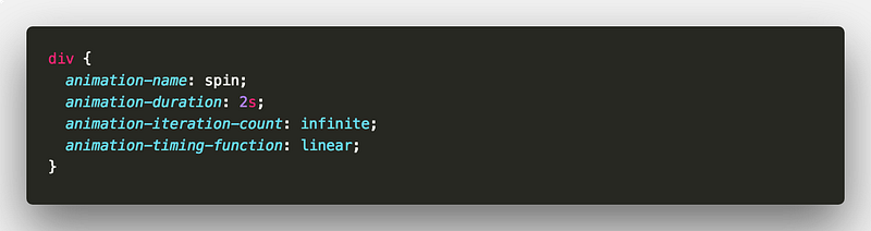
But the animation only ran once. What if we wanted the animation to run many times or not even stop? In the case of loading animations, we may want the animation to be infinite. This is where animation-iteration-count comes into play.
Let’s say we wanted the animation to run five times.
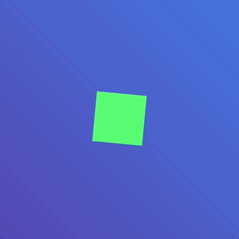
It’s as easy as that. Let’s turn our spinning square into a loading spinner. To do this, animation-iteration-count also accepts the keyword infinite 👍
Which gives us the following 🎉
animation-timing-function
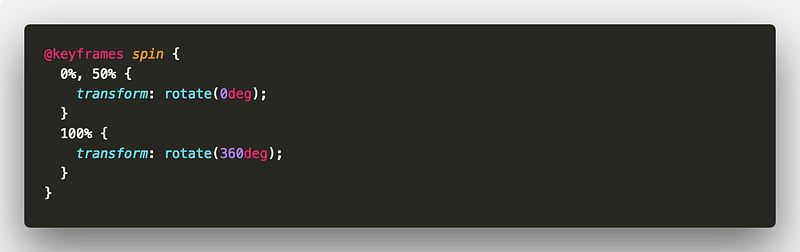
Let’s take another look at that spinning square. The square does keep on spinning. But not without a little break after every spin. This is due to the animation-timing-function.
The animation-timing-function property defines the speed characteristics of an animation. It accepts a few different values.
cubic-bezier(x1, y1, x2, y2)- provides ability to define custom speedease- start and end slowly but speedier in the middle(default)ease-in- start slowlyease-in-out- start and end slowly but not the same aseaseease-out- end slowlylinear- maintain speed throughoutsteps(number, direction <optional>)- provides a way to split the animation into equal steps.directionvalues can either bestartorend.startmeans that the first step happens at the start of the animation.endmeans that the last step happens at the end of the animation.endis the default value.
So which one do you choose? Different scenarios will call for different easing. The following is a nice short resource about the basics of easing.
You can experiment with different easings to find what feels right in your applications. This pen shows how animation-timing-function can affect the same animation.
The only ease that might be trickier to grasp is cubic-bezier.
In essence the cubic-bezier function defines a cubic bezier curve. There is a good explanation about the cubic-bezier function in this article
Or, you may prefer to play with the cubic-bezier function and compare it to the other easing values. cubic-bezier.com has you covered 👍
So returning to our spinning square. How do we remove that little break? We can apply a linear timing. This replaces the default ease timing.
This would give us
Sweet 🍭
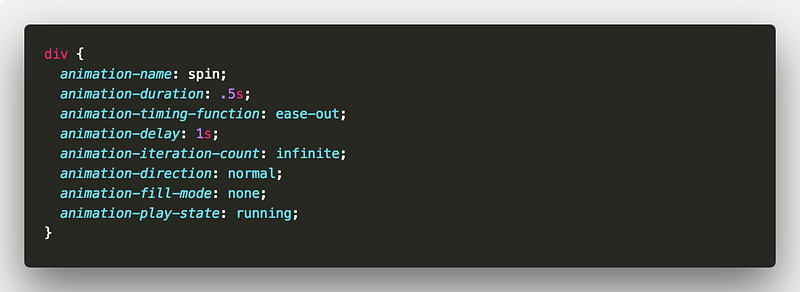
animation-play-state
Play state is pretty simple. You can pause animations or have them running. You do this with the animation-play-state property. For our spinning square we could introduce a checkbox that toggles the play state. Using the sibling selector, we can toggle the play state 👍
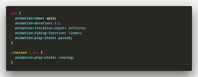
When it’s :checked we set the play state to running 👟
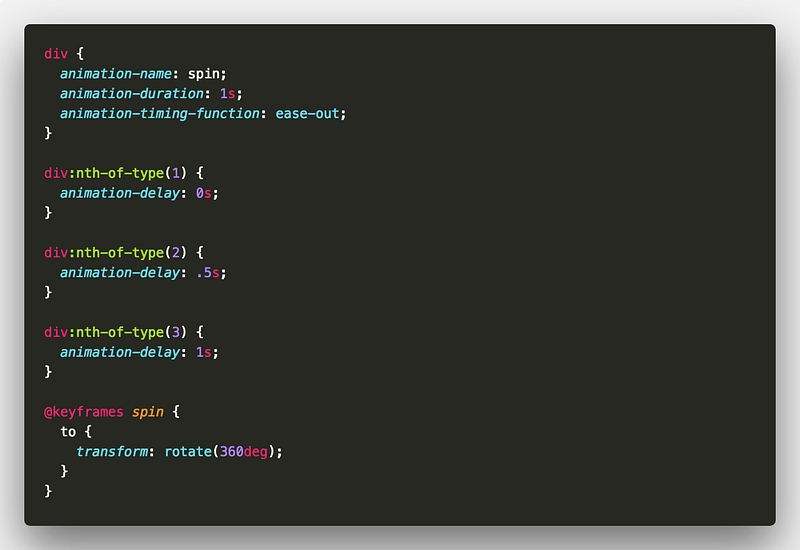
animation-delay
Next up is delaying animations. Like animation-duration, animation-delay takes a time value in milliseconds or seconds.
Let’s add some extra squares and have them all spin side by side once. Note we’ve changed the animation-timing-function value to ease-out.
If we add a delay to each square could we create a staggered effect?
The answer is yes! 👍
But, if we then wanted the squares to keep spinning we would lose the staggered effect. This is because animation-delay is only applied once before an animation begins 👎 It does not apply to every iteration of an animation. At this point we have two choices. We could experiment with different delays using the Animations Inspector. Or we could try stalling the first half of the animation by delaying the spin.
In fact, if we leverage CSS variables, we can create some interesting effects with delay. For example, using negative delays. This can give the effect of our animation already being in full swing at a certain point. A great use case is staggering animations without staggering elements into animated states. Move the slider in this demo to see some of the different effects we can achieve.
animation-fill-mode
Next up is animation-fill-mode. This one’s magic 🎩
By default, when we apply an animation to an element, it has no affect before or after it has ran. animation-fill-mode changes that.
The values for animation-fill-mode that will interest us are;
forwards- element retains animation stylingbackwards- element retains style from first keyframe duringanimation-delayboth- element retains styling in both directions
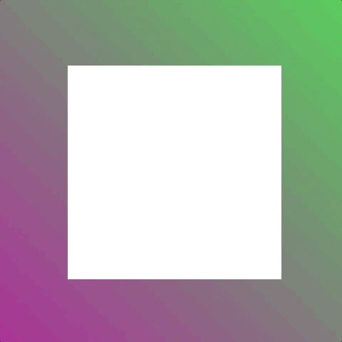
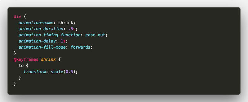
Let’s consider an animation where we shrink an element to half its size.
Without using animation-fill-mode the element returns to normal size at the end of the animation. But using animation-fill-mode means we can keep the element at half size once the animation ends.
Now a more common scenario for using animation-fill-mode is when showing and hiding elements. Consider a scenario where we have three elements that we want to fade in.
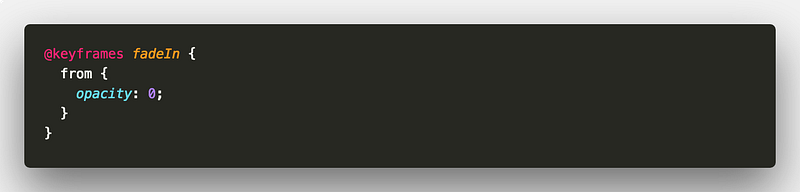
We’d prefer a staggered effect so we give each element a different animation-delay.

But the outcome is not quite as desired because we didn’t use animation-fill-mode 👎 Applying animation-fill-mode: backwards will fix it!
For another demo consider this walk sign using animation-fill-mode 🚶
animation-direction
Last but not least is animation-direction. No surprises that this property allows you to define the direction of your animation. There are four main keywords;
alternate- the direction of the animation alternates on each iterationalternate-reverse- same asalternatebut starts inreversenormal- self explanatoryreverse- the animation is played in reverse
For an example we could use alternate for something that opens and closes.
How about a clapper board?
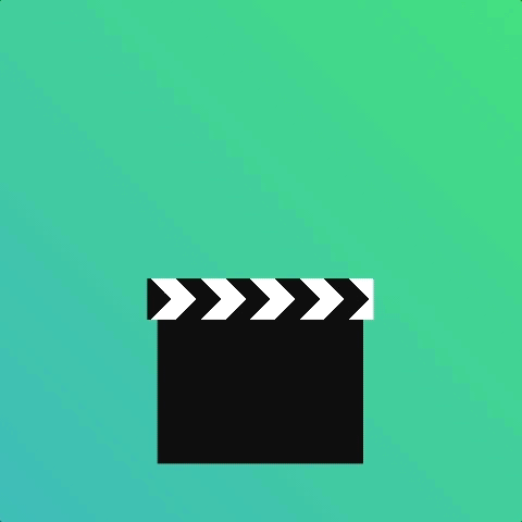
Using an animation-iteration-count of 2 with animation-direction alternate saves us writing separate animations.
animation shorthand
If you’ve got this far, that’s all the animation properties 🎉 You know them all now 🤓 There’s now an opportunity to tidy up your animation code by using the shorthand property. That’s right, you don’t need to write out all the properties each time.
This
Is equivalent to this
Sweet 🍭
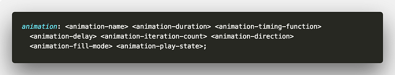
Those properties are also optional so you can use whichever combination you need 👍
But that’s not all. Using the animation property makes it a little easier to apply many animations to an element.
Consider an element that we make come in from below and then rotate by 45 degrees.
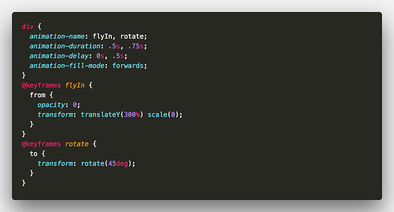
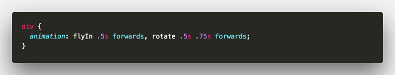
You can use comma separated values for your animation properties. But you could also do this
That’s it for Part 2! 🎉
We’ve gone through the different animation properties and their behaviour.
You should now be in a pretty good place with CSS animation 💪 I hope you’ll join me in Part 3 where we wrap up by looking at different ways of using CSS animations.
Remember, all of the demo code is available in the following CodePen collection 👍
As always, any questions or suggestions, please feel free to leave a response or tweet me 🐦!

✉️ Subscribe to CodeBurst’s once-weekly Email Blast, 🐦 Follow CodeBurst on Twitter, view 🗺️ The 2018 Web Developer Roadmap, and 🕸️ Learn Full Stack Web Development.