
9 Techniques to Discover Data Narratives
Data Visualizations that improve overall dataset comprehension
In the previous article “Strategies to turn data into insights”, I discussed the 3-step process of turning data into insights. Now I will share various techniques for deriving stories from data.
Picture yourself tasked with analyzing a fresh consumer dataset provided by the marketing division. You might find yourself pondering which data aspects to begin with, where to uncover compelling narratives, and how to ensure comprehensive coverage of all the stories and points within this dataset.
In this article, I will share 9 techniques to help you better identify narratives within your dataset. Most of the techniques are based on data visualization, enabling you to gain a more comprehensive understanding of the entire dataset (after all, a single image can convey a wealth of information).
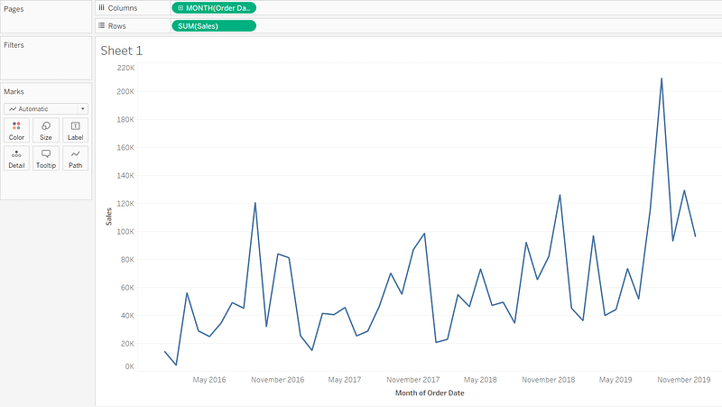
Technique 1: Change Over Time (Time Series):
When plotting your data across time, trends can be identified, particularly when dealing with time series data. These trends might indicate upward or downward movement or even seasonal patterns as time progresses.
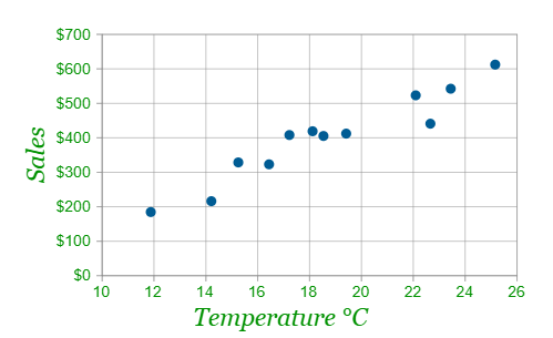
Technique 2: Identify the relationship between variables:
Typically, compelling data narratives emerge when there exists a correlation between them. Several valuable charts for exploring this approach include heatmaps, dynamic charts, and scatter plots.
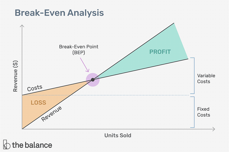
Technique 3: Intersection points
In certain scenarios, variables coincide at a specific juncture, generating an intersection. This intersection can yield noteworthy insights. For instance, in finance, there’s the break-even point where costs and revenue converge, determining whether there’s profit or loss. Similarly, in economics, the equilibrium point arises when supply and demand curves intersect. A popular example is a break-even chart, shown below.
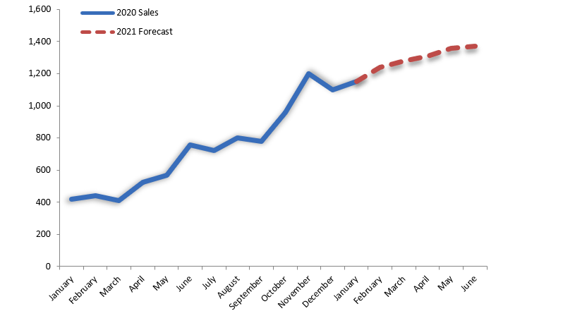
Technique 4: Forecasting
A prevalent form of forecasting involves estimating a company’s sales revenue for a specific timeframe, using historical data and trend patterns. This revenue projection aids the company in optimizing resource allocation and expenditures.
Typically, analysts integrate this graph with the correlation chart from technique 2 to discern the variables influencing the forecast and trends. For instance, a marketer could predict trends by examining the correlation between sales revenue and marketing campaign factors.
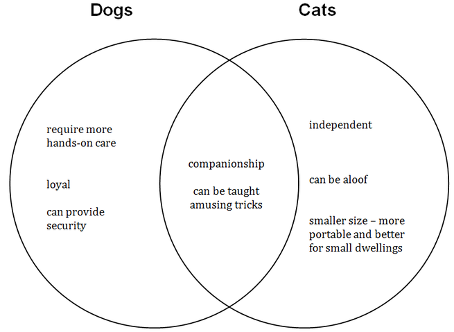
Technique 5: Compare and Contrast
In this technique, we can compare and find the patterns and behaviours in different observations. For instance, we can segment and contrast two customer groups: those who are repeat customers and those who have been lost. By doing so, we can pinpoint patterns that foster customer loyalty while also addressing potential concerns that might lead customers to disengage from the company. An intriguing illustration of this comparative approach is presented below, highlighting the differences between dogs and cats:
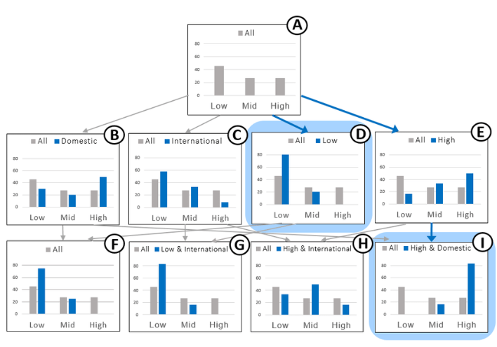
Technique 6: Drill Down Technique
The drill-down method enables us to examine a problem from various perspectives and angles, ranging from a broad overview to intricate details. For instance, rather than analyzing the product directly, we can delve into the performance of its associated category or subcategory.
Technique 7: Zoom in/Zoom out
Typically considered a feature within visualization or business intelligence tools, this functionality lets you zoom in and zoom out of a chart to adjust the level of detail. This feature’s benefit parallels that of drill-down capabilities, permitting the examination of data across multiple levels of detail. This is particularly useful when dealing with substantial datasets that can be structured in layers for enhanced comprehension.
Technique 8: Clustering
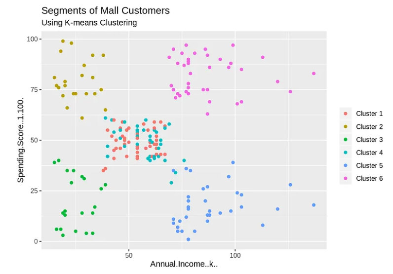
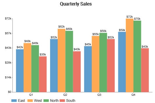
A clustered chart illustrates the relative comparison among distinct datasets. The columns are clustered together in groups, and the order of the clusters can be changed to show which data set is the most important. They are perfect for visualizing data that is grouped into categories. For example, the Segments of Mall Customers chart below illustrates the 6 clusters (6 customer segments), cluster 1 with the highest annual income and spending score probably is the most important customer of the shopping mall.
Clustered column charts are often used to compare sales figures or other data that change over time. For example, the below chart categorizes quarterly sales data by each region, so each region has 4 bars, one for each quarter. By doing that, you can easily compare how each cluster/region grows over the year and how important of each cluster/region is to your company.
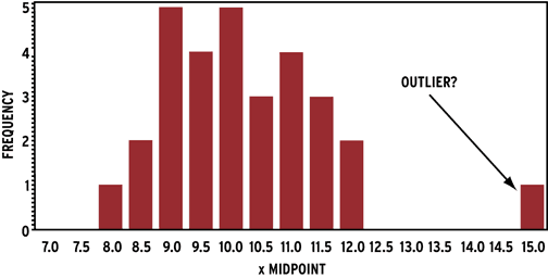
Technique 9: Outlier
An outlier is an observation that lies an abnormal distance from other values in a dataset. In statistical modeling, data scientists and analysts tend to eliminate outliers because they can distort the results of a model. However, it’s important to exercise caution when discarding an outlier, as it might actually represent a valid and valuable insight. There are two scenarios to consider:
1/ If an outlier arises due to a typographical error or an input mistake, it’s advisable to exclude the outlier. For instance, if an individual accidentally enters an age of 4 instead of 40 for an adult.
2/ When an outlier is a valid input, it’s prudent to assess the dataset both INCLUDING and EXCLUDING the outlier, and subsequently compare the outcomes. Furthermore, delving into these outliers is crucial to comprehend their underlying causes. Scatter plots, distributions, and histograms are commonly employed to identify outliers within your dataset.
Conclusion
I trust that the nine techniques outlined in this article can assist you in efficiently pinpointing data elements within your narratives and conveying information or perspectives with optimal effectiveness.