
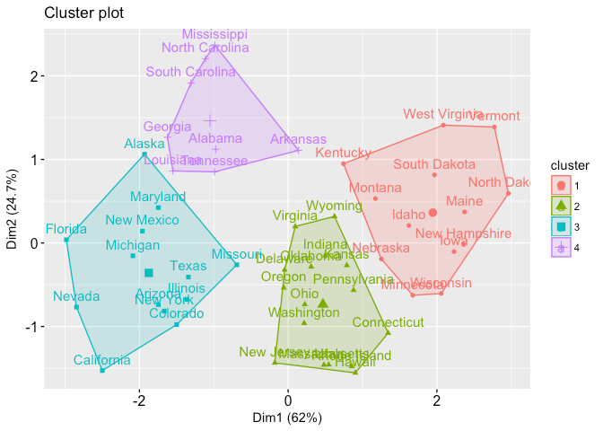
Customer Segmentation using Cluster Analysis
What is Cluster Analysis?
It is a collection of data objects that are similar to one another within the same cluster but different /dissimilar to the objects in other clusters.The process of grouping objects into classes of similar objects is known as clustering.
Types of cluster Analysis
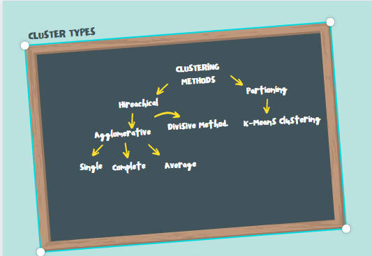
Hierarchical cluster analysis is an unsupervised clustering algorithm which involves creating clusters that have predominant ordering from top to bottom. Example: All folders and files in our hard disk
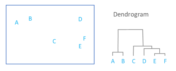
The Agglomerative Hierarchical Clustering is the most common type of hierarchical clustering used to group objects in clusters based on their similarity. It’s a “bottom-up” approach: each observation starts in its own cluster, and pairs of clusters are merged as one moves up the hierarchy.
- Single linkage: The distance between two clusters is defined as the shortest distance between two points in each cluster.
- Complete linkage:The distance between two clusters is defined as the maximum distance between two points in each cluster.
- Average linkage:The distance between two clusters is defined as the average distance between each point in one cluster to every point in the other cluster.
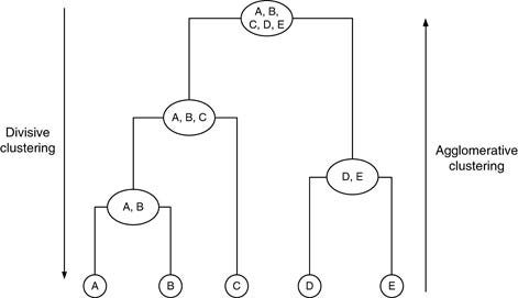
The Divisive Hierarchical Clustering is a “top-down” clustering method :assign all of the observations to a single cluster and then partition the cluster to two least similar clusters. Finally, we proceed recursively on each cluster until there is one cluster for each observation. So its exactly opposite to agglomerative method
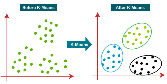
K-means is a centroid-based algorithm, or a distance-based algorithm, where we calculate the distances to assign a point to a cluster. In K-Means, each cluster is associated with a centroid. the main objective of the K-Means algorithm is to minimize the sum of distances between the points and their respective cluster centroid.
How we really represent these clusters?
For hierarchical clustering we use Dendograms. It is used to represent the hierarchical relationships between objects. Y-axis is the distance between clusters and X-axis is the order of clustered objects/groups.
For K means clustering we represent a graph with all the data points which are grouped and provided with an unique identity.
Customer Segmentation using R
- We need to load the Data set
#read the data
cluster=read.csv(“Mall_customers.csv”)
#to see what the data is really about
head(cluster)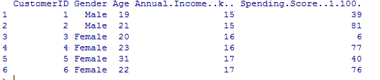
- Customer-Id : Unique number for each customer
- Gender: Customer gender as Male/Female
- Age: Age of customer in mall
- Annual Income K- Annual income of the customer
- Spending Score(1–100):Score assigned by the mall based on customer behavior and spending nature.
2.Inspect Data
- check missing data
colSums(is.na(cluster))
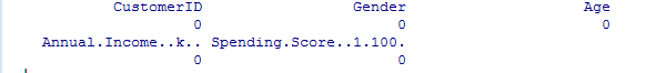
From this we could conclude that there is no missing data.
- To analyse the summary of Dataset
summary(cluster)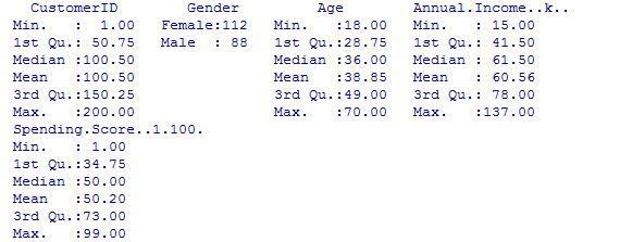
3. Visualization of data
- Gender data visualization
 gen=table(cluster$Gender)
 barplot(gen,main="gender data barplot",xlab="No of people",ylab="their gender",col=rainbow(2))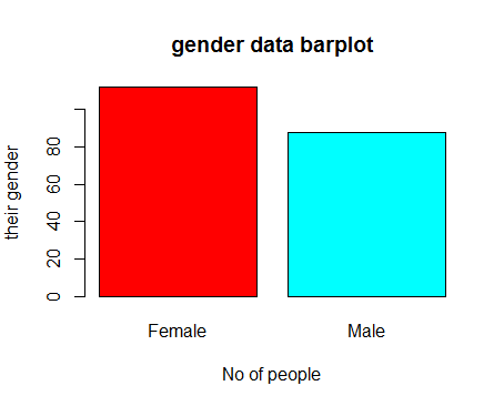
Conclusion: Female customers come to mall more than male customers.
- Age data visualization
boxplot(cluster$Age,col=”#ff0066",main=”Boxplot for age of customers coming to mall”)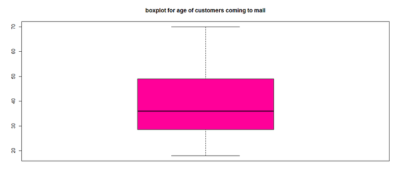
Conclusion:The average age of customers is 30–35 and min age-18 max age-70.
- Annual Income of customers
hist(cluster$Annual.Income..k..,col="#660033",main="Histogram for annual income",xlab="Annual Income Class",ylab="frequency",labels=TRUE)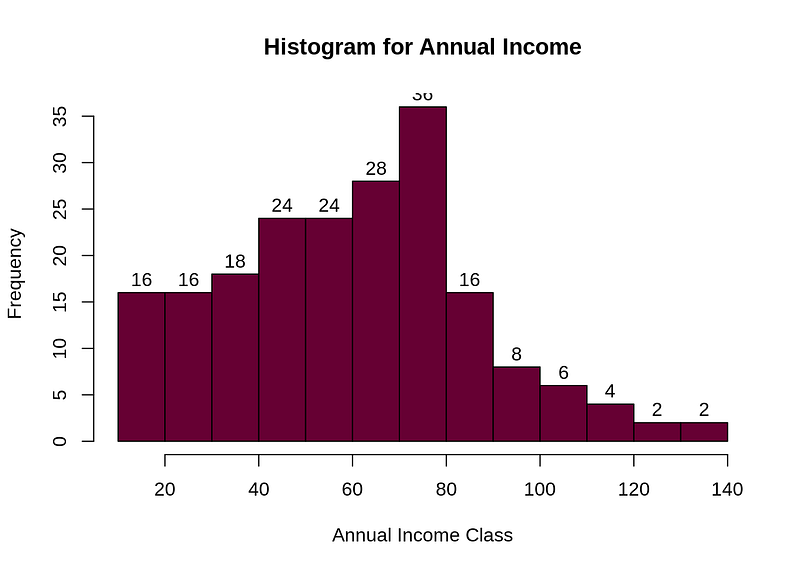
Conclusion:The minimum income is 15k and the highest income is 137k and we could see average income range is 60k. We analyse that income follow normal distribution too.
- spending score of customers
summary(cluster$Spending.Score..1.100.)
Min. 1st Qu. Median Mean 3rd Qu. Max.
## 1.00 34.75 50.00 50.20 73.00 99.00boxplot(cluster$Spending.Score..1.100.,horizontal=TRUE,col=”#990000",main=”BoxPlot for Descriptive Analysis of Spending Score”)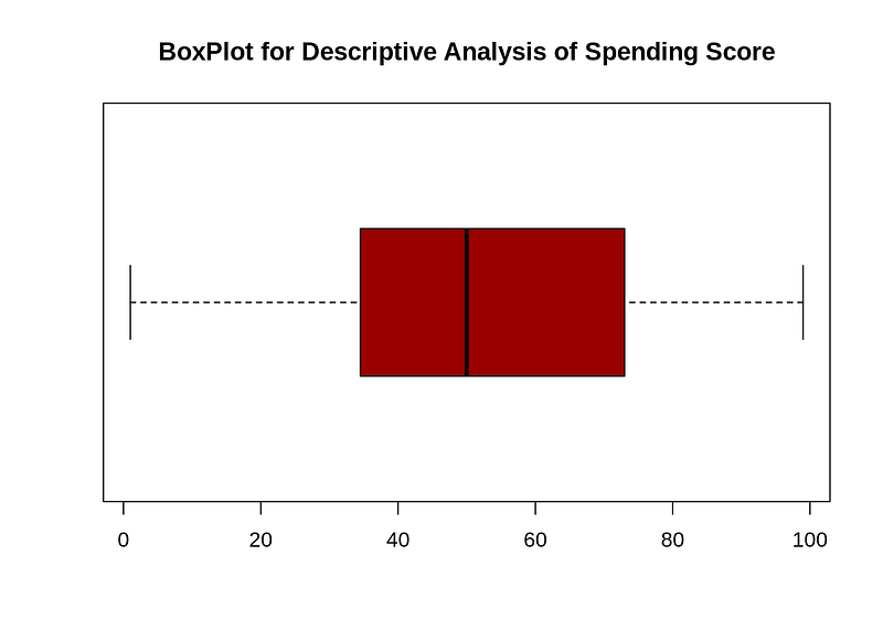
Conclusion:The minimum spending score is 1, maximum is 99 and the average is 50.20. We can see Descriptive Analysis of Spending Score is that Min is 1, Max is 99 and avg. is 50.20.From the box plot we could tell the average spending score between 40–50.
K-means Algorithm
- Find the optimal number of clusters (using elbow method)
set.seed(123)
k.maximum <- 15
d <- as.matrix(scale(cluster[,(3:5)]))w<sapply(1:k.maximum,function(k){kmeans(d,k,nstart=100,iter.max=100)$tot.withinss})
plot(1:k.maximum, w,
type="b", pch = 19, frame = FALSE,
xlab="Number of clusters",
ylab="Sum of squares")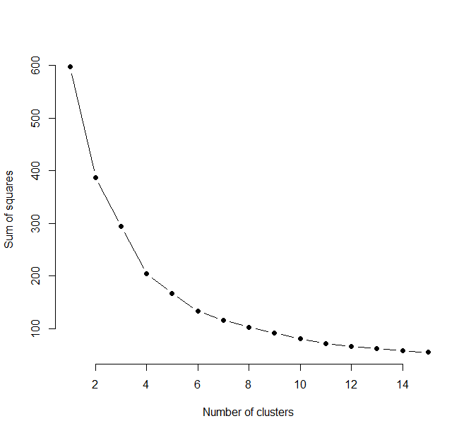
Conclusion:The optimal number of clusters is 4. Also we can go upto 6.
2. Let’s take optimal clusters as 4 then 5 and 6.
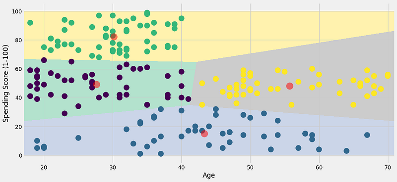
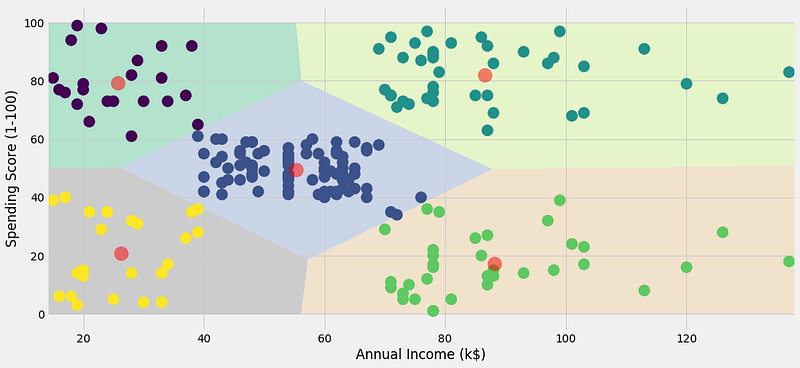
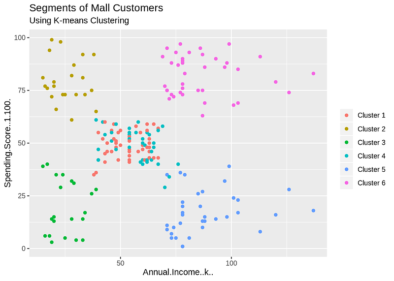
OBSERVATION:
Cluster 1 — This cluster represents the customer_data having a high annual income as well as a high annual spend.
Cluster 2 — This cluster denotes a high annual income and low yearly spend.
Cluster 3 — This cluster denotes the customer_data with low annual income as well as low yearly spend of income.
Cluster 6 and 4 — These clusters represent the customer_data with the medium income salary as well as the medium annual spend of salary.
Cluster 5 — This cluster represents a low annual income but its high yearly expenditure.
CONCLUSION:
In this data science project, we went through the customer segmentation model. Specifically, we made use of a clustering algorithm called K-means clustering. We analyzed and visualized the data and then proceeded to implement our algorithm.
Hope You enjoyed the project!