
Exploring React Leaflet for Interactive Map
React Leaflet is a wrapper of Leaflet, a JavaScript library for mobile-friendly interactive maps
Introduction
Leaflet is the leading open-source JavaScript library for mobile-friendly interactive maps. It is designed with simplicity, performance, and usability in mind. React Leaflet provides bindings between React and Leaflet to come up with React components for Leaflet maps.
There are two ways to use Leaflet:
- Use
leafletAPIs in React apps. - Use
react-leafletcomponents in React apps.
Here is the npm trends comparing leaflet and react-leaflet.
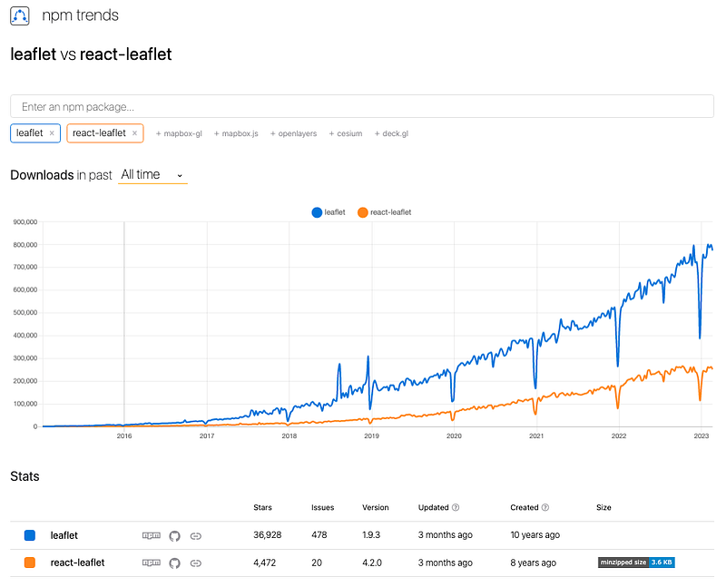
react-leaflet is a wrapper that requires leaflet. The npm trends show that half of Leaflet developers use react-leaflet, and the other half either directly use leaflet APIs or do not use React libraries.
In a previous article, we have described the first way on how to use Leaflet APIs in React apps. In this article, we are going to take a look at the second way on how to use React Leaflet components. Both ways work for the same examples. You may open the two articles side by side to see the similarities and differences.
Set Up React Leaflet in Create React App
We use Create React App as a base to explore React Leaflet. The following command creates a React project:
% yarn create react-app react-leaflet-map
% cd react-leaflet-map
Set up leaflet and react-leaflet.
% yarn add leaflet react-leafletBoth packages become part of dependencies in package.json:
"dependencies": {
  "leaflet": "^1.9.3",
  "react-leaflet": "^4.2.0"
}
The working environment is ready.
Show a Map With React App
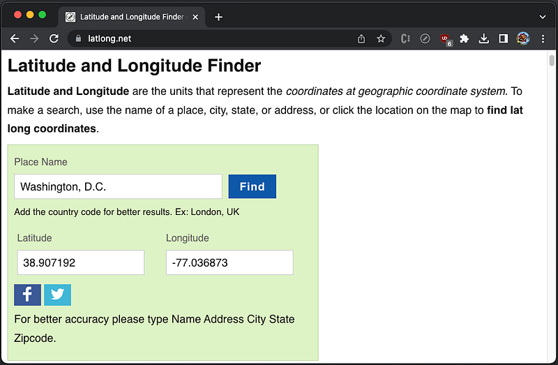
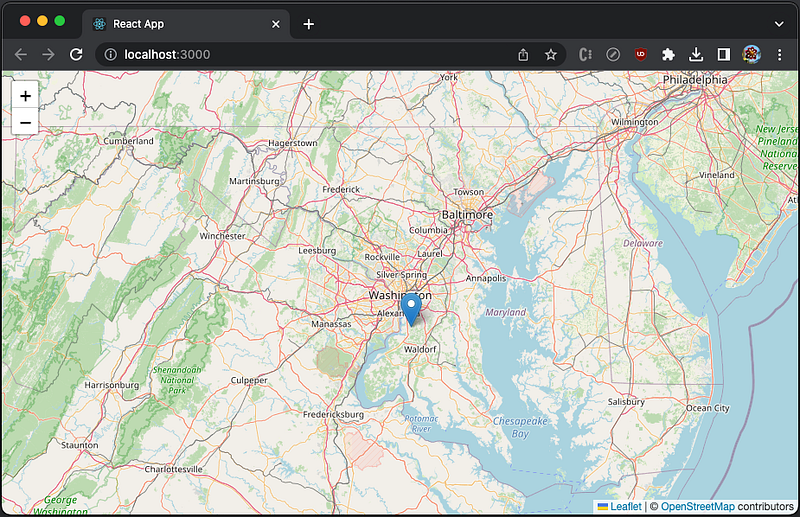
We are going to create an interactive map in a React app. The map is centered at Washington, D.C., whose coordinates, (38.907192, -77.036873), can be found at https://www.latlong.net/.
Leaflet is typically imported by import L from 'leaflet'. L.map(id: string, options?: MapOptions) is a Leaflet API to instantiate a map object with id of a <div> element.
Equivalently, React Leaflet declares MapContainer a type of MapContainerProps, whose props includes id.
export interface MapContainerProps extends MapOptions {
  bounds?: LatLngBoundsExpression;
  boundsOptions?: FitBoundsOptions;
  children?: ReactNode;
  className?: string;
  id?: string;
  placeholder?: ReactNode;
  style?: CSSProperties;
  whenReady?: () => void;
}
MapContainerProps extends Leaflet’s MapOptions, which has props of center and zoom.
center?: LatLngExpression | undefined;
zoom?: number | undefined;
L.tilelayer(urlTemplate: string, options?: TileLayerOptions) is a Leaflet API to load and display map tile layers.
Equivalently, React Leaflet declares TileLayer a type of TileLayerProps, whose props includes url.
export interface TileLayerProps extends TileLayerOptions, LayerProps {
    url: string;
}
TileLayerProps extends Leaflet’s TileLayerOptions, which has a prop, attribution.
OpenStreetMap is a project that creates and distributes free geographic data for the world. The following component loads and displays map tile layers from OpenStreetMap, with attribution set to the map contributors and url set to OpenStreetMap service.
<TileLayer
attribution='© <a href="https://www.openstreetmap.org/copyright">OpenStreetMap</a> contributors'
url="https://tile.openstreetmap.org/{z}/{x}/{y}{r}.png"
/>Here is the modified src/App.js:
- At line 6–11,
MapContaineris instantiated withcenter(Washington, D.C. coordinates) andzoom(8). - At lines 7–10,
TileLayeris instantiated withattributionandurl.
React Leaflet also requires some CSS changes, which are specified in src/index.css:
body {
margin: 0;
}
.leaflet-container {
width: 100%;
height: 100vh;
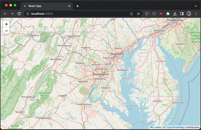
}Execute yarn start, and we see an interactive map that is centered at Washington, D.C.
Create Markers and Popups on the Map
To mark a single location on the map, Leaflet provides markers. These markers use a standard symbol, or can be customized. L.marker(id: string, options?: MarkerOptions) is a Leaflet API to display clickable/draggable icons on the map.
Equivalently, React Leaflet declares Marker a type of MarkerProps, whose props includes position.
export interface MarkerProps extends MarkerOptions, EventedProps {
  children?: ReactNode;
  position: LatLngExpression;
}
MarkerProps extends Leaflet’s MarkerOptions, which is defined as following:
export interface MarkerOptions extends InteractiveLayerOptions {
  /** Icon instance to use for rendering the marker */
  icon?: Icon | DivIcon | undefined;

  /** Whether the marker is draggable with mouse/touch or not. */
  draggable?: boolean | undefined;

  /**
   * Whether the marker can be tabbed to with a keyboard and clicked by
   * pressing enter.
   */
  keyboard?: boolean | undefined;

  /**
   * Text for the browser tooltip that appear on marker hover (no tooltip
   * by default).
   */
  title?: string | undefined;

  /**
   * Text for the `alt` attribute of the icon image (useful for
   * accessibility).
   */
  alt?: string | undefined;

  /** Option for putting the marker on top of all others (or below). */
  zIndexOffset?: number | undefined;

  /** The opacity of the marker. */
  opacity?: number | undefined;

  /**
   * If `true`, the marker will get on top of others when you hover the
   * mouse over it.
   */
  riseOnHover?: boolean | undefined;

  /** The z-index offset used for the `riseOnHover` feature. */
  riseOffset?: number | undefined;

  /** `Map pane` where the markers shadow will be added. */
  shadowPane?: string | undefined;

  /**
   * Whether to pan the map when dragging this marker near its edge or
   * not.
   */
  autoPan?: boolean | undefined;

  /**
   * Distance (in pixels to the left/right and to the top/bottom) of the
   * map edge to start panning the map.
   */
  autoPanPadding?: PointExpression | undefined;

  /** Number of pixels the map should pan by. */
  autoPanSpeed?: number | undefined;

  /** When true, the map will pan whenever the marker is focused. */
  autoPanOnFocus?: boolean | undefined;
}
MarkerOptions has a prop, icon, which can be a type of BaseIconOptions:
export interface BaseIconOptions extends LayerOptions {
  /**
   * (required) The URL to the icon image (absolute or relative to your
   * script path).
   */
  iconUrl?: string | undefined;

  /**
   * The URL to a retina sized version of the icon image (absolute or
   * relative to your script path). Used for Retina screen devices.
   */
  iconRetinaUrl?: string | undefined;

  /** Size of the icon image in pixels. */
  iconSize?: PointExpression | undefined;

  /**
   * The coordinates of the "tip" of the icon (relative to its top left
   * corner).
   * The icon will be aligned so that this point is at the marker's
   * geographical location. Centered by default if size is specified,
   * also can be set in CSS with negative margins.
   */
  iconAnchor?: PointExpression | undefined;

  /**
   * The coordinates of the point from which popups will "open",
   * relative to the icon anchor.
   */
  popupAnchor?: PointExpression | undefined;

  /**
   * The coordinates of the point from which tooltips will "open",
   * relative to the icon anchor.
   */
  tooltipAnchor?: PointExpression | undefined;

  /**
   * The URL to the icon shadow image. If not specified, no shadow image
   * will be created.
   */
  shadowUrl?: string | undefined;

  /** The URL to the retina icon shadow image. */
  shadowRetinaUrl?: string | undefined;

  /** Size of the shadow image in pixels. */
  shadowSize?: PointExpression | undefined;

  /**
   * The coordinates of the "tip" of the shadow (relative to its top left
   * corner) (the same as iconAnchor if not specified).
   */
  shadowAnchor?: PointExpression | undefined;

  /**
   * A custom class name to assign to both icon and shadow images. Empty
   * by default.
   */
  className?: string | undefined;
}
Let’s add a marker to label Washington, D.C. in src/App.js:
- At line 4, Leaflet distributed marker icon,
leaflet/dist/images/marker-icon.png, is imported. - At line 5, Leaflet distributed marker shadow image,
leaflet/dist/images/marker-shadow.png, is imported. - At line 14–24,
Markeris created usingposition(Washington, D.C. coordinates,icon,title('Capital City'), anddraggable.iconis customized with Leaflet distributed marker icon and shadow image (lines 17–20).
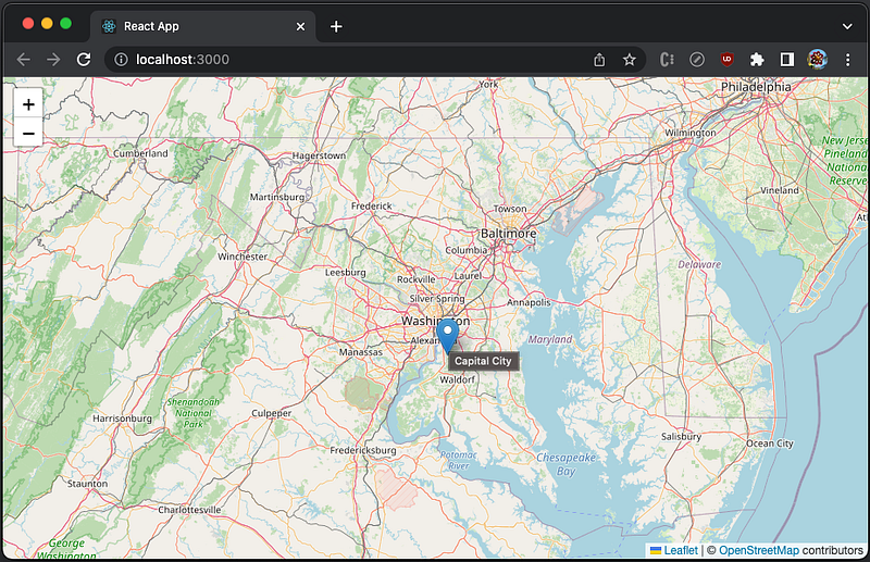
Execute yarn start, and the map shows a shadowed and draggable marker at Washington, D.C. coordinates.
When the marker is hovered on, the title, Capital City, shows.
We can open popups in certain places of a map. A popup can be standalone, but it is typically bound to a marker. It can be programmably opened by calling openPopup() from a marker. In order to access a marker, ref needs to be set up.
<Marker
  position={...}
  icon={...}
  ref={markerRef}
>
L.popup(latlng: LatLngExpression, options?: PopupOptions) is a Leaflet API to instantiate a popup object given latlng where the popup will open, and an optional options object that describes its appearance and location.
Equivalently, React Leaflet declares Popup a type of PopupOptions, whose props includes position.
export interface PopupProps extends PopupOptions, EventedProps {
  children?: ReactNode;
  position?: LatLngExpression;
}
PopupProps extends Leaflet’s PopupOptions, which extends DivOverlayOptions:
export interface PopupOptions extends DivOverlayOptions {
  /** Max width of the popup in pixels. Default is 300. */
  maxWidth?: number | undefined;

  /** Min width of the popup in pixels. Default is 50. */
  minWidth?: number | undefined;

  /**
   * If set, creates a scrollable container of the given height inside a
   * popup if its content exceeds it.
   */
  maxHeight?: number | undefined;

  /**
   * Set it to true if you want to prevent users from panning the popup
   * off of the screen while it is open. Default is false.
   */
  keepInView?: boolean | undefined;

  /**
   * Controls the presence of a close button in the popup. Default is
   * true.
   */
  closeButton?: boolean | undefined;

  /**
   * Set it to false if you don't want the map to do panning animation to
   * fit the opened popup. Default is true.
   */
  autoPan?: boolean | undefined;

  /**
   * The margin between the popup and the top left corner of the map view
   * after autopanning was performed.
   */
  autoPanPaddingTopLeft?: PointExpression | undefined;

  /**
   * The margin between the popup and the bottom right corner of the map
   * view after autopanning was performed.
   */
  autoPanPaddingBottomRight?: PointExpression | undefined;

  /**
   * Equivalent of setting both top left and bottom right autopan padding
   * to the same value. Default is Point(5, 5).
   */
  autoPanPadding?: PointExpression | undefined;

  /**
   * Set it to false if you want to override the default behavior of the
   * popup closing when another popup is opened. Default is true.
   */
  autoClose?: boolean | undefined;

  /**
   * Set it if you want to override the default behavior of the popup
   * closing when user clicks on the map. Defaults to the map's
   * closePopupOnClick option.
   */
  closeOnClick?: boolean | undefined;

  /** Set it to false if you want to override the default behavior of the
   * ESC key for closing of the popup.
   */
  closeOnEscapeKey?: boolean | undefined;
}
DivOverlayOptions is defined as following:
export interface DivOverlayOptions {
  /** The offset of the popup position. Default is Point(0, 7). */
  offset?: PointExpression | undefined;

  /** A custom CSS class name to assign to the popup. */
  className?: string | undefined;

  /** Map pane where the popup will be added. Default is 'popupPane'. */
  pane?: string | undefined;

  /**
   * If true, the popup/tooltip will listen to the mouse events. Default
   * is false.
   */
  interactive?: boolean | undefined;

  /**
   * Sets the HTML content of the overlay while initializing. If a
   * function is passed the source layer will be passed to the function.
   * The function should return a String or HTMLElement to be used in
   * the overlay.
   */
  content?: string | HTMLElement | ((layer: Layer) => string) | ((layer: Layer) => HTMLElement);
}
In order to know whether a popup is ready, ref can be called to set the popup state to be ready.
<Popup ... ref={() => setPopupRefReady(true)}>
  {...}
</Popup>
Here is the modified src/App.js:
- At lines 12–14, the marker ref calls
openPopup()when bothMarkerandPopupare ready. - At lines 22–31,
Markeris instantiated with aref. - At lines 32–34,
Popupis instantiated as a child ofMarker,popupRefReadyis set to true whenrefis generated.
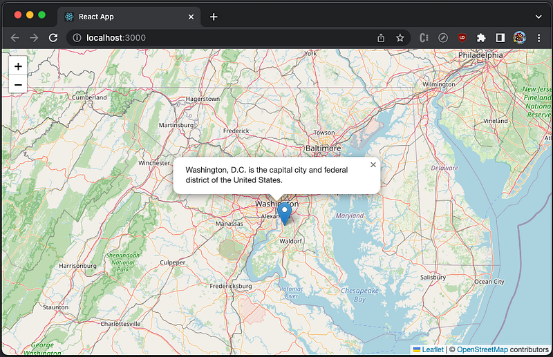
Execute yarn start, and the map has a popup that is bound to the marker.
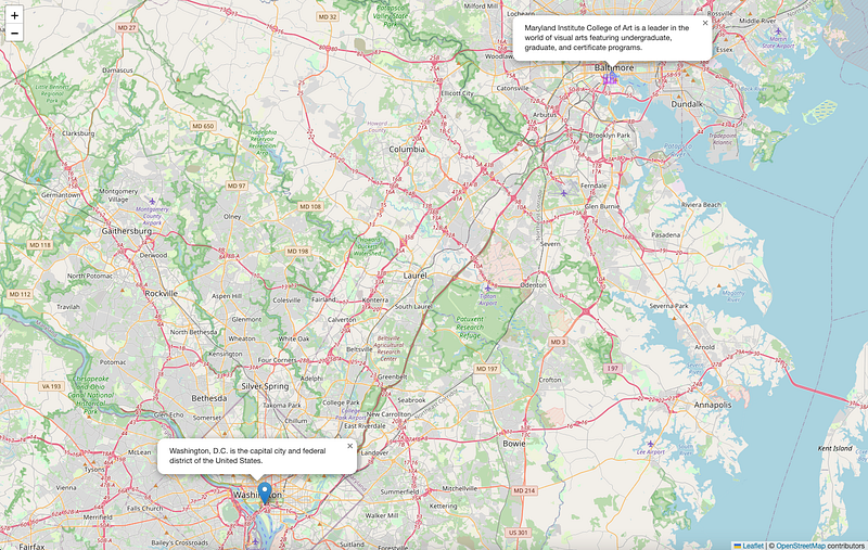
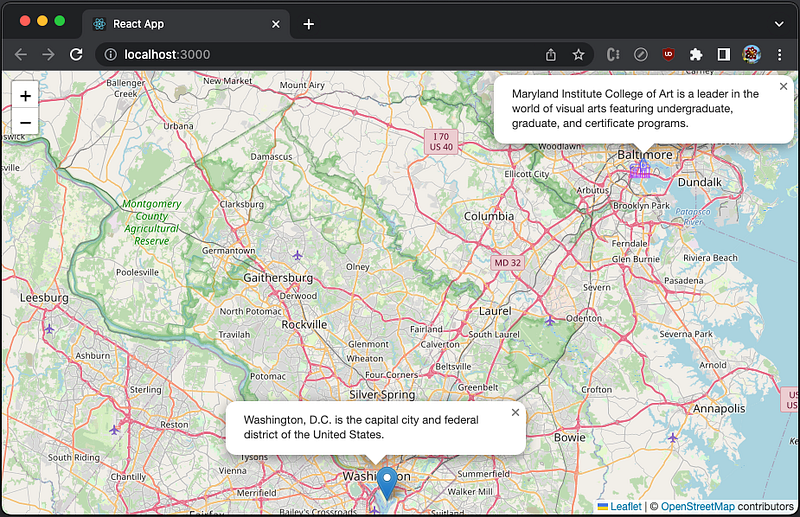
We have shown a marker and a popup. In addition to Washington, D.C., we are going to have a custom icon to indicate Maryland Institute College of Art at Baltimore, Maryland.
Here is the custom icon, src/icons8-university-64.png:

Here is the modified src/App.js:
- At line 7, the custom marker icon,
./icons8-university-64.png, is imported ascollegePng. - At line 24,
MapContainersetszoomto 10. - At lines 29–42, Washington, D.C. marker is created with a popup, where
autoCloseis set to false (line 39). - At lines 43–57, Maryland Institute College of Art marker is created with a popup, where
autoCloseis set to false (line 54). The custom icon’s size (line 48) and anchor (line 49) are adjusted.
Execute yarn start, and the map has two markers and two popups.
Create Various Maps in Layers
Web Map Service (WMS) is a popular way of publishing maps by professional GIS software. It provides alternatives to OpenStreetMap, with different types of maps.
The following component loads and displays WMS map tile layers with layers set to TOPO-WMS for showing world topography, and url set to Mundialis service:
<WMSTileLayer
  layers="TOPO-WMS"
  url="http://ows.mundialis.de/services/service?"
/>
For WMS layer names, check out software such as QGIS to see what layers are available in a WMS server.
Here is the modified src/App.js:
- At lines 7–32,
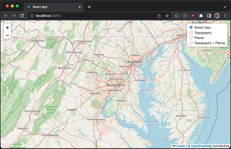
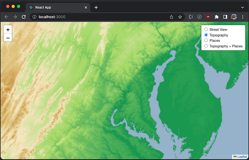
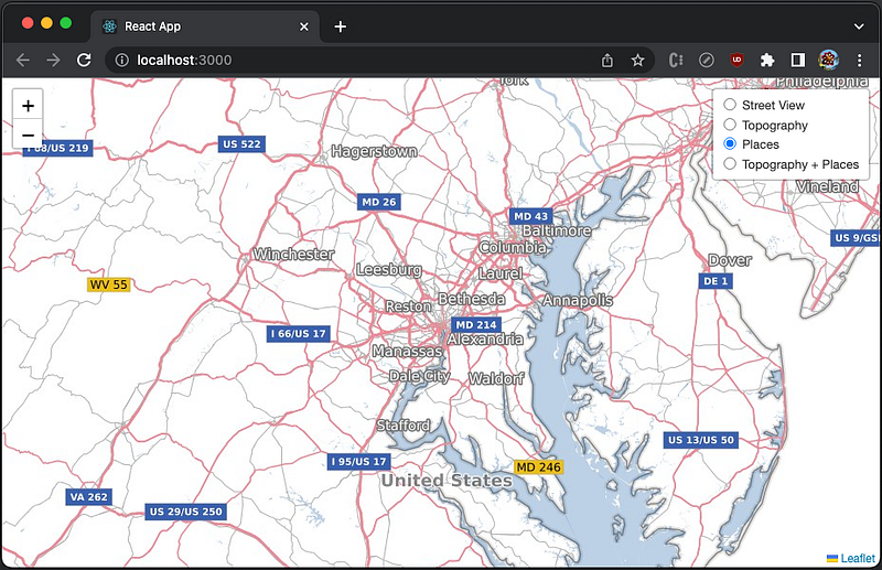
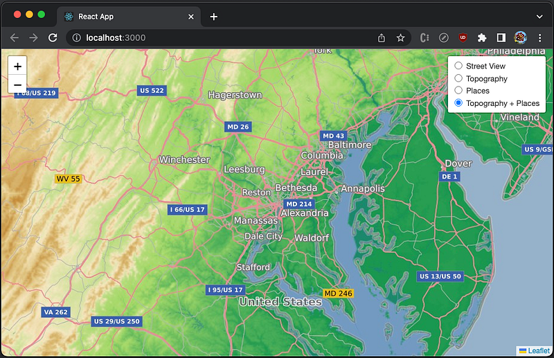
LayersControlis instantiated with the prop,collapsed, set to false. It has 4 child layers. – At lines 8–13, the layer,Street View, is created from OpenStreetMap. It ischeckedas the default layer. – At lines 14–19, the layer,Topography, is created from WMS, with a layer of'TOPO-WMS', showing the world topography. – At lines 20–25, the layer,Places, is created from WMS, with a layer of'OSM-Overlay-WMS', showing the place names. – At lines 26–31, the combined layer,Topography + Places, is created from WMS, with two layers of'TOPO-WMS,OSM-Overlay-WMS', showing the world topography with the place names on top of it.
Execute yarn start, and we see the default layer, Street View.
Click the radio button of Topography, and we see the layer, Topography ('TOPO-WMS').
Click the radio button of Places, and we see the layer, Places ('OSM-Overlay-WMS').
Click the radio button of Topography + Places, and we see the combined layer, Topography + Places (TOPO-WMS,OSM-Overlay-WMS, where the order matters).
Render GeoJSON Dynamically
GeoJSON is a format for encoding a variety of geographic data structures using JSON. A GeoJSON object supports the following types:
Feature: It is a spatially bounded entity, including a geometry object and additional properties. For example,the Washington, D.C. area object.FeatureCollection: It is a list of Features, For example,[the Washington, D.C. area object, the Baltimore area object].- Geometry: It is a region of space, including
Point,LineString,Polygon,MultiPoint,MultiLineString,MultiPolygon, andGeometryCollection.
We write a GeoJSON file as public/example.geojson:
- At line 2, it specifies
typeasFeatureCollection. - At lines 4–13, it defines
Featureforthe Washington, D.C. area object. – At lines 6–9, it defines aPointingeometrywith Washington, D.C.coordinates. – At lines 10–12, it defines apopupContentinproperties. - At lines 14–28, it defines
Featureforthe Baltimore area object. – At lines 16–19, it defines aPointingeometrywith Baltimorecoordinates. – At lines 20–27, it defines apopupContentand aniconinproperties.
L.geoJSON(geojson?: Object, options?: GeoJSONOptions) is a Leaflet API to create a GeoJSON layer. It optionally accepts an object in GeoJSON format to display on the map.
Equivalently, React Leaflet declares GeoJSON a type of GeoJSONProps, whose props includes data.
export interface GeoJSONProps extends GeoJSONOptions, LayerGroupProps, PathProps {
  data: GeoJsonObject;
}
GeoJSONProps extends Leaflet’s GeoJSONOptions, which is defined as following:
export interface GeoJSONOptions<P = any, G extends geojson.GeometryObject = geojson.GeometryObject> extends InteractiveLayerOptions {
  /**
   * A Function defining how GeoJSON points spawn Leaflet layers.
   * It is internally called when data is added, passing the GeoJSON point
   * feature and its LatLng.
   *
   * The default is to spawn a default Marker:
   *
   * ```
   * function(geoJsonPoint, latlng) {
   *   return L.marker(latlng);
   * }
   * ```
   */
  pointToLayer?(geoJsonPoint: geojson.Feature<geojson.Point, P>, latlng: LatLng): Layer; // should import GeoJSON typings

  /**
   * PathOptions or a Function defining the Path options for styling GeoJSON lines and polygons,
   * called internally when data is added.
   *
   * The default value is to not override any defaults:
   *
   * ```
   * function (geoJsonFeature) {
   *   return {}
   * }
   * ```
   */
  style?: PathOptions | StyleFunction<P> | undefined;

  /**
   * A Function that will be called once for each created Feature, after it
   * has been created and styled. Useful for attaching events and popups to features.
   *
   * The default is to do nothing with the newly created layers:
   *
   * ```
   * function (feature, layer) {}
   * ```
   */
  onEachFeature?(feature: geojson.Feature<G, P>, layer: Layer): void;

  /**
   * A Function that will be used to decide whether to show a feature or not.
   *
   * The default is to show all features:
   *
   * ```
   * function (geoJsonFeature) {
   *   return true;
   * }
   * ```
   */
  filter?(geoJsonFeature: geojson.Feature<G, P>): boolean;

  /**
   * A Function that will be used for converting GeoJSON coordinates to LatLngs.
   * The default is the coordsToLatLng static method.
   */
  coordsToLatLng?(coords: [number, number] | [number, number, number]): LatLng; // check if LatLng has an altitude property

  /** Whether default Markers for "Point" type Features inherit from group options. */
  markersInheritOptions?: boolean | undefined;
}
GeoJSON is a wrapper of L.geoJSON, and its props, pointToLayer and onEachFeature, are handled identically to L.geoJSON.
The Leaflet APIs to automatically adjust the zoom (map.fitBounds(geojsonLayer.getBounds())) and to open each popup (geojsonLayer.eachLayer((layer) => layer.openPopup())) are applied similarly on refs.
Here is the modified src/App.js:
- At line 9, the state,
jsonContent, is created to store the GeoJSON object. - At lines 14–1 9,
useEffect()fetchesexample.geojsonto initializejsonContent. - At lines 21–26,
useEffect()sets the map’s zoom to be automatically adjusted (line 23) and each popup is opened (line 24), when the map is ready. - At lines 28–41,
pointToLayerdefines how points are displayed on layers. If a custom icon is defined, it is rendered (lines 29–33). Otherwise, the default icon is rendered (lines 35–40). - At lines 43–49,
onEachFeatureis defined to show popups if they are defined by a feature. Each popup’sautoCloseis set to false (line 46). - At line 56, the callback,
whenReady, sets the map state to be ready. - At lines 62–69,
GeoJSONrendersjsonContent, with defined methods,pointToLayerandonEachFeature.
Execute yarn start, and the map has two markers and two popups.

Conclusion
Leaflet is an open-source JavaScript library for mobile-friendly interactive maps. It is designed with simplicity, performance, and usability in mind. React Leaflet provides bindings between React and Leaflet to come up with React components for Leaflet maps.
There are two ways to use Leaflet:
- Use
leafletAPIs in React apps. - Use
react-leafletcomponents in React apps.
In the previous article, we have described the first way on how to use Leaflet APIs in React apps. In this article, we have looked at the second way on how to use React Leaflet components. Both ways work for the same examples.
Which way do you prefer?
Thanks for reading.
Thanks Ethan Brown for introducing Leaflet to me, and Sushmitha Aitha and S Sreeram for implementing Leaflet features in Domino products.
Want to Connect?

If you are interested, check out my directory of web development articles.
More content at PlainEnglish.io.
Sign up for our free weekly newsletter. Follow us on Twitter, LinkedIn, YouTube, and Discord.
Interested in scaling your software startup? Check out Circuit.


