
Writing|Money|Marketing
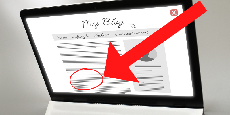
5 Blog Formatting Tricks I Use To Make $5,000 Per Month
My exact strategies
You may think that making money from blogging is a complex process — and, in many ways, you’re right.
But there are actually a few simple tricks that can help you boost your income.
One of the most effective is to simply format your blog posts in a certain way. Format might not seem like a big deal, but it helps me make up to $5,000+ each month.
Here are 5 blog formatting tricks I use.
The Blog Formatting Tricks That Make Me 5K
I use what I call “Visual Speed Bumps” to get a longer average read time on the articles across my portfolio of websites.
Essentially, I use formatting to slow the reader down on the page.
The formatting tricks include subtle and more obvious speedbumps. At its simplest, a “speed bump” is any format change that makes the content slightly slower (and easier) to consume.
By slowing down the reader, these formatting tricks help to:
- Increase the time spent on the page
- Improve retention rates
- Boost engagement
- Earn more money through display ad revenue and affiliate commissions
In short, visual speed bumps help control the reader’s pace.
People like to skim.
We’re all busy and, in theory, we don’t want to waste the precious resource of our time.
We want to be entertained, enlightened, and informed — mostly in a hurry.
By carefully controlling the reader’s experience, I ensure that readers spend enough time with my work to get value. When readers get value, I get value, too.
In this way, visual speed bumps are an essential part of my writing process.
Here Are the 5 Speedbumps I Use To Boost Retention
I use five specific formatting tricks as “visual speedbumps” to boost reader retention.
Here are those five formatting tricks.
1) Bigger Buckets
One of the easiest ways to get people to consume more food (or more content on your website) is to give them bigger buckets.
A research study published in the Journal of Nutrition Education and Behavior found that people given bigger popcorn buckets ate more popcorn.
The inverse is also true.
People with smaller popcorn buckets ate less popcorn. This is the same reason that plate size affects how much or little food you consume during a meal.
One of the more fascinating findings from the study is that participants ate 30% more popcorn with big buckets (get this) even when they didn’t like the taste of the popcorn.
The long and short of it is that bucket size matters.
You can use this psychological trick in your articles by writing longer articles and using a larger font.
If you’re like most people, you probably don’t spend a lot of time thinking about font size.
But the truth is, font size can have a big impact on your blog posts.
Not only does a larger font make for a better user experience, but it also helps to keep readers engaged with each blog post longer.
This is true on all versions of your website:
- Desktop
- Mobile
- Tablets
I usually use an 18 font size. You can even increase the font size of your subheadings to 20+, which I personally prefer.
You might also want to increase the font size of your introduction a bit larger than the rest of your text since it’s at the beginning and most people drop off early in an article.
By increasing the font size of your blog posts, you’re making it easier for people to read and enjoy your content.
So don’t be afraid to experiment with different font sizes to find what works best for you and your audience.
2) Unique Chunks
Subheadings are a good way to mentally invite readers to take a break.
By subdividing your text into manageable chunks, you make it easier for a reader to digest the information. And by using bold or larger font sizes, you can make sure that the reader takes notice of the subheadings.
I call them “unique chunks” not because it sounds gross (but it does).
Unique means the subheadings grab attention. They don’t just list off the expected basic information.
These formatting tricks are meant to grab the reader, slow them down, and make them want to read the text on the screen. They pull the reader in. Unique subheadings will do that.
Boring, basic subheadings that don’t appeal to the reader will not do that.
For example:
- I could have named this trick “subheadings.” That’s boring.
- Instead, I went with “unique chunks.” It might sound nasty but it is probably slightly more curiosity-triggering.
3) Formatting Porn
Your brain loves lists.
Lists help to break up the text and make it more scannable. Plus, they allow the reader to quickly grasp the main points of your article.
According to decades of research, including this one in the American Psychologist about how much we enjoy control and completion, our brains are hardwired to respond positively to lists.
In fact, the very act of manually creating a list helps us to better remember and process the information.
In addition, lists help to break down complex topics into manageable chunks.
This makes them easier for readers to digest.
As a result, including lists and bullet points in blog posts can actually help to increase reader retention and engagement.
Of course, this doesn’t mean that every blog post should be a listicle. But if you’re struggling to keep your readers engaged, adding a few strategic lists can make a big difference.
Here are a few tips for making the most of this powerful tool:
- Use short, clear sentences. When it comes to lists, less is definitely more. Readers will quickly lose interest if they’re confronted with a wall of text. Keep your sentences short and to the point, using simple language that’s easy to understand.
- Stick to one topic per list. Don’t try to pack too much information into each list. Instead, focus on one specific topic or theme. This will help ensure that your readers can actually absorb and process the information you’re sharing.
- Use formatting wisely: Lists are more visually appealing but should not be overdone. I shoot for one list for about every 500 or so words.
4) Spacial Fluency
When you’re reading online, you want the experience to be as smooth and seamless as possible.
You don’t want to have to work hard to understand what you’re reading, and you certainly don’t want to feel like you’re slogging your way through a dense wall of text.
That’s why it’s so important to ensure that your writing is highly fluent.
Fluency, in research, is how easy a mental task is to complete. And when it comes to reading, the easier it is for your brain to process the words on the page, the more likely you are to stick around and finish the article.
There are a number of ways to increase fluency, but two of the most effective are micro paragraphs and plenty of white space.
Micro paragraphs are short, straightforward sections of text that are easy to digest. They give your brain regular breaks, which helps to reduce cognitive load and keeps you engaged with the material.
Similarly, white space makes texts more visually appealing and easier to read.
It gives your eyes a rest, making it less tiring to read large blocks of text. By increasing spacial fluency, you can boost reader engagement and keep people on your site for longer.
5) Visual Goldmines
People are visual creatures.
We’re hardwired to respond to images, which is one reason why advertising, Social Media, and Photography are such ginormous industries.
And when it comes to reading online, there are three little pieces of visual bait that keep readers hooked:
- Graphics
- Videos
- Freebies
A good graphic can make an article more visually appealing and easier to understand.
Videos add another level of engagement, giving readers a break from all the text and providing information in a visually stimulating way.
For example, since you’re reading this article, you might be interested in this video about quickly ranking articles on Google:
Freebies are also popular because they offer readers something of value that they can’t get anywhere else. You can offer a free download, ebook, or template, for example.
By using graphics, videos, and freebies, you’re essentially giving readers a reason to stick around longer.
The longer they stay on your page, the more money you make.
By using these five simple tricks, I’m able to better control the pacing of my articles and ensure that more of my readers stay engaged until the very end.
What All These Tricks Have In Common
You may have caught on to a pattern in all of these formatting “tricks.”
Namely, they all change the physical information on the screen. They all, ever so slightly, shift the visual map of the blog post.
The New Yorker explained it this way:
Whenever we encounter new information, our brains immediately try to make sense of it. Once they figure out what we’re seeing in a physical sense, they work to provide personal context and decide if it’s relevant enough to focus on further. The process is instantaneous: we don’t even realize we’ve made a choice in the time our minds have selected one path or another. Our gaze either stops, or we simply keep scanning. Recall a time when you were spacing out while skimming a stream of content and then, without quite knowing why, found yourself pausing to actually process the words. What made you stop and focus? On a physical level, the answer is often simple: difference.
It’s these little “differences” that can make all the difference in reader retention and revenue.
Final Thoughts
Ultimately, you get better engagement from writing better articles with better headlines on topics people want to read.
No formatting trick will save a poorly chosen topic or title.
One of my favorite quotes for writing and business is from Walt Disney:
“Do what you do so well that they will want to see it again and bring their friends.” — Walt Disney, Co-Founder of The Walt Disney Company
I think Walt had it right.
Related posts:
- How I Make $200 an Hour for Articles I Don’t Even Write
- Update These 3 Types of Content for a 75% Boost in Traffic
- How I Make $2,000 Each Month by Answering Simple Yes or No Questions
If you want to support my writing, become a Medium Member. Then you can read all of my other articles and thousands more. If you use my link, I’ll get a small commission from your fee. I truly appreciate it.


