
3 Marketing Lessons to 10X Boost Your Website Conversion Rate
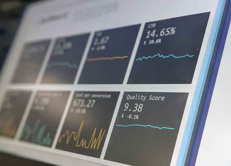
Shocking outcomes from eye-tracking studies
Optimizing your website for the best conversion rate is not guesswork anymore.
Where to place your best CTA( Call to Action ) does take a lot of time, patience, and experiments. But, thanks to the ever-emerging technology and Softwares for making human's lives more feasible.
Eye-tracking software and heatmaps can reveal astonishing results on — how users interact with your site, the time spent on each element of your webpage, how long they have skimmed through your site.
Studying such metrics provides creators to optimize their websites parallel to their audience's wants.
Here’s the kicker —
1. Non-Clickable CTA’s
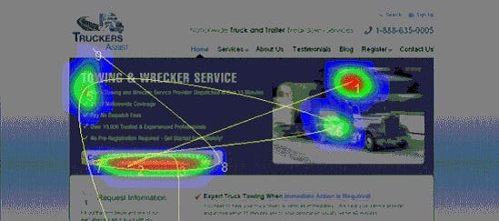
Examine this case study from TechWyse that studied the homepage of a truck service website with heatmap software.
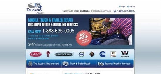
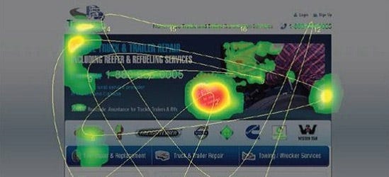
Observed both the images? What is your conclusion? With this structure of webpage can the website get the highest conversion rate?
Here’s the deal —
The “NO FEES” logo is getting the majority of attention from users. On top of that, it is non-clickable. Do you know the worst part about this?
The phone number to book your services( which is the real CTA ) is getting overshadowed and receiving the least attention.
Here’s how they resolved this issue,
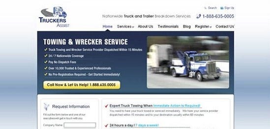
Now, the actual CTA is getting the majority of attention, which is clickable :)
Lesson learned — Always showcase your CTA’s like the odd one out throughout the webpage. Provide your most important information on it and make it clickable. Don’t blend it with rest of the elements, make it stand aside.
2. Significance of Visual’s for CTA
Websites with infographics and visuals showcasing directions for better navigation tend to perform better on search results.
As human beings, we tend to follow the gaze of others and follow the directions instructed to us, without giving it a second thought about its intention.
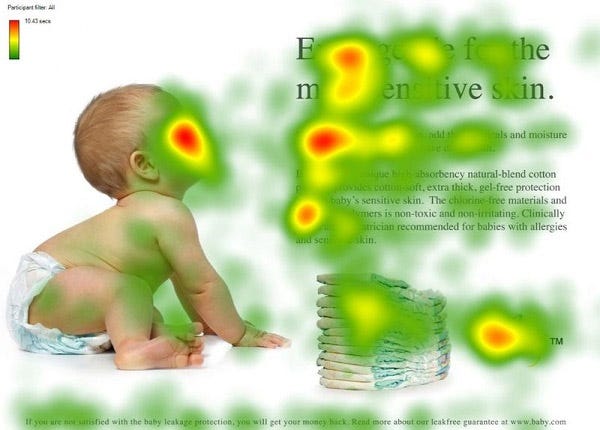
Let’s have a look at the webpage with a baby’s face and an excellent headline product copy.

What is your conclusion? Is the compelling headline and sales copy getting enough attention?
Sadly not. Visuals won’t make you any penny.
The product copy is receiving the least attention of all. Yeah, the baby’s face is cute but, from a marketing perspective emotions won’t make you money.
Here’s how they resolved this issue —
Pretty well done. The baby’s face is receiving a good amount of attention, but people are also focusing on and reading the headline and compelling copy.
Did you get it? The human tendency in action. Following the gaze of others. Navigating the attention of users from the baby’s face to the headline.
Lesson learned — Make rightly use of visuals and directions to shower the attention of users on your CTA. Your CTA should be the main event for WrestleMania.
3. Make the F-pattern work for you
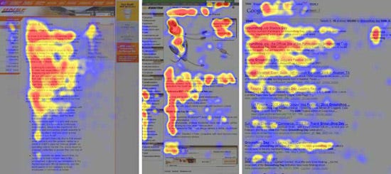
According to this study from the Neilsen Group, all articles on the Internet — e-commerce websites, blogs, news- bulletins, have one thing in common. People always browse from the left-hand side. Browsing in an F- pattern.
Note —
This study has taken place, establishing English as the default language. The opposite is true for those languages that read from right to left. Their users sprinkle their attention first on the right side, then gradually shift their focus to other things.
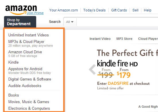
Have you ever wondered why some of the biggest sites online have given significance to the left side of the page?
Lesson learned — Make use of the user's footprint to reward them with your best product. Remember to display your most important information onto the left side, then gradually shift the user’s focus to right with more information.
Your takeaway
Monetizing your website with ads is not the way to go in the future. This system is going to collapse. I Hate Ads.
Keeping this in mind, monetizing your website with your own services or joining affiliate programs will be nurtured by the readers. Placing the right CTA’s at the right time and the right place will be the key to success in the coming times.
Let’s quickly revise the 3 Marketing lessons to boost your Conversion Rates —
- Placing CTA’s at the right place, which are clickable. It should be the odd one out throughout the page. Use contrasting colors or backgrounds to make it pop-out.
- Making correct use of visuals for higher CTR ( Click Through Rate ). People follow directions blindly. Have some arrows or visuals pointing out to your CTA.
- The F-pattern. users leave their footprints behind while browsing on the web. They go from left to right. Remember to make use of such metrics to correctly display your information for better sales.
Selling your product or services online is not that tough as it seems. Just keep yourself in parallel to your user’s demand and habit.
I am sure you will apply these techniques and witness tremendous growth in your conversion rates :)
Thank you for reading! Have a nice day
Join my Email list — Determined to make your life easier and joyful :)