
Visualizing Geospatial Information using GeoPandas in Python
Learn how to leverage the GeoPandas library to create interactive and dynamic geospatial visualizations in your Python projects

In this blog, we will cover the below topics
- Introduction
- Understanding Coordinate Reference Systems (CRS)
- Plotting Geospatial Data with Matplotlib and GeoPandas
- Customizing Maps: Colors, Legends, Labels
- Conclusion
Introduction
In today’s data-driven world, understanding the geographical aspects of your information is essential for making informed decisions. From analyzing the spread of diseases to plotting the locations of your favorite coffee shops, geospatial data visualization provides valuable insights by bringing data to life on interactive maps.
In this article, we’ll delve into the world of geospatial analysis and visualization, focusing on how to harness the capabilities of GeoPandas to create stunning maps that not only display your data but also allow for seamless exploration and interaction. Whether you’re a seasoned data analyst or a curious beginner, this guide will equip you with the skills you need to transform your raw location-based data into visually appealing, informative, and user-friendly maps.
We’ll start with the basics, introducing you to the fundamental concepts of geospatial data and Coordinate Reference Systems (CRS). Then, we’ll dive into the GeoPandas library, a popular Python package that simplifies the process of creating maps with just a few lines of code. With its user-friendly interface and powerful features, GeoPandas empowers you to visualize data points, overlay layers, and even add custom markers, pop-ups, and tooltips to enhance the viewer’s understanding.
Understanding Coordinate Reference Systems (CRS)
Coordinate Reference Systems (CRS) are a fundamental concept in geospatial analysis and cartography, serving as a framework for defining and locating geographic positions on the Earth’s surface. They provide a standardized way to accurately represent spatial data, allowing different datasets to be integrated and analyzed seamlessly.
The Earth is three-dimensional, but maps and spatial data are two-dimensional representations. Coordinate Reference Systems address this by establishing a mapping between Earth’s curved surface and a flat plane. This mapping specifies how geographic coordinates (latitude and longitude) on the Earth’s surface are projected onto a two-dimensional Cartesian plane.
There are two main types of Coordinate Reference Systems:
- Geographic Coordinate Systems (GCS): Geographic Coordinate Systems use latitude and longitude to define points on the Earth’s surface. Latitude measures the north-south position, while longitude measures the east-west position. The most common GCS is the World Geodetic System 1984 (WGS 84), used by the Global Positioning System (GPS) and many other mapping technologies. GCS is based on an ellipsoid model of the Earth’s shape. Here is a list of common ones.
- “EPSG:4326” WGS84 Latitude/Longitude, used in GPS
- “EPSG:3395” Spherical Mercator. Google Maps, OpenStreetMap, Bing Maps
- “EPSG:32633” UTM Zones (North)
- “EPSG:32733” UTM Zones (South)
- Projected Coordinate Systems (PCS): Projected Coordinate Systems are used to represent geographic locations on a flat surface, often referred to as a map. They involve a mathematical transformation from the spherical or ellipsoidal coordinates of the GCS to a Cartesian coordinate system. This transformation introduces distortion, which varies based on the chosen projection. Different projections minimize specific types of distortion depending on the area of interest. Examples of map projections include Mercator, Lambert Conformal Conic, and Albers Equal Area.
A combination of parameters defines CRS:
- Datum: A reference model of the Earth’s shape and size. Different datums can result in varying accuracy of spatial data, especially when comparing data across different CRS.
- Projection: The mathematical method used to project the three-dimensional Earth onto a two-dimensional plane. Projections are chosen based on the intended use and area of analysis.
- Units: The units of measurement for distances and coordinates, such as meters, feet, or degrees.
- Origin: The point where the coordinate system’s origin is located.
- False Easting and False Northing: Offsets are added to the x and y coordinates to avoid negative values and to ensure all coordinates are positive within a specific region.
Feel free to check the blog Introduction To Geospatial Analysis With Python. It covers the basics of geospatial analysis using GeoPandas and Matplotlib for visualizing geospatial data.
Visualization with Matplotlib and GeoPandas
Let’s start with the plotting of the US map using the census data. It has 58 rows and 11 columns with each state representing a state information.
states = geopandas.read_file("data/usa-states-census-2014.shp")
print(states.shape)
print(states.columns)

OUTPUT:
(58, 11)
Index(['STATEFP', 'STATENS', 'AFFGEOID', 'GEOID', 'STUSPS', 'NAME', 'LSAD',
       'ALAND', 'AWATER', 'region', 'geometry'],
      dtype='object')
Let’s look at the data; our focus will be on a few key factors like state, region, and geometry.
STUSPS NAME region geometry
0 CA California West MULTIPOLYGON Z (((-118.59397 33.46720 0.00000,...
1 DC District of Columbia Northeast POLYGON Z ((-77.11976 38.93434 0.00000, -77.04...
2 FL Florida Southeast MULTIPOLYGON Z (((-81.81169 24.56874 0.00000, ...
3 GA Georgia Southeast POLYGON Z ((-85.60516 34.98468 0.00000, -85.47...
4 ID Idaho West POLYGON Z ((-117.24303 44.39097 0.00000, -117....
It will essential to note the coordinate system (CRS). The data is in EPSG:4326. We will discuss the CRS and its importance in the later sections.
states.crs

OUTPUT:
<Geographic 2D CRS: EPSG:4326>
Name: WGS 84
Axis Info [ellipsoidal]:
- Lat[north]: Geodetic latitude (degree)
- Lon[east]: Geodetic longitude (degree)
Area of Use:
- name: World.
- bounds: (-180.0, -90.0, 180.0, 90.0)
Datum: World Geodetic System 1984 ensemble
- Ellipsoid: WGS 84
- Prime Meridian: Greenwich
Now, let's start with basic visualization of the maps. There are various colors, and boundaries that can be used. Here are a few examples.
fig, axes = plt.subplots(2,2, figsize=(12,6), sharex=True, sharey=True)
base = states.plot(ax=axes[0,0])
axes[0,0].set_title("Standard plot")

base = states.boundary.plot(ax=axes[0,1])
axes[0,1].set_title("Boundary plot")

base = states.plot(cmap = "magma",ax=axes[1,0])
axes[1,0].set_title("magma Theme")

base = states.plot(cmap = "Pastel1",ax=axes[1,1])
axes[1,1].set_title("Paste1 theme")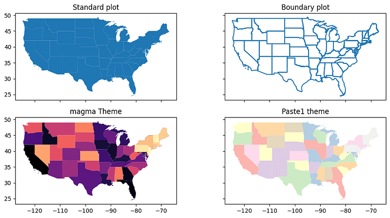
We can also focus on a specific state for example California.
states[states['NAME'] == 'California'].plot()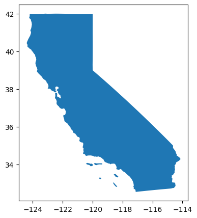
The maps are certainly impressive, and adding the labels of the states would provide valuable context. Moreover, is there functionality to emphasize a particular group of states using a distinct color? Our intention is to spotlight the states in the mid-west region.
midwest = states[states['region'] == 'Midwest']

fig = plt.figure(1, figsize=(12,12))
ax = fig.add_subplot()
states.apply(lambda x: ax.annotate(text = str(x.STUSPS),
              xy=x.geometry.centroid.coords[0], ha='center',
                      fontsize=14),axis=1)
states.boundary.plot(ax=ax, color='Black', linewidth=.4)
states.plot(ax=ax, color='ivory', figsize=(12, 12))

midwest.plot(ax=ax)
ax.text(-0.05, 0.5, transform=ax.transAxes,
        fontsize=20, color='gray', alpha=0.2,
        ha='center', va='center', rotation='90')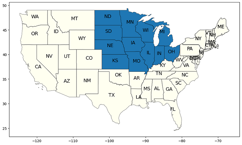
In the same way, we can segment different regions like below eg: west, southwest, southeast, midwest, and northeast.
west = states[states['region'] == 'West']
southwest = states[states['region'] == 'Southwest']
southeast = states[states['region'] == 'Southeast']
midwest = states[states['region'] == 'Midwest']
northeast = states[states['region'] == 'Northeast']

fig = plt.figure(1, figsize=(12,12))
ax = fig.add_subplot()
states.apply(lambda x: ax.annotate(text = str(x.STUSPS),
  xy=x.geometry.centroid.coords[0], ha='center', fontsize=14),axis=1)
states.boundary.plot(ax=ax, color='Black', linewidth=.4)
# states.plot(ax=ax, color='ivory', figsize=(12, 12))
southwest.plot(ax=ax)
west.plot(ax=ax,color="MistyRose")
southwest.plot(ax=ax, color="PaleGoldenRod")
southeast.plot(ax=ax, color="Plum")
midwest.plot(ax=ax, color="PaleTurquoise")
northeast.plot(ax=ax, color="ivory")
ax.text(-0.05, 0.5, transform=ax.transAxes,
        fontsize=20, color='gray', alpha=0.2,
        ha='center', va='center', rotation='90')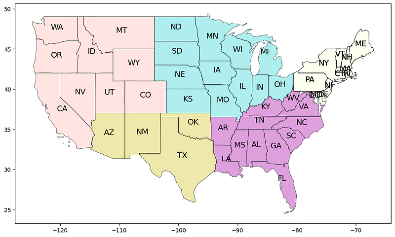
Up to this point, our exploration has encompassed the creation of visual representations and spatial segmentation, coupled with the integration of data into these visualizations. Traditionally, global or regional cartographic depictions serve as foundational frameworks, upon which analytical insights are projected to convey narratives effectively. In the preliminary blog post titled “Initiation into Geospatial Analysis Using Python,” our focus centered on the incorporation of seismic activity data onto a global map. In the next section, we will pivot to tornado-related data, seamlessly superimposing our analytical observations onto the foundational map developed within this phase.
We will use the tornado data from the US and the skills we learned from the previous section to visualize the data. Let’s load the tornado data and explore it. There are 63K rows and 23 columns.
torn = geopandas.read_file("1950-2018-torn-initpoint.shp")

torn.shape
OUTPUT:
(63645, 23)

torn.columns
OUTPUT:
Index(['om', 'yr', 'mo', 'dy', 'date', 'time', 'tz', 'st', 'stf',
        'stn', 'mag','inj', 'fat', 'loss', 'closs', 'slat', 'slon',
        'elat', 'elon', 'len','wid', 'fc', 'geometry'],
      dtype='object')

torn.head()

OUTPUT:
om yr mo dy date time tz st stf stn ... loss closs slat slon elat elon len wid fc geometry
0 1 1950 1 3 1950-01-03 11:00:00 3 MO 29 1 ... 6.0 0.0 38.77 -90.22 38.8300 -90.0300 9.5 150 0 POINT (-90.22000 38.77000)
1 2 1950 1 3 1950-01-03 11:55:00 3 IL 17 2 ... 5.0 0.0 39.10 -89.30 39.1200 -89.2300 3.6 130 0 POINT (-89.30000 39.10000)
2 3 1950 1 3 1950-01-03 16:00:00 3 OH 39 1 ... 4.0 0.0 40.88 -84.58 40.8801 -84.5799 0.1 10 0 POINT (-84.58000 40.88000)
3 4 1950 1 13 1950-01-13 05:25:00 3 AR 5 1 ... 3.0 0.0 34.40 -94.37 34.4001 -94.3699 0.6 17 0 POINT (-94.37000 34.40000)
4 5 1950 1 25 1950-01-25 19:30:00 3 MO 29 2 ... 5.0 0.0 37.60 -90.68 37.6300 -90.6500 2.3 300 0 POINT (-90.68000 37.60000)
5 rows × 23 columns
Let’s look at the CRS of this data and we observe that the CRS is the same as that of the USA map we had in the earlier sections.
torn.crs

OUTPUT:
<Geographic 2D CRS: EPSG:4326>
Name: WGS 84
Axis Info [ellipsoidal]:
- Lat[north]: Geodetic latitude (degree)
- Lon[east]: Geodetic longitude (degree)
Area of Use:
- name: World.
- bounds: (-180.0, -90.0, 180.0, 90.0)
Datum: World Geodetic System 1984 ensemble
- Ellipsoid: WGS 84
- Prime Meridian: Greenwich
Let's explore the tornado by plotting it on the map.
torn.plot( figsize=(12,9), color='red', marker='x', markersize=1)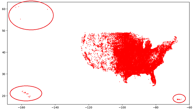
From the visuals, it looks like there are 3 more additional states in tornado data that are missing in the base map. Let’s check
len(list(states.STUSPS.unique()))
OUTPUT: 49

len(list(torn.st.unique()))
OUTPUT: 52
For the sake of simplicity, let’s remove these regions from the analysis and plot the filtered data on the map.
torn_states_filtered = torn[torn['st'].isin(list(states.STUSPS.unique()))]

# Verify
len(list(torn_states_filtered.st.unique()))
OUTPUT:
49
fig = plt.figure(1, figsize=(25,15))
ax = fig.add_subplot()
states.apply(lambda x: ax.annotate(text = str(x.STUSPS),
xy=x.geometry.centroid.coords[0], ha='center', fontsize=14),axis=1)
states.boundary.plot(ax=ax, color='black', linewidth=.4)
states.plot(ax=ax, color = 'ivory', figsize=(12, 12))
torn_states_filtered.plot(ax=ax, color='red',alpha = 0.5, marker='.',
markersize=1)
ax.text(-0.05, 0.5, transform=ax.transAxes,
fontsize=20, color='white', alpha=0.2,
ha='center', va='center', rotation='90')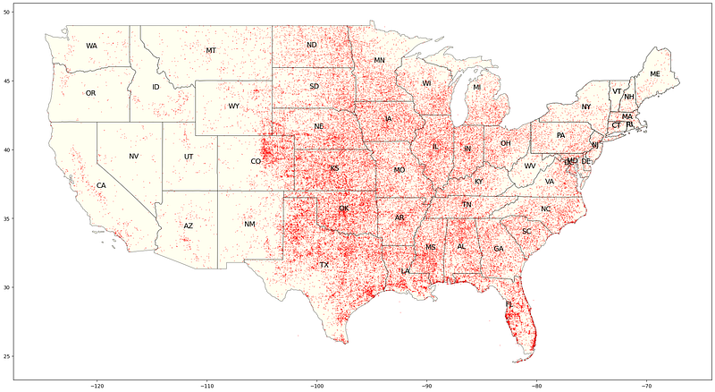
We can see that there are fewer tornadoes in the western region compared to the eastern part. Tornadoes are more frequent in the southeast and midwest areas. To confirm this observation, let’s verify it using the available data.
torn['cnt'] = 1
torn_sub = torn[['st','cnt']].groupby('st').count()
torn_sub = torn_sub.sort_values('cnt', ascending=True).tail(20)
torn_sub.plot.barh()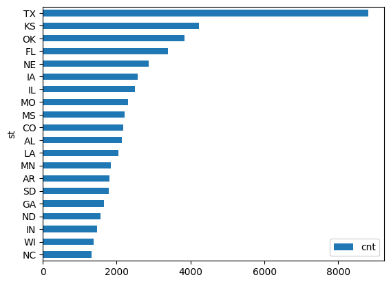
Well, Texas has the highest number of tornadoes followed by KS and OK. We can carry on with further analysis by region, specific states, etc but the objective here is to set the baseline approach and analysis. It is also up to the analysts to use their imagination and data for creative visualization.
Conclusion
The geospatial data visualization using GeoPandas in Python opens up a world of possibilities for unlocking insights and communicating information in a visually captivating manner. Throughout this guide, we’ve explored the core concepts of geospatial data, from understanding Coordinate Reference Systems (CRS) to mastering the capabilities of the GeoPandas library. Data visualization isn’t just about creating visually appealing maps it’s about telling stories and conveying meaningful insights hence it is recommended that one experiment with different data sources, explore various map styles, and experiment with interactive elements like pop-ups and tooltips for compelling storytelling.
I hope you liked the article and found it helpful.
You can connect with me — on Linkedin and Github
My other Geospatial Analysis blogs
Introduction To Geospatial Analysis With Python Interactive Geospatial Maps using Folium in Python
References
https://www.spc.noaa.gov/gis/svrgis/
In Plain English
Thank you for being a part of our community! Before you go:
- Be sure to clap and follow the writer! 👏
- You can find even more content at PlainEnglish.io 🚀
- Sign up for our free weekly newsletter. 🗞️
- Follow us on Twitter, LinkedIn, YouTube, and Discord.


