

Zooming In and Zooming Out in Matplotlib to Better Understand the Data
Complete code provided for each plot
Matplotlib is arguably the most popular visualization library in Python. Also, some other higher-end libraries are also built on Matplotlib. I have a few articles on Matplotlib visualization techniques. Please feel free to check them out. I have the links at the bottom of this page.
This article will focus on some zooming techniques. Sometimes when we make a scatter plot or line plot, we may find a lot of data cluttered in one place. In those cases, it will be helpful to zoom in to those cluttered places to really understand the data points clearly. Again, if the data points are too scattered around it is hard to see if there is a trend there. Zooming out can help see any trend in the data.
Luckily the Matplotlib library has some pretty cool tricks that can help also we can use some simple techniques to zoom in and zoom out.
Let’s work on some examples.
Let’s do the imports and read the dataset first. I am using an auto dataset from Kaggle. Here is the link to the dataset:
This is an open dataset that is mentioned here.
import pandas as pd
import matplotlib.pyplot as plt
import seaborn as sns
d = pd.read_csv("auto_clean.csv")This dataset is pretty big. So I cannot share any screenshots here. These are the columns:
d.columnsOutput:
Index(['symboling', 'normalized-losses', 'make', 'aspiration', 'num-of-doors', 'body-style', 'drive-wheels', 'engine-location', 'wheel-base', 'length', 'width', 'height', 'curb-weight', 'engine-type', 'num-of-cylinders', 'engine-size', 'fuel-system', 'bore', 'stroke', 'compression-ratio', 'horsepower', 'peak-rpm', 'city-mpg', 'highway-mpg', 'price', 'city-L/100km', 'horsepower-binned', 'diesel', 'gas'], dtype='object')At first, I want to work on the zoom-out technique.
For that, I will make a scatter plot of the length vs width. Here is the complete code for that and I will explain it a bit after the plot:
fig = plt.figure(figsize = (8, 6))x = d['length']
y = d['width']
c = d['price']ax = plt.scatter(x, y, s = 25, c = c)plt.xlabel('Length', labelpad = 8)
plt.ylabel('Width', labelpad = 8)
plt.title("Length vs Width and Color Represents the Changes of Price")ax_new = fig.add_axes([0.2, 0.7, 0.2, 0.2])
plt.scatter(x, y, s=5, c = c)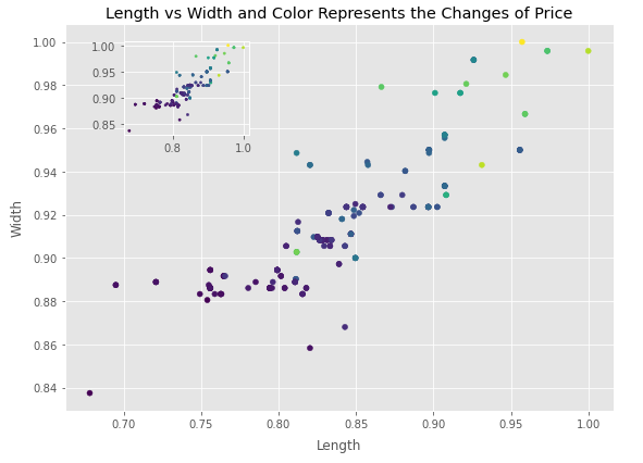
Look, a small zoom-out window inside the plot. I am assuming you know how to do a scatter plot already. I am not going through that code. The zoom window came from fig.add_axes() function that has one parameter inside. That is a list of four elements [0.2, 0.7, 0.2, 0.2]. Here the last two elements 0.2 and 0.2 mean the height and width of the zoom window. The first two elements 0.2 and 0.7 define the positioning of the zoom window. Please feel free to change those numbers and see what happens.
Let’s see some zoom-in techniques. I will use a length vs price plot this time. We need to import mark_inset and inset_axes functions first. The inset_axes function will define the size of the zoom window and the positioning of the zoom window. On the other hand, mark_inset function will draw the line from the original dots to the zoom window. Please see the comments in the code below for some clear understanding. Here is the complete code:
from mpl_toolkits.axes_grid1.inset_locator import mark_inset, inset_axesplt.figure(figsize = (8, 5))
x = d['length']
y = d['price']ax = plt.subplot(1, 1, 1)
ax.scatter(x, y)
ax.set_xlabel("Length")
ax.set_ylabel("Price")#Defines the size of the zoom window and the positioning
axins = inset_axes(ax, 1, 1, loc = 1, bbox_to_anchor=(0.3, 0.7),
bbox_transform = ax.figure.transFigure)axins.scatter(x, y)x1, x2 = 0.822, 0.838
y1, y2 = 6400, 12000#Setting the limit of x and y direction to define which portion to #zoom
axins.set_xlim(x1, x2)
axins.set_ylim(y1, y2)#Draw the lines from the portion to zoom and the zoom window
mark_inset(ax, axins, loc1=1, loc2=3, fc="none", ec = "0.4")
plt.show()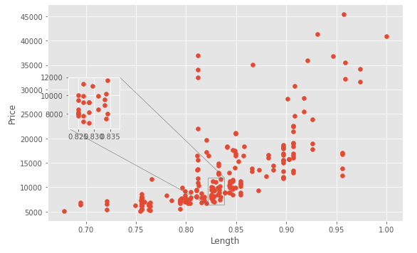
Here is one last example on zoom in. This time I will use subplots to present the zoom_in window. There will be two small zoom-in windows on top and the original big plot at the bottom. The portions to zoom will be highlighted with colors and the connecting lines will show clearly. Please check the comments in the code carefully for more clarity on the code. Here is the complete code:
from matplotlib.patches import ConnectionPatchfig = plt.figure(figsize=(8, 5))
#the plot with red dots
plot1 = fig.add_subplot(2,2,1) # two rows, two columns, fist cell
plot1.scatter(d['city-mpg'], d['highway-mpg'], color = 'red')
plot1.set_xlim(15, 20)
plot1.set_ylim(17, 25)
plot1.set_ylabel('highway-mpg', labelpad = 5)
#the plot with blue dots
plot2 = fig.add_subplot(2, 2, 2)
plot2.scatter(d['city-mpg'], d['highway-mpg'], color = 'blue')
plot2.set_xlim(25, 30)
plot2.set_ylim(25, 35)#the original plot
plot3 = fig.add_subplot(2,2,(3,4)) # two rows, two colums, combined third and fourth cell
plot3.scatter(d['city-mpg'], d['highway-mpg'], color = 'darkorchid', alpha = .7)
plot3.set_xlabel('city-mpg', labelpad = 5)
plot3.set_ylabel('highway-mpg', labelpad = 5)#highlighting the portion of original plot to zoon in
plot3.fill_between((15, 20), 10, 60, facecolor= "red", alpha = 0.2)
plot3.fill_between((25, 30), 10, 60, facecolor= "blue", alpha = 0.2)#connecting line between the left corner of plot1 and the left #corner of the red hightlight
conn1 = ConnectionPatch(xyA = (15, 17), coordsA=plot1.transData,
xyB=(15, 20), coordsB=plot3.transData, color = 'red')
fig.add_artist(conn1)#connecting line between the rightcorner of plot1 and the right #corner of the red hightlight
conn2 = ConnectionPatch(xyA = (20, 17), coordsA=plot1.transData,
xyB=(20, 20), coordsB=plot3.transData, color = 'red')
fig.add_artist(conn2)#connecting line between the left corner of plot2 and the left #corner of the blue hightlight
conn3 = ConnectionPatch(xyA = (25, 25), coordsA=plot2.transData,
xyB=(25, 30), coordsB=plot3.transData, color = 'blue')
fig.add_artist(conn3)#connecting line between the right corner of plot2 and the right #corner of the blue hightlight
conn4 = ConnectionPatch(xyA = (30, 25), coordsA=plot2.transData,
xyB=(30, 30), coordsB=plot3.transData, color = 'blue')
fig.add_artist(conn4)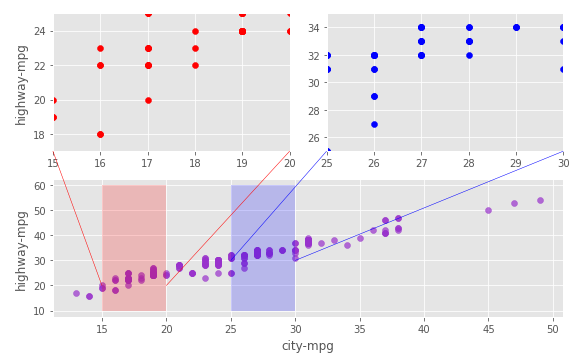
If you have any questions understanding any code in this article, please ask in the comment section.
Conclusion
For this dataset, zooming in or out may not seem as significant. But in real life, there are a lot of datasets that actually require zooming in or out for a better understanding of the data. I hope you get to use these techniques in your real-life projects and do some cool work.
Feel free to follow me on Twitter and check out my new YouTube channel.