
Dashboard UI Designs: Experimental & Immersive — vol. 255
仪表盘用户界面设计:实验性与沉浸式--第 255 卷
Check out experimental and immersive dashboards that offer an innovative design approach and engaging user experience. These dashboards, created by immersive web app development firms, are both pioneering and captivating.
看看具有创新设计方法和引人入胜的用户体验的实验性沉浸式仪表盘。这些由身临其境的网络应用程序开发公司制作的仪表盘既具有开创性,又引人入胜。
CreditTB — Credit SaaS Dashboard
CreditTB - 信用 SaaS 控制面板
👨🎨 Jack R.
👥 RonDesignLab ⭐️
👨🎨 Jack R. 👥 RonDesignLab ⭐️
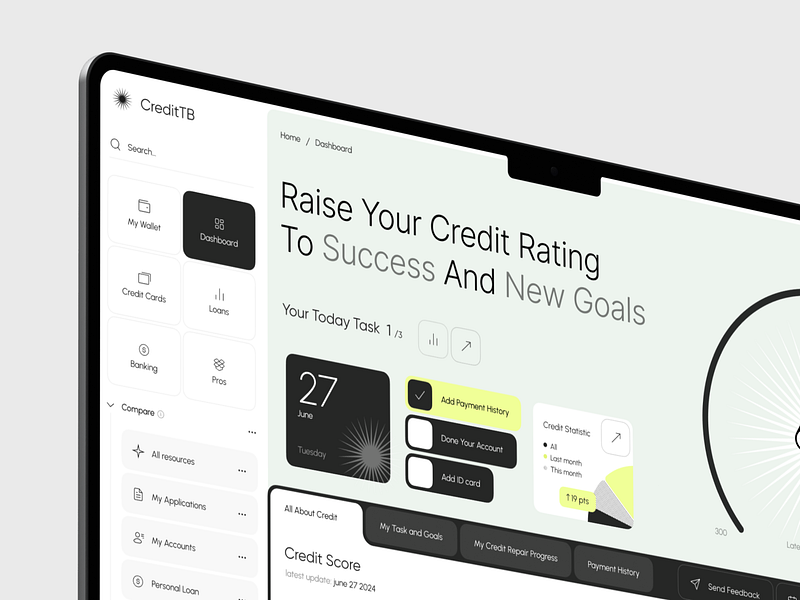
The dashboard design for “CreditTB” efficiently utilizes a clean, minimalistic layout that emphasizes clarity and ease of navigation.
CreditTB" 的仪表盘设计采用了简洁的布局,强调清晰度和导航的便捷性。
Key visual elements like the “Credit Score” graph integrate dynamic visuals which enhance user engagement and interaction.
信用评分 "图表等关键视觉元素整合了动态视觉效果,增强了用户的参与度和互动性。
However, the design lacks deeper experimental features, such as immersive elements or predictive analytics, that could transform standard data presentation into a more compelling, user-centric experience.
然而,该设计缺乏更深层次的实验功能,如沉浸式元素或预测分析,而这些功能可以将标准的数据展示转变为更有吸引力的、以用户为中心的体验。
DTF Fund portfolio details
DTF 基金投资组合详情
👨🎨 Max Burlak
👨🎨 Max Burlak
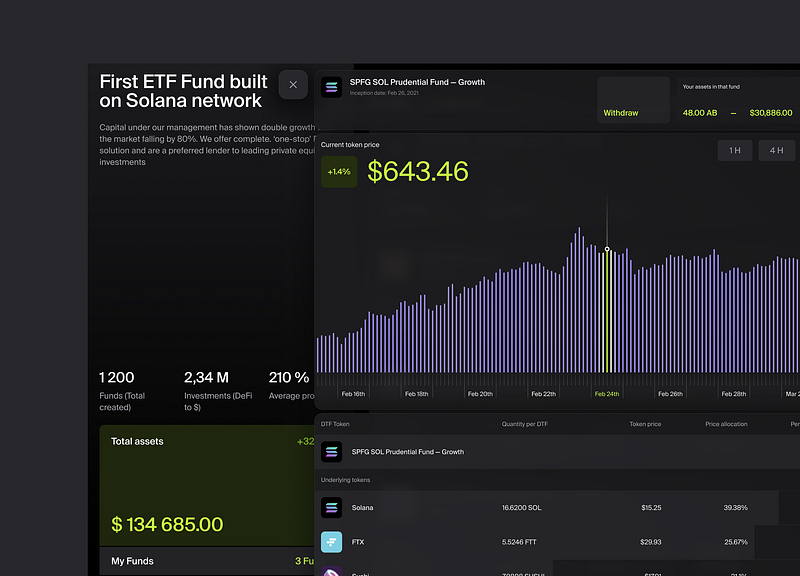
The “First ETF Fund built on Solana network” dashboard leverages a deep, dark color scheme that effectively highlights key financial data, enhancing visibility and focus.
首个基于 Solana 网络的 ETF 基金 "仪表盘采用了深沉的配色方案,有效突出了关键财务数据,提高了可视性和关注度。
Bold use of contrasting colors for important metrics such as the current token price and percentage changes creates an immediate visual hierarchy that guides the user’s attention efficiently.
在当前代币价格和百分比变化等重要指标上大胆使用对比色,创造出一种直接的视觉层次,有效地引导用户的注意力。
However, while the dashboard presents data clearly, it lacks interactive elements that would allow for more immersive user exploration, such as customizable data views or predictive analysis tools.
不过,虽然仪表盘能清晰地显示数据,但它缺乏互动元素,无法让用户更身临其境地进行探索,例如可定制的数据视图或预测分析工具。
Holocare⁺ — Medical Dashboard 💊
Holocare⁺ - 医疗仪表板 💊
👨🎨 Arfi Maulana
👥 Pickolab Studio
👨🎨 Arfi Maulana 👥 Pickolab Studio
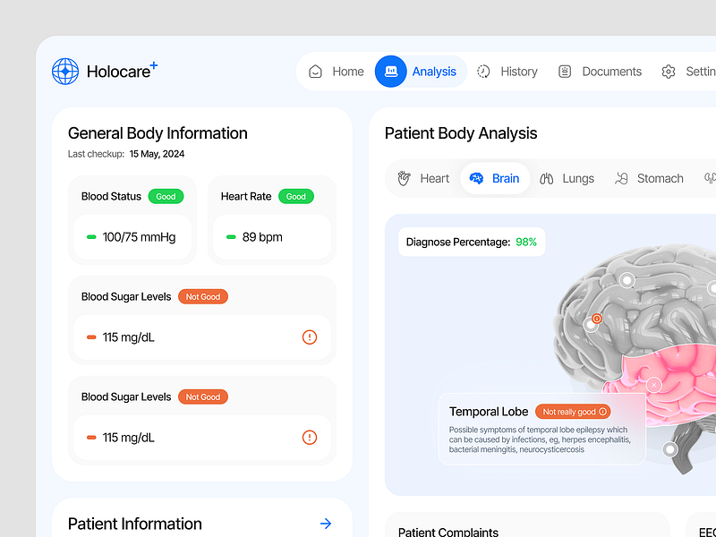
The “Holocare+” dashboard showcases a clean, intuitive design with a focus on user-friendly navigation, using clear color coding to quickly communicate patient health metrics.
Holocare+"仪表盘采用简洁、直观的设计,注重用户友好型导航,使用清晰的颜色编码快速传达患者的健康指标。
Integration of an interactive brain model on the right side enhances the immersive aspect, allowing users to engage directly with detailed health data.
右侧集成的交互式大脑模型增强了身临其境的感觉,让用户可以直接参与详细的健康数据。
Despite these strengths, the design could benefit from more dynamic elements such as real-time updates or interactive historical data trends to further enrich the user experience.
尽管有这些优势,但该设计仍可受益于更多的动态元素,如实时更新或交互式历史数据趋势,以进一步丰富用户体验。
Dashboard Meta for Business 📊
仪表板 Meta for Business 📊
👨🎨 Angel Villanueva
👥 Orizon: UI/UX Design Agency
👨🎨 Angel Villanueva 👥 Orizon:UI/UX 设计公司
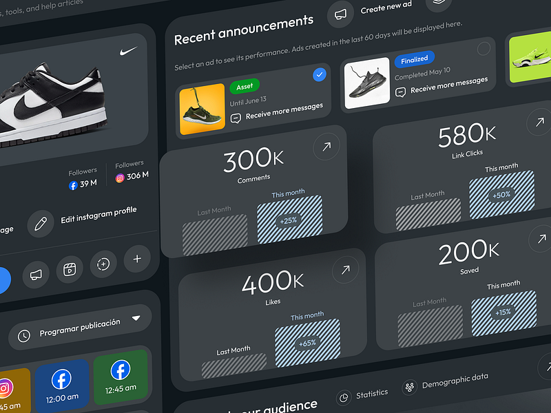
The dashboard design displayed is streamlined and visually cohesive, employing a dark theme that allows colorful elements such as performance metrics to stand out sharply.
所展示的仪表盘设计简洁明了,具有视觉凝聚力,采用深色主题,使性能指标等色彩丰富的元素更加突出。
Its card-based layout is effective in segmenting information clearly, making data digestion quick and efficient.
其卡片式布局能有效地将信息清晰地分割开来,使数据消化快速高效。
Inclusion of dynamic, interactive elements like performance trends and actionable buttons directly on the cards enriches the user interaction, making it not only functional but engaging.
在卡片上直接加入性能趋势和可操作按钮等动态互动元素,丰富了用户互动,使其不仅实用,而且引人入胜。
Tipalti — SaaS Redesign to Improve User Experience Design
Tipalti - 改进用户体验设计的 SaaS 重新设计
👨🎨 Ashikur Rahman
👥 Design Picko
👨🎨 Ashikur Rahman 👥 Design Picko
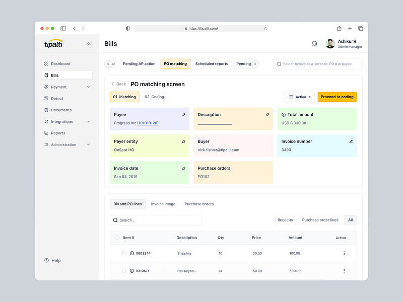
The “Tipalti” dashboard employs a clean, streamlined interface that prioritizes functionality and ease of use, evident in its clear segmentation of financial data and PO matching screen.
Tipalti "仪表盘采用了简洁、流畅的界面,将功能性和易用性放在首位,这一点从其清晰的财务数据细分和 PO 匹配屏幕中可见一斑。
Design uses a soft color palette to delineate different sections and actions effectively, enhancing the user’s ability to process information quickly.
设计采用柔和的色调,有效地划分了不同的部分和操作,提高了用户快速处理信息的能力。
While the interface is highly practical, it does not incorporate particularly experimental or immersive features, focusing instead on clarity and efficiency in financial operations.
虽然界面非常实用,但并没有加入特别的实验性或沉浸式功能,而是侧重于财务操作的清晰度和效率。
Finance Dashboard Dark UI Design
财务仪表板暗色 UI 设计
👨🎨 Vinomind UI/UX Design Agency
👨🎨 Vinomind UI/UX 设计公司
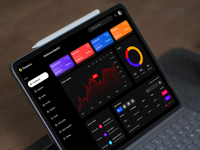
The “Finance” dashboard displayed on the tablet uses a vivid, high-contrast color scheme that effectively segments various financial metrics, enhancing readability and user engagement.
平板电脑上显示的 "财务 "仪表板采用生动、高对比度的配色方案,有效地细分了各种财务指标,提高了可读性和用户参与度。
Its use of dynamic charts and interactive elements such as toggles and dropdown menus facilitates an immersive experience, allowing users to interact with their financial data in real-time.
它使用动态图表和互动元素(如切换和下拉菜单),为用户提供身临其境的体验,让他们能够与财务数据进行实时互动。
This design effectively balances aesthetic appeal with functional utility, creating a user-friendly interface that caters to efficient financial monitoring and decision-making.
这种设计有效地兼顾了美感和功能实用性,创建了一个用户友好型界面,以满足高效的财务监控和决策需求。
Trading Dashboard for Quickit UI Kit
用于 Quickit UI Kit 的交易仪表板
👨🎨 Nikolay K.
👨🎨 Nikolay K.
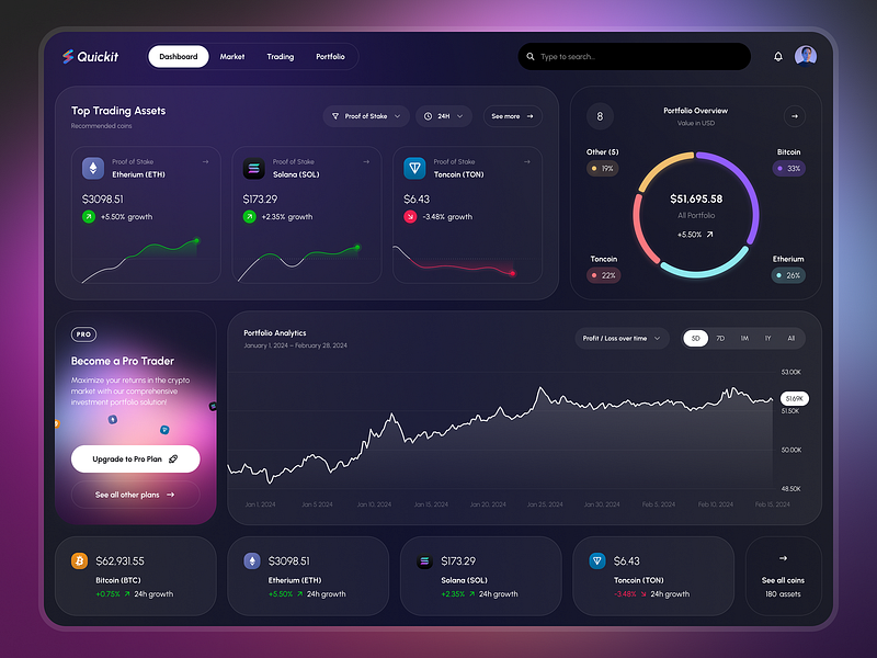
The “Quickit” trading dashboard effectively harnesses a dark theme complemented by vibrant color highlights to differentiate data points, enhancing user focus and interaction.
Quickit "交易仪表盘有效地利用了深色主题,辅以鲜艳的色彩亮点来区分数据点,提高了用户的关注度和互动性。
Circular portfolio overview graph alongside real-time asset performance indicators exemplifies modern dashboard aesthetics, fostering both engagement and functionality.
环形投资组合概览图和实时资产绩效指标体现了现代仪表盘的美感,同时促进了参与性和功能性。
Moreover, interactive elements like sliding filters for time range on the portfolio analytics chart contribute to an immersive user experience, allowing for detailed, customizable data exploration.
此外,投资组合分析图表上的时间范围滑动筛选器等交互式元素也为用户提供了身临其境的体验,使他们能够进行详细的、可定制的数据探索。
Course education | Dashboard
课程教育 | 控制面板
👨🎨 Kalugina Natalia
👨🎨 Kalugina Natalia
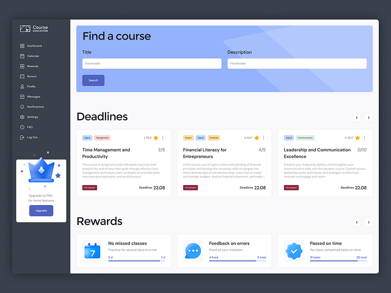
The “Course Education” dashboard design employs a clear, structured layout with a soothing color palette that promotes a focused learning environment.
课程教育 "仪表板设计采用了清晰、有条理的布局,配以舒缓的色调,营造出一种专注的学习环境。
Dashboard smartly segments information into cards for courses and deadlines, combined with a rewarding system visualized through icons and progress bars, which effectively gamifies the learning process.
仪表板巧妙地将信息细分为课程和截止日期卡片,并结合通过图标和进度条可视化的奖励系统,有效地将学习过程游戏化。
This approach not only makes it straightforward to track progress and upcoming deadlines but also enhances user engagement by rewarding consistency and achievement.
这种方法不仅可以直接跟踪进度和即将到来的截止日期,还可以通过奖励一致性和成就感来提高用户的参与度。
FoundMail — AI Dashboard
FoundMail - AI 控制面板
👨🎨 Arounda Product
👥 Arounda
👨🎨 Arounda 产品 👥 Arounda
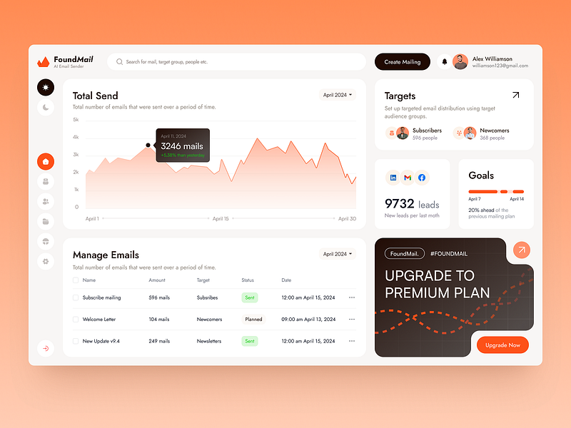
The “FoundMail” dashboard design exhibits a well-organized interface with a vibrant color scheme that makes key metrics instantly noticeable.
FoundMail "仪表盘设计的界面井然有序,色彩鲜艳,关键指标一目了然。
Graphs and data points are elegantly integrated, providing a seamless overview of email campaign performance.
图表和数据点完美整合,提供电子邮件营销活动绩效的无缝概览。
Notably, the interactive elements such as hover details on graphs and the actionable upgrade prompt enhance user interaction, making the dashboard not only a visual tool but also an operational hub for direct marketing adjustments.
值得注意的是,图表上的悬停细节和可操作的升级提示等互动元素增强了用户互动,使仪表盘不仅成为视觉工具,也成为直销调整的操作中心。
AI Healthcare & Medical Dashboard
人工智能医疗保健仪表板
👨🎨 Ava Fami
👨🎨 Ava Fami
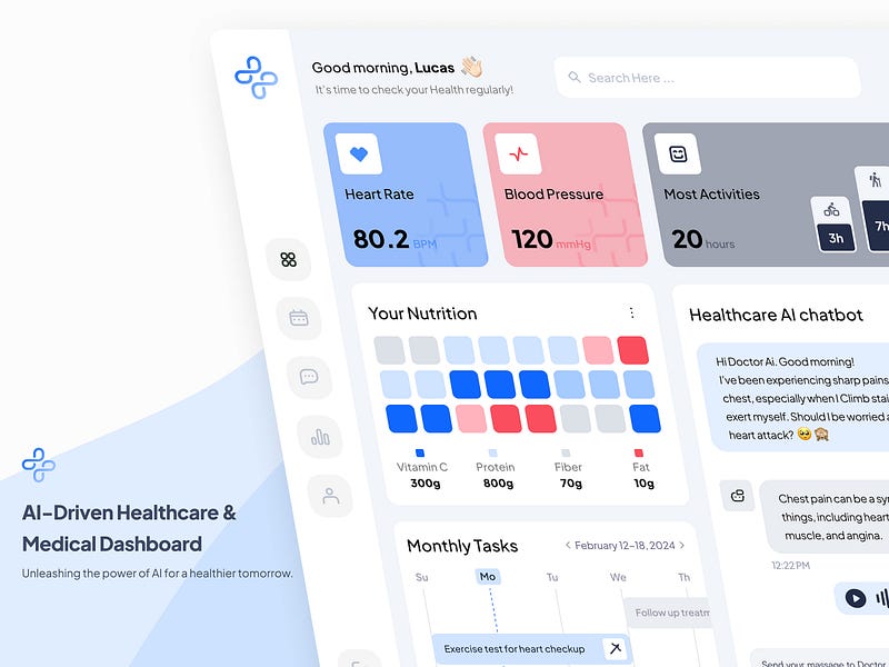
The “AI-Driven Healthcare & Medical Dashboard” utilizes a soft color palette and clear, minimalistic design to present critical health metrics in an easily digestible format.
人工智能驱动的保健和医疗仪表盘 "采用柔和的色调和清晰简约的设计,以易于消化的格式展示重要的健康指标。
Integration of an AI chatbot within the dashboard is a standout feature, providing real-time, interactive support and advice, significantly enhancing the user’s engagement and experience.
在仪表板中集成人工智能聊天机器人是一项突出功能,可提供实时、互动的支持和建议,大大提高了用户的参与度和体验。
Interactive component, combined with straightforward visual representations of health data like heart rate and nutrition, ensures that the dashboard is not only informative but also highly functional in daily health management.
交互式组件与心率和营养等健康数据的直观显示相结合,确保了仪表盘不仅信息丰富,而且在日常健康管理中功能强大。
Express — Admin Dashboard Design for Courier Service
快递 - 为快递服务设计管理仪表板
👨🎨 CMARIX
👨🎨 CMARIX
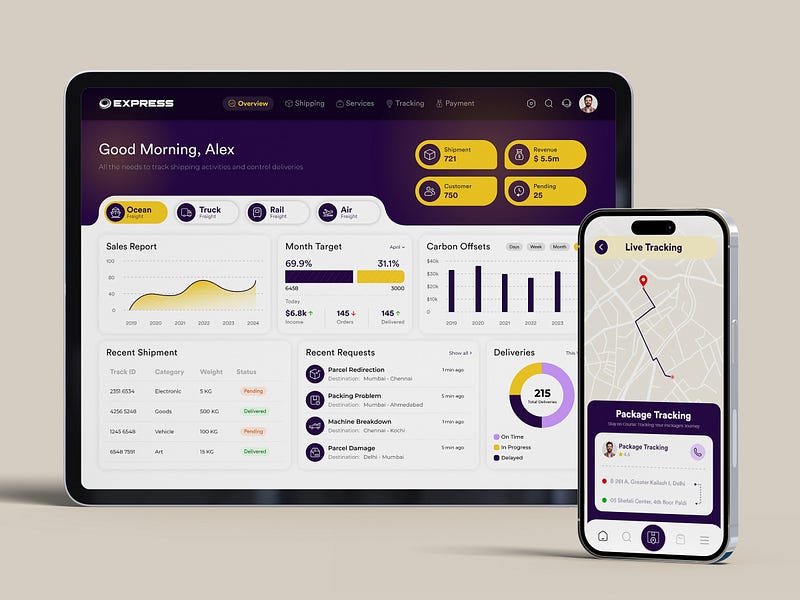
The “Express” logistics dashboard excels in delivering a comprehensive view of shipping operations with a vibrant and organized interface, prominently displaying essential metrics such as shipment totals, revenue, and customer counts.
Express "物流仪表盘界面生动活泼、井井有条,能够提供全面的航运业务视图,显著显示航运总量、收入和客户数量等基本指标。
Key features like live tracking on the mobile device and detailed, interactive charts for sales and carbon offsets on the tablet enhance the user’s ability to monitor and manage logistics effectively.
移动设备上的实时跟踪以及平板电脑上详细的销售和碳抵消互动图表等关键功能,增强了用户有效监控和管理物流的能力。
These elements, combined with a cohesive color scheme and intuitive layout, provide a seamless and engaging user experience across devices.
这些元素与连贯的配色方案和直观的布局相结合,提供了跨设备的无缝和引人入胜的用户体验。
Cloud service | web app
云服务
👨🎨 Yev Ledenov
👥 Ledo
👨🎨 Yev Ledenov 👥 Ledo
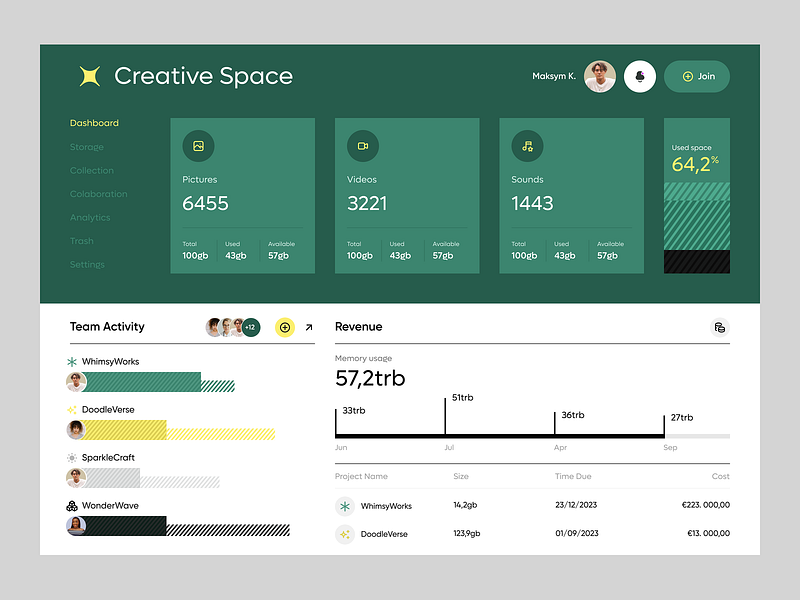
The “Creative Space” dashboard design employs a harmonious green color palette that underscores the creative content management theme.
创意空间 "仪表板设计采用了和谐的绿色调,突出了创意内容管理的主题。
It effectively uses straightforward, large numerical displays for immediate comprehension of data like pictures, videos, and sounds, aiding quick assessment of storage and usage.
它有效地使用了直观的大数字显示屏,可立即理解图片、视频和声音等数据,有助于快速评估存储和使用情况。
Addition of interactive elements like team activity progress bars and detailed revenue charts not only provides depth to the data presented but also enhances user engagement through visual differentiation and interactive feedback.
添加互动元素,如团队活动进度条和详细的收入图表,不仅能深入分析所展示的数据,还能通过视觉差异和互动反馈提高用户参与度。
QuikFin Finance — Bills & Payments
QuikFin Finance - 账单和付款
👨🎨 Filllo Design Agency
👨🎨 Filllo 设计公司
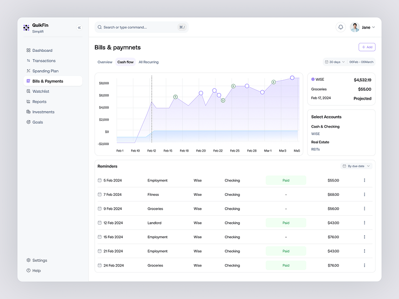
The “QuikFin Simplifi” financial dashboard offers a clear, intuitive layout, emphasizing user-friendly access to financial data through a well-organized interface.
QuikFin Simplifi "财务仪表板布局清晰、直观,强调通过组织良好的界面方便用户访问财务数据。
Integration of a detailed, interactive cash flow graph along with a sidebar for reminders enhances user engagement by providing actionable insights at a glance.
详细的交互式现金流量图与侧边栏的提醒功能相结合,让用户一目了然,从而提高了用户的参与度。
This layout is augmented by subtle color coding and easy navigation between accounts and transactions, which simplifies financial management and ensures a more immersive experience.
这种布局通过微妙的颜色编码和账户与交易之间的轻松导航得到了加强,从而简化了财务管理,并确保了更身临其境的体验。
E-commerce Dashboard Design
电子商务仪表板设计
👨🎨 Mahid
👨🎨 Mahid
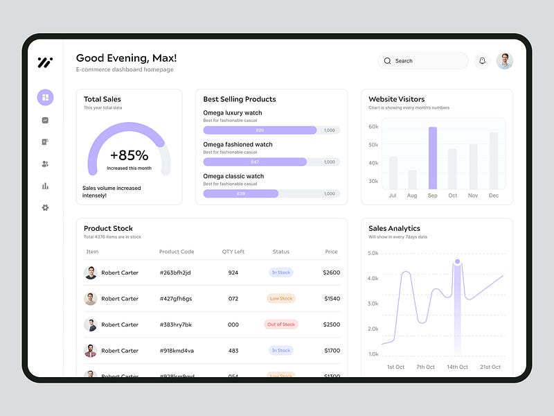
The e-commerce dashboard showcases a crisp, modern design with well-organized metrics crucial for business monitoring.
电子商务仪表板采用了简洁、现代的设计,并对业务监控的关键指标进行了精心组织。
Its use of muted color palettes highlights key performance indicators like total sales growth and product stock levels, making data easy to digest at a glance.
它采用柔和的调色板,突出了销售总额增长和产品库存水平等关键绩效指标,使数据一目了然。
Interactive elements such as hover details over sales trends and best-selling products enhance the immersive experience, enabling detailed insights into consumer behavior and sales performance.
销售趋势和畅销产品悬停详情等互动元素增强了身临其境的体验,使人们能够详细了解消费者行为和销售业绩。
🌍🚢Porthub: Your Global Container Management Solution
🌍🚢Porthub:您的全球集装箱管理解决方案
👨🎨 rangga cahyo
👥 Potara Studio
👨🎨 rangga cahyo 👥 波塔拉工作室
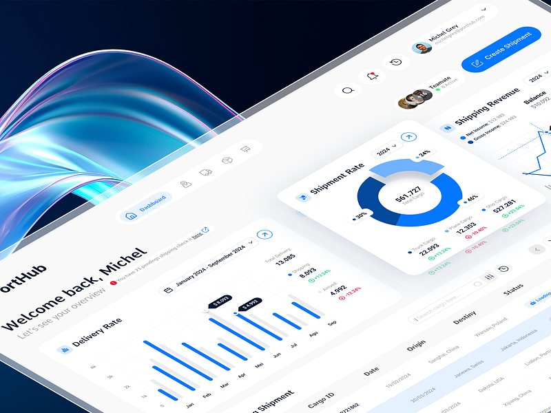
The “PortHub” dashboard leverages a visually striking design with a futuristic aesthetic, particularly highlighted by the dynamic wave background that enriches the interface’s engagement level.
PortHub "仪表盘的设计极具视觉冲击力和未来主义美感,尤其是动态波浪背景的设计,丰富了界面的参与度。
Dashboard efficiently utilizes interactive charts, such as the shipment rate gauge and delivery rate timeline, to provide intuitive, real-time data visualization.
仪表板有效利用了交互式图表,如装运率标尺和交付率时间轴,以提供直观、实时的数据可视化。
This design not only facilitates immediate data comprehension but also significantly enhances the user experience through graphical elegance and operational simplicity.
这种设计不仅便于用户立即理解数据,还通过优雅的图形和简单的操作大大提升了用户体验。
Dashboard
仪表板
👨🎨 Nerdfox Design
👨🎨 Nerdfox Design
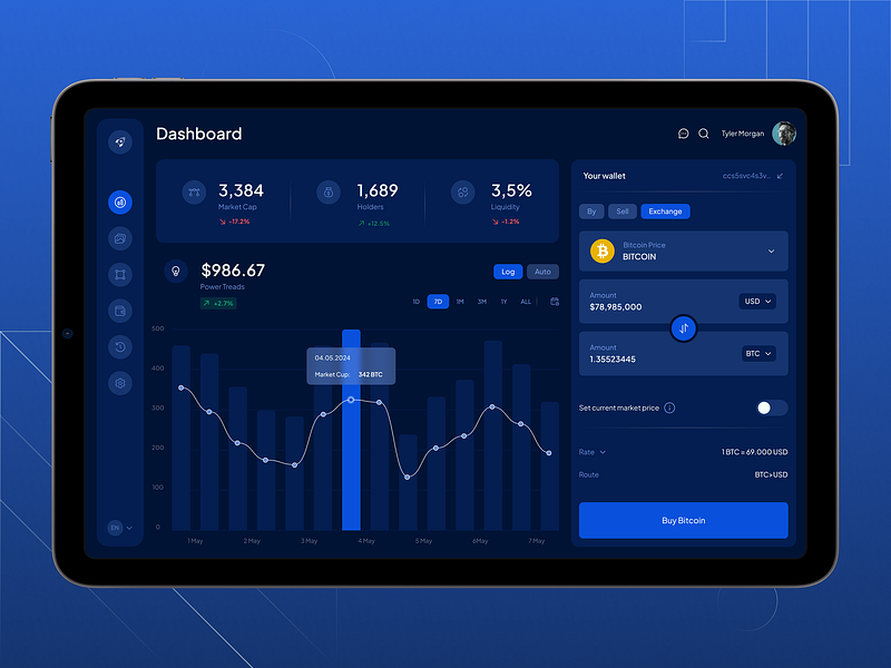
The cryptocurrency trading dashboard features a sleek, modern interface, utilizing a deep blue color scheme that underscores its focus on financial data.
加密货币交易仪表盘的界面时尚现代,采用深蓝色配色方案,突出了对金融数据的关注。
Inclusion of dynamic, interactive charts for market capitalization and real-time trading options directly within the user’s wallet enhances the practicality and immersion of the dashboard.
在用户的钱包中直接包含动态、交互式的市值图表和实时交易选项,增强了仪表盘的实用性和沉浸感。
This approach provides a seamless integration of market analytics and personal finance management, catering efficiently to the needs of active traders.
这种方法将市场分析与个人财务管理无缝结合,有效地满足了活跃交易者的需求。
Jetfly — UI/UX dashboard design for an aviation company
Jetfly - 为一家航空公司设计用户界面/用户体验仪表盘
👨🎨 Léa Poisson
👨🎨 Léa Poisson
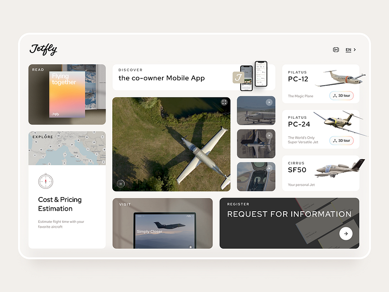
The “JetFly” dashboard is meticulously designed to offer a user-friendly experience for potential co-owners of luxury aircraft, blending elegant aesthetics with functionality.
JetFly "仪表盘经过精心设计,为豪华飞机的潜在共同拥有者提供友好的用户体验,将优雅的美感与功能性完美融合。
Dashboard integrates interactive 3D tours of available aircraft and concise modules for reading material and cost estimation, creating an immersive experience that engages users effectively.
控制面板集成了可用飞机的交互式 3D 导览,以及阅读材料和成本估算的简明模块,创造了一种身临其境的体验,有效地吸引了用户。
Each section is strategically designed to provide quick insights and easy navigation, making complex information about aircraft ownership more accessible and engaging.
每个部分都经过精心设计,以提供快速见解和简易导航,使有关飞机所有权的复杂信息更容易获取,更具吸引力。
Projar — Project Management Dashboard
Projar - 项目管理仪表板
👨🎨 Techuz UI/UX Agency
👨🎨 Techuz UI/UX 公司
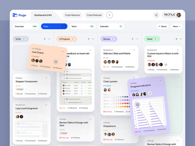
The “Projar” project management dashboard utilizes a clean, modern interface that enhances task visibility and prioritization through a card-based layout, prominently displaying key details such as due dates, comments, and task status.
Projar "项目管理仪表板采用简洁、现代的界面,通过卡片式布局提高任务的可见性和优先级,突出显示到期日期、注释和任务状态等关键细节。
This design supports effective workflow management by integrating color-coded urgency levels and interactive elements that allow for quick updates and team collaboration.
这种设计通过整合彩色编码的紧急程度和互动元素,实现快速更新和团队协作,从而支持有效的工作流程管理。
Integration of draggable cards and expandable menus within the dashboard encourages an interactive, user-centric approach to managing complex projects and tasks.
仪表板中集成了可拖动卡片和可扩展菜单,鼓励以用户为中心的交互式方法来管理复杂的项目和任务。


