
Your starting guide on price action and Japanese candlesticks
Inside the realm of technical analysis, there is only one king. His name is “Price Action.” This is the first subject a beginner trader should need to master.
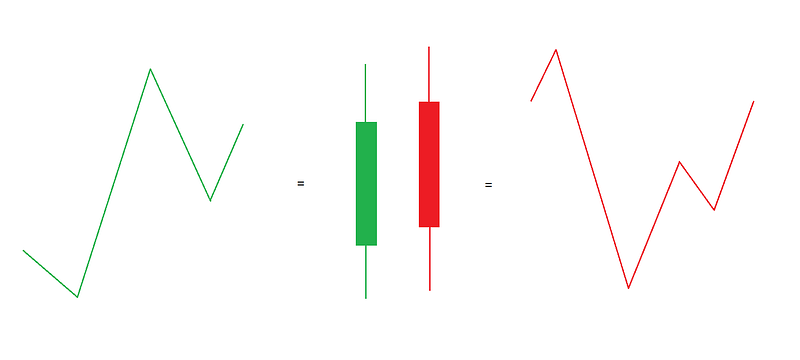
Simply put, price action is the movement of the price in relation to time. All the transactions within an instrument create a summarized chart, and this is the most important indicator that we have to analyze.
The History of Japanese Candlesticks
This particular chart type dates back to the 1700s in Japan. Munehisa Homma, a Japanese businessman, used the candlestick charts to track the price of rice. This method gave him an edge in his sector because he can map periods of fear and greed in the rice market.
Single candlesticks, according to their shape and size, can have “nicknames.” Most of these names came back from the Homma’s era in their original Japanese, and many others have been translated into English.
The candlestick pattern chart has been brought to the West by Steve Nison in 1989. This chart pattern replaced, in many cases, the bar pattern chart that was used in the West until that time.
Timeframes
Every trade concerning an asset is been grouped into a timeframe. If we look at the monthly timeframe then we need to understand that a single candlestick includes all the transactions that happened inside this timeframe.
No timeframe is better than the other, it simply contains more or less information than the other. The bigger the timeframe (months, weeks, days, etc.), the less the noise in the chart. The smaller the timeframe (five minutes chart, ten minutes chart, etc.), the more the noise. On the other hand, the bigger the timeframe, the lesser the trading opportunities. The opposite is true for the smaller timeframes.
Bigger Timeframes
- Less Noise
- Less Trading Opportunities
- Less Volatility
- Shows the Bigger Picture
Smaller Timeframes
- More Noise
- More Trading Opportunities
- More Volatility
- Shows the Details
OHLC (Open-High-Low-Close) Candles
Most of the time, when we refer to the candlestick chart, we refer to the OHLC candles. This simply means that the candles include the open, high, low, and close prices. Many advanced charting software programs include more choices than this.
The body of a bullish candle, which usually is green, includes the opening price on the lower side and the close price on its upper side. The upper line of a candlestick is either called ‘shadow’ or ‘wick,’ and it represents the highest value that the price has taken. The lower wick represents the lower price that the asset has taken.
The red or bearish candle represents the same information with the difference that the upper side of its body represents the opening value and the lower side shows the closing price.
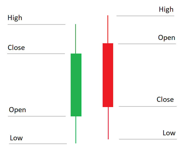
The red and green colors are the most popular choices. Other choices include black and white or hollow bodies with other color choices. The colors are mostly a cultural thing. In the West, the red color symbolizes danger, that’s why we use it to represent the downwards movement or the price. In China, red symbolizes luck and positiveness, that’s why they use this color for the upward price candle.
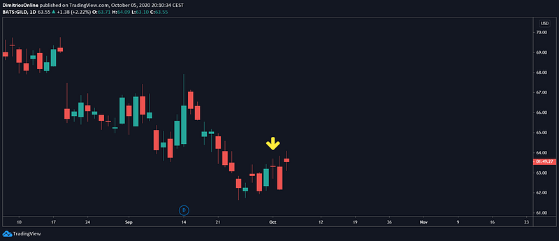
Doji
In the picture below, you can see an example of the perfect Doji candle. The Doji simply means that bears and bulls fought, but there was no winner. After the opening, going higher and lower, and closing, the price remained the same. We usually use the yellow color to represent this candle.
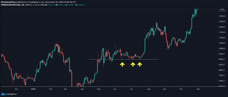
Support and Resistance
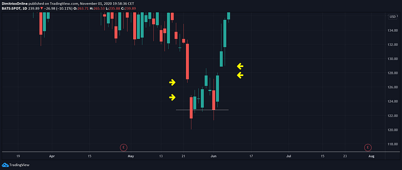
Other price action concepts are support and resistance. We call ‘support’ the price level at which the price finds a ‘floor’ and it finds it hard to fall below it. Below you can see an example of a support level. The price ‘tested the price, at least, three times and, in this particular example, never fell below it.
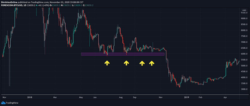
The opposite is true for what we call a ‘resistance’ level. The image below shows that the price tried three times and at the fourth time broke through the resistance level.
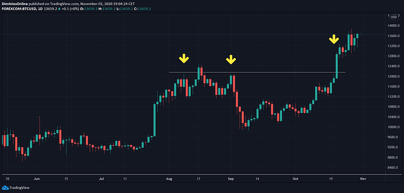
The support and resistance level can be drawn by either a single line or with a rectangle. The rectangle represents an area of resistance or support.
Uptrend and Downtrend
A price can also be trending. A trend can be either an upward trend or a downwards trend.
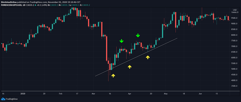
When the price is trending upwards, it creates a higher high and a higher low. The image below shows an uptrend. The green arrows represent the higher highs and the yellow arrows show the higher lows.
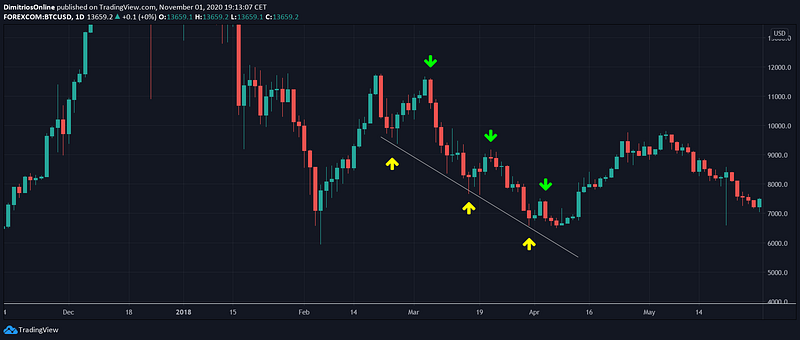
On a downtrend, on the other side, the price creates lower highs and lower lows. The image below shows a downtrend, with the green arrows shows the lower highs and the yellow arrows the lower lows.
Gaps
Sometimes the price might ‘gap down’ or ‘gap up.’ This means that the opening price of the day was different than the closing price of the last day. The image below shows a gap down movement on the left side, a sideways move of the price, defined by the gray line, and a gap up movement on the right side.
Sources
- https://optionalpha.com/how-you-can-profit-from-the-history-of-candlestick-patterns-10821.html
- Japanese Candlestick Charting Techniques by Steve Nison
DISCLAIMER:
You must be aware of the risks and be willing to accept them in order to invest in these markets. Don’t trade with money you can’t afford to lose. The information contained in this article is for educational purposes only and is not to be a recommendation for any specific investment. Trading any market carries a high level of risk, and may not be suitable for all investors.
Check out our new platform 👉 https://thecapital.io/
https://twitter.com/thecapital_io