
Your Articles Look Like Shite
Yes, we pay attention to the pretty stuff
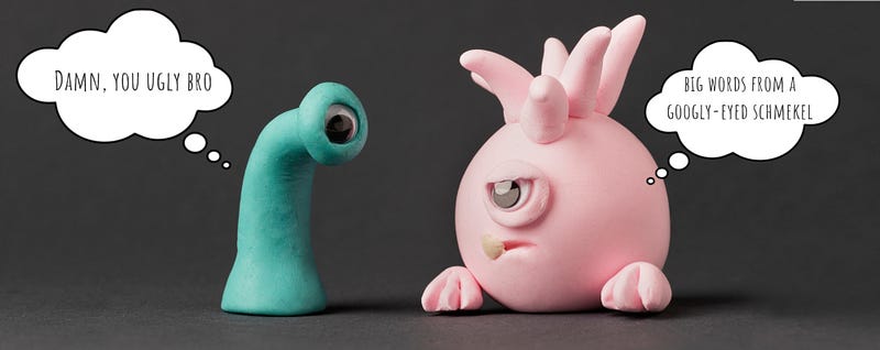
If someone told you that looks don’t matter, they lied — your articles, not your face. There’s a reason we put pretty people on magazines, still Photoshop the shit out of them, and then finesse the fonts and graphics.
We like shiny things.
And there are some ugly-ass articles on Medium. The character of your content matters, of course. But making it visually eye-catching means more people might read your words.
‘But I saw this article that looked awful and did well!’
Yes, it can happen. It’s generally the exception, not the rule though. But why take the chance? I’d rather spend a few minutes zhuzhifying it than take the chance. Why spend hours sculpting mind-bending, emotion-moving words, just to slap a shitty picture on it and hit publish?
Medium has given us a stunning design and easy-to-use formatting tools to create articles that are the written visual equivalent of Helen of Troy. And some of their designers are probably sobbing in the fetal position in the corner looking at the mess some of us have made of it.
If you think your posts might be lackluster in the looks department, don’t worry — I gotchu boo boo. A few minutes of effort can go a long way in the looks department.
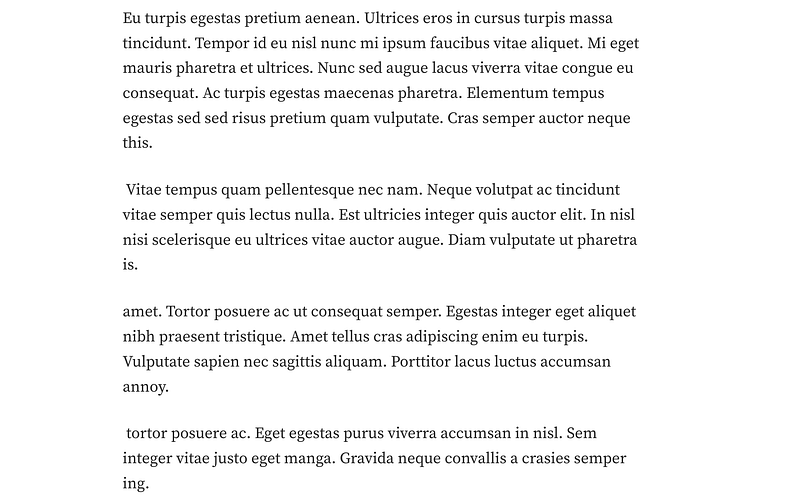
Too Much Junk in the Trunk
I’m talking about that big ole paragraph badonkadonk. Fat and wide paragraphs that take up half the page. Long paragraphs have a time and place, but seeing an endless array of long paragraphs is visually exhausting.
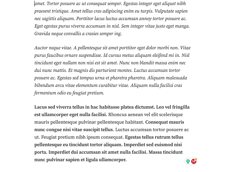
Here’s an example:
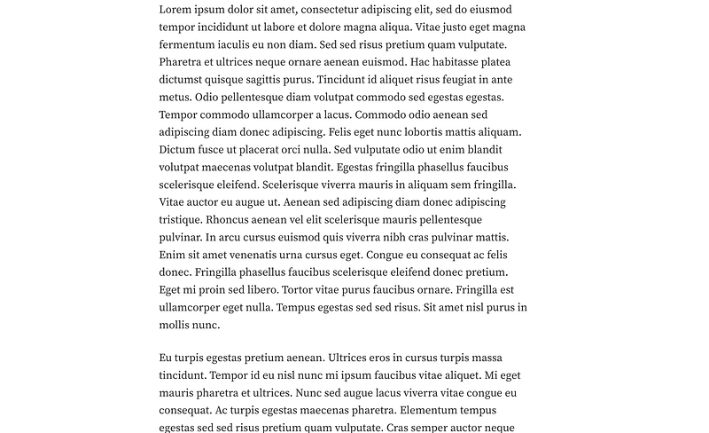
If you’re dying to read the example on the left, then you’re in the minority. But I marvel at your attention span, kudos.
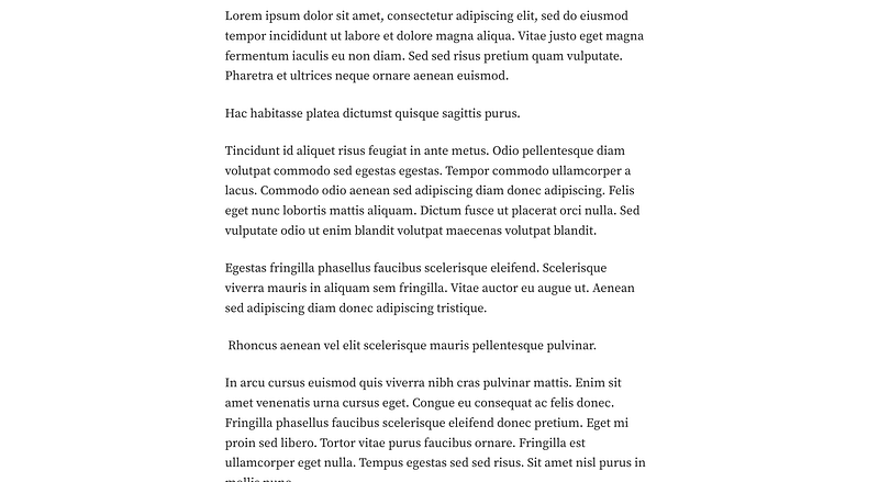
Don’t Be The Skinny Margarita Writer Either
Too much badonkadonk will make me bounce-a-bounce — but so can single sentences. I might get some editorial shiznit for this, but anemic paragraphs are harder to follow. Especially with my gnat-sized attention span.
Not only are single sentences on repeat not visually appealing to many, it causes many writers to become disjointed in their flow. Paragraphs serve up a single coherent concept. Single-sentence paragraphs in repetition can cause the writer to jump around too much in their thought processes.
Here’s an example:
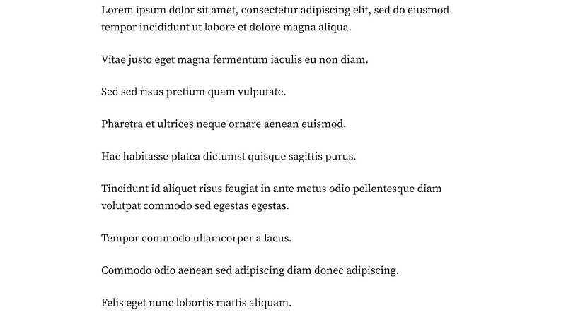
Single sentences serve a purpose — to emphasize a point. But stringing them back to back to back to back doesn’t mean you’re emphasizing every point. Emphasized points need supporting clauses (generally speaking).
Mixed paragraph lengths allow for the best visual flow, while allowing you room for emphasis where necessary.
Ooh — Pretty Pictures!
There’s a reason Instagram is one of the top social networks; we like purdy pictures. Purdy pics grab our eyes’ attention by the balls. Put some time into your images, especially the primary image (which is what is displayed in feeds). Don’t just click the Unsplash button, enter a keyword and click on one of the first three images you see.
Yes, we can tell when people do that.
Speaking of picking the first thing that pops up on Unsplash. Some pictures are more saturated than the crystals in a grade school supersaturation solution experiment. Linda Caroll wrote a bomb-ass post about over-used images (she also has a Substack with amazeballs advice). This is one way that we can tell that you picked an image as quickly as possible — because it’s ultra-saturated and it’s one of the first results.
Do any (or all) of these look all too familiar?
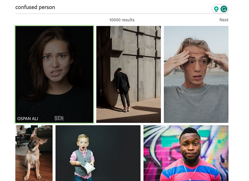
Do a little competitive research when it comes to your images. Search your article topic, look at the images — and then pick a swaggier one. Then look at your feed and ask yourself ‘Out of all these pictures, would I click mine?’
I don’t know how common this is, but if I click on a shorter article (say, three minutes), and I see 12 images — I bounce. Unless you’re Ansel Adams (or any photographer), you should have more words than images.
Lonely Hangers Onners
Ok, so this one is an expert-level tip for your brain bucket — don’t leave a single word dangling on the last line of a paragraph. Think back to a time you read a book and a chapter ended with a single word on a new page. Uber grr, right? Just cram that mofo into the last page.
For example:
Only leave annoying hanger onners if you want to send obsessive compulsives into a full-on mental breakdown.
Subheadings Are the Shapewear of Writing
Have you ever been distracted by a ‘Squirrel!’ while reading and lost your place on the page? I can’t be the only squirrely person. Luckily the brain is an incredible thing, and in microseconds, as your eyes glance across the page to look at the shiny thing — it remembers.
Shorter and varied paragraph lengths help us visually find our spot again — so do subheadings. They’re the shapewear of writing and draw our eyes to the ‘badonkadonk’ and ‘hello nurse’ parts.
They’re also what skimmers pay the most attention to. How do I know this? I’m the mayor of Skimmerville. Especially if it’s a long post — I want to quickly scan to see if I want to invest my precious minutes.
Don’t Use Too Much Makeup
Formatting finagling can be fine. Used effectively and it creates a visual flow. But using too much bolding, italics, and emojis — and I’m out like sauerkraut. I don’t read things that look like a 12-year-old’s MySpace page. And I’m not alone.
I’m showing my age here, but who remembers Mimi from The Drew Carey Show?
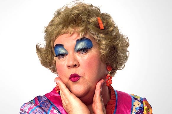
You’re welcome for that visual.
Bolding and italics are the makeup of the written world. They add emphasis when used sparingly (and serve a few other random purposes). They’re a smokey eye when used sparingly — they’re a Mimi when overused.
If you use italics for an entire article, I won’t just leave. I’ll take a mental image of your profile name, and proactively avoid you like the plague until the day I die. Yes, I am a petty bitch.
Words matter — but so do appearances. Don’t let people skip your bombastic words because you visually scared them away by designing the article equivalent of a Chucky doll.
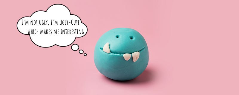
And yes, I realize this is one of my uglier articles. It would have been ‘cuter’ without all the screenshots…but it wouldn’t have been as helpful. So there’s a time and place for things. Don’t sacrifice quality for looks, but don’t design articles that look like the writer’s embodiment of a Blobfish either.
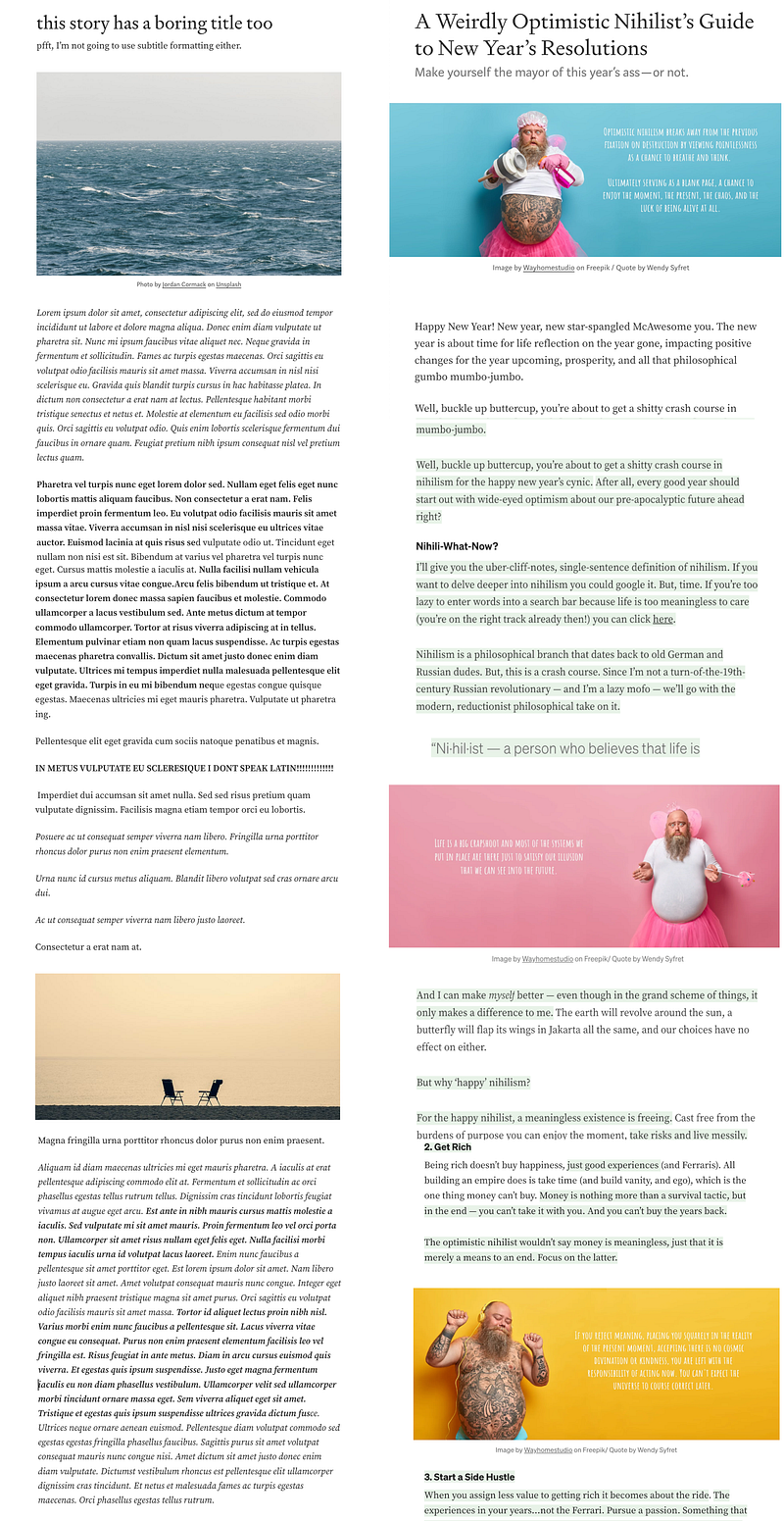
Which one would you read? That was rhetorical. If you said the one on the left then your brain must be a wild place to live.
Of course, not everyone should go into my level of detail for graphics. I can assure you, it’s a craptacular way to waste your free time. But a little effort goes a long way.
We notice, we appreciate it — and, we come back for it.
~Robin Wilding, reporting from…a bad-design-induced visual cross-eyed coma.