
Expectations & Reality
Your Apps Were Upgraded, Do You Feel Happiness or Trepidation?
Two apps, Facebook vs. Medium. Radically different experiences. One went smoothly, one clunky with failures. What to watch out for.

Both of these were upgraded about the same time.
Facebook vs. Medium — Different results
You, the app user, should not notice a significant difference, except more and better new features, and maybe better response time. The look/feel, if it changes much, may take some time to get used to. The app certainly should not break, especially on actions that were already part of the app. That’s the scary part for you, the user.
If you are the app provider, the anxiety level is even higher. You hope that all the new features work, no existing features break, and important features do not disappear. Finally, if you made a mistake, you may have a million witnesses who are upset with you… well, upset with your company and its management. For me, changing an existing app was much scarier than having the company’s future riding on my brand new app.
Unfortunately, an upgrade does not always go smoothly.
What have been your recent experiences with upgrades? Did anything upset you and what did you do about it? The lessons here might help in the future.
Tale of two apps
Recently, Facebook and Medium updated their platforms with radically different results. Facebook made relatively minor changes, not much risk. Medium made a major change to their Response entry and display modules — many more risks. Comments are called Responses in Medium.
Facebook went smoothly. They made better use of the screen while keeping the web page structure the same. The filler color for empty spaces started out black. It was quite overwhelming, but they even included two setup options — light and dark. I chose light after using the dark for a short time. Finally, they had the option to change back-and-forth from the old version to the new version while people got used to it.
I found no significant problems and only one minor technical flaw that occasionally appeared in a secondary window. It disappeared when closed and reopened.
Medium had design flaws, procedural problems, and program bugs. Having designed and built over 100 apps throughout my career, I was surprised that some got past preliminary testing by the programmers. However, others were not their fault, like Responses went to an error page when used with an obsolete web browser.
I was using Microsoft Edge, which now occupies about 7% of the market. All programming and testing were done on Google Chrome, used by 70% of the world.
The web browser problem is not unique to Medium.
I tried to use Zoom from my web browser and it would not work. It listed 4 other browsers that would work, including Chrome. I installed the latest version of Chrome, but still had problems with the Response module.
Design flaws and program bugs
Before, a Response looked and performed just like a story, except for payments. It doesn’t work that way now. The old version went to a new page to add the comment and show others. The new version does both with a pop-up window on one side. You enter your Response in a text box at the top, just like typing in Notepad.
Old: Response looked and performed like a published story New: Response looks and acts like Notepad
Other Response faults are listed below.
The pop-up window design has numerous problems:
- It covers part of the readable main window. The user cannot see what is under it. The pop-up disappears if the user clicks the main window.
- There is no scroll bar on the pop-up window when all comments will not fit. That’s a web browser problem. The scroll bar is there using Chrome.
- The scroll bar on the right moves the main window, part of which is hidden under the pop-up.
- The text on the pop-up uses a much smaller font — hard to read. I must use reading glasses when I don’t need them for anything else on the computer or for the old comments page.
- The comment entry box inside the pop-up window is much smaller, and seems to use an even smaller font.
The font size varies between browsers. It is small with Microsoft Edge, but even worse with Firefox. It’s small, but clear, on Chrome.
In the prior version, you could add quotes, bold text, and other member references. I include links to other stories so I don’t have to type the same long Response to many different stories. Links to other stories appeared as a pretty box.
This link change by Medium destroys those features!
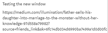
Now, a link appears as a URL, partly shown when the text box is not large enough, like these examples:

Clicking the new link does not always work.
I put the same thought and effort into Responses that I do with stories. The new Response methodology does not allow that. Now,
The Responses in the pop-up window look like a text message — unprofessional.
The pop-up, sometimes, shows a clickable “Read More” link at the end indicating that the Response is longer. The paragraphs do reformat and separate when the Response expands after clicking “Read More.”
The terms “Comments” and “Responses” are interchangeable in that article. Responses used to look like and work just like a posted story. They don’t now in the pop-up window. In my professional opinion, the new pop-up Responses method is a design flaw.
Things I wished they had done
I could not find, in either app, a list of changes or what to expect. Facebook did send me a notification. On Medium, the changes just appeared one day.
There should be a prominent, easy-to-find, announcement somewhere and a button on the main menu for reporting problems, if they occur. Both apps have a method to report general problems and ask for help, but an upgrade should not use the same method. Upgrade issues should not be combined with normal communication.
Reporting upgrade problem should be separate & easy
That could be an Upgrade Issues button in a prominent place on the main startup page and other strategic pages, or a link in the header if there is a header bar. The page should state that it is for reporting upgrade problems only and provide a link or button for normal communications.
The upgrade reporting buttons should be hidden or removed after things settle down.
What can a user do?
Suppose you are the poor app user. What can you do besides complain to your cat? The cat won’t care. Whining on social media won’t help, either.
To get their attention, you need specific examples and a way to communicate with the app support people. Most apps have a help window or email address to send questions. That will do if they didn’t provide an Upgrade Issues button.
Then, tell them what happened in as much detail as possible. I write everything in a Word document before I ever try to send for help. Everything includes my operating system, browser name, version if I can find it, what I was trying to do, and the results.
Once I have everything organized, I can copy and paste it into the help page or email. There is no guarantee that they will respond, since they may have 50,000 complaints, but at least you will have done your part. Then I save my word document.
After that, you can only sit back and wait.
Conclusion
Rolling out new apps and upgrades is always a tense time, but should not be traumatic. Keep in mind, all programs have bugs! If the project team has planned properly, they should be able to handle them promptly or have a plan in place to go back to the prior version.
I’m wondering how many Medium readers and writers like the new Responses pop-up window and don’t care what their Responses look like or if they work as before.
Medium developers have rolled out far more complex changes before, with no problems. I am confident they will fix this one.
Discovered after publication: The “Read Aloud” feature quit working with Chrome but does with Microsoft Edge.
_________________________________________________________________
For developers: The lessons here, like a separate upgrade problem-reporting button, can be used anywhere.
Here is an alternative method to deploy changes besides an outright replacement:


