
XGBoost for stock trend & prices prediction
Using technical indicators as features, I use XGBRegressor from XGBoost library to predict future stock prices.
Let’s start with the imports.
Imports
import os
import numpy as np
import pandas as pd
import xgboost as xgb
import matplotlib.pyplot as plt
from xgboost import plot_importance, plot_tree
from sklearn.metrics import mean_squared_error
from sklearn.preprocessing import MinMaxScaler
from sklearn.model_selection import train_test_split, GridSearchCV
# Time series decomposition
!pip install stldecompose
from stldecompose import decompose
# Chart drawing
import plotly as py
import plotly.io as pio
import plotly.graph_objects as go
from plotly.subplots import make_subplots
from plotly.offline import download_plotlyjs, init_notebook_mode, plot, iplot
# Mute sklearn warnings
from warnings import simplefilter
simplefilter(action='ignore', category=FutureWarning)
simplefilter(action='ignore', category=DeprecationWarning)
# Show charts when running kernel
init_notebook_mode(connected=True)
# Change default background color for all visualizations
layout=go.Layout(paper_bgcolor='rgba(0,0,0,0)', plot_bgcolor='rgba(250,250,250,0.8)')
fig = go.Figure(layout=layout)
templated_fig = pio.to_templated(fig)
pio.templates['my_template'] = templated_fig.layout.template
pio.templates.default = 'my_template'
Using XGBoost algorithm, this code imports various Python libraries that are required for a machine learning project involving time series analysis, visualization, and modeling.
Data science libraries such as NumPy, Pandas, Matplotlib, and XGBoost comprise the first import block. NumPy and Pandas are used for data manipulation and analysis. Machine learning algorithms such as XGBoost are commonly used in regression, classification, and ranking. Visualizations can be created with Matplotlib, a plotting library.
In the second block of imports, additional visualization libraries are included that are useful for creating interactive and dynamic charts. Plotly, Plotly.io, and Plotly.graph_objects are among them. In a figure, the make_subplots function creates subplots. To work offline, the offline module of Plotly is used, and to download the JavaScript file for Plotly, the download_plotlyjs function is used.
Using the STL decomposition method, the third block of imports decomposes time series. Time series data can be broken down into trends, seasonal components, and residual components using STL decomposition.
Scikit-Learn’s warnings are muted by the fourth block of imports.
Last but not least, we initialize the notebook mode and change the default background color for all visualizations in Plotly. Additionally, it creates a custom visualization template called ‘my_template’ that can be used for all future visualizations.
Read historical prices
The historical data frame for the stock I am going to analyze (e.g. CERN) is read. Over the past decade, the New York Stock Exchange dataset provides day-by-day price history. In order to reduce the amount of data to be processed, I decided to crop the time period and start from a year 2010.
In order to keep the data frame clean, rows are removed, followed by reindexing.
ETF_NAME = 'CERN'
ETF_DIRECTORY = '/kaggle/input/price-volume-data-for-all-us-stocks-etfs/Data/Stocks/'

df = pd.read_csv(os.path.join(ETF_DIRECTORY, ETF_NAME.lower() + '.us.txt'), sep=',')
df['Date'] = pd.to_datetime(df['Date'])
df = df[(df['Date'].dt.year >= 2010)].copy()
df.index = range(len(df))
df.head()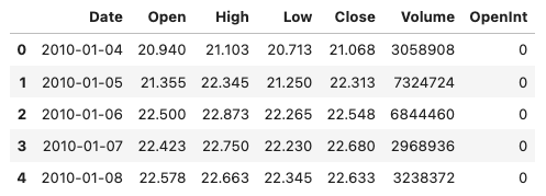
In this code, a stock price and volume dataset for the ETF with the ticker symbol ‘CERN’ is read from a local directory.Using the Pandas library, it reads the dataset into a Pandas DataFrame using the read_csv() function, where ETF_DIRECTORY is the directory containing the data, and ETF_NAME is the file name.
After that, the code performs some data cleaning and preprocessing steps. Using the pd.to_datetime() function, the ‘Date’ column is converted to a datetime format. Using the df[‘Date’].dt.year property and the >= operator, it filters the DataFrame to include only dates from 2010 onwards. In order to avoid modifying the original DataFrame, the copy() function makes a copy of the filtered DataFrame. Last but not least, the code resets the index of the DataFrame using the index property to ensure that the index is a simple range of integers.
To check that the data has been loaded and cleaned correctly, the head() function displays the first few rows of the cleaned DataFrame.
OHLC Chart
To determine historical prices, I draw an OHLC chart (open/high/low/close). In the area below OHLC, I have drawn a Volume chart, which shows the number of stocks traded on a daily basis. In my previous notebook (linked above) I explain importance of OHLC and Volume charts in technical analysis.
fig = make_subplots(rows=2, cols=1)
fig.add_trace(go.Ohlc(x=df.Date,
                      open=df.Open,
                      high=df.High,
                      low=df.Low,
                      close=df.Close,
                      name='Price'), row=1, col=1)
fig.add_trace(go.Scatter(x=df.Date, y=df.Volume, name='Volume'), row=2, col=1)
fig.update(layout_xaxis_rangeslider_visible=False)
fig.show()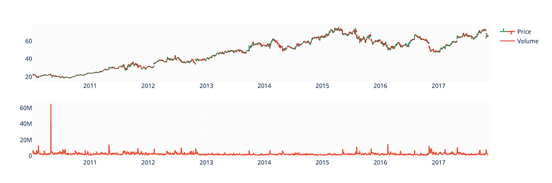
For the stock price and volume dataset loaded earlier, this code creates two subplots using the Plotly library.
Make_subplots() creates the figure with two rows and one column. Then we use the add_trace() function to add two traces to the figure, one for stock price data and one for volume data. The go.Ohlc() function creates an interactive candlestick chart based on stock price data, where the x parameter is set to the ‘Date’ column, and the open, high, low, and close parameters to the corresponding columns. To label the trace, we set the name parameter to ‘Price’. The go.Scatter() function is used to plot the volume data, with the x and y parameters set to the ‘Date’ and ‘Volume’ columns, respectively, and the name parameter set to ‘Volume’ to label the plot.
By setting layout_xaxis_rangeslider_visible to False, the update() function modifies the layout of the plot. By doing this, you’ll get rid of the range slider for the x-axis. In the output, the plot is displayed using the show() function.
Decomposition
df_close = df[['Date', 'Close']].copy()
df_close = df_close.set_index('Date')
df_close.head()
decomp = decompose(df_close, period=365)
fig = decomp.plot()
fig.set_size_inches(20, 8)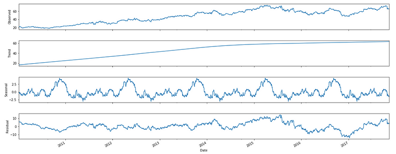
The code decomposes the stock price data using the STL decomposition method and plots the decomposed components.
Using the [[‘Date’, ‘Close’]] syntax, the first line of code creates a new DataFrame called df_close containing only the ‘Date’ and ‘Close’ columns of the original DataFrame. By using the copy() function, you can make a copy of the selected DataFrame without modifying the original. We then use set_index() to make the ‘Date’ column the index of the DataFrame.
A variable called decomp stores the result of the STL decomposition on the ‘Close’ column of the DataFrame using a period of 365 days.
The plot() function plots the decomposed components of the time series, including the trend, seasonal, and residual components. The plot is set to 20 inches wide and 8 inches tall with the set_size_inches() function. The plot shows the decomposed components of the stock price data, which is useful for figuring out trends and patterns.
Technical indicators
df['EMA_9'] = df['Close'].ewm(9).mean().shift()
df['SMA_5'] = df['Close'].rolling(5).mean().shift()
df['SMA_10'] = df['Close'].rolling(10).mean().shift()
df['SMA_15'] = df['Close'].rolling(15).mean().shift()
df['SMA_30'] = df['Close'].rolling(30).mean().shift()

fig = go.Figure()
fig.add_trace(go.Scatter(x=df.Date, y=df.EMA_9, name='EMA 9'))
fig.add_trace(go.Scatter(x=df.Date, y=df.SMA_5, name='SMA 5'))
fig.add_trace(go.Scatter(x=df.Date, y=df.SMA_10, name='SMA 10'))
fig.add_trace(go.Scatter(x=df.Date, y=df.SMA_15, name='SMA 15'))
fig.add_trace(go.Scatter(x=df.Date, y=df.SMA_30, name='SMA 30'))
fig.add_trace(go.Scatter(x=df.Date, y=df.Close, name='Close', opacity=0.2))
fig.show()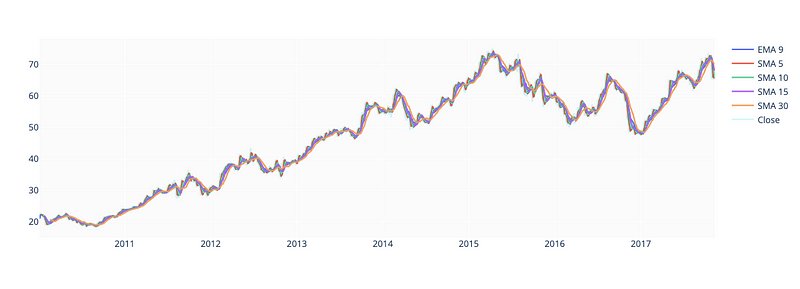
This code snippet deals with financial time-series data analysis and visualization.
Using the ewm() and rolling() functions on the ‘Close’ price column of a pandas DataFrame (df), we compute the Exponential Moving Average (EMA) and Simple Moving Average (SMA) for different time windows (9, 5, 10, 15, and 30). Shift() shifts the computed values back by one period, so they align with the corresponding date.
The second block of code generates a new plot using the plotly go module. Multiple traces can be added to the plot with the add_trace() function, each representing one of the computed moving averages and the original ‘Close’ price. Each trace has a different name, which is displayed in the legend. Set the opacity parameter to make the ‘Close’ price trace appear as a shaded area in the background.
The show() function displays the resulting plot in an interactive window. The resulting plot shows the different moving averages and the ‘Close’ price over time, so it’s easy to compare their trends.
Relative Strength Index
To predict whether a stock is overbought or oversold, I’ll add the RSI indicator.
def relative_strength_idx(df, n=14):
    close = df['Close']
    delta = close.diff()
    delta = delta[1:]
    pricesUp = delta.copy()
    pricesDown = delta.copy()
    pricesUp[pricesUp < 0] = 0
    pricesDown[pricesDown > 0] = 0
    rollUp = pricesUp.rolling(n).mean()
    rollDown = pricesDown.abs().rolling(n).mean()
    rs = rollUp / rollDown
    rsi = 100.0 - (100.0 / (1.0 + rs))
    return rsi

df['RSI'] = relative_strength_idx(df).fillna(0)
fig = go.Figure(go.Scatter(x=df.Date, y=df.RSI, name='RSI'))
fig.show()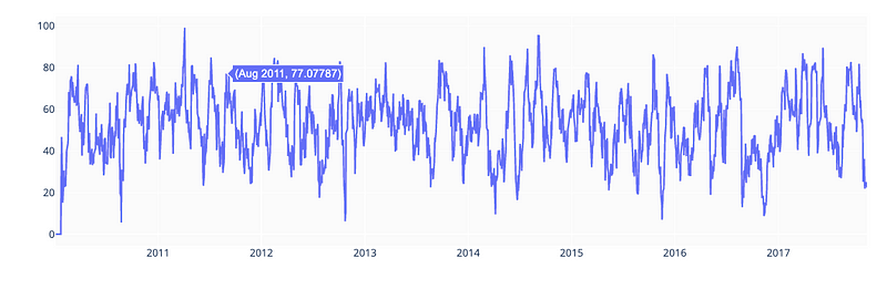
The code calculates the Relative Strength Index (RSI) of a stock, which is a technical momentum indicator used in financial analysis to measure the strength of a stock’s price action. RSI is calculated based on the average gains and losses of the stock over a specified period of time.
A pandas DataFrame (df) containing financial data is passed to relative_strength_idx() along with an optional parameter n (default 14) specifying the period over which the RSI is calculated. DataFrame’s ‘Close’ price column is extracted, and the difference between consecutive values is calculated using the diff() function.
Two separate Series are created to hold the positive changes in price (pricesUp) and negative changes in price (pricesDown). Negative values in pricesUp are set to 0, and positive values in pricesDown are set to 0. As a result, rolling means are calculated for both pricesUp and pricesDown over the specified time period n.
RS is calculated as the ratio of the rolling mean of pricesUp to the rolling mean of pricesDown. Finally, the function calculates the RSI based on the RS values and returns it.
RSI values are calculated for the DataFrame df using the relative_strength_idx() function, and the RSI values are added as a new column ‘RSI’ to the DataFrame using the fillna() function to replace any missing values.
The final step is to create a new plot using the plotly library’s go module. The add_trace() function adds a single trace representing the RSI values over time to the plot. Using the show() function, the plot is displayed. Through the plot, traders and investors can evaluate the strength of the stock’s price action and determine potential buy and sell signals.
MACD
EMA_12 = pd.Series(df['Close'].ewm(span=12, min_periods=12).mean())
EMA_26 = pd.Series(df['Close'].ewm(span=26, min_periods=26).mean())
df['MACD'] = pd.Series(EMA_12 - EMA_26)
df['MACD_signal'] = pd.Series(df.MACD.ewm(span=9, min_periods=9).mean())

fig = make_subplots(rows=2, cols=1)
fig.add_trace(go.Scatter(x=df.Date, y=df.Close, name='Close'), row=1, col=1)
fig.add_trace(go.Scatter(x=df.Date, y=EMA_12, name='EMA 12'), row=1, col=1)
fig.add_trace(go.Scatter(x=df.Date, y=EMA_26, name='EMA 26'), row=1, col=1)
fig.add_trace(go.Scatter(x=df.Date, y=df['MACD'], name='MACD'), row=2, col=1)
fig.add_trace(go.Scatter(x=df.Date, y=df['MACD_signal'], name='Signal line'), row=2, col=1)
fig.show()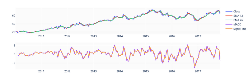
This code computes and visualizes the Moving Average Convergence Divergence (MACD) indicator of a financial time series.
The first block of code computes two Exponential Moving Average (EMA) series for the ‘Close’ price column of the pandas DataFrame df. The ewm() function calculates the EMA for a specified time period (12 or 26 in this case), and the min_periods parameter specifies the minimum number of observations needed for a valid EMA calculation. To store the EMA values for 12 and 26 periods, two pandas Series are created.
A new column ‘MACD’ is added to the DataFrame df containing the MACD calculated as the difference between the two EMA series. Furthermore, a signal line is calculated by calculating a 9-period EMA of the MACD, and stored as a new column ‘MACD_signal’.
A new plot is created using the make_subplots() function from the plotly.subplots module in the second block of code. It is composed of two rows and one column, with the top row containing the stock’s ‘Close’ price, the 12-period EMA, and the 26-period EMA, and the bottom row containing the MACD and signal line.
The add_trace() function adds individual traces to the plot, each representing one of the computed values. The legend of the plot specifies a different name for each trace. In the plot, each trace’s position is specified by the row and col parameters.
The show() function displays the resulting plot in an interactive window. Traders and investors can use this plot to evaluate the strength and direction of the stock’s trend by looking at the different moving averages and the MACD indicator over time.
Shift label column
df['Close'] = df['Close'].shift(-1)This code moves all values up by one position in a pandas DataFrame by shifting the ‘Close’ column by one period into the future.
With the parameter -1, the shift() function is applied to the ‘Close’ column, shifting all values by one position in the negative direction. It mimics a shift in time by one period by replacing each value in the ‘Close’ column with the value from one period in the future.
As a result of shifting the ‘Close’ prices in this way, the price values at each time point are now associated with the future rather than the present, allowing the models to be tested on data that weren’t available at the time of training, which can be useful in time-series modeling and forecasting tasks.
Drop invalid samples
df = df.iloc[33:] # Because of moving averages and MACD line
df = df[:-1]      # Because of shifting close price
df.index = range(len(df))
Using this code, we modify the pandas DataFrame df by removing rows from the beginning and end, and re-indexing the remaining rows.
The first line of code removes the first 33 rows from the DataFrame df by using the iloc[] function. In earlier code, moving averages and MACD lines were calculated based on a limited number of observations. In order to ensure that only valid data is used in this calculation, the first 33 rows of the DataFrame are removed.
DataFrame df’s last row is removed using the [:-1] slicing notation in the second line of code. The last row of the DataFrame contains NaN values because the original DataFrame had been shifted by one period in the future. In order to ensure that the DataFrame contains only valid data, the last row is removed.
The third line of code resets the index of the DataFrame to an integer range starting at 0. DataFrame’s index attribute is used to create a range of integers equal to the DataFrame’s length, and range() is used to create that range. DataFrames can be indexed and referenced specific rows in the DataFrame using this continuous index, which starts from 0.
There are three subsets of stock data frames here: training (70%), validation (15%), and test (15%). In order to create three separate frames (train_df, valid_df, test_df), I calculated split indices. In the chart below, all three frames are plotted.
test_size  = 0.15
valid_size = 0.15
test_split_idx  = int(df.shape[0] * (1-test_size))
valid_split_idx = int(df.shape[0] * (1-(valid_size+test_size)))
train_df  = df.loc[:valid_split_idx].copy()
valid_df  = df.loc[valid_split_idx+1:test_split_idx].copy()
test_df   = df.loc[test_split_idx+1:].copy()
fig = go.Figure()
fig.add_trace(go.Scatter(x=train_df.Date, y=train_df.Close, name='Training'))
fig.add_trace(go.Scatter(x=valid_df.Date, y=valid_df.Close, name='Validation'))
fig.add_trace(go.Scatter(x=test_df.Date,  y=test_df.Close,  name='Test'))
fig.show()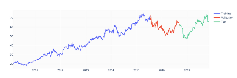
In order to train, validate, and test a machine learning model, a pandas DataFrame df containing financial data is subdivided into three parts.
In the first two lines of code, test_size and valid_size variables specify the proportion of data being used for testing and validation.
DataFrame df is split into training, validation, and testing subsets based on test_split_idx and valid_split_idx variables. The following code calculates these indices. A proportion of the DataFrame’s length is rounded down to the nearest integer using the int() function.
By using the loc[] function, a DataFrame df is split into training, validation, and testing subsets. The .copy() method is used to avoid modifying the original DataFrame.
A new plot is then created using the plotly library’s go module. The plot shows separate traces for each of the three subsets. Visual inspection of the data and verification that the subsets have been properly divided is possible with this plot of Close prices over time for each subset.
A machine learning model can be trained and evaluated using the training, validation, and testing subsets; the training set trains the model, the validation set tunes the model’s hyperparameters, and the testing set tests the model’s performance.
Drop unnecessary columns
drop_cols = ['Date', 'Volume', 'Open', 'Low', 'High', 'OpenInt']
train_df = train_df.drop(drop_cols, 1)
valid_df = valid_df.drop(drop_cols, 1)
test_df  = test_df.drop(drop_cols, 1)
In training, validation, and testing, specific columns are removed from a pandas DataFrame containing financial data.
By adding this line of code to the DataFrame, you can drop columns such as ‘Date’, ‘Volume’, ‘Open’, ‘Low’, ‘High’, and ‘OpenInt’ from the DataFrame. These columns can be dropped if they are not relevant to the machine learning model being trained or if they introduce noise or bias to the model.
Using the drop() function, the following three lines remove the specified columns from the training, validation, and testing subsets of the DataFrame. By specifying 1, the drop() function operates on columns instead of rows. In this case, all original columns except those specified in drop_cols are produced as DataFrames.
The training, validation, and testing subsets of the DataFrame can be used to train, validate, and test a machine learning model after removing the irrelevant or noisy columns.
Split into features and labels
y_train = train_df['Close'].copy()
X_train = train_df.drop(['Close'], 1)
y_valid = valid_df['Close'].copy()
X_valid = valid_df.drop(['Close'], 1)
y_test  = test_df['Close'].copy()
X_test  = test_df.drop(['Close'], 1)
X_train.info()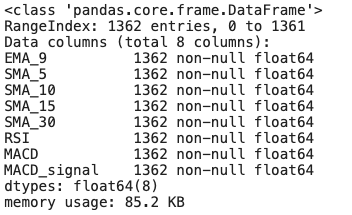
This code separates the target variable (‘Close’) from the feature variables to display information about the resulting feature subsets.
The first three lines of code copy the target variable ‘Close’ into separate Series for training, validation, and testing subsets. By using the drop() function, we also extract the feature variables into separate DataFrames for each subset, and remove the ‘Close’ column from each DataFrame.
In the final line of code, the info() function is called on the feature subset X_train. The function provides information on the DataFrame, including the number of rows, the number of non-null values in each column, and the type of columns. This information can be used to identify potential problems or inconsistencies in the data, as well as to make sure the data is properly formatted and free of missing values.
These steps are involved in preprocessing the data for machine learning. For a machine learning model to predict the target variable, it is necessary to separate the target variable from the feature variables. Using the info() function, a quick overview of the feature variables in the training subset can be used for preprocessing and feature engineering.
Fine-tune XGBoostRegressor
%%time

parameters = {
    'n_estimators': [100, 200, 300, 400],
    'learning_rate': [0.001, 0.005, 0.01, 0.05],
    'max_depth': [8, 10, 12, 15],
    'gamma': [0.001, 0.005, 0.01, 0.02],
    'random_state': [42]
}
eval_set = [(X_train, y_train), (X_valid, y_valid)]
model = xgb.XGBRegressor(eval_set=eval_set, objective='reg:squarederror', verbose=False)
clf = GridSearchCV(model, parameters)
clf.fit(X_train, y_train)
print(f'Best params: {clf.best_params_}')
print(f'Best validation score = {clf.best_score_}')
To tune a machine learning model’s hyperparameters, XGBoost and GridSearchCV are used.
%%time magic command in Jupyter Notebook displays the execution time of the following code block in the first line of code.
A dictionary of hyperparameters, including the number of estimators, learning rate, maximum depth, gamma, and random state, is then created. In order to search for an XGBoost model, a hyperparameter dictionary, and an evaluation set, the GridSearchCV function must be called. By fitting the model with different combinations of hyperparameters, GridSearchCV performs an exhaustive search over a parameter grid.
The best hyperparameters are obtained using the best_params_ attribute of the GridSearchCV object, and the best validation score is obtained using the best_score_ attribute. By using the print() function, the results are displayed on the console.
This code searches for the best combination of hyperparameters for the XGBoost machine learning model using GridSearchCV to perform a systematic search over a specified parameter grid. Machine learning models can then be trained and tested using the best hyperparameters.
%%time
model = xgb.XGBRegressor(**clf.best_params_, objective='reg:squarederror')
model.fit(X_train, y_train, eval_set=eval_set, verbose=False)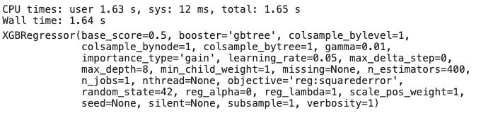
Using the best hyperparameters obtained from hyperparameter tuning with GridSearchCV, a machine learning model is trained.
In the first line of code, the %%time magic command is used to display the time taken to execute the following code block.
In the second line, the best hyperparameters from the previous step are used to create a new XGBoost model. The XGBRegressor function is called with the **clf.best_params_ syntax, which unpacks the best hyperparameters obtained from the GridSearchCV object and passes them as arguments to the XGBRegressor function. By setting the objective function to ‘reg:squarederror’, models are trained to minimize mean squared error.
The third line of code calls the fit() function on the XGBoost model with the training data and evaluation set. During training, no output will be printed if the verbose parameter is set to False. The Fit() function trains the XGBoost model using the hyperparameters and objective function specified in the training data. During training, the model’s performance is calculated using the evaluation set to avoid overfitting.
Using the hyperparameter tuning steps from the previous hyperparameter tuning step, this code trains an XGBoost model using these hyperparameters. It is now possible to make predictions using the new data or to evaluate and test the model further based on the new data. A %%time magic command displays the time taken to train the model so that you can monitor performance and optimize training time.
plot_importance(model);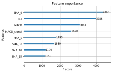
For the trained machine learning model, XGBoost plots a graphical representation of feature importance.
In the XGBoost library, plot_importance() plots the relative importance of each feature. On the x-axis of a bar chart, feature names are plotted, while the y-axis shows importance scores.
The plot_importance() function is used in this code to plot the XGBoost model object model. Plotting the relative importance of each feature in the model is useful for understanding which features are most important for predicting the target variable, and for identifying irrelevant or noisy ones.
A trained XGBoost model can be analyzed by visualizing the importance of its features using this function.
Calculate and visualize predictions
y_pred = model.predict(X_test)
print(f'y_true = {np.array(y_test)[:5]}')
print(f'y_pred = {y_pred[:5]}')
Using a trained XGBoost model, the code makes predictions on the testing data, and displays the actual and predicted values of the target variable for the first five instances.
With the testing feature variables X_test as input, the predict() function is called on the trained XGBoost model object model. Predicted values for the target variable are stored in y_pred.
The following two lines of code display the actual values of the target variable for the first five instances in the test data using the print() function and the np.array() function. In the y_test variable, the actual target variable values are stored.The y_pred variable also displays the predicted values of the target variable for the same instances in the testing data.
Overall, this code compares the actual and predicted values of the target variable to evaluate the performance of the trained XGBoost model. The predict() function is used to generate predictions for the testing data using the trained model, and the print() function is used to display the actual and predicted values for the first five instances in the testing data, so that the model can be visualized.
print(f'mean_squared_error = {mean_squared_error(y_test, y_pred)}')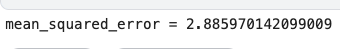
A mean squared error (MSE) is calculated and displayed between the actual and predicted values of the target variable for the testing data using the code below.
To calculate the MSE between the actual values of the target variable y_test and the predicted values y_pred generated by the XGBoost model, the mean_squared_error() function from the scikit-learn library is used. A lower MSE indicates a better fit between the model’s predictions and the actual values.
Using the print() function, the MSE is displayed using string formatting and the f string prefix. MSE values are displayed as floating point numbers, making it easy to evaluate the model’s performance on the test data.
This code uses the mean squared error as a performance metric to evaluate the performance of the trained XGBoost model on the testing data. As a result, the MSE can be compared to other models or used as a benchmark for future improvements.
predicted_prices = df.loc[test_split_idx+1:].copy()
predicted_prices['Close'] = y_pred
fig = make_subplots(rows=2, cols=1)
fig.add_trace(go.Scatter(x=df.Date, y=df.Close,
name='Truth',
marker_color='LightSkyBlue'), row=1, col=1)fig.add_trace(go.Scatter(x=predicted_prices.Date,
y=predicted_prices.Close,
name='Prediction',
marker_color='MediumPurple'), row=1, col=1)fig.add_trace(go.Scatter(x=predicted_prices.Date,
y=y_test,
name='Truth',
marker_color='LightSkyBlue',
showlegend=False), row=2, col=1)fig.add_trace(go.Scatter(x=predicted_prices.Date,
y=y_pred,
name='Prediction',
marker_color='MediumPurple',
showlegend=False), row=2, col=1)fig.show()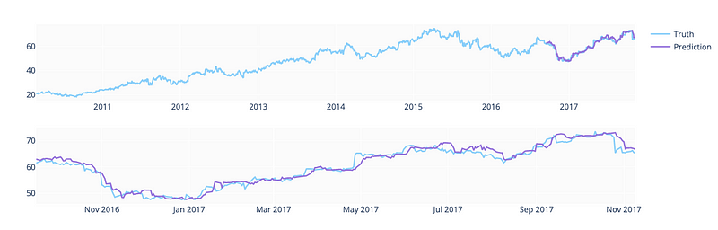
It compares the actual values from the training and validation data with the predicted values for the target variable for the testing data.
The loc[] function and the copy() method are used in the first line of code to create a copy of the testing data. Predicted values for the target variable are assigned to the Close column of the predicted_prices dataframe by using the y_pred variable.
The next block of code creates a new subplot figure using the make_subplots() function from plotly.subplots. Two rows and one column of the figure display the actual and predicted values of the target variable in two subplots.
Using the add_trace() function and the go.Scatter() class from the plotly.graph_objects module, the actual and predicted values for the target variable are displayed in the first subplot (row 1, column 1). Using the df dataframe and the LightSkyBlue color, the actual values from training and validation data are also displayed for comparison.
The second subplot (row 2, column 1) displays only the actual and predicted values of the target variable for the testing data, without a legend or color coding. The subplot can be used to compare actual and predicted values, as well as to evaluate the model’s performance.
The last line of code displays the figure using the plotly.graph_objects module’s fig.show() function. This plot shows the actual and predicted values of the target variable for the testing data, as well as the actual values from the training and validation data.
As a whole, this code is used to create a graphical representation of the predicted and actual values of the target variable for the testing data, and to compare them with the actual values from the training and validation data. This plot may be useful for identifying any patterns or discrepancies in the model’s predictions based on the trained XGBoost model.