
Working with Arabic in UX design
Designing screens and experiences for RTL languages
Last year I got to work on an app that was ultimately going to be deployed globally in every market and every language including RTL (Right-to-Left) languages — with a specific focus on Arabic.
I have to admit this one was new for me, so I did some research, did some design, and learned some things. With a background in linguistics, this was fascinating for me.
Addition: I’m adding updates to this post as I’m having further conversations and learning even more new things!
Arabic presents some unique design challenges for UX, UI and copy, which meant we had to design for Arabic from the beginning, even though we were initially user testing with English-speaking audiences and launching our first MVP in LTR language markets.
Key challenges for interface design using Arabic
Directional flow & mirroring
The “rule everyone knows” (never assume) is that you simply flip or mirror the interface — job done! Er no, it’s a bit harder than that. Sorry, hard things are hard.
From my understanding, RTL script is not just a different visual pattern, it is also a mindset or perception change. Rather than simply knocking out UI components and flipping them round, we need to think differently and in a more holistic way.
Time and progression
Take the example of time. The sense of task progression is reversed. The linear representation of time is reversed. Whereas LTR text readers perceive things like loading bars and sliders as left-to-right, those now need to work the other way.
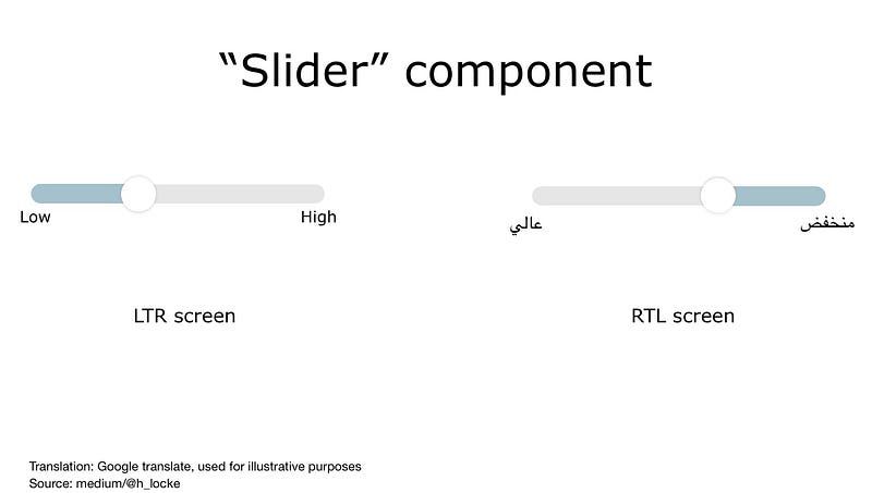
However — if you just flipped everything in your UI you’d get it wrong. There are exceptions:
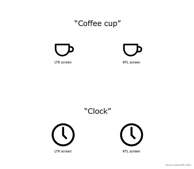
- Clocks still turn “clockwise”
- Icons such as coffee cups still have handles to the right. (note also, majority of users are still right-handed)
Handling RTL text
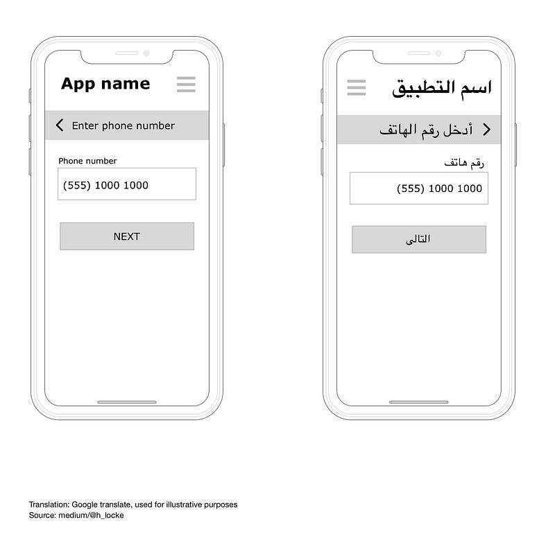
As I mentioned for UI components, with RTL languages, your text flows, well, right to left. Users’ visual scanning behaviour is also reversed, including the use of F-Patterns.
Icons and check boxes related to text therefore sit to the right of the copy, however the tick itself remains as a LTR graphic.

Numbers
Numbers appearing in RTL interfaces generally still run LTR. As an example the year 2018 is still written 2018. However, if the sense you are trying to communicate is a period of time (2018–2020) then that text runs in line with the RTL mindset — (2020–2018).
The exception for this is LTR text appearing in a RTL interface such as a phone number, which always appears LTR even in a RTL interface design.
Symbols and icons:
As mentioned above, icons that communicate directionality are reversed, however icons that do not, are not. This includes universal icons such as camera, or home.
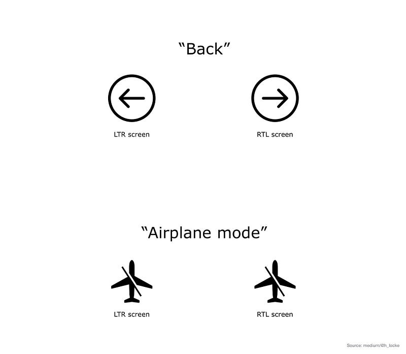
Note: a backslash within an icon is not reversed. Similarly, neither are brand icons or recognised trademarks.
Characteristics of the language:
Length of copy
The first thing to know is that English to Arabic does not translate 1:1. If you’ve ever worked with German translation before this won’t surprise you, however it’s much more complex than German.
Some words from English will be translated into longer phrases as they are descriptive of the sense or concept being described. You’re going to need flexibility in your UI to allow for this.
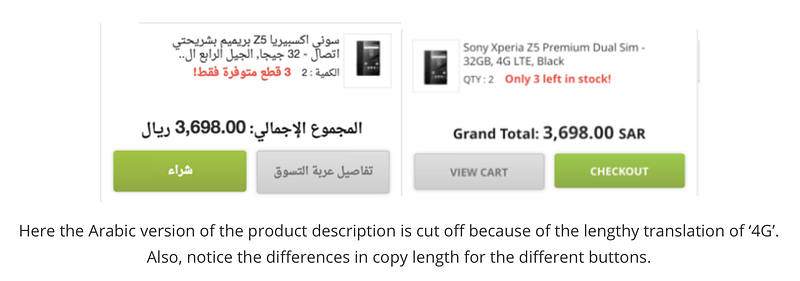
Also, where letters appear in a sentence change its meaning, so you cannot simply chop longer words or sentences at the line break and expect it to mean the same. This can easily happen if you get copy translated professionally but then just “run it in” to your design.
The best approach here would be to have an initial professional native translation, then have a UX writer and UI designer working with the translator to implement the successful design.
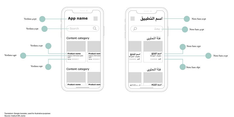
Fonts
Arabic is more visually complex compared to some other languages, making use of dots and diacritics (small symbols representing vowels) and also takes up more horizontal space than roman text. Because of this, when translating from English to Arabic, we’re going to need a bigger font than you do when you translate to languages which are also in roman text, to ensure legibility.
Humans eyes have the same problems with vision, ageing and accessibility — whatever language you speak. We need to design accordingly whatever language we are using.
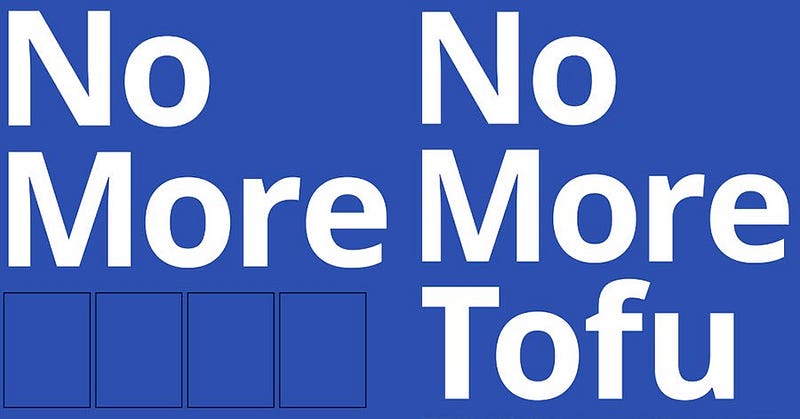
The recommended font to use for Arabic interfaces is Google’s Noto Font. It’s free to download, has 75+ font families available. So, no more tofu.
Arabic to English content journeys
There is a lot of content on the internet, and for complex reasons, a lot of it is in English.
There is a disproportionate amount of content in English or non-Arabic content compared to the number of Arabic speakers online.
Therefore, whatever you are designing in Arabic, if you are linking out to other content, the user could land on an English content website, so consideration of multi-lingual user journeys is important.
Equally, if content is not available for your experience in Arabic, it may be better to include English content rather than none, if it increases the chance of user comprehension. Either way, your interface needs to support both languages.
Addition: I’ve since had conversations with UI designers working in Arabic who are designing nav layouts in LTR with RTL text, mostly due to some users being more used to LTR layouts. Jakob’s Law in action.
Not ‘one size fits all’
Another complexity when considering translation is that Arabic is not a single language or a single country. There are linguistic and cultural differences and challenges.
It would be easy to make an arbitrary rule, like “just use Modern Standard Arabic” (MSA) however, if you are targeting one specific arabic-speaking user group, then using a version of Arabic that can be adequately understood, but comes across as overly formal, might not resonate. It would be better to understand your audience (yes, research) and make a decision based on evidence rather than assumption.
Trust
According to Arabic UX agency IstiZada, “Arabs tend to be much more risk averse than many other cultures around the world”. If this is the case for your users, as with any other trust-sensitive market, then additional work needs to be done on defining what trust looks like — across the experience and through both design and copy.
What can you do to the overall IA and task flow to ensure clarity, transparency and trust of your product or service?
As always, aim to understand your actual users’ needs, rather than apply broad brush rules. Do primary research.
Never assume
I think we can conclude that designing interfaces for Arabic language and audiences as a Westerner requires care and attention, however in reality this is only the care and attention we should be giving to understanding the needs of all of our users.
- Who are our users?
- What are their mental models of this product or service?
- How can we understand them better?
- Does this design meet their needs?
- How can it flex for a range of user needs?
- How can we make this culturally relevant and appropriate?
- How can we make this interface accessible?
Clearly, all of the above can be achieved by conducting appropriate primary research — generative and evaluative, by engaging expert stakeholders (local market, industry and translation consultants) and by following W3C standards.
Just like we should be doing for every experience we design.
If you found this useful, consider subscribing for free to get email alerts when I post new articles, or you can join Medium for full access to my article archive, plus everything else on Medium.
References
Stats on Arabic content vs users.
Cultural implications for choice of Arabic and MSA
F-patterns in different cultures (NNG)
Resources
Google material guidelines for bidirectionality/mirroring.
Download page for Google’s Noto Font.
Creating HTML in Arabic (W3C)


