
How to Create Interactive Maps Using Python GeoPy and Plotly
Geocoding, Reverse Geocoding, Compute Surface Distance, Driving Distance, Create Scatter Map, Bubble Map, Choropleth Map and Animated Map in Python

Geospatial data science is booming now. A typical Geospatial dataset includes data, such as, latitude, longitude, addresses, street names, zip codes. These data require a different set of tools to process and turn them into insights. In this article, I’ll share Python libraries that are useful to process geospatial data and create geospatial visualizations: GeoPy and Plotly.
I. Process Geospatial Data
GeoPy is a Python library that provides access to several popular geocoding web services, such as Google Maps, Bing Maps, Nominatim, and Yahoo BOSS. It is a useful tool to help us process Geospatial Data.
Install Library
Open the anaconda prompt or command prompt and type the following commands.
pip install geopyImport Libraries
import geopyInitial a Geocoding Service API
As I mentioned above, there are many Geocoding APIs available. You can use free API, such as, OpenStreetMap or paid API, such as, Google Maps. It all depends on how you will deploy your program. You will get what you pay for. A free API might work fine for your own pet project. If you’ll deploy for commercial purposes, You should consider paid API because you can expand the daily API quota limits.
In order to use Google Maps API, we will need a Google Maps API. You can follow this quick tutorial to generate your own Google Maps API key for FREE.
# OpenStreetMap API
from geopy.geocoders import Nominatim
geolocator = Nominatim(user_agent="Your Email")
# Google Maps API
from geopy.geocoders import GoogleV3
geolocator = GoogleV3(api_key='Your Google Maps API Key')Extract Latitude and Longitude from Raw Address
To create maps, we need to obtain the Latitude and Longitude of each location. Usually, a dataset would include address information, such as, street number, street names, city, state, zip codes. To get Latitude and Longitude, we can use “geocode” function from GeoPy.
address = '5801 SW Regional Airport Blvd Bentonville AR'
location = geolocator.geocode(address)
print(location.latitude, location.longitude)
# 36.3236395 -94.255661Extract Raw Address Information from Latitude and Longitude
Sometimes, the dataset might only have Latitude and Longitude and don’t have any address information, such as, city, state, zip codes which are meaningful to humans. Reverse geocoding is an important step to convert location coordinates to addresses with locational information. To achieve this, we can simply use “reverse” function to obtain the address information of locations
location = geolocator.reverse('36.350885, -94.239816')
print(location.address)
# 2658, Southwest 20th Street, Bentonville, Benton County, Arkansas, 72713, United States
Besides the public and commercial Geocoding Service APIs we’ve mentioned above, there are also government Geocoding APIs, which are available to the public. For example, we can extract county information from FCC’s Area and Census Block API using Latitude and Longitude.
In the following code, we create a function, “extract_location_data”, to return location information from FCC API using Latitude and Longitude.
import requests
import urllib
def extract_location_data(lat, lon):
    params = urllib.parse.urlencode({'latitude': lat, 'longitude':lon, 'format':'json'})
    url = 'https://geo.fcc.gov/api/census/block/find?' + params
    response = requests.get(url)
    data = response.json()
    return data
result = extract_location_data(36.350885, -94.239816)
print(result['County'])
print(result['State'])
# {'FIPS': '05007', 'name': 'Benton County'}
# {'FIPS': '05', 'code': 'AR', 'name': 'Arkansas'}Measure Surface Distance Between Two Places
The distance between two places could an essential feature in many machine learning models. But this information is usually lacking in a dataset. To compute the distance, we don’t have to apply mathematical formula ourselves. “geodesic” function is available in GeoPy library to compute the surface distance between two places.
In the following code, “geodesic((lat_1, lon_1), (lat_2, lon_2))” would return the surface distance between two coordinates. You can return the distance in kilometers, miles, or feet.
from geopy.distance import geodesic
point1 = (36.236984, -93.09345)
point2 = (36.179905, -94.50208)
distance = geodesic(point1, point2)
print(distance.miles, ' miles')
print(distance.meters, ' meters')
# 78.80808645816887  miles
# 126829.32109293535  meters
Measure Driving Distance Between Two Places
The surface distance is a merely theoretical concept, which applies straight distance between two places. We might need a driving distance by car, bike or walking, which is more meaningful in a machine learning model. Getting the driving distance is easy using APIs.
Method 1: Calculate driving distance using Free OSRM API
OSRM is a free and open source API. Extracting information is easy with “requests” function in Python. In the following code, it sends two coordinates to the API, it will return driving distance and duration of the ride.
import requests
import json
lat_1, lon_1  = 36.236984, -93.09345
lat_2, lon_2  = 36.179905, -94.50208
r = requests.get(f"http://router.project-osrm.org/route/v1/driving/{lon_1},{lat_1};{lon_2},{lat_2}?overview=false""")
routes = json.loads(r.content)
route_1 = routes.get("routes")[0]
print(route_1["duration"], ' seconds')
print(route_1["distance"], ' meters')
# 8048.5 seconds
# 150883.3 metersMethod 2: Calculate driving distance using Google Distance Matrix API
We can also use googlemaps library and Google’s Distance Matrix API to obtain the similar information. As you can see from the following codes, the results getting from Google’s Distance Matrix API is comparable to the ones from OSRM API.
import googlemapsgmap = googlemaps.Client(key='Your Google Maps API Key')
gmap_output = gmap.distance_matrix((36.236984, -93.09345), (36.179905, -94.50208), mode='driving')
print(gmap_output['rows'][0]['elements'][0]['duration']['value'], 'seconds')
print(gmap_output['rows'][0]['elements'][0]['distance']['value'], 'meters')
# 6913 seconds
# 150700 metersII. Basic Map Graphs
In this section, I’ll talk about how to use Plotly library to create beautiful maps with interactive features. These graphs are easy to make and will be self-contained and ready for presentation.
Plotly also makes Dash, a Python framework to create visualization, build web applications and deploy machine learning models.
Install Library
Open the anaconda prompt or command prompt and type the following commands.
pip install plotlyImport Libraries
Besides Plotly base functions, we’ll also use Plotly.Express, which is a wrapper for Plotly to create complex and richly interactive graphs with simple syntax.
import plotly
import plotly.express as px
Register MapBox Token
If you will create a map based on MapBox service, then you will need to register for a free MapBox account and obtain a MapxBox token. A free MapBox token can be obtained here. A typical token looks like “pk.eyJ1IjoiYWAyb24tY2xvdmVyxxxxxSI6ImNrcGVybWd3aTcwaXUyd242amV9NzFvazIifQ.8SnSj0JCi1VkNUED2FINIB”.
You can register the token in layout.mapbox.access_token or px.set_mapbox_access_token() configuration function if using Plotly.Express.
from urllib.request import urlopen
px.set_mapbox_access_token(open('mapbox.mapbox_token').read())
mapbox_access_token = open('mapbox.mapbox_token').read()
Create Simulated Location Data
For this article, I’ll create a simulated geospatial dataset, which includes 1000 randomly generated locations in the US.
lon = []
lat = []
county = []
state = []
observation = 1
while observation <= 1000:
lon_0 = np.random.uniform(-120,-65)
lat_0 = np.random.uniform(26,48)
data = extract_location_data(lat_0, lon_0)
print(data)
if data['status'] == 'OK':
if data['County']['FIPS'] != None:
lon.append(lon_0)
lat.append(lat_0)
county.append(data['County']['FIPS'])
state.append(data['State']['code'])
observation +=1
else:
pass
else:
pass
years = [randint(2000, 2010) for i in range(1000)]
df = pd.DataFrame({'long': lon, 'lat': lat, 'state': state, 'county_fips': county, 'year': years})Create Locations Scatter Plot in a Map
First, Let’s create the simplest map, a scatter plot, which displays the locations on a map. We’re going to use “scatter_mapbox” from Plotly.Express. In the program, we’ll need to specify the latitude and longitude of locations.
To export the map graph, we can use “write_html” function to save the plot in a local folder.
fig = px.scatter_mapbox(
    df,
    lat="lat",
    lon="long",
    zoom=4,
    title = 'Simulated Locations in the US'
)fig.write_html('Locations Map.html')
Create Choropleth Map
Next, we’ll create choropleth maps, which is a type of statistical thematic map that uses the intensity of color to represent an aggregate summary of a geographic characteristic within a geographical location. In the following code, we’ll create two choropleth maps - the first one displays the number of Walmart stores per state in the US and the second one displays the number of Walmart stores per county.
Before we create the maps, we need to aggregate the data to compute the number of Walmart stores per state or county. To do that, we use “groupby” with “count” function in Pandas. Then Choropleth maps can be created using “choropleth” function.
- “location” argument would take the geographic units (e.g., state or county FIPS code).
- “color” argument would take numeric values (e.g., the number of Walmart stores) that correspond to the intensity of color within a geographic unit. The higher the number of Walmart stores, the darker the color.
- “locationmode” argument indicates a set of locations on the map. It can take one of ‘ISO-3’, ‘USA-states’, or ‘country names’. ‘ISO-3’ is a three-letter country code and “USA-states” would return US maps with state boundaries. County boundaries are NOT available in “locationmode” argument. Instead, we need to include a county GeoJSON file in “geojson” argument. This GeoJSON file is available in ‘https://raw.githubusercontent.com/plotly/datasets/master/geojson-counties-fips.json'.
- “scope” argument indicates the scope in a map. It can take one of ‘world’, ‘usa’, ‘europe’, ‘asia’, ‘africa’, ‘north america’, or ‘south america’
- “color_continuous_scale” argument specify a continuous color scale when the column denoted by “color” contains numeric values
# by state
store_by_st = df.groupby('state')['long'].count().reset_index()
store_by_st.rename(columns = {'long':'Number of Locations'}, inplace = True)
fig = px.choropleth(
locations=store_by_st['state'],
color = store_by_st['Number of Locations'].astype(float),
locationmode="USA-states",
scope="usa",
color_continuous_scale = 'ylorrd',
labels={'color':'Number of Locations'},
title = 'Number of Simulated Locations by State'
)
fig.write_html('Choropleth Map by state.html')##################
# by county
with urlopen('https://raw.githubusercontent.com/plotly/datasets/master/geojson-counties-fips.json') as response:
counties = json.load(response)store_by_county = df.groupby('county_fips')['long'].count().reset_index()
store_by_county.rename(columns = {'long':'Number of Locations'}, inplace = True)fig = px.choropleth(
locations=store_by_county['county_fips'],
color = store_by_county['Number of Locations'].astype(float),
geojson=counties,
scope="usa",
color_continuous_scale = 'ylorrd',
labels={'color':'Number of Locations'},
title = 'Number of Simulated Locations by County'
)
fig.write_html('Choropleth Map by county.html')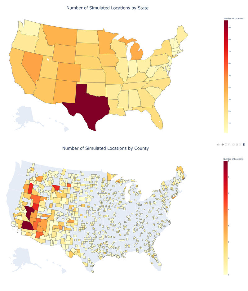
Create Bubble Map Based on a Column
Next, we’ll create bubble maps using “scatter_geo” function. This function is similar to “choropleth” function. We will need to specify “size” argument with the numeric column, instead of “color” argument.
# by state
fig = px.scatter_geo(
    store_by_st,
    locations="state",
    hover_name="state",
    size="Number of Locations",
    size_max = 30,
    locationmode="USA-states",
    scope="usa",
    title = 'Number of Locations by State'
    )
fig.write_html('Bubble Map by state.html')
##################
# by county
fig = px.scatter_geo(
store_by_county,
locations="county_fips",
hover_name="county_fips",
size="Number of Locations",
size_max = 30,
geojson=counties,
scope="usa",
title = 'Number of Locations by County'
)
fig.write_html('Bubble Map by county.html')
Create a Maps with Multiple Layers
We can create Maps with multiple layers in Plotly. For example, in a single map we would like to include both a scatter plot and a choropleth map. To do that, we will need to use both “plotly.graph_objects” and “plot.express”.
We will create the first layer of map using “px.choropleth”, then add the second layer using “add_trace” function with “go.Scattergeo”. “go.Scattergeo” is equivalent to “px.scatter_mapbox”. Lastly, we can modify the layout of the whole map, such as, title, font, font size, legend, and others, using “update_layout” function.
import plotly.graph_objects as go# by state
fig = px.choropleth(
locations=store_by_st['state'],
color = store_by_st['Number of Locations'].astype(float),
locationmode="USA-states",
scope="usa",
color_continuous_scale = 'Blues',
labels={'color':'Number of Stores'},
)
fig.add_trace(
go.Scattergeo(
lon =df['long'],
lat =df['lat'],
mode="markers",
marker_color = 'maroon',
marker_size = 4
)
)
fig.update_layout(
title_text ='Simulated Locations by State',
title_x =0.5,
title_font_size=30)
fig.write_html('Choropleth_with_locations by state.html')##################
# by county
fig = px.choropleth(
locations=store_by_county['county_fips'],
color = store_by_county['Number of Locations'].astype(float),
geojson=counties,
scope="usa",
color_continuous_scale = 'Blues',
labels={'color':'Number of Stores'},
)fig.add_trace(
go.Scattergeo(
lon =df['long'],
lat =df['lat'],
mode="markers",
marker_color = 'maroon',
marker_size = 4
)
)
fig.update_layout(
title_text ='Simulated Locations by County',
title_x =0.5,
title_font_size=30)
fig.write_html('Choropleth_with_locations by county.html')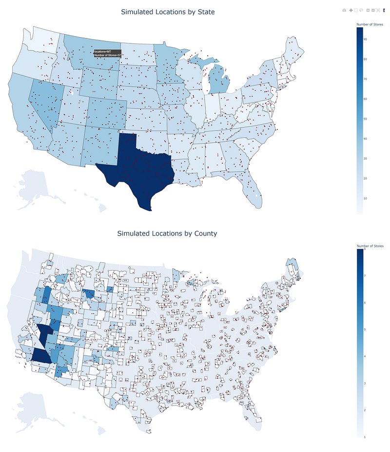
III. Advanced Map Graphs
In this section, we’ll talk about creating advanced Map graphs in Plotly. By combining different features, we can create richly interactive maps.
Combine Multiple Maps in a Single Page Using a Drop-down Menu
Sometimes, we will create multiple maps, but wish to include all of them in a single page. Creating a drop-down menu is a perfect solution to contain all the information while keeping the format clean and organized.
In the following example, we would like to create a choropleth map at the county level and design a drop-down menu to select a specified state to display the choropleth map.
In the program, we’ll need two components, namely, “traces” and “buttons”. “traces” is a list that includes all the layers of maps. Each layer includes choropleth map for a specific state. “buttons” is a list that includes elements in the drop-down menu. In order to make the drop-down menu work, we would need to specify “updatemenus” argument inside the “layout” with the “buttons” list we’ve created. When a user selects a value in a drop-down menu, the “visible” and “title” arguments would automatically get updated through “updatemenus” argument.
Don’t forget to include “accesstoken=mapbox_access_token” we’ve mentioned above inside the layout argument.
import numpy as np
store_by_county2 = df.groupby(['state', 'county_fips'])['long'].count().reset_index()
store_by_county2.rename(columns = {'long':'Number of Locations'}, inplace = True)
# create drop-down menu
menu = store_by_county2['state'].unique().tolist()
visible = np.array(menu)traces = []
buttons = []
for value in menu:
subset = store_by_county2[store_by_county2['state']==value]
traces.append(
go.Choroplethmapbox(
locations=subset['county_fips'],
z = subset['Number of Locations'].astype(float),
geojson = counties,
colorscale = 'Blues',
colorbar_title = "Number of Stores",
visible= True if value==menu[0] else False
))
buttons.append(
dict(label=value,
method="update",
args=[{"visible":list(visible==value)},
{"title":f'Simulated Locations in <b>{value}</b>'}]))# create figure
fig = go.Figure(
data=traces,
layout=dict(
updatemenus=[{"active":0, "buttons":buttons,}]
))first_title = menu[0]
fig.update_layout(
title= f'Simulated Locations in <b>{first_title}</b>',
autosize=True,
hovermode='closest',
showlegend=False,
mapbox=dict(
accesstoken=mapbox_access_token,
bearing=0,
center=dict(
lat=38,
lon=-94
),
pitch=0,
zoom=4,
style='light'
))fig.write_html('Maps with drop-down.html')
Alternatively, we can use Dash to create a drop-down menu using a callback function.
Draw a Circle with a Given Radius Around Points
We can create bubbles in a map using “scatter_geo” function, however, when we zoom in or zoom out on the map, the bubble size would stay unchanged. To draw a circle with a given radius on the map, we would need a different solution.
In the following example, we would like to include Walmart stores within 30 miles radius of the University of California, Los Angeles.
To include this 30 miles buffer in the map, we need to create it from scratch. First, we would need the latitude and longitude of the center point, e.g., UCLA. Then we create a function, called “geodesic_point_buffer” to return a list of latitudes and longitudes in the boundaries of this 30 miles buffer using “pyproj” and “shapely” libraries. When there are enough points in the boundaries of the buffer, we can create a geometry object that looks very close to a circle by connecting points with straight lines.
Lastly, we just need to include this 30 miles buffer we just created inside “mapbox” argument with “layers=layers”. To make the map look nicer, we would like to center the map based on the center point when we open the map. To do that, we can set “center=dict( lat=lat, lon=lon)”, where lat and lon are the latitude of longitude of the center point.
from functools import partial
import pyproj
from shapely.ops import transform
from shapely.geometry import Point
# define a function to create buffer around a point
proj_wgs84 = pyproj.Proj('+proj=longlat +datum=WGS84')
def geodesic_point_buffer(lat, lon, miles):
# Azimuthal equidistant projection
aeqd_proj = '+proj=aeqd +lat_0={lat} +lon_0={lon} +x_0=0 +y_0=0'
project = partial(
pyproj.transform,
pyproj.Proj(aeqd_proj.format(lat=lat, lon=lon)),
proj_wgs84)
buf = Point(0, 0).buffer(miles * 1000/0.621371) # distance in miles
return transform(project, buf).exterior.coords[:]# Example
target = geolocator.geocode('University of California, Los Angeles')
lat, lon = target.latitude, target.longitude# create buffer layer
features = [{ "type": "Feature", "geometry": {"type": "LineString","coordinates": geodesic_point_buffer(lat, lon, 30)}}]
layers = [dict(
sourcetype = 'geojson',
source={"type": "FeatureCollection", 'features': features},
color= 'maroon',
type = 'fill',
opacity=0.2,
line=dict(width=1.5),
below = "state-label-sm"
)]# Create the map
fig = go.Figure()fig.add_trace(go.Scattermapbox(
lat=df['lat'],
lon=df['long'],
mode='markers',
marker=go.scattermapbox.Marker(
size=5,
color='blue'
)
))fig.update_layout(
title='Simulated Locations <br>Within 30 Miles of UCLA',
autosize=True,
hovermode='closest',
showlegend=False,
mapbox=dict(
accesstoken=mapbox_access_token,
layers=layers,
bearing=0,
center=dict(
lat=lat,
lon=lon
),
pitch=0,
zoom=6.5,
style='light'
),
)fig.write_html('Locations Map with 30 Miles Radius.html')
We can create circles around multiple points or circles with different colors by modifying features and layers list variables in the program.
Create Animated Maps
Next, we’ll create a map with animation. For example, we would like to create a dynamic choropleth map which would change over time.
Several Plotly Express functions, such as, scatter, bar, choropleth, support the creation of animated figures through the animation_frame and animation_group arguments.
In the following example, we’ll create a dynamic choropleth map that displays the number of simulated locations by state year over year
First, we’ll aggregate the data frame to compute annual location counts by state using “groupby” and “count” functions in pandas. Then “px.choropleth” is used to the animated map with additional arguments, “animation_frame=df[“year”]” and “animation_group=df[“state”]”.
- animation_frame: This argument specifies a column that is used to create animation frames. In this example, we’ll create one frame per year
- animation_group: This argument specifies that the same value in the column would be treated as the same object in each frame. In this example, we’ll treat rows with the same state as the same object in each frame.
- range_color: This argument specify the range of color in a choropleth map. To keep the color scheme consistent across all frames. We need to specific the range_color argument with the max numeric value.
df =df.sort_values(['state', 'year'])
df = df.groupby(['state', 'year'])['long'].count().reset_index()
df = df.rename(columns = {'long': 'count'})
df = df.sort_values(['year'])
color_max = df['count'].max()
fig = px.choropleth(
locations=df['state'],
color = df['count'].astype(float),
locationmode="USA-states",
scope="usa",
color_continuous_scale = 'ylorrd',
labels={'color':'Number of Locations'},
title = 'Number of Simulated Locations by State',
animation_frame=df["year"],
animation_group=df["state"],
range_color = [0, color_max]
)
fig.update_layout(
title_x =0.5,
title_font_size=30)fig.write_html('choropleth with sliders by state.html')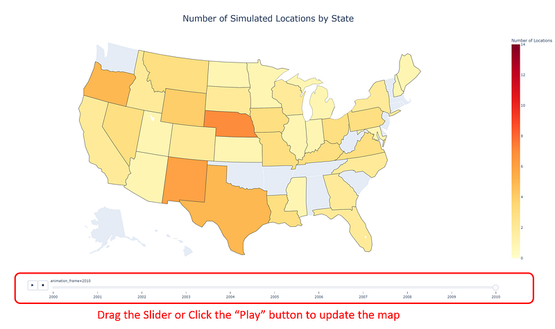
Thank you for reading !!!
If you enjoy this article and would like to Buy Me a Coffee, please click here.
You can sign up for a membership to unlock full access to my articles, and have unlimited access to everything on Medium. Please subscribe if you’d like to get an email notification whenever I post a new article.


