
Why White on Black is a Poor Choice For Reading Text
Publishers may have a preferred background color, but they should honor the writer's choice.
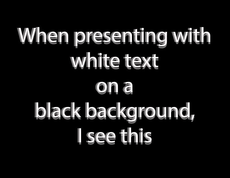
Jessica has astigmatism. The image is how she sees white text on a dark background. The reflections off the dark screen bleed into the white letters causing blurriness. A white background dilutes the effect of the reflections.
Many programmers prefer a dark background because syntax coloring shows better against a darker background, but we are talking about reading, not programming.
Reading is easier with high contrast between the text and the background, but the white of a screen is not a natural background. Take a look at a printed book. It’s not titanium white. It’s more likely an off-white with a brown or yellow tinge that makes it less bright.
About 50% of people have impaired eyesight. For them, a back background can be much more difficult to read. A white background is better because their eyes are less dilated with a narrower focus and less distortion around the edges.
Fonts are designed to work best with black on white, but comic-sans is a better font for dyslexics, but not for the rest.
Many people wear blue blocker glasses when working online. Skiers wear yellow-tinted glasses to enhance the contrast.
Picking a background-color
Regardless of your personal preference, the best combination for readers is dark print on a light background, but not pure white.
The background color of this article is Ivory with 95% lightness, #FFFFEB, rgb(255, 255, 230). It is white with a reduced blue component making it warmer and more restful.
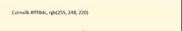
Let’s look at the CSS color Cornsilk.
The hex value and the rgb number represent the same number. The higher the value, the brighter the color, with 255 the brightest and 0 for no color. rgb(255, 255, 255) is white, and rgb(0, 0, 0) is black.
Cornsilk has higher values, so it is lighter, but it is weighted towards red, making it more restful to read in contrast to a color weighted towards blue, which would cause more eyestrain. If you choose a background color with less blue, you will be doing your readers a favor.
In picking colors for this article, I found a good starting point was W3schools HTML Color Groups. The colors are arranged in groups, making it easier to try colors that are warm with lower blue content. When you find a color you want to try out, click on the shades link, you can find the shades listed by lightness.
The first color group is Pink, which is not a good color group despite the findings of a study on dyslexia. All the colors in the group have too much blue. Likewise, don’t bother with the Purple, Cyan, or Blue groups. Green may cause problems with color blindness, but I haven’t done a literature search.
On the Color Groups page, selecting the hex link will give you all the text values on the selected background, and the mix link will create a list of colors between a beginning color and an ending color.
To make the color change, click on your avatar/image. Click on Settings. Under Design Click on Design your profile. Edit the background color on the left. Experiment with different colors until you find one you like. Then Press Publish. Presto, your stories are easier to read.
Sepia
While not a CSS named color, Sepia is a darker earth tone that is easy on the eyes. The samples are pretty light.


This shade of sepia, 89% light, #ffdfc8, rgb(255, 223, 200) is closer to natural sepia, which is darker still, but I find it a little dark.
Gray
Gray is one of the easiest colors to experiment with because all the colors in basic gray have the same value. #F0F0F0, rgb(240, 240, 240) is light gray, #F0F0F0, rgb(224, 224, 220) is a darker shade.
Reflections
Dark text on a light background is easier to read than Dark Mode, but pure white is too bright for continuous reading because the blue component is too strong.
Ivory, the background color of the story, Cornsilk, and sepia are good starting points for experimentation, as are some shades of gray and white.
Readers can try blue blocker glasses which–tada– block some of the blue light.
A request for comments and other begging
There is a theory among writers that a story gets more distribution if it has more comments. I would like to see if that is true. My read-to-view ratio is generally above 40%. I just need more eyeballs.
I try to uphold my end of the deal by answering all polite comments, especially if you disagree with me or find typos or factual errors. I am open to criticisms of style, story flow, or engagement.
If you join Medium, you get to read stories from thousands of Writers. A portion of your subscription fee helps support my writing at no cost to you. Subscribe
© Copyright Russell Salsbury


