
Why we should use animation in Data Vizualisation
3 evidence-backed reasons for bringing data to life with motion
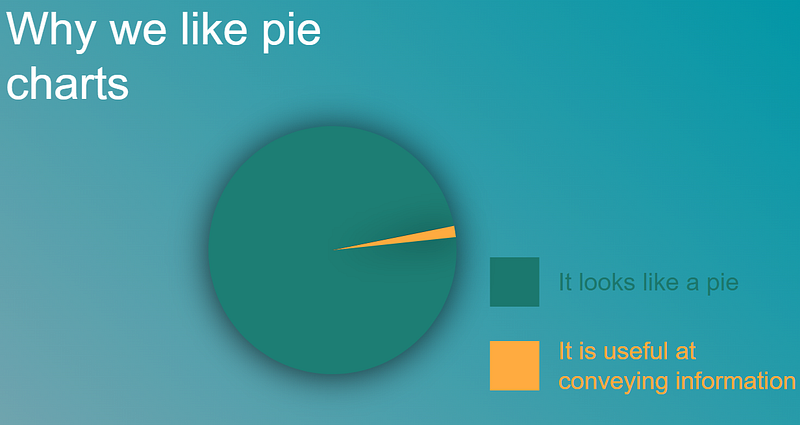
Animation in data visualisation is somewhat of a dirty word, sitting just above 3D bar charts and just below pie charts as a topic that data visualisation purists love to hate.
It is true that misuse of animation to visualise data can cause confusion and put strain on our working memory [1].
However, when done right, movement can add something to data visualisation that cannot be replicated in any other way. In this article I present 3 reasons why you should bring your data to life with motion.
1. Engagement
All media in the 21st century is screaming for our attention. Competition is fierce, content is everywhere. This has lead to increasingly sophisticated strategies from content providers to grab our attention and keep it.
The business world is no different. Tools make it increasingly easy to create content and share it. However, somewhat paradoxically, this makes it hard for individual pieces of content to stand out from the increasing amounts of ‘digital noise’ flying around any given organisation. This noise can lead to a a loss in engagement. Individuals may become numb to information even when it is insightful and informative purely because it is not engaging.
So why is this important when it comes to data visualisation? The answer is very simple; engagement is key because a data visualisation that fails to engage users also fails to convey any information.
There is a lot businesses can learn from the Social Media giants when it comes to engaging end users. In 2016 Twitter performed an internal analysis of its data. They found that media increased engagement of content significantly. Videos were 600% more likely to be Retweeted than photos.[2]
Videos are six times more likely to be Retweeted than photos and three times more likely than GIFs.
What this does not tell us is why videos stand out so much more than static content. We can hypothesise that such media is
- easier for us to digest;
- suggests better quality content (based on the fact that videos require a greater investment of time to create); and
- stands out from the ‘noise’ of other formats.
Research from Microsoft goes a step further and suggests that, when it comes to data visualisation, motion is more engaging to users simply due to the fact that is more ‘fun’. In a study comparing static and animated charts, participants enjoyed animated visualisations more than static charts and graphs. “users repeatedly reported that the animation condition was ‘fun’ or ‘exciting’ or, in one case, ‘emotionally touching.’ ”[3]
2. Emotion
Emotion has a substantial influence on our cognitive processes, including perception, attention, learning, memory, reasoning, and problem solving [4]. To create a truly powerful, long lasting and memorable experience we must engage with a user’s emotions.
Animation can do this in a way that is impossible with static charts. Animation of even inanimate objects can bring them to life. It can create higher level meaning including causality and anthropomorphism.
To understand what this really means, it is worth watching the video below of the Heider-Simmel Illusion from 1944:
Despite being made almost 80 years ago, this video is still capable of creating the same emotional attachment to three inanimate, geometric shapes.
What is just as surprising as the emotional attachment shown from participants in the original (and subsequent) experiments, was the consistency in the interpretation. Participants saw the same story unfolding and attributed human characteristics to the shapes when describing the scene [5]. The fact that we find interpretation of such images so easy highlights how powerful they can be to convey information to an audience.
3. Information
As humans, we are hard wired to detect motion. This is essentially a survival mechanism, being able to quickly spot a predator moving towards us could mean the difference between life or death. Interestingly, movement is a key part of this identification.
We have all experienced this, just as it is easier to spot a friend in a crowd when they start to wave at us, a stealthy animal cloaked by camouflage immediately loses its invisibility once it begins moving.
A stealthy animal cloaked by camouflage immediately loses its invisibility once it begins moving.
Recent research has confirmed just how efficient we are at spotting moving objects, even when they are against ‘noisy’ backgrounds. Typically, we can identify objects in this situation within 30 milliseconds [6].
Given that the entire field of data visualisation is dedicated to presenting information in a visual way that allows us to quickly and efficiently process it, animation provides a powerful tool to ‘tap into’ our sensitivity to identification of moving objects.
Conclusion
Motion in data visualisation has been largely shunned by specialists in the field. This represents a missed opportunity; there is clear evidence that animation can increase engagement, create an emotional attachment with an audience and convey information in a more effective and informative manner.
Next time you need to visualise data, don’t forget to bring it to life with movement!
Further reading
If you are interested in examples of the use of motion in data visualisation, I am attaching some of my favourites below. Please do comment if you have any further examples to add.
- Hans Rosling 200 countries in 200 years is a fantastic example. It has been recreated so many times but never with the same passion and delivery that Hans was famous for.
- Bar chart races have been described as the ‘fidget spinner’ of data visualisation. They are an excellent example of how animation can can really engage the audience. It is not clear who created the first example of these but the evolution of global brands is considered to be the first viral example.
- This example of flights between Europe and the US is memorising. It would not be possible to recreate this in the same way with a static chart.
References
[1] The science of Visual Data Communication: What Works. 2021 Steven L. Franconeri et al.
[2] Twitter internal data analysis 2016
[3] Effectiveness of Animation in Trend Visualization 2016, George Robertson et al.
[4] Perceptual causality and animacy. 2017, Brian J Scholla, Patrice D Tremoulet
[5] Heider, F., & Simmel, M. (1944) An experimental study in apparent behaviour. The American Journal of Psychology, 57, 243–259
[6] Spatial suppression promotes rapid figure-ground segmentation of moving objects, Nature Communications 2019, Duje Tadin et al