
Opinion Piece 🔥👀
Why These Medium Design Changes Hurt
And what we REALLY need instead
Welcome to article #19271298 about the new Medium design, a frightening change where it allows everyone to customize their own profile. As some have put it, it harkens back to the days of Myspace, a platform I’d never used.
I’ll take your word on it — never had a Myspace.
But to some people, these design changes hurt. Listen.
Why Customization Hurts
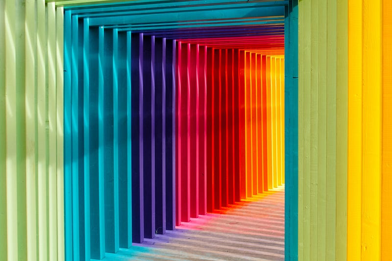
While most social media websites have a standard light mode and dark mode for users to customize for their own use, Medium decided to go the opposite way and let writers decide what colours all of their articles should appear in.
This means that there is nothing (except perhaps shame) stopping people from choosing these horrendous colour combinations:
- Yellow background, bright green highlights
- Red background (it doesn’t matter what the highlights are anymore, it just hURTS)
- Dark backgrounds with dark highlights (lacking contrast)
This actually makes it hard for some people to even view text, becoming an accessibility issue.
What We Really Need Instead
What we need instead is the ability for readers to customize their reading experience. That way we engage with the material in a way accessible to readers.
Writers seldom reread their own articles once published, so designing the colours to their personal liking only serves for personalization (which is still important). However, if your design choices are turning away your readers because of how difficult it is (yellow-green combo, I’m looking at you), it the customization serves to disconnect rather than connect.
Sure, I still like the idea of allowing writers some more leeway in terms of showing their own colours and personality through their profile design. I think there needs to be more restrictions on how much this can change. For example, this might look like allowing people to choose from a select few options of highlighting colours that have preset background colours that optimize contrast for readers).
An Interim Solution
Please. Consider. Viewing. Your. Colours. Through. A. Colour. Palette. Service. First. Here are three:
Lucy (The Eggcademic) is upsetti 😭about this spaghetti 🍝, if this spaghetti represents this Medium set of design changes. For now, she’s stopped reading pieces from people who have set their colour choices to something ridiculous, instead bookmarking them for later to read on her phone. Hopefully Medium doesn’t change the mobile app either.
What’s your next adventure? 🐰
- 🌌 hop down this rabbit hole: What it means to be Frank (or frank)
- 🔊 a voice to amplify: Dear bookworm, a poem by Maryjo Bautista


