
Why is the Univers Font all over China?
While the West kept reinventing Helvetica, China somehow settled with printing almost everything in Univers. After exploring one of its provinces, I’m here to find out why.
I forgot how Hainan treats decibels as if it doesn’t exist.
My mom had planned for my older brother and me to visit our great-grandmother in her hometown and spend a week in China in January. It was no surprise that she invited some friends to join us to enjoy the original ‘Hainanese Chicken,’ being the sweet, hospitable lady that she is. (Spoiler alert: it’s not the same as Singapore’s.)
For one of our lunch recommendations, we sat down at a no-frills, open-air restaurant that loudly boasts about its roasted goose. Each order my mom placed to the waiters sounded like rapid-fire. It seemed like they were about to throw hands, but it was just normal for them to raise their voices to communicate conveniently at a faraway distance.
At that moment, she realized that being there at noon meant they were all out of roasted geese. We settled for Wenchang chicken instead and other stir-fried vegetables to accompany our rice bowls. As they prepped our round table equipped with a typical, large, lazy Susan, we were also handed travel-sized boxed tissues.
Signboards, and Words
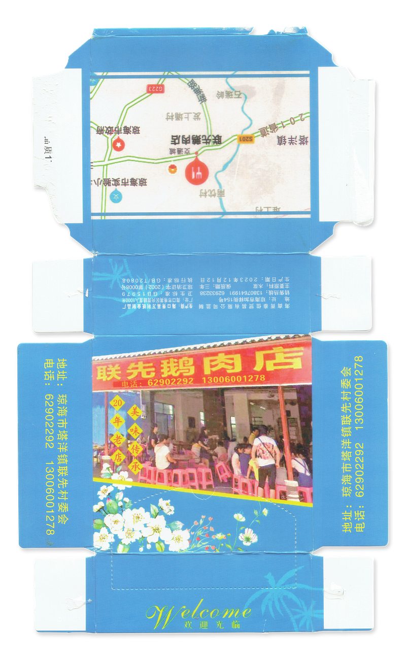
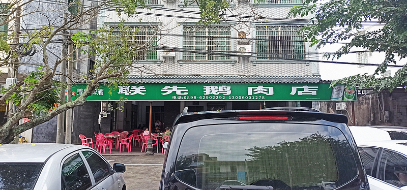
Each box was printed with a low-quality photo of their restaurant, featuring a signboard with stretched-out wording. It was clearly an old photo, as the current signboard they’ve affixed is green, with even more stretched-out words, teetering on illegibility. Nevertheless, I could discern that “goose meat” was their speciality.


These printed tissue boxes are a staple in the majority of family-owned restaurants here. We visited another rural area to indulge in braised pork trotters abundant in collagen, and even their establishment provided printed tissue boxes. This time, they were adorned with poorly photoshopped animals on green pastures, including black pigs and their cooked counterparts, signalling their offering of really fresh produce.

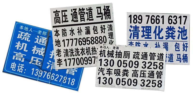
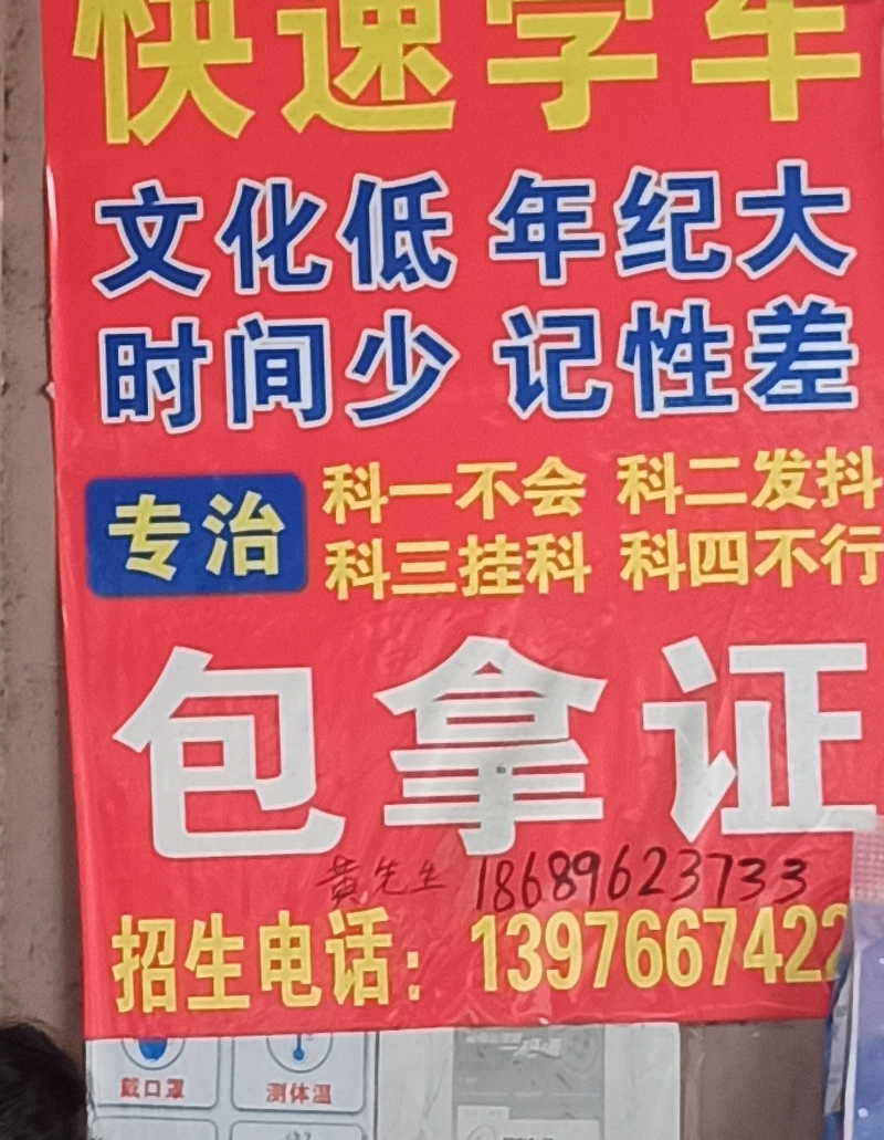
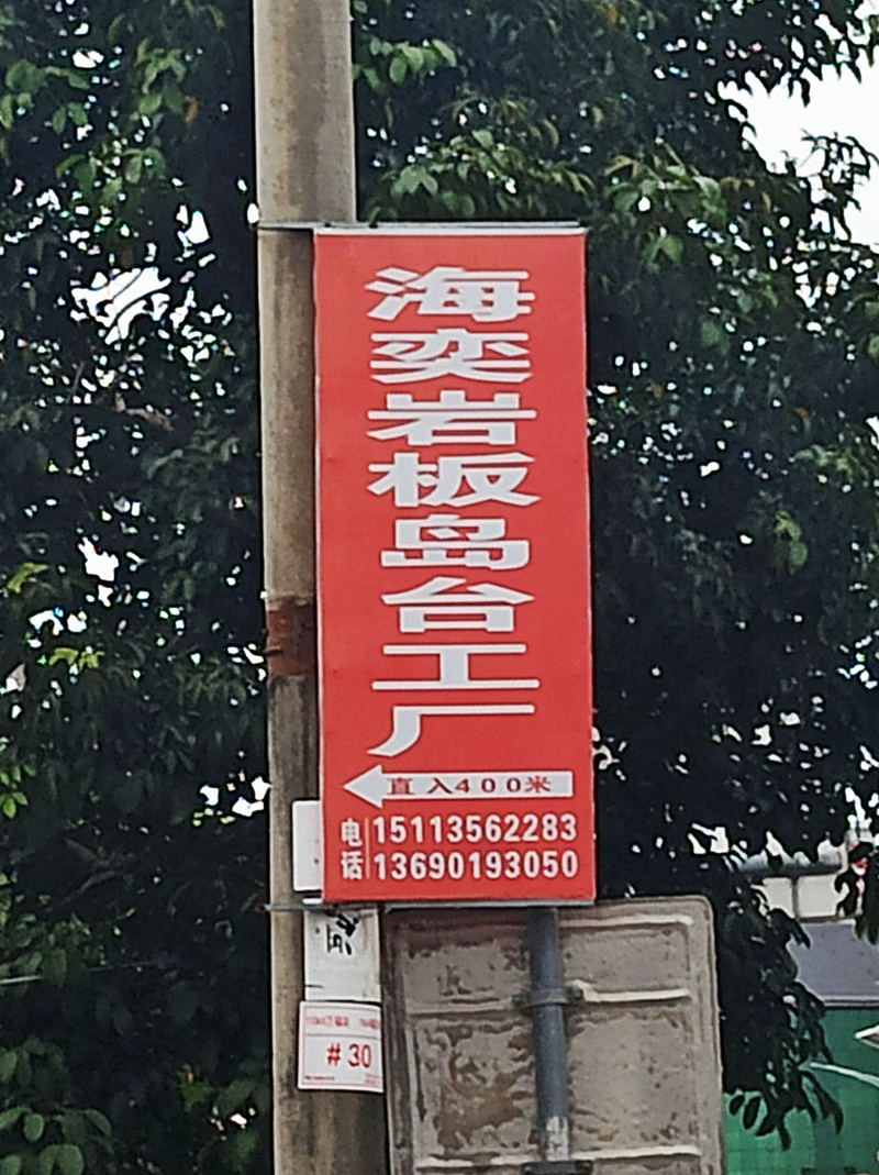
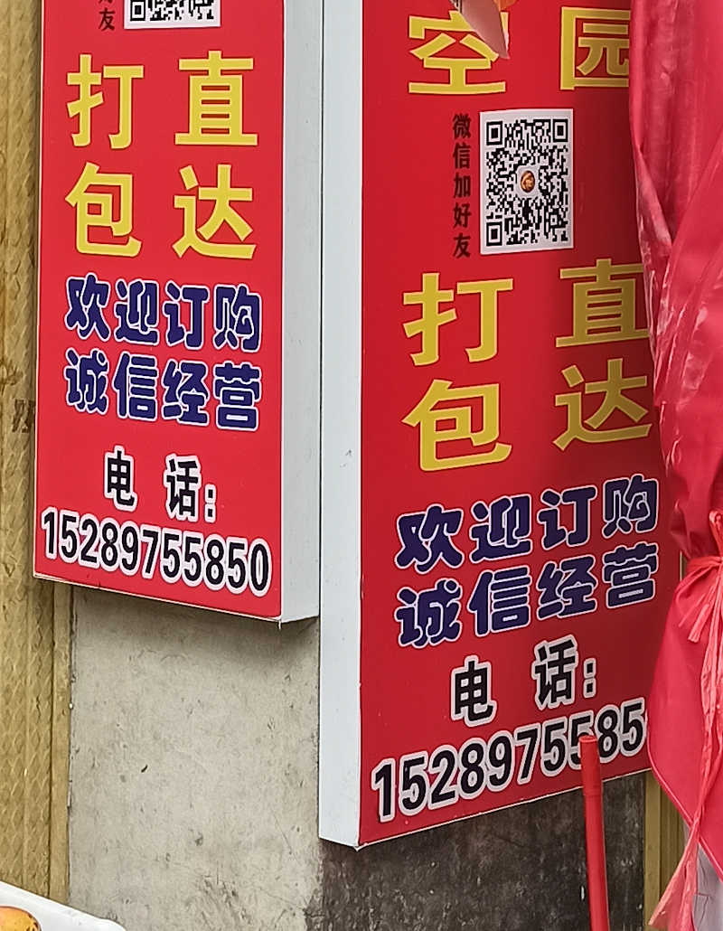
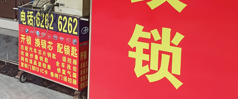
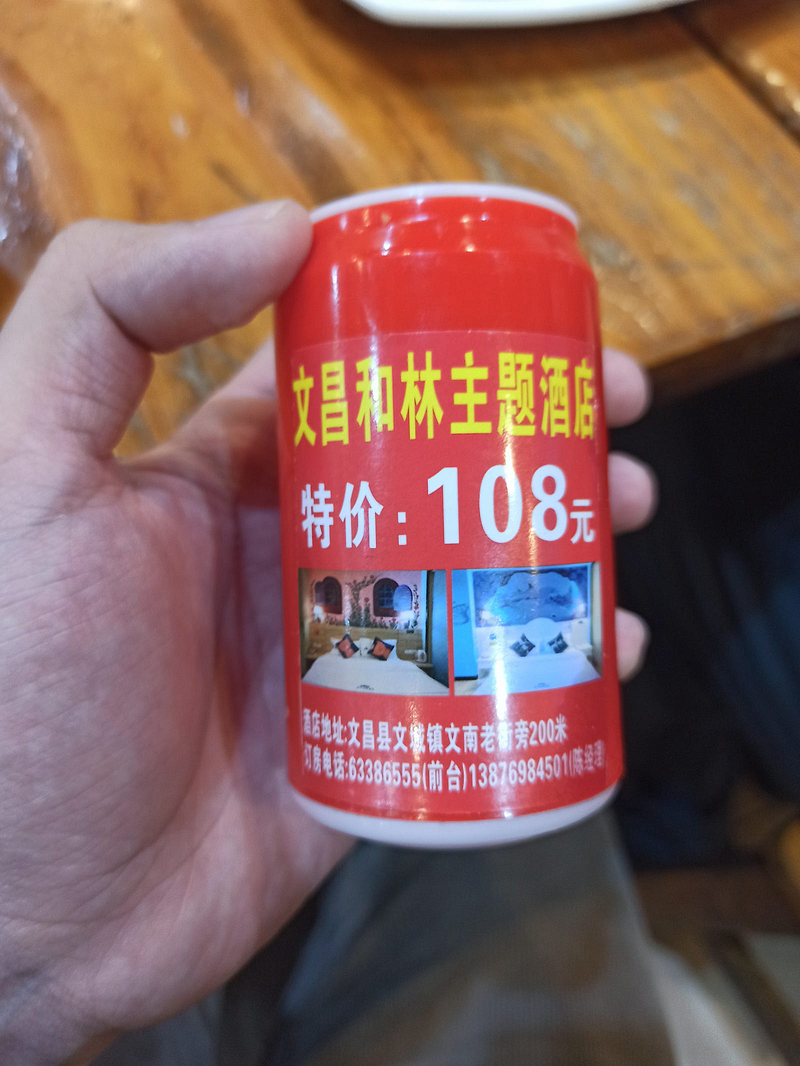
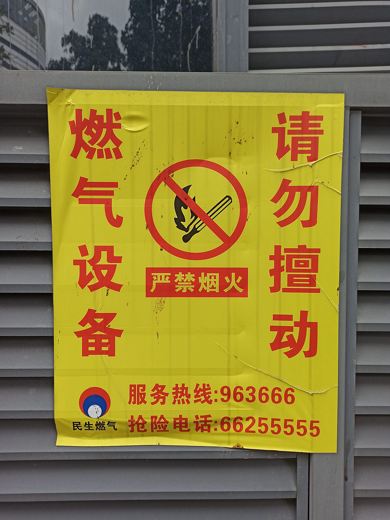
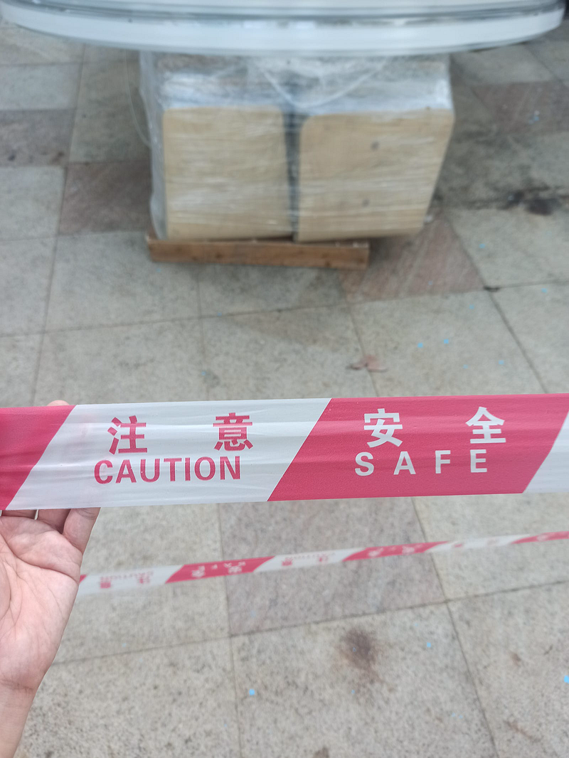
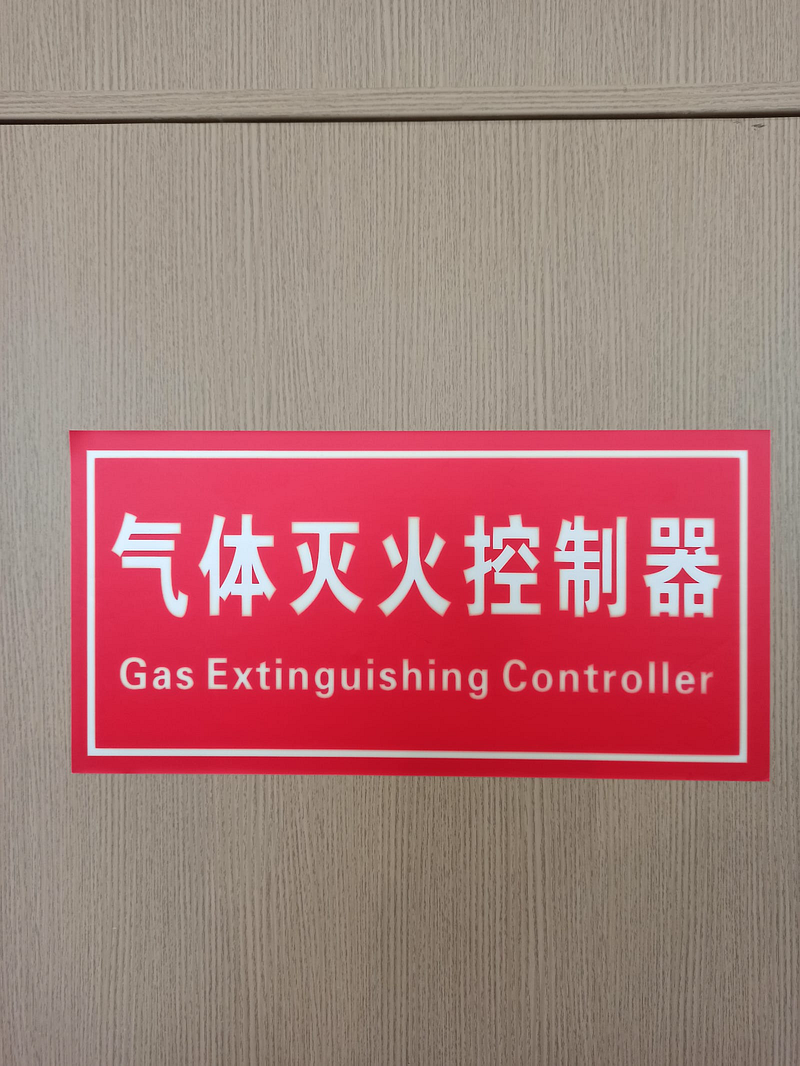
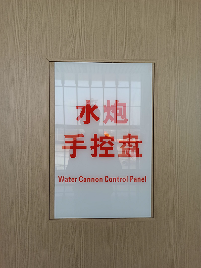
The locals seemed to adhere to an unspoken rule that Chinese characters should occupy at least two-thirds of the visual space in many of their prints. While these characters have evolved to fit within invisible square frames, residents contort and squeeze them into the most challenging areas, even if it means the characters condense or expand till a typesetter can scream.
Their visual advertising culture is rather quirky and endearing, although some may argue that it’s ugly and contributes to visual pollution. Apart from the distortion of words, another thing that has caught my attention is that they are mostly in Gothic (also known as 黑体/hēitǐ). Interestingly, the numerals used for their ordering hotlines are frequently formatted in Univers. To be precise, it is the bold style of Adrian Frutiger’s beloved grotesque.
Univers
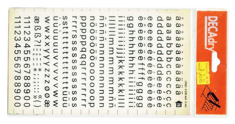
The debut of Univers (released by Deberny & Peignot) in 1957 was no small feat. While older fonts were crafted in metal and exhibited visual inconsistencies at different font sizes, Univers set a new standard for typography. Frutiger not only meticulously crafted each font style with seeming “steadiness and homogeneity”, but also expanded the range of weights and widths a single typeface could have. This resulted in 21 font styles (including slants/obliques) under Univers being promoted for phototypesetting, a revolutionary technology at that time that eliminated the need for using molten metal to create type.
It’s important to note that this research was solely triggered by my constant observation of Univers, not the Chinese Gothic. Having been raised to speak English as a native language, most of my typographic exposure is limited to Latin-based typefaces, which hindered my ability to differentiate between one ‘Hei Ti’ and another.
It’s also hard to overlook Univers, especially since one of my past lecturers consistently used it in our worksheets. As a result, those numerals stand out to me among the sea of simplified Chinese characters. It’s almost as if to say that they have no other numbers to use, not even the global generic spawn of Arial.
With this awareness, I continued pulling out my phone camera to capture every low-grade advertisement that I could find among the tropical palms of Hainan, especially those with Univers looming in the background.

I was handed a domestic travel brochure (or rather a folded A3 paper) by a worker at a tourist spot in Sanya, and boy was the wall of text unabashedly tacky! However, it was the right ‘Univers’ specimen. For a moment, though, I second-guessed whether I was seeing Univers until I saw another signboard in Haikou using the distinctive uppercase ‘Q,’ where its tail juts horizontally outward from the bowl.
At this point, I’m eager to find out how Univers ended up becoming so widely used within the province where my ancestors once lived.
Suspicions
I was quite certain it was the culprit of a font file. We’re no strangers to how typefaces like Comic Sans became so popular as a result of Windows’ mass distribution to personal computers. So could it be the same for this Chinese Gothic? If so, what font could that be?

It was rather foolish of me, but I first tried searching for “signboard printing” in Chinese, hoping some company might provide me with at least a font list showing the Gothic font included. But all I found were Taobao listings, which, though they didn’t answer the query, further convinced me that this is not just a phenomenon in Hainan; it’s a service offered in various parts of China. Those listed image thumbnails only frustrated me more because they were designed with the same maximalist approach and Univers numerals. It felt like the answers were almost within my reach.
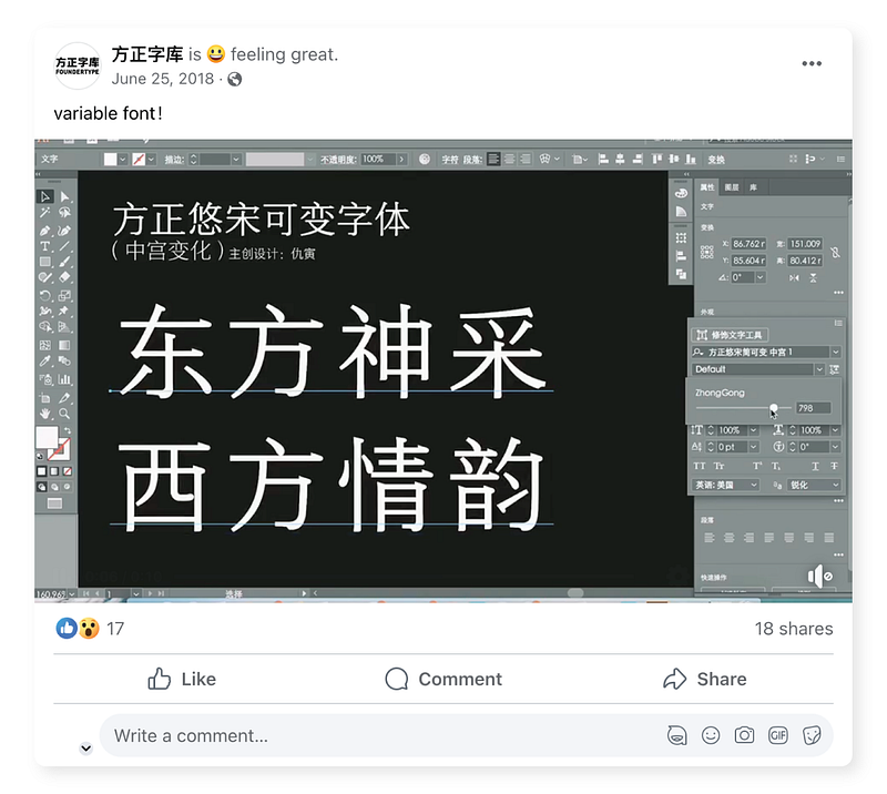
Though I had no frame of reference for standard ‘Hei Ti’ typefaces, I thankfully got a better lead by image searching for terms like “popular signboard fonts.” It led me to an image collage of various font names formatted according to their typefaces. My eyes quickly darted to that singular, bolded sans serif font, which said ‘Fang Zheng Da Hei (方正大黑).’
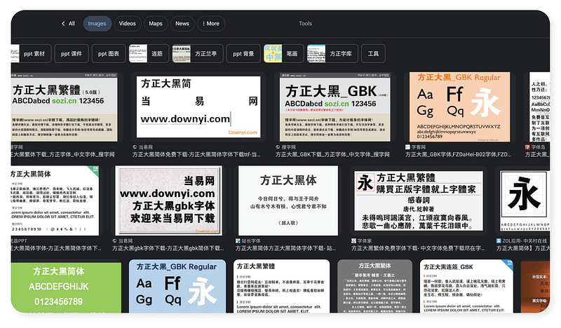
A subsequent web search of the name finally led me in the right direction. Several questionable font sites, like Fontke, displayed image thumbnails of the type specimen showcasing Univers as the Latin characters. Even a couple of Taobao listings featured the stencil version of Da Hei, but the fact that the fonts weren’t published under a type foundry made these renditions possibly illegal. Speaking of type foundry…
Not Just Da Hei
It turns out that ‘Fang Zheng’ is the Chinese company name for Founder Type, a nationally renowned type foundry that produces the majority of the fonts used in China. Almost 90% of their media use fonts from Founder, encompassing both digital and physical publishing.
The founder (of Founder), Wang Xuan, also pioneered phototypesetting technology in China during the 1970s, even though it was already popular in the Western world at that time. He later expanded the company to cater to the television and radio industries. During the 1970s, Univers was a standardised go-to font for the masses, while Da Hei was independently developed by the Shanghai Typecasting №1 Factory (上海字模一厂) under a different name.
Unsurprisingly, in the world of capitalism, acquisitions occurred, resulting in Univers being acquired by Linotype in the 1980s. Two decades later, Founder developed Da Hei and debuted it as a digital typeface, selling it to a wider audience through MyFonts. Besides Da Hei, Univers also appears in other fonts by Founder, such as Cu Hei and Zong Yi.
To go a bit off-topic, Univers wasn’t the only font that Founder might have taken from Linotype. To name just a couple of them, Cu Yuan uses VAG Rounded, while Cai Yun uses an outlined version of Helvetica Rounded for its Latin characters.
How?
So, how did Founder acquire Univers from Linotype and include it as the English/Latin characters for Da Hei? The only lead I could find suggesting that Founder may have been involved with Linotype was when it worked with Microsoft in 1991. They helped develop Chinese Postscript fonts for the Windows operating system and continued this relationship by developing and introducing another Gothic typeface (named Ya Hei) for its series of ClearType fonts in 2007.
Since Microsoft also licensed Linotype’s Palatino to be distributed in Windows 2000 and onwards, there might (and it’s a very loose “might”) have been an occasion where Linotype and Founder could have worked something out before Da Hei was accompanied by Univers for digital sales. But, you know…
It’s Just (Shady) Business?
As mentioned in one of my previous essays on font copyright, a digital font file can be copyrighted under US law, while the typeface (the appearance of a font) cannot. This was evident when Adobe successfully sued another company for copying 1100 of their digital font files with minimal alterations and selling them as their own on CD-ROMs.
However, if a company were to create a font based on a typeface or manually trace the typeface and sell it, it would not infringe any copyright. This explains why Arial and Helvetica can coexist without issue, and why there are numerous Futura look-alikes that are not subject to lawsuits.
Therefore, Founder could have avoided the need to pay Linotype altogether if they had simply redrawn a typeface from scratch based on Univers. In fact, the SIL (the organisation that created the Open Font License) themselves created a (flawed) version of the Univers typeface called Sophia without facing any issues.
Nevertheless, it remains unclear whether Founder copied the font file or traced Univers. Only the type company itself would have the definitive answer. Furthermore, Linotype (or Monotype, who has since acquired them) does not appear to be pursuing legal action, and the latest version of Da Hei has replaced its Latin typeface with another unassuming Neo-grotesque. The Latin glyphs for their other fonts have also been updated in their latest releases.

Lost Between Business to Businesses to Businesses
Out of the 90% of Founder’s typefaces used in China, how many are utilising licensed fonts? That’s something really hard to track, considering the vast number of printing services and their customers who extensively use Da Hei to this day. It’s also impossible to rule out font piracy especially since questionable websites readily offer these fonts for free instead of users paying directly to Founder.
The situation escalates when signmakers and printing shops exclusively use Da Hei, leading to more businesses displaying signs with this typeface. As a result of potential ignorance of font licensing and limited knowledge of diverse typefaces, Da Hei has become the default font choice. Univers became part of this equation when Founder decided to use it as a Latin companion during the font-making process.
What surprises me, however, is that this didn’t occur in the same manner as Comic Sans. Da Hei is not bundled with Windows operating systems, despite its widespread use in China. Instead, Sim Hei and Ya Hei are the ones that were included, but neither of these fonts is commonly used enough by businesses to appear on public signs and posters.
Unresolved
It’s unfortunate that I have to conclude my essay with more questions than answers. How did Founder acquire Linotype typefaces? Did they collaborate with sign-making businesses for font licensing, or was it more of piracy? Why did the majority of the country choose to use Da Hei rather than other Gothic typefaces?
If you have ever been involved in any of these industries, I’d love to hear from you in the comments section about this! Until then, I guess I’ll be here thinking about the Hainanese roasted goose that I never had the chance to savour. And Da Hei, of course.


