
Why ‘dark mode’ causes more accessibility issues than it solves
Dark mode. Isn’t it marvellous? All cool and trendy and accessible and sustainable. It even helps offset the damage you’re doing to your circadian rhythms by checking your phone before you turn out the lights.
Winning.
So it’s great that every app is introducing a dark mode setting.
Or is it?
Turns out, for some people it’s not accessible at all.
What’s the problem?
Dark mode causes something called “halation” which massively impacts how people with astigmatism perceive digital interfaces.
I learned about halation effect some time ago, when I was asked to review the usability (and therefore the accessibility) of an interface using yellow on black and white on black because it was more “accessible”.
As it turned out, it was more accessible for this client’s users (who were partially sighted) but not for me, because I have astigmatism.
So like a good UXer I went off to find out why.
What is astigmatism?
Astigmatism is a condition affecting a large percentage of humans. You find different stats everywhere, but in the UK it’s roughly 47% who need corrective treatment for this condition (by which we mean glasses or contact lenses in order to be able to see properly).
Here’s a definition from the NHS website:
Astigmatism means your eye is shaped more like a rugby ball than a football, so light is focused at more than one place in the eye.
This can cause:
• blurred vision
• headaches
• eye strain (you may notice this after concentrating for a long time — on a computer, for example)
Astigmatism normally occurs alongside short sight or long sight.
Source: NHS
Actually it turns out that most peoples’ eyes aren’t perfect, and most people have some level of astigmatism. Who knew.
For some users who have astigmatism, the impact of dark mode can be considerable and this is due to the way their wonky lenses respond to light.
So yes, for the first time ever, I am the user.
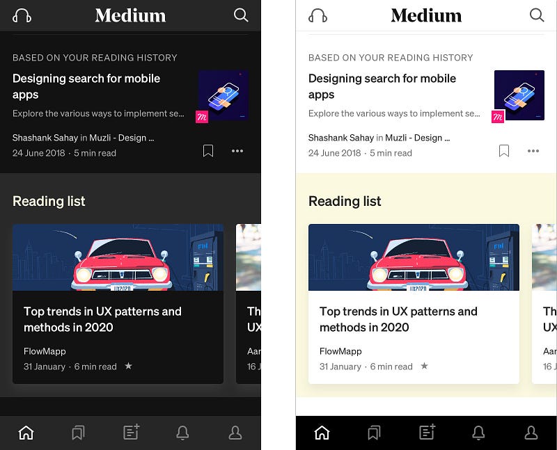
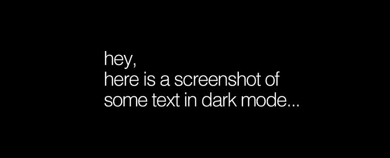
When looking at “dark mode” on the majority of apps, I am experiencing something called “halation effect”. Which means that things look a bit like this:
And the smaller the font, and the closer together the lines get, the worse it gets. Fun times.
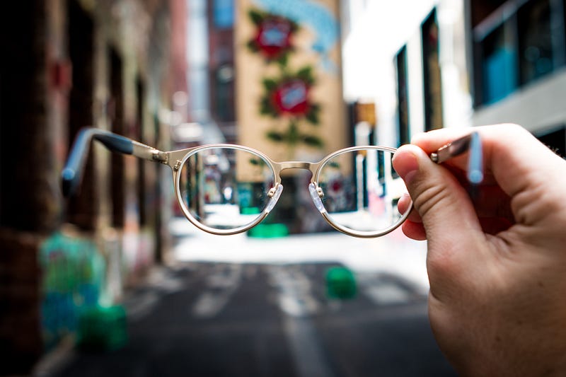
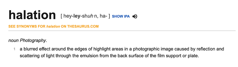
What is halation?
Most online searches for halation or halation effect lead you to photographic or general colour theory websites. That’s where you see things like this:
So it’s about lenses, and eyeballs have lenses. Makes sense so far.
Why does halation effect impact people with astigmatism?
According to Jason Harrison from the Sensory Perception and Interaction Research Group, at University of British Columbia[2002 . WWW Colors and Readability]:
People with astigmatism (approximately 50% of the population) find it harder to read white text on black than black text on white. Part of this has to do with light levels: with a bright display (white background) the iris closes a bit more, decreasing the effect of the “deformed” lens; with a dark display (black background) the iris opens to receive more light and the deformation of the lens creates a much fuzzier focus at the eye.
Note: This paper is referenced and cited all over the internet for astigmatism and halation effect. It’s the only one that comes up in everyone’s articles, and the paper just isn’t out there to read for yourself. Try following the trail, it’s weird. I was able to track down Jason Harrison (lovely guy!) and basically this is from his post doc work and part of the “known” science — not referenced, not based on research and not a new finding. Well done internet. I’ve tried to find new or more recent references to no avail, so if someone can add them please do.
TLDR — dark mode makes astigmatism worse.
So your dark mode could be messing with the user experience of up to 47% of your user base. Oops.
Does this effect everyone with astigmatism?
It doesn’t effect everyone with astigmatism — it needs to be of a certain severity (requiring glasses) or untreated (you’re not wearing your glasses) or that its just the type of astigmatism where glasses don’t really make that much of a difference (👋).
Note: as with most accessibility challenges, there are permanent, temporary or situational needs to be considered.
If 47% need glasses, and half of them aren’t wearing them, that’s still nearly 25% of your users struggling.
If you have another 20% who don’t need generally glasses, but experience this issue under low light, then you’re back up to nearly 50% anyway.
So what does this mean for the user?
It might be annoying that the world is suddenly inaccessible for nearly 50% of users, but perhaps it’s good for users who don’t normally experience significant visual challenges from digital products to gain some empathy? After all, dark mode has long been used or desired by those with light sensitivity (photophobia) or visual impairment who live in a “light mode” world.
Isn’t dark mode more accessible generally?
There is research that shows that generally, for generic internet users, the best colour contrasts are:
- Black on white
- Black on grey
- Blue on white
- White on black
- Black on yellow
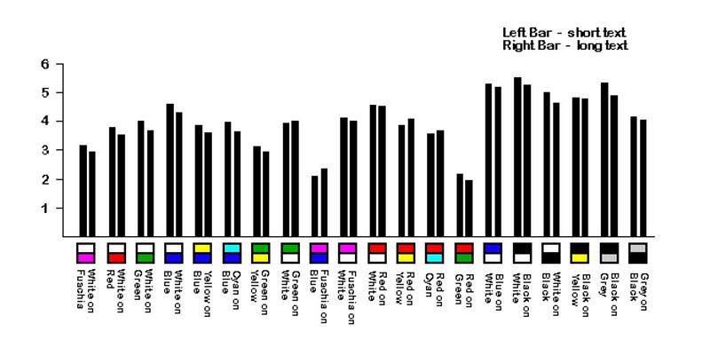
But that’s people with “normal” vision, not when you are designing for astigmatism.
And we know some people are designing for this audience — for example the way that at academic conferences now, white text on black background for slides is generally banned.
Some people have even suggested reducing the colour contrast to grey on white / white on grey, but again this could throw up issues for other users with different visual needs.
The natural tendency of researchers and designers is to try and find a rule that will solve a problem. That would be nice, but it’s not that simple.
The short version is that everyone’s eyes are different. There is no one single solution that’s going to be best for everyone. Sorry. Hard things are hard.
What should we do?
As with all design decisions we need to be super clear and honest about why were are making decisions, research thoroughly the best way to implement that design, and put the user in control.
Why are we designing in dark mode — be honest now
Is it because it is cool or pretty? Or is it because we think it has some actual benefit for the user?
Let’s not pretend that we’re making screens better for night reading and offsetting what blue light does to your circadian rhythms, when there are already phone functionalities such as adaptive brightness to handle that for us.
Let’s not pretend we’re being sustainable and increasing phone battery life when we’re burning loads of extra dev time creating something users might not actually need.
Or maybe they do…
Put the user in control
And if we’re claiming accessibility-based motives, as with all accessibility options — dark mode should be an option rather than a default. Having carried out research with users whose needs differ from “the mainstream”, I’ve learned that the user should be able to control settings as much as possible, thereby creating their own version of the tool suitable for their individual needs.
It doesn’t mean infinite versions of a design, it means appropriate control over colour, font size etc. There’s also a wonderful design challenge in designing for the different combinations available without degrading your original design vision — who would not want to do that?!
Give the user control. Make it easy to opt out of dark or light mode.
**turns off dark mode**
And in the meantime, anyone on my team who sends me this…
…gets one of these.

If you found this useful, consider subscribing for free to get email alerts when I post new articles, or you can join Medium for full access to my article archive, plus everything else on Medium.
References:
Explanation of photographic lens halation effect | https://exposuretherapy.ca/photography-guide/lens-aberrations-and-distortion/
Explanation of astigmatism | https://www.nhs.uk/conditions/astigmatism/
Percentage of people in the UK with astigmatism | https://www.jnjvisioncare.co.uk/education/astigmatism-and-contact-lenses/the-astigmatism-market
Overview of accessibility | https://www.iweb.co.uk/2016/10/inclusive-design-why-our-websites-should-more-accessible/
David C. Holzman | What’s in a Color? The Unique Human Health Effects of Blue Light
https://www.laurenscharff.com/research/survreslts.html
https://www.laurenscharff.com/research/AHNCUR.html
Info on how the eye adapts to light | https://en.wikipedia.org/wiki/Adaptation_(eye)
Designing dark mode properly | https://blog.prototypr.io/designing-a-dark-mode-for-your-ios-app-the-ultimate-guide-6b043303b941


