
Why Chips Should Replace Checkboxes and Radio Buttons
Introduction to chip components
Traditional checkboxes and radio buttons have become a thing of the past. They’re outdated and have lousy usability. Their tiny targets are hard to click with accuracy. The difference between a dot and checkmark cue can confuse non-tech-savvy users. The next evolution of checkboxes and radio buttons is chips.
Easier to Click and Tap
Radio buttons and checkboxes have small target zones without visible target borders. They’re hard for users to tap because the finger doesn’t fit inside the target zone.

Chips have a larger target zone with distinguished borders, making them easier to hit on desktop and mobile devices. The user can see the target clearer and hit it with higher accuracy.
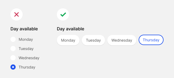
Once users click or tap a chip, they’ll see a selection cue. A checkmark signifies multi-select behavior. A thicker outline signifies single-select behavior. The distinct style of the cues indicates different affordances.
Easier to Differentiate
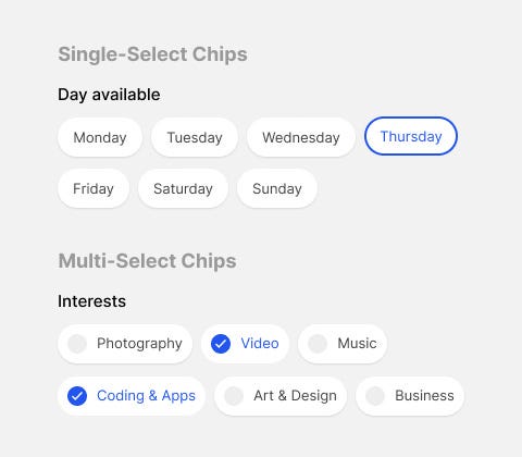
Instead of using the ambiguous terms “radio button” or “checkbox,” it’s better to differentiate the two by using the terms “single-select” or “multi-select.”
Single-select is for mutually exclusive items (radio buttons), and multi-select is for mutually inclusive items (checkboxes).
Flexible Arrangements
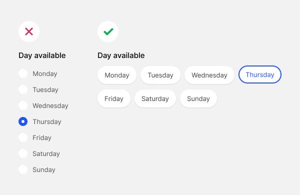
A couple of ways you can arrange your chips is with a vertical or horizontal stack. A vertical stack is a simple list, while a horizontal stack wraps the chips line-by-line.
Checkboxes and radio buttons are typically vertical lists. Chips with a horizontal stack allow you to fit and display many items without taking too much vertical screen space.
It also looks less overwhelming because each text label has ample whitespace around them, making it easier on the eyes.
Style Variants
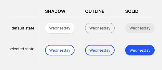
You can also choose between a few style variants for your chips. A drop shadow style displays visual depth and is more subtle. However, an outline style has a higher contrast border. A solid style uses a receding background color with a high-contrast color fill.

For more insightful design articles, get a subscription to the official UX Movement Newsletter on Substack


