
When You Need to Show a Button’s Loading State
Buttons have more than an enabled and disabled state. They also have a loading state. The loading state isn’t usually shown to users because most actions happen within seconds. But for operations that take longer than usual to occur, not showing the loading state leads to action errors.
Action Errors
If the action takes longer than expected to finish, users need to know that the system is processing their request. If they see nothing happening, they’ll think they didn’t press the button correctly. This belief will cause them to press the button again.
When users press a button more than once, it not only increases the system’s processing load, but it duplicates the operation. Depending on the context, this can lead to significant errors that not only frustrate users but you as well.
For example, users could accidentally send repetitive messages, submit forms multiple times, or order the same product twice. These action errors create extra data that you have to manage and clean up. And sometimes cleaning up that data can cost you time and money.
Progress Buttons
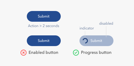
To prevent these errors, you need to use progress buttons on operations that take longer than two seconds. A research study found that users expect pages to load in two seconds or less, and become impatient when it takes longer.
A progress button gives users a visual cue that indicates a loading state. When users see a process taking place, they’re less likely to press the button again. It’s crucial to ensure no action errors occur by disabling the button when it’s in progress.
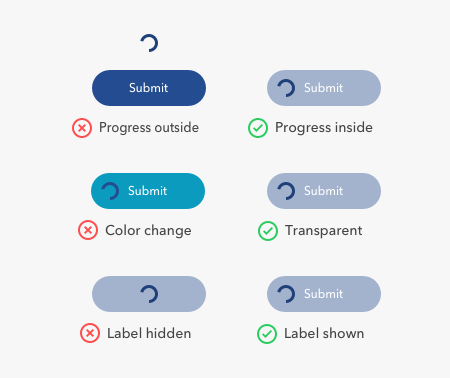
You can display the button’s loading state outside of the button, but this isn’t ideal. Users already have their eyes on the button when they press it. By placing it on the button, it’s in line with their visual field. A progress indicator in another area means users have to look for it and might miss it.
Progress buttons should be simple to implement and have a consistent style. This way, users can better recognize the loading state, and the buttons won’t conflict other screen elements. The progress indicator shouldn’t increase the button size or dimensions. Nor should it require the button to have a unique background color. Instead, use a transparent background to signify a disabled state and a high contrast color for the indicator.
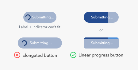
The progress indicator shouldn’t hide the button label, so users always know what’s in progress. Accomplishing this is difficult when you don’t have enough space to fit both the indicator and label together. What you can do is use a linear progress indicator instead of a circular one. This approach displays the progress inside the button while keeping the button label visible. You can also show the progress on the top edge of your button if it has sharp corners.
To better inform users what’s in progress, you can also change the button label to describe what the system is doing. For example, changing the original label from “submit” to “submitting…” tells users what’s happening as they’re waiting. Keep in mind this approach may not work if your button isn’t wide enough to hold a longer label.
Follow the Two-Second Rule
The loading state isn’t what most designers consider when they design buttons. But when your actions take longer than two seconds to complete, it’s essential to show users the loading state. Progress buttons are the control for doing this. Make use of them so users won’t commit action errors that cause you trouble.
Originally published at https://uxmovement.com on August 17, 2019.


