
When To Use What— Module Tabs vs Accordion vs Single Page
Information can be shown in various ways to users. We can show all the information in one-go or we can show it in chunks. Module Tabs and Accordion are a good way to show information in digestible chunks, but single page design has also its use case. Choosing the right way entirely depends on the context and user-requirement. Without wasting words let’s take a quick view.
Module Tabs
Module Tabs are a metaphor for folders kept in a drawer. Where each folder is specific to its content, yet belongs to all other folders.

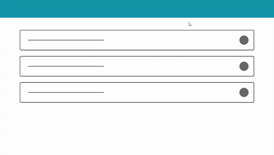
Checkpoints Module Tabs
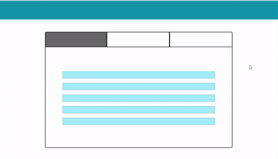
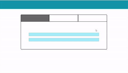
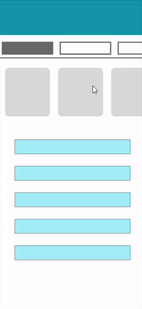
- Avoid information imbalance (Broken Experience) — One tab is scrollable and the other is non-scrollable with very less information.
2. Which tab would be your default tab? (Not a big problem, but need to consider what will be our criteria)
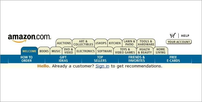
3. Multiple rows of tabs should be always avoided (because it increases complexity and makes visual relations among sections tough). Amazon did that in their earlier designs, later they dropped the Tabbed design and went for Single Page (You will get the reason in the later part of the article).
4. Section names should be relatively short and there should be some kind of color-coding or other visual support to indicate what tab is currently being viewed.
5. Avoid placing swipeable items in the content area of a UI that has tabs, as the user may mistakenly swipe the wrong component.
Choose Module Tabs When
- Information can be divided into chunks that don’t need to be compared or accessed simultaneously. Tabs organize content into categories to help users easily find different types of information. People often scan websites rather than reading them. Tabs are helpful here.
- You want to avoid very long-page scrolling. Optimum use of space by showing different information in the same space. Accordions take more space than tabs to show the same information.
Accordion
It’s a useful pattern for progressive disclosure — highlighting important details of a section and revealing more details upon a tap or click if wanted.
Checkpoints Accordion
- Icon that indicates expansion, shouldn’t conflict with other UI elements and their meanings.
2. Expansion icon may also indicate the direction of movement or more specifically, where the user’s view will be moved to once the icon has been tapped or clicked.
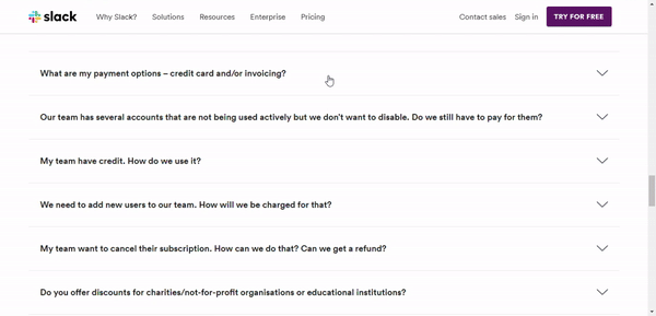
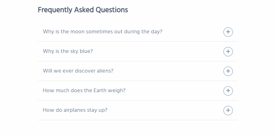
3. To avoid confusion and make the process easy, category title, icon, and the entire area should trigger expansion. Good usability is about predictability — does the user understand what will happen when they take XYZ action.
4. If one section is already expanded, and the user clicks on another section, should the first one collapse or stay as is? The answer to the question depends on user-requirements and the use-case.
When to use Accordion
- Good for responsive design. Accordion must fit in one screen whereas tabs may have a horizontal scroll (User will be needed to see hidden tabs themselves).
- Accordions are more “experiential” — you can animate the transition between the slides easily, it’s fun and it makes sense. The animated transition between tabs is very rare. There are a lot of rooms to experiment with accordions such as mouseover, expansion, collapse, etc.
Single Page
Choose Single Page When
- Information needs to be seen simultaneously.
- You have to give an unbreakable smooth experience with an absolute zero number of clicks. It encourages users to continue scrolling to explore, whereas tabbed navigation would break up the experience. That’s why E-commerce and Social Media websites use the long or infinite scroll.
- The content is arranged in some kind of sequential format.
You may have a look at these references for a detailed discussion on each. Thanks for reading out!