
When The S&P 500 Forms This One Pattern I Invest In Stocks That Move 80%+
This pattern repeats itself over and over again

The S&P 500 has climbed 650% since the last Great Bear Market of 2008.
During this climb and what is the longest bull run in history, the S&P 500 has followed a particular pattern.
Aligning with this pattern has positioned me to create portfolios that outperform the market whilst remaining objective and free from emotions.
As a mentor with over a decade of experience helping CEOs, HNWIs and high-salary earners invest in the stock market, one of the main challenges people face is being derailed by mainstream and social media.
The solution to this is simple: watch various news sources to stay informed about world events so you can have meaningful discussions around a dinner table, but block that all out and focus on the charts when managing your stock market portfolio.
Think about it for a second. How many world events have we been through, including a global pandemic that sent us into a 2-year lockdown, whilst the stock market has skyrocketed?
Too many to even count.
Logic has to prevail that Wall Street is disconnected from The High Street. The stock market will rally despite what our media channels try to pump us with.
Case-in-point: Remember at the start of 2023 when our media channels were slammed with failing banks and the supposed end of the world as we know it?
Instead, the S&P 500 rallied by 25% in 2023, fooling virtually everyone apart from those rare investors guided by charts and aligned with the established bull market.
How did we do this?
Let’s break down the longest bull trend in history wave by wave.
The Recovery From The Last Great Bear Market
Below is the weekly timeframe of The S&P 500. The black line is the 200 simple moving average (200sma).
A quick history lesson. Old-school traders used to draw charts by hand. As one can imagine, this was a long and laborious process. As a result, they were uber-selective with the information they added to the charts. They discovered the 200sma to be a proven indicator of the long-term trend.
- If an asset were trading above the 200sma, the bias was bullish, and they would look for long positions.
- If an asset were trading below the 200sma, the bias was bearish, and they would look for short positions.
Institutions and trend followers like myself still use this logic today.
If ain’t broke, don’t fix it as they say.
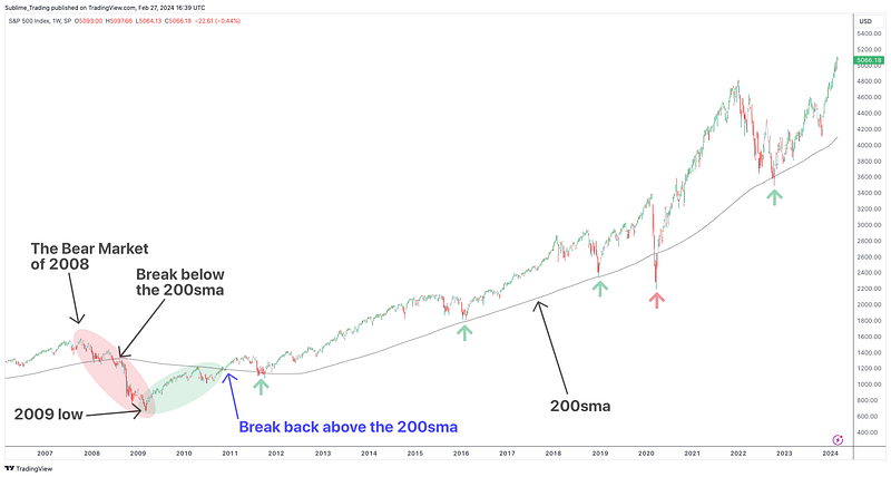
The reason why 2008 was the last Great Bear Market (red shade) is because that was the last time the S&P 500 broke below the 200sma. It then declined -50% to 2009’s low.
The S&P 500 recovered by 78% (green shade) from the 2009 low, breaking back above the 200sma in 2010 (blue arrow), and it is from here that we start diving into the repeated pattern the S&P 500 has adhered to.
First, note how, since 2010, the index has remained above the 200sma, periodically touching it (green arrows) and using it as a trampoline to push to new heights. We can ignore the temporary blip below the 200sma (red arrow) caused by the global pandemic, a Black Swan event.
Profit is made between these bounces off the 200sma.
Pro Tip: People spend more time trying to understand why the stock market behaves as it does, or worse, denying that it acts as it does, rather than accepting that it does and learning to profit from it. The simplicity of following the market is where people fall short.
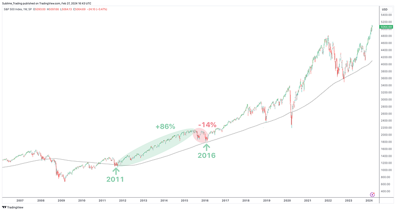
The First Big Wave Above The 200sma
2011 to 2016
2011 was the first bounce off the 200sma by the S&P 500 since breaking back above it in 2010. The index rallied by +86% to the 2015 high before a -14% correction back to the 200sma in 2016.
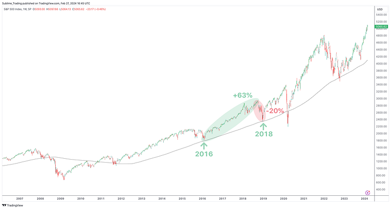
The Second Big Wave Above The 200sma
2016 to 2018
The bounce off the 200sma by the index in 2016 was followed by a +63% bull run to the high of 2018 before a -20% correction back to the 200sma in 2018.
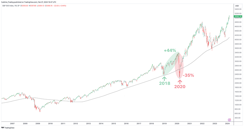
The Wave Before The Crash
2018 to 2020
A +44% bull run in the index followed the bounce off the 200sma in 2018 before disaster struck, and the market toppled -35% in 2 months due to the global pandemic.
All we need to know here is that Black Swan events are called as such because they are exceptionally rare. However, they can and will happen and why risk and exit management must always be in play. We do not compromise on this.
A good investor ALWAYS focuses on their downside first and lets the profit come to them. Assume a Black Swan event is possible at any moment of the day.
Also, note how the impact of the Black Swan event is short-lived, and the bull trend continues once CV19 is factored into the market.
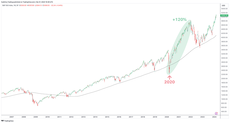
The Hugely Profitable Tsunami After The Crash
2020 to 2022
A +120% bull run in the S&P 500, a wave of epic proportions, emerged post-CV19, taking the index to highs most never saw coming. The media did an excellent job of keeping people stagnant while we were in lockdown through what is now proven to be inaccurate reporting of the pandemic.
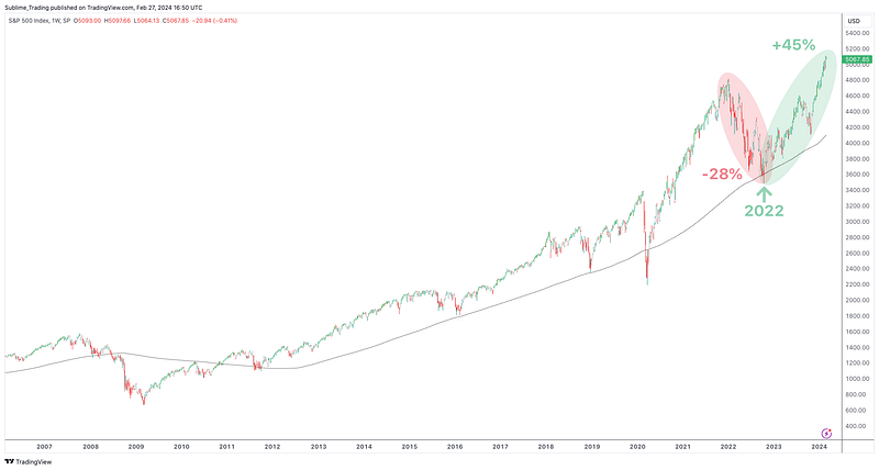
The Wave That Caught Everyone Staring
2022 to 2024
A -28% decline in the index through 2022 made it one of the more challenging years in recent times, but once again, the 200sma held firm as a support level, pushing the index back up.
The S&P 500 has rallied by a massive +45% (at the time of writing) and printing new all-time highs, a move that many were caught on the wrong side of with the failing banks narrative at the start of 2023.
A Point Regularly Overlooked
The S&P 500’s creation of new all-time highs tends to cause widespread panic, with regular talk of the stock market being insanely overvalued.
Those who prioritise calling market tops, often deemed as experts and driven by an unhealthy desire to be right, have a history of continually ending up on the wrong side of the market. This is at the expense of following the long-term market trend and making profit.
Be careful whom you choose to admire. False idols are a dime a dozen in this online investment space.
The reality is that the stock market has been creating new all-time highs since 2010.
Each blue line marks a level that the S&P 500 broke through following a bounce off the 200sma to create new all-time highs.
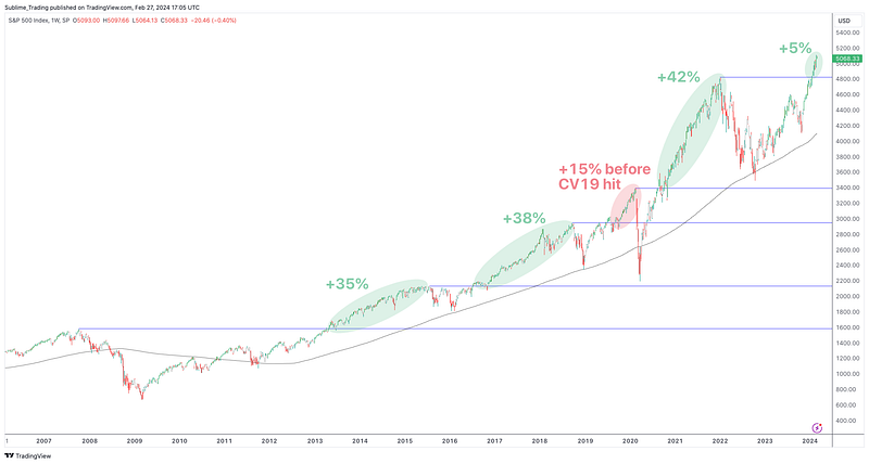
When printing new all-time highs:
- Between 2013 and 2015 the index climbed +35%
- Between 2016 and 2018 the index climbed +38%
- Between 2019 and 2020 the index had climbed +15% before CV19 hit
- Between 2020 and 2022 the index climbed 42%
Each time, the S&P 500 rallied between 35% to 42% when printing new all-time highs.
At the time of writing, the index has only climbed 5%, since starting to print new all-time highs in January 2024. This means there is still plenty of upside potential of at least 30% if the S&P 500 continues to repeat the above pattern.
Applying the +30% climb to current price action, the S&P 500 has the potential of moving through the 6000 round number, a key resistance level which, if broken, will mean further strength over the coming months.
This takes us nicely onto…
How To Profit From The Waves Between The Bounces
Between each bounce off the 200sma, the stock market goes through a boom period.
However, each boom varies as money flows from sector to sector. For example:
- Health Care performed exceptionally well between 2012 and 2015.
- Industrials performed well between 2015 and 2017.
- Utilities performed well between 2018 and 2019.
- IT and Communication Services boomed during lockdown from 2020 to 2021.
- Healthcare and Energy performed well in 2022 when the S&P 500 fell 28%.
- We have been heavily invested in Materials and Consumer Staples since 2023.
Our focus as investors is to find, shortlist and invest in the best-performing stocks from the most robust sectors.
Each of these stocks follows a particular pattern, which I call The 4PS Method, and often go on to move +80% over 12 to 18 months. I go into detail on The 4PS Method in this article.
To find these stocks, we deploy professional scanners programmed with elements of The 4PS Method to go through over 20,000 stocks and create an initial shortlist of 50 to 500 stocks, depending on how the market is moving.
I then use bespoke charting tools I have developed to manually filter out the creme de la creme stocks from the 50 to 500 shortlist and add them to our portfolio.
This process is where art meets science, and the title of ‘investor’ is earned.
The best techniques are remarkably simple to learn and execute but there is a level of sophistication to investing and trend-following that is often not given the respect it deserves.
And there you have it: a detailed look at how to use the repeated pattern in the S&P 500 to align with the bull market and significantly boost your portfolio performance.
In Summary
- Follow the long-term market pattern the S&P 500 has displayed since breaking above the 200sma in 2010.
- Profit is made buying stocks between the bounces off the 200sma when the S&P 500 can rally between +35% and +42%.
- When a bull market is in play, scan sectors and use charting tools to find, shortlist and invest in the best-performing stocks from the most robust sectors.
- Block out media noise and focus on the charts as Wall Street is without a doubt disconnected from The High Street.
How To Get Started Today?
Visit us at DataDrivenInvestor.com
Subscribe to DDIntel here.
Have a unique story to share? Submit to DDIntel here.
Join our creator ecosystem here.
DDIntel captures the more notable pieces from our main site and our popular DDI Medium publication. Check us out for more insightful work from our community.
DDI Official Telegram Channel: https://t.me/+tafUp6ecEys4YjQ1


