
Wise Words Column
When It Comes to Formatting Your Writing — Less Is Always More
Analysis of an over formatted story
When I work through submissions to our publication, the same issues reappear with a frightening consistency. The one that occurs the most is a writer’s tendency to over-format their work.
Before we dive into this, it’s important to remember the purpose of formatting. At its core, formatting allows us to highlight, emphasize, reference, and pull out quotes.
What I see, especially on a blogging platform, is regular miss-use of these, albeit with genuine intentions.
To illustrate this, I’ll tell an overformatted story.
Shrek is a giant, green, entirely misunderstood ogre who discovers his swamp has been taken over by fairytale creatures.
They have been sent there by the terrible Lord Farquaad.
In a bid to “get back my swamp,” Shrek sets out, with a talkative donkey by his side, to demand that Lord Farquaad free his swamp.
Lord Farquaad agrees to this on one condition.
Shrek must first rescue the beautiful young princess Fiona from a tower guarded by a dragon.
This is so that she can become Farquaad’s bride and make him a true king by definition.
Shrek is able to pull off the daring mission to rescue her.
During the journey back with Fiona, it becomes apparent that not only does Shrek like Fiona, but Fiona is keeping something secret.
As Farquaad and Fiona are about to marry, Shrek interrupts at the last moment and declares his love for Fiona.
At this moment, we discover that Fiona is also an ogre.
After falling in love with Shrek, she takes her true form, permanently becoming an ogre.
Everyone who isn’t eaten by a dragon lives happily ever after.
In the example above, the writer is using bolding and italics to highlight key events, names, and themes of the story. They are applying the quote formatting to emphasize two significant parts, rather than use it to reference quoted text. The writer here has also been very heavy on one-line sentences.
While this is all entirely OK, the overuse of them has led to the opposite of the writer’s desired outcome — the story is now harder to read and understand, and it’s unclear what takeaways the writer wants the reader to leave with.
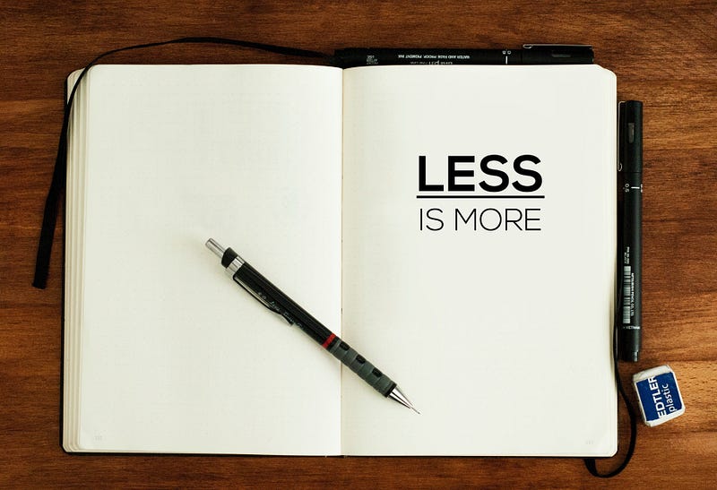
When it comes to formatting your work, less is always more.
If you want to bold something, save it for the one killer line that you want to have the most impact. Writers think it’s smart to highlight every key part of their writing, but bolding too much does the opposite.
When using italics, save them for what they are designed for — emphasis and reference. Overuse leads to the text being more challenging to read.
When considering the quote format, ask yourself: “Am I quoting something or trying to be too smart?” Unnecessarily quoting text is often distracting and not very effective.
With sentence structure, consider your work to be more than words. Layout is a form of art. One line sentences can be impactful, but only when you use them sparingly. A great technique is to ‘zoom out’ of your piece and see the sentence composition from further back. I encourage you to play around with it, mixing up larger chunks in bigger paragraphs with shorter, snappier sentences spread out across several lines. Your layout choices can make your work exciting to read through, and this will encourage people to keep on scrolling down.
When you’re editing through your work, remind yourself that less is more. Ask yourself, “When an editor sees this, will they understand why I’ve chosen to highlight this line and pull this out as a quote?”
If you can’t answer that, do your work a favour and leave as it is — beautiful, simple words telling a story.


